
If your home feed feels stuck between stark minimalism and full-blown maximalism, a softer, smarter middle ground is rising: avant-basic. Think pared-back furniture and clean lines warmed by pastel waves and given an edge with checkerboard accents—an easy way to make small spaces feel intentional, modern, and a little playful.
For US homeowners and renters alike, the pressure to create a “perfect” home has never been higher. We’ve swung from the chilly, gray-toned minimalism of the 2010s to the clutter-heavy, dopamine-driven maximalism of the early 2020s. But what if you want a space that feels both calming and expressive? Enter avant-basic decor. This design philosophy is taking over TikTok home decor trends and Instagram interior inspiration because it perfectly balances function with personality. By focusing on two major trending elements—soft pastel waves and graphic checkerboard patterns—you can transform your living room, bedroom, or home office without a full gut renovation.
In this guide, we’ll break down exactly what avant-basic design is, explore the psychology behind pastel gradients and checkerboard revivals, and give you actionable, budget-friendly styling tips. Whether you are tackling small apartment decorating or refreshing a suburban living room, read on to discover how to mix patterns and colors for a home that feels uniquely, joyfully yours.
What is Avant-Basic Decor?
To understand avant-basic decor, it helps to look at where it came from. The term is a playful spin on the “basic” aesthetic—a label once used to describe safe, mass-produced, millennial-gray interiors. Avant-basic reclaims that foundation of accessible, functional basics (think a comfortable neutral sofa, a simple wooden dining table, or clean-lined shelving) and injects it with “avant-garde” or forward-thinking, trend-forward details.
The core principles of this style revolve around simplicity, everyday function, and the strategic use of small, playful details. Unlike stark minimalism, which often strips a room of all character to achieve a museum-like stillness, avant-basic embraces warmth. Unlike maximalism, which relies on layering dozens of patterns, vintage finds, and bold colors until every surface is covered, avant-basic exercises restraint. It is the definition of minimalist with personality.
This movement has been heavily influenced by fashion’s crossover into home decor. Just as “dopamine dressing” encourages wearing bright, joyful colors to boost your mood, avant-basic applies that same psychology to our living spaces. Social media has accelerated this shift; creators on TikTok and Instagram are proving that you don’t need a massive budget or a custom architect to make a statement. A single curved, pastel-toned accent chair or a quirky checkerboard side table can completely elevate a “basic” room. It is an aesthetic that celebrates the modern reality of American homes: we want our spaces to be highly functional for remote work and relaxing, but we also want them to look incredibly chic on camera.
Pastel Waves Trend Explained
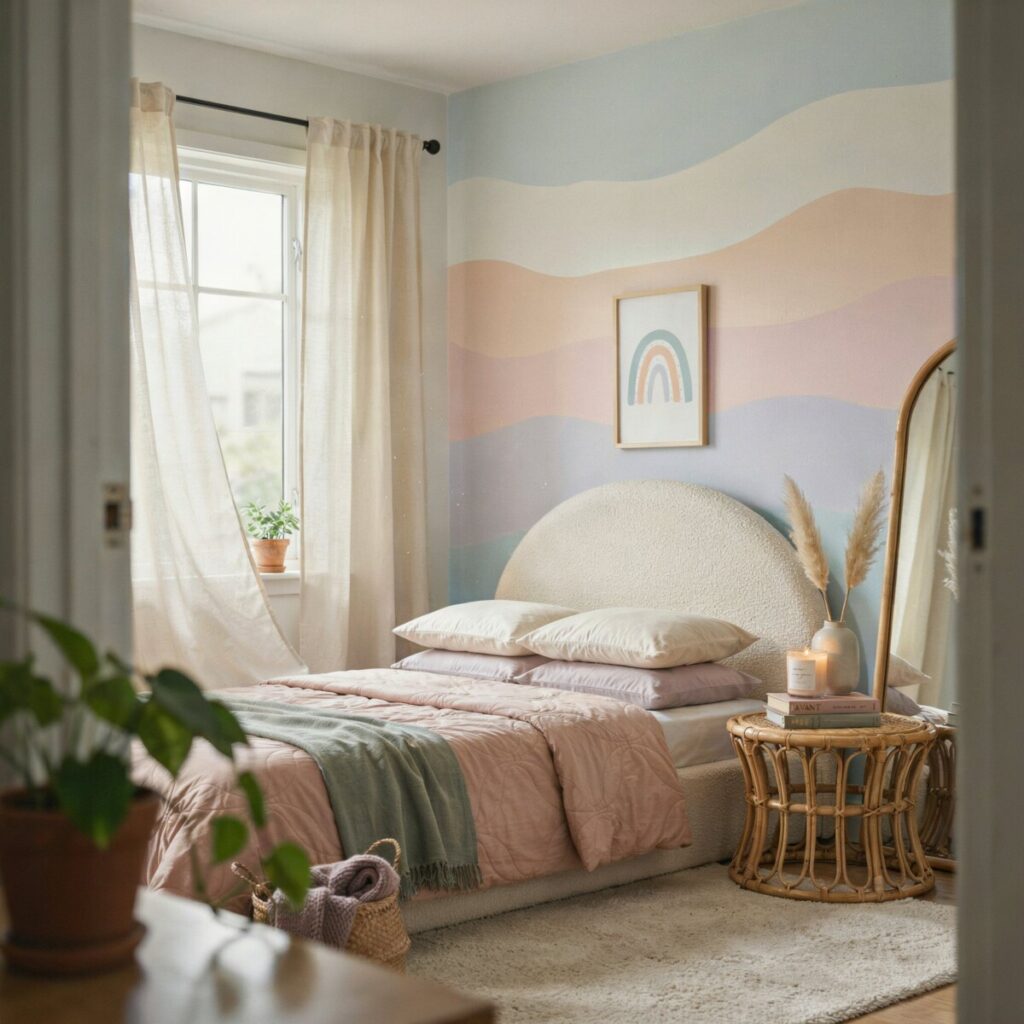
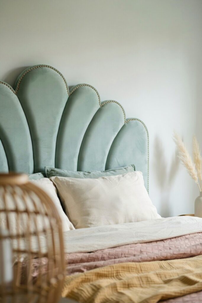
When we talk about pastel waves decor, we are referring to a visual language defined by soft gradient color transitions, rounded or curved silhouettes, and plush, inviting textures. Imagine a pastel gradient wall that fades seamlessly from a warm cream at the ceiling to a soft blush pink at the baseboards, or a scalloped headboard that mimics the gentle rolling of ocean waves.
Why do pastels feel so incredibly fresh right now? After years of global uncertainty and high-stress environments, modern pastel interiors offer a visual exhale. Color psychology tells us that soft, muted hues like lavender, sage, butter yellow, and powder blue promote serenity, optimism, and mental clarity. They reflect light beautifully, making them an ideal choice for brightening up darker rooms or making compact spaces feel airier. Furthermore, color blocking with pastels allows you to introduce multiple colors into a room without the visual chaos that comes with highly saturated primary tones.
Here is how you can apply the pastel waves trend across different rooms in your home:
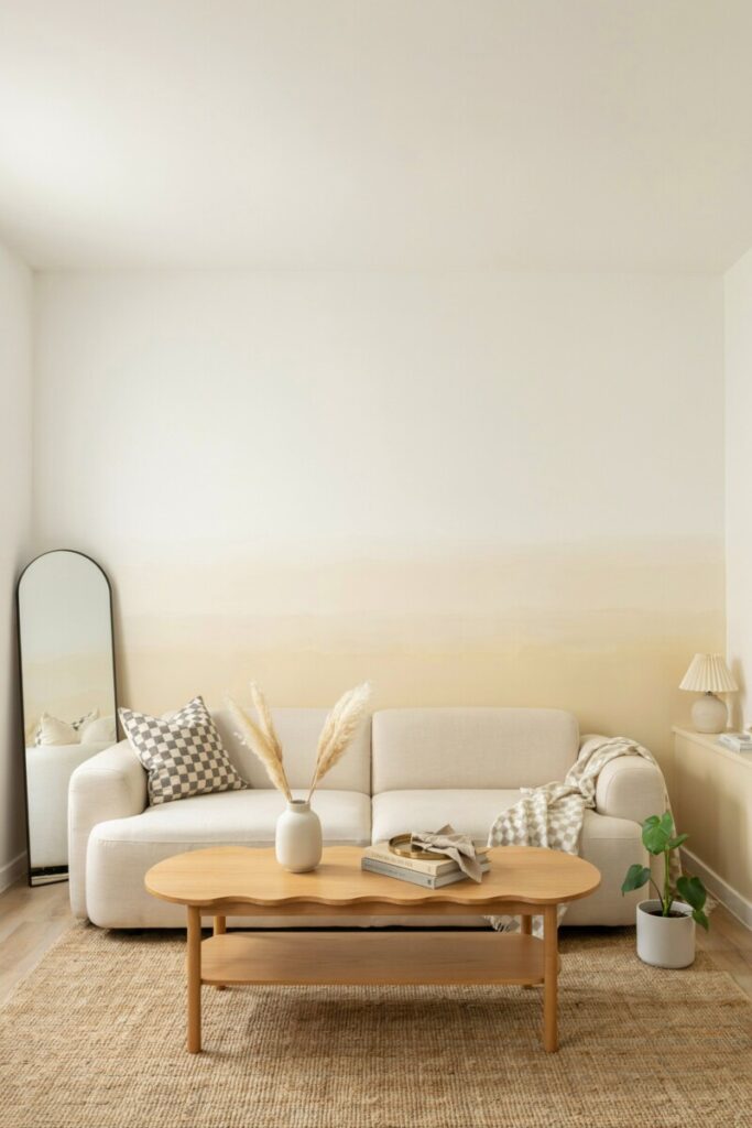
- The Living Room: Anchor the space with a curved, bouclé sofa in a soft oatmeal or pale lilac. Pair it with a pastel gradient wall behind your media console. The curved silhouette of the furniture mimics the “wave” concept, while the gradient wall provides a soothing, modern backdrop that feels far more dynamic than a flat coat of paint.
- The Bedroom: For cozy pastel bedroom ideas, focus on textiles. Layer a scalloped or wavy-edge duvet cover in soft mint over crisp white sheets. Add a plush, curved velvet bench at the foot of the bed. The key here is layering textures in decor—mixing smooth cotton with nubby velvet and soft wool to make the pastel palette feel rich and grounded rather than washed out.
- The Home Office: Bring the trend to your workspace with pastel home accents. Swap out harsh black desk organizers for wavy, pastel-toned acrylic or ceramic pieces. Install curved, pastel acoustic panels on the wall to dampen sound for Zoom calls while adding a soft, artistic focal point behind your monitor.
Checkerboard Pattern Resurgence
If pastel waves are the soothing yin of avant-basic decor, the checkerboard trend is the energetic yang. The checkerboard pattern is having a massive modern revival, stepping out of its 1950s diner and 1970s retro checkerboard associations to become a staple of contemporary design.
Today’s iteration of the pattern is all about scale, distortion, and unexpected colorways. While a classic black-and-white checkerboard tile will always have a place in traditional design, the avant-basic approach favors muted pastels, earthy terracottas, and tonal checkerboard designs (like pale gray and white, or cream and beige). You’ll also see “warped” or wavy checkerboards, where the rigid grid is melted or distorted, bridging the gap between the graphic pattern and the fluid wave trend.
The reason this graphic pattern decor works so beautifully is that it provides necessary visual weight. Soft color palettes can sometimes fall flat or look overly sweet without a grounding element. A checkerboard introduces high contrast, geometric structure, and a subtle nod to skate and street culture, giving a room an immediate edge.
Here are three ways to integrate the checkerboard trend into your home:
- The Entryway: First impressions matter. Lay down a bold, oversized checkerboard rug in a high-traffic entryway. Pair it with a sleek, minimalist console table and a simple round mirror. The rug does all the heavy lifting, turning a boring drop-zone into a striking focal point.
- The Kitchen Backsplash: If you want to tackle how to mix patterns and colors in the kitchen, try a pastel checkerboard backsplash. Imagine soft sage green and cream tiles laid in a classic grid behind your stove. It pairs beautifully with warm wood cabinets and brass hardware, offering a fresh take on the traditional farmhouse kitchen.
- The Bathroom Floor: A modern checkerboard floor is a brilliant way to add personality to a small, utilitarian space. Opt for a bold vs subtle patterns approach: use a high-contrast charcoal and white tile on the floor, but keep the walls, vanity, and shower tiles in a solid, soft white or pale pink to prevent the room from feeling dizzying.
“Pair one pastel focal wall with a small-scale checkerboard rug to get playful contrast without overwhelming the room.”
How to Combine Pastel Waves and Checkerboard
Mixing a fluid, soft trend with a rigid, graphic one might sound like a recipe for design disaster, but when done correctly, it is the ultimate avant-basic power move. The secret lies in understanding scale, color repetition, and the use of neutral anchors.
When learning how to mix patterns and colors, follow these golden rules:
- Balance the Scale: If your pastel wave is a massive, wall-to-wall gradient, keep your checkerboard pattern small and contained (like a throw pillow or a small area rug). Conversely, if you have large-scale checkerboard flooring, keep your pastel elements subtle and solid.
- Repeat the Color Family: Tie the two trends together by pulling a color from the pastel palette into the checkerboard. A pastel pink wall looks incredibly cohesive with a checkerboard rug that features cream and muted pink squares, rather than harsh black and white.
- Anchor with Neutrals: Let your “basic” foundations do the work. A beige sofa, a light oak coffee table, or warm white trim will give the eye a place to rest between the playful waves and the graphic checks.
Scenario 1: The Small Living Room
In a compact living room, you want to avoid visual clutter while maximizing style.
- Step 1 (The Base): Start with a low-profile, modular sofa in a durable, warm cream linen. Add a light wood coffee table with rounded, wavy edges.
- Step 2 (The Waves): Paint the wall behind the sofa in a subtle, tonal gradient, fading from white at the top to a soft butter-yellow at the bottom.
- Step 3 (The Checkerboard): Introduce a small-scale, tonal checkerboard throw blanket draped casually over the arm of the sofa, and add two checkerboard-patterned lumbar pillows in charcoal and cream.
- Step 4 (The Anchor): Ground the space with a large, solid neutral jute rug.
Scenario 2: The Studio Apartment
In a studio, you need to zone your space without building walls.
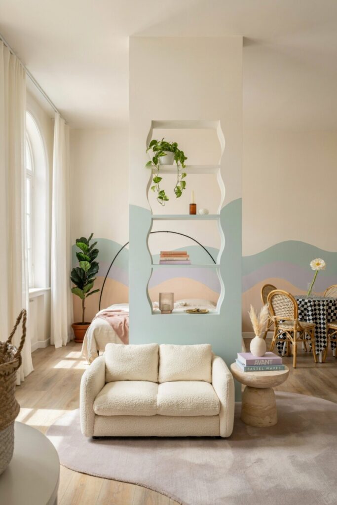
- Step 1 (Zoning): Use a large, pastel-toned curved rug (perhaps a soft lavender) to define the “living” area, separating it from the sleeping or dining zone.
- Step 2 (Soft Dividers): Place a wavy, pastel-colored open shelving unit or a curved room divider to block the view of the bed.
- Step 3 (Graphic Anchor): In the dining nook, lay down a peel-and-stick checkerboard floor mat or use a checkerboard tablecloth. The graphic punch clearly defines the dining area, while the pastel wave elements keep the overall studio feeling open, airy, and unified.
Budget and Rental-Friendly Ideas
One of the best things about the avant-basic movement is that it is incredibly accessible. You do not need to hire a contractor or buy luxury furniture to achieve this look. If you are renting or simply watching your budget, there are plenty of rental-friendly decor ideas that deliver high impact with low commitment.
- Peel-and-Stick Magic: Peel-and-stick wallpaper is your best friend for creating a pastel gradient wall or a wavy mural without losing your security deposit. Similarly, peel-and-stick checkerboard tile decals can instantly transform a dated kitchen backsplash or a boring bathroom floor.
- DIY Gradient Art: If wallpaper feels too daunting, try DIY gradient art. Buy a large, cheap canvas from a craft store and use sponges and diluted acrylic paints to dab a soft gradient from top to bottom. Frame it in a simple, thrifted wooden frame for a custom, high-end look.
- Thrifted Furniture Refreshes: Hunt for basic, sturdy furniture at local thrift stores or online marketplaces. A basic wooden nightstand can be sanded down and spray-painted in a soft pastel hue. Swap out standard round knobs for wavy, asymmetrical ceramic pulls to instantly give it an avant-basic vibe.
- Textile Swaps: You don’t need a new couch; you just need a new slipcover. Drape a wavy-edged, pastel throw over your existing furniture, and swap out your solid window curtains for ones with a subtle, tonal checkerboard weave.
When shopping, look beyond high-end boutiques. Big-box home stores often carry on-trend textiles and small accent pieces at a fraction of the cost. For unique, wavy ceramics or custom checkerboard linens, explore indie maker marketplaces like Etsy, where you can support small businesses while finding one-of-a-kind pieces. [Internal Link: Budget-Friendly Home Decor Projects]
Sources of Inspiration and Where to Shop
To keep your avant-basic vision sharp, curate your digital feeds. Search for Instagram hashtags like #AvantBasic, #PastelInteriors, and #CheckerboardDecor. On TikTok, follow creators who specialize in rental makeovers and dopamine decor. Use Pinterest or moodboard apps like Milanote to collect images, extract color palettes, and plan your room layouts before buying a single item.
When it comes to shopping, categorize your hunt. Look to fast-home retailers (like Target, H&M Home, or IKEA) for affordable, trend-forward pastel home accents and basic furniture silhouettes. Turn to indie makers and Etsy for unique, handcrafted wavy mirrors, tufted checkerboard rugs, and custom gradient art. Finally, don’t ignore local tile shops or architectural salvage yards; you can often find discounted, high-quality checkerboard tile or unique hardware that will make your space feel custom-designed.
Conclusion / Final Styling Checklist
Avant-basic decor proves that you don’t have to choose between a calm, functional home and a stylish, expressive one. By blending the soothing, fluid lines of pastel waves with the structured, playful punch of checkerboard patterns, you can create a space that feels entirely your own.
Your Quick Avant-Basic Checklist:
- [ ] Choose one focal trend (waves or checkerboard) to dominate, and use the other as an accent.
- [ ] Anchor playful patterns with warm, neutral, “basic” furniture.
- [ ] Mix textures (velvet, bouclé, wood, ceramic) to add depth to pastel palettes.
- [ ] Utilize peel-and-stick options for rental-friendly, low-risk updates.
Which room in your home are you going to tackle first? Pin this guide to your decor inspiration board, share your mood boards with us, and let us know in the comments below whether you are team Pastel Waves or team Checkerboard!
