
The ’70s Called — And Your Living Room Is Ready to Answer
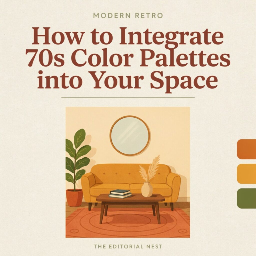
Something groovy is happening in American interiors. Walk into any well-curated home right now and you’ll spot them: mustard throw pillows on a clean-lined sofa, a burnt-orange accent wall behind a sleek media console, avocado green kitchen cabinets that feel fresh rather than funky. The 70s color palette is back — but this time, it’s trading shag-carpet chaos for quiet confidence.
Designers and homeowners alike are rediscovering the warmth, groundedness, and soul of vintage color trends from that era, and they’re pairing those hues with modern furniture, minimal clutter, and thoughtful lighting. The result? Spaces that feel nostalgic without being costumed, cozy without being cluttered.
This guide will walk you through exactly how to use 70s colors in your home — whether you own a bungalow in Austin, rent a studio in Brooklyn, or are refreshing a bedroom in suburban Chicago. No time machine required. Let’s get into it.
What Defines a 70s Color Palette?
Before you grab a paintbrush, it helps to understand what makes a 1970s color scheme unmistakably seventies — and why these shades still resonate half a century later.
The decade’s signature palette was rooted in the natural world. Think of the colors you’d find on a hike through autumn forests or a desert at golden hour:
- Mustard yellow and harvest gold — warm, honeyed yellows that glow without screaming.
- Burnt orange, rust, and terracotta — earthy reds with a sun-baked quality.
- Avocado green, olive, and moss — muted greens that feel organic and calming.
- Chocolate brown, sienna, and warm beige — the grounding neutrals of the era.
- Deep teal and ochre — accent colors that add sophistication and depth.
What unites these hues is their tonal quality. Unlike the sharp, saturated primaries of the 1960s mod movement or the neon brightness of the 1980s, mid-century modern colors from the ’70s lean warm, slightly dusty, and gently desaturated. They have what color theorists call low chroma — meaning they’re softened, as if viewed through a linen curtain at sunset.
These colors were almost always paired with natural materials: macramé wall hangings, rattan furniture, thick-pile wool rugs, raw wood paneling, and nubby woven textiles. The combination created interiors that felt layered, tactile, and deeply livable. Neutrals didn’t play a passive role — warm beige, cream, and tobacco brown were active participants, anchoring bolder shades and keeping rooms from feeling chaotic.
Understanding this tonal DNA is the key to pulling off a modern retro interior without veering into theme-park territory.
Why 70s Colors Are Back (and Why They’re Here to Stay)
Design trends are cyclical, and the pendulum always swings. After nearly two decades dominated by cool grays, stark whites, and Scandinavian minimalism, homeowners are craving warmth, personality, and a sense of home. Enter the retro color palette — specifically, the earthy, sun-drenched tones of the 1970s.
As Architectural Digest explored in its widely shared piece “Why Are We Yearning for ’70s Decor Again?”, the revival isn’t pure nostalgia. It’s a reaction to uncertain times. The ’70s, for all their turbulence, projected a visual language of comfort: conversation pits, enveloping sofas, and rooms designed for lingering. That energy resonates today.
Several forces are fueling the comeback:
- Nostalgia marketing and influencer culture. Celebrities like Kendall Jenner and designers like Athena Calderone have showcased warm earthy tones interior schemes on social media, normalizing colors that once felt “dated.”
- Sustainability and thrifting. The rise of sustainable retro decor means more people are rescuing vintage furniture and refreshing it with period-appropriate colors rather than buying new.
- Compatibility with modern styles. These hues pair beautifully with mid-century modern colors, Japandi aesthetics, and even industrial lofts — they’re surprisingly versatile.
- A rejection of sterile minimalism. People want homes that feel lived in, not staged.
The bottom line? A vintage-inspired palette isn’t a fad — it’s a course correction toward comfort.
How to Choose a 70s-Inspired Palette for Your Space
Here’s the part where we get practical. Choosing retro color combinations doesn’t have to mean painting every wall avocado green. A simple, repeatable formula will keep your space feeling intentional:
The 4-Color Method:
- Pick a dominant color (60% of the room) — usually a neutral like warm beige, cream, or soft brown.
- Pick a secondary color (25–30%) — your main 70s hue, like mustard, burnt orange, or olive.
- Add two accent colors (10–15% combined) — think deep teal, brass, or a muted pink.
- Ground everything with natural textures — wood, leather, woven fibers.
Here are three 70s inspired home decor palettes, ready to use:
Palette 1: “Golden Hour” — Living Room
| Role | Color | How to Use |
|---|---|---|
| Dominant | Warm Beige | Walls, large rug |
| Secondary | Mustard Yellow | Sofa upholstery, curtains |
| Accent 1 | Chocolate Brown | Coffee table, shelving |
| Accent 2 | Deep Teal | Throw pillows, one piece of art |
Best for: Living rooms with good natural light. This 70s palette living room combo feels sunlit without being overwhelming.
Palette 2: “Terra & Vine” — Dining Room
| Role | Color | How to Use |
|---|---|---|
| Dominant | Cream | Walls, ceiling |
| Secondary | Burnt Orange | Dining chairs, accent wall |
| Accent 1 | Olive Green | Plants, table runner |
| Accent 2 | Brushed Brass | Light fixture, candleholders |
Best for: Dining rooms and eat-in kitchens. A burnt orange living room or dining space in this palette feels warm, inviting, and perfect for hosting.
Palette 3: “Harvest Moon” — Bedroom
| Role | Color | How to Use |
|---|---|---|
| Dominant | Soft Linen White | Bedding, walls |
| Secondary | Harvest Gold | Headboard, throw blanket |
| Accent 1 | Muted Avocado | Nightstand, small dresser |
| Accent 2 | Dusty Pink | Pillows, bedside lamp shade |
Best for: Bedrooms and reading nooks. The soft contrast promotes rest while still feeling rich.
Test Before You Commit
Light drastically changes how retro color ideas read in a room. Before you buy gallons of paint:
- Order peel-and-stick samples (Samplize, Peel-Stick Shop) and move them around the room at different times of day.
- Collect fabric swatches from upholstery suppliers.
- Build a mood board — physical or digital (Pinterest and Canva both work well) — to see how your 70s color palette interacts before anything is installed.
Styling Techniques to Keep the Look Modern
The difference between a room that feels curated and one that feels like a flea market exploded comes down to styling. Here’s how to use 70s colors without tipping into kitsch:
Pair Retro Color with Clean Lines
Let the color be the star. Use furniture with simple, geometric silhouettes — low-profile sofas, slim-legged dining tables, platform beds. A mustard yellow sectional with tapered walnut legs reads as modern and intentional; the same color on an overstuffed, tufted, skirted sofa reads as costume.
Introduce Color in Measured Doses
You don’t need to commit to four walls. Try these measured approaches:
- One accent wall in a saturated hue (behind the bed, behind the sofa, or in a hallway).
- Textiles first: swap out throw pillows, a rug, or curtains before painting.
- Art and objects: a large framed print in harvest gold and teal can anchor a neutral room.
- Lighting: a colored glass pendant or a ceramic lamp base in burnt orange adds warmth without permanence.
Mix Textures Liberally
The ’70s were tactile. Recreate that richness with modern materials:
- Bouclé on an accent chair
- Velvet on dining chairs or a headboard
- Natural leather on a sofa or ottoman
- Woven rattan or cane on cabinet doors and side tables
- Chunky wool or shag in a small-area rug
Texture is what keeps a modern retro interior from feeling flat.
Update the Metallics
Swap out shiny chrome and polished nickel — hallmarks of ’80s and 2000s design — for warmer metals: matte brass, brushed gold, antique bronze, or even matte black hardware. These finishes complement warm earthy tones interior palettes far better than cool silver tones.
Protect Negative Space
Clutter is the enemy of a modern-retro room. Edit surfaces. Let one bold object breathe on a shelf instead of crowding it with six small ones. Negative space is what separates a 2026 interpretation from a 1974 recreation.
Renter-Friendly Swaps
If you’re renting, you can still pull off a retro home makeover:
- Use peel-and-stick wallpaper 70s-style patterns (geometric, floral, or earthy stripes) on one feature wall.
- Slipcover existing furniture in mustard, olive, or rust-toned covers.
- Layer vintage-style rugs over rental carpet.
- Swap out cabinet hardware (and save the originals to reinstall before move-out).
- Use removable adhesive hooks to hang large retro art prints.
Where to Use Each Color
Not every 70s hue works in every spot. Here’s a quick placement guide:
| Color | Best Used For | Avoid |
|---|---|---|
| Mustard Yellow | Accent walls, upholstery, large rugs | Small, windowless rooms |
| Burnt Orange | Dining chairs, kitchen island bases, throw blankets | Entire bedrooms (too energizing) |
| Avocado Green | Kitchen cabinets, bathroom vanities, entryway walls | Pairing with cool grays |
| Harvest Gold | Bedroom headboards, lampshades, kitchen textiles | Overhead ceilings (can feel heavy) |
| Chocolate Brown | Trim, built-ins, furniture, grounding accent walls | Small rooms without ample light |
| Deep Teal | Powder rooms, studies, front doors | Large open-plan spaces without warm accents |
Quick Dos and Don’ts:
- ✅ Do paint trim and doors a saturated 70s color — it’s a sophisticated, unexpected move.
- ✅ Do use dark hues like chocolate brown on built-in bookshelves to create depth.
- ❌ Don’t paint a small, north-facing room entirely in avocado green — it will feel cave-like.
- ❌ Don’t pair warm 70s colors with cool undertone grays; opt for warm whites and creams instead.
- ✅ Do consider the ceiling — painting it a soft harvest gold (a “fifth wall” treatment) adds warmth overhead.
An avocado green kitchen works beautifully because kitchens tend to have abundant lighting and white countertops that balance the green. Similarly, a burnt orange living room accent wall works because living rooms are typically large enough to absorb the visual weight.
Shopping and Sourcing: Where to Find the Pieces
Building a 70s inspired home decor look in the US is easier than ever. Here’s where to shop:
Thrift & Vintage (Best for Character)
- Local estate sales and Goodwill outlets — excellent for thrifted vintage furniture with solid wood bones.
- Chairish and 1stDibs — curated online vintage marketplaces.
- Facebook Marketplace and OfferUp — great for local finds like rattan chairs, brass lamps, and teak credenzas.
Online Retailers (Best for Reproductions)
- Etsy — handmade retro pillows, vintage rugs, peel-and-stick wallpaper 70s patterns, and macramé.
- West Elm and Joybird — modern furniture with 70s-inspired silhouettes and upholstery options.
- World Market — affordable rattan, textured throws, and earthy ceramics.
Big-Box Budget Options
- Target (especially the Threshold and Project 62 lines) — surprisingly solid retro color palette accessories.
- IKEA — swap out standard fronts with third-party rattan or fluted panels.
- Wayfair — extensive filtering by color and style.
Paint & Specialty
- Farrow & Ball, Sherwin-Williams, and Benjamin Moore all now carry curated “retro” color collections. Ask for their warm, earthy fan decks.
Smart search terms: 70s vintage sofa, rattan peacock chair, sunburst mirror, retro geometric rug, mustard velvet armchair, brass arc floor lamp.
Mini Case Study: A Living Room Modern-Retro Makeover in Austin, TX
The Challenge: Sarah M., a homeowner in Austin, Texas, had a 350-square-foot living room with beige rental-grade carpet, a gray sofa, and builder-white walls. She loved the warmth of 70s color palette interiors she’d been pinning on Pinterest but was afraid the look would feel dark or dated in her space.
The Plan: She chose the “Golden Hour” palette — mustard yellow as the secondary color, warm beige as the base, chocolate brown for grounding, and deep teal as an accent.
The Execution (One Weekend, ~$580):
- Painted one accent wall in Benjamin Moore’s “Yorkshire Tan” (a warm, muted gold-brown) — $45 in paint and supplies.
- Swapped her gray sofa cushions for custom mustard-colored linen slipcovers from Etsy — $180.
- Layered a 5×7-foot geometric retro rug (rust, cream, and olive) from World Market over the existing carpet — $160.
- Added two deep teal velvet throw pillows and a brass arc floor lamp from Target — $95 combined.
- Hung a large vintage sunburst mirror (thrifted from a local estate sale) above the sofa — $65.
The Result: The retro home makeover took one Saturday. Before: a sterile, forgettable room. After: a warm, layered 70s palette living room that feels both current and soulful. Sarah’s favorite detail? “The brass lamp against the mustard pillow — it’s the combination I never would have tried on my own.”
Common Mistakes and How to Avoid Them
Even the best retro color ideas can go sideways. Watch out for these pitfalls:
1. Over-Saturation
The mistake: Using mustard walls, an orange sofa, and olive curtains in the same room.
The fix: Stick to the 60/30/10 rule. Let one retro color dominate, and surround it with warm neutrals.
2. Ignoring Lighting
The mistake: Choosing a 70s color palette in the store, then hating it at home because your north-facing room makes everything look muddy.
The fix: Always test samples in your light. Warm bulbs (2700K–3000K) enhance earthy tones; cool daylight bulbs (5000K) will make them look flat.
3. Clashing Patterns
The mistake: Mixing three different 70s-era patterns — floral, geometric, and psychedelic — at the same scale.
The fix: Vary pattern scale. Pair one large-scale print with a small-scale one and a solid.
4. Forgetting Scale
The mistake: A tiny mustard accent chair swallowed by an oversized sectional.
The fix: Make sure your colorful pieces hold their own. A bold color deserves a proportional footprint in the room.
5. Skipping Texture
The mistake: Flat-painted walls, flat-fabric sofa, flat-weave rug — everything smooth.
The fix: Layer at least three textures. The ’70s were tactile — your modern-retro room should be, too.
Quick Palette Cheat Sheet
Grab one of these retro color combinations and run with it:
- 🟡 Mustard + Teal + Warm Walnut — cozy living room, mid-century vibe
- 🟠 Burnt Orange + Cream + Matte Black — modern dining room with an edge
- 🟢 Avocado + Linen White + Brass — fresh, organic kitchen
- 🟤 Chocolate Brown + Harvest Gold + Bouclé White — moody, sophisticated study
- 🟡 Ochre + Dusty Pink + Natural Rattan — playful, sun-drenched bedroom
- 🟤 Rust + Olive + Warm Beige — grounded, earthy family room
- 🟢 Deep Teal + Terracotta + Raw Wood — bohemian home office
- 🔵 Slate Blue + Mustard + Walnut — unexpected, retro-modern den
- 🟡 Harvest Gold + Sage Green + Cream — soft, vintage-inspired nursery
- 🟤 Sienna + Warm White + Black Hardware — clean, updated entryway
- 🟠 Pumpkin + Moss + Tan Leather — layered autumn living space
- 🟢 Muted Avocado + Blush + Gold — feminine, retro bathroom
Your Move: Start Small This Month
You don’t need a full renovation to bring the warmth of a 70s color palette into your home. Pick one change — a mustard throw, a burnt-orange lampshade, an olive velvet pillow — and layer it in this month. For more tips on furniture selection and layout for small spaces, see our guide to choosing the right sofa for your living room. Snap a photo of your modern-retro refresh and share it on Instagram with #MyModernRetro — we’d love to see what you create.
