
There’s something undeniably captivating about a wall that shifts in color like a sunset stretching across the horizon. An ombre accent wall brings that quiet, painterly drama into your home without the need for expensive wallpaper or professional contractors. Whether you’re refreshing a tired bedroom, adding personality to a rental, or creating a statement in your living room, this ombre accent wall DIY project is one of the most rewarding wall painting techniques you can tackle on a weekend.
The beauty of an ombre wall lies in its simplicity. You don’t need advanced artistic skills, just a little patience, the right paint colors, and a willingness to blend. Unlike bold geometric accent walls or intricate murals, an ombre effect works with soft transitions that feel calming rather than chaotic — making it perfect for home decor ideas that lean toward modern, minimalist, or boho aesthetics.
In this guide, we’ll walk you through everything you need to know about painting an ombre wall, from choosing the perfect wall to blending colors like a pro. By the end, you’ll have all the confidence you need to pick up a paint roller and transform a single wall into a designer-worthy focal point.
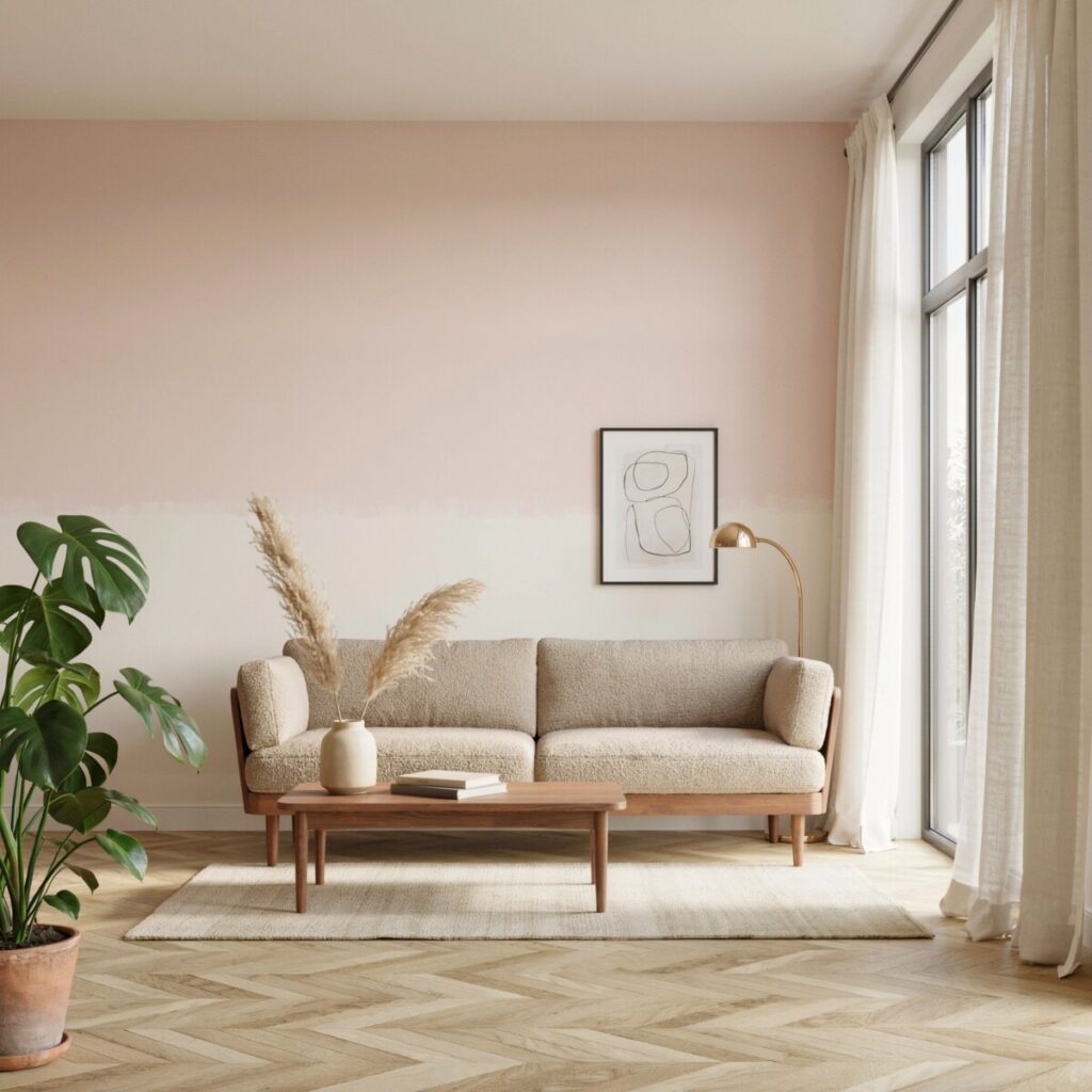
What Is an Ombre Accent Wall?
The word “ombre” comes from the French word meaning “shaded.” In interior design, it refers to a gradient wall paint effect where one color gradually fades into another — usually from light to dark, but sometimes from one hue to a completely different one. Think of the soft wash of color you see in watercolor paintings, or the way a sunset moves from pale peach to deep coral across the sky.
An ombre accent wall applies this same principle to your interior spaces. Instead of a single flat color, the wall features a smooth color transition that creates depth, movement, and visual interest. When done well, the effect feels organic and effortless — the kind of look that makes guests stop and ask, “Who did this for you?”
This wall painting technique is especially popular in the US because it pairs beautifully with nearly every design style: Scandinavian, coastal, mid-century modern, farmhouse, and contemporary. It also works across nearly every room in the house. A soft gray-to-charcoal ombre can anchor a bedroom accent wall, while a blush-to-cream gradient can bring warmth to a nursery or living room accent wall.
Tools and Materials You’ll Need
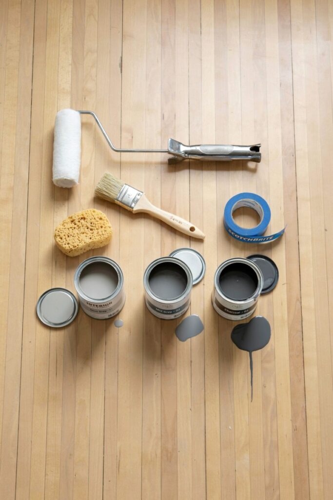
Before you start any DIY home improvement project, gathering your supplies is half the battle. Having everything within reach keeps the painting process smooth and prevents the paint from drying before you’ve had a chance to blend. Here’s your complete shopping list:
Essential Paint Supplies
- Three coordinated shades of paint — one light, one medium, one dark (same brand and finish recommended)
- Primer and base coat — especially important if you’re painting over a dark or uneven surface
- Paint trays and tray liners for easy cleanup
- Paint roller with a medium-nap cover (3/8-inch nap works well for most interior walls)
- Extension pole for reaching high sections
- Angled paint brushes (2-inch and 1-inch) for cutting in edges
- Sponge or dry brush for blending the color transitions
Prep and Protection
- Painter’s tape (FrogTape or ScotchBlue are popular US brands)
- Drop cloth or plastic sheeting to protect floors and furniture
- Sandpaper (120 to 150 grit) or a sanding sponge
- Spackling compound and a putty knife for patching holes
- Tack cloth or a damp rag for removing dust
- Measuring tape and a level for marking sections
- Pencil for light marking
Optional but Helpful
- Paint sprayer for ultra-smooth application (advanced users only)
- Lint-free rags for blending and cleanup
- Small containers for mixing custom gradient shades
Step-by-Step Instructions
Ready to get started? Follow this detailed process to create a flawless ombre wall that will look professionally done.
Step 1: Choose the Right Wall
Not every wall is a good candidate for an ombre effect. Pick a wall that already serves as a natural focal point — the wall behind your bed, the wall your sofa faces, or the wall you see first when you enter a room. Avoid walls with lots of doors, windows, or built-in shelving, as these break up the gradient and make the effect harder to read.
For interior wall design purposes, wider, unbroken walls produce the most dramatic results. A standard 8-foot by 12-foot wall is a great size for a first-time project.
Step 2: Clean and Prepare the Surface
Proper wall prep is the single most important step in any DIY wall painting project. Start by wiping down the wall with a damp cloth and a mild all-purpose cleaner to remove dust, grease, and grime. Pay special attention to areas near light switches and outlets where fingerprints tend to accumulate.
Let the wall dry completely before moving on. If you skip this step, your paint may not adhere properly, leading to peeling or uneven coverage down the line.
Step 3: Patch Holes and Sand
Use spackling compound to fill any nail holes, dents, or cracks. Apply the compound with a putty knife, let it dry according to the package instructions, then sand the area smooth with 120-grit sandpaper. Wipe away all dust with a tack cloth.
If your existing wall has a glossy finish, lightly sand the entire surface to help the new paint grip. This is especially important in kitchens, bathrooms, or any wall previously painted with semi-gloss or high-gloss paint.
Step 4: Tape Off Edges
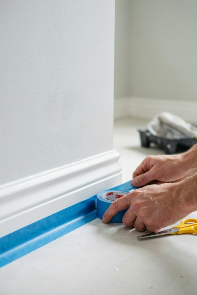
Using painter’s tape, carefully mask off the ceiling, baseboards, adjacent walls, and any trim or outlets on the wall you’re painting. Press the tape down firmly with a putty knife or your fingernail to create a tight seal. This prevents paint bleed and gives you crisp, clean lines — essential for a professional-looking finish.
If you’re painting a bedroom accent wall or a wall in a rental, take extra care with the tape. Rentals often have delicate trim that can be damaged by aggressive removal, so consider using low-tack painter’s tape.
Step 5: Apply Primer or Base Coat
If your current wall color is dark, heavily stained, or very different from your ombre palette, apply a coat of primer first. A white or light-tinted primer creates a clean canvas and ensures your ombre colors show up true to their swatch.
Let the primer dry completely — usually 2 to 4 hours — before moving to the next step. If you’re painting over a lighter or neutral wall, you can skip the primer and go straight to your lightest ombre shade as the base coat.
Step 6: Divide the Wall Into Sections
Using your measuring tape and pencil, divide the wall into three roughly equal horizontal bands: the top third (lightest shade), the middle third (medium shade), and the bottom third (darkest shade). Lightly mark these divisions with a pencil — don’t press too hard, as you don’t want the marks to show through the paint.
Some designers prefer a vertical ombre (dark at the ceiling fading to light at the floor) for a more unusual look, but horizontal is by far the most common and forgiving direction for beginners.
Step 7: Paint the Lightest, Middle, and Darkest Shades
Start at the top of the wall and work downward. Use your paint roller and angled brush to apply the lightest shade to the top third, the medium shade to the middle third, and the darkest shade to the bottom third. Don’t worry about perfect edges between the sections — that’s exactly what the next step is for.
Apply paint in a “W” or “M” pattern, then fill in the gaps with vertical strokes for even coverage. One coat may be enough if your paint has good opacity, but plan for a second coat if needed. Let each section set for just a few minutes — but not long enough to dry — before moving to blending.
Step 8: Blend the Colors While Wet
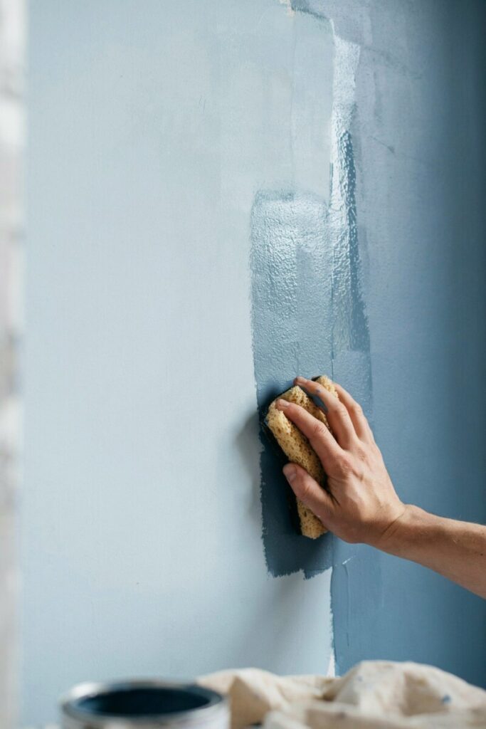
This is where the magic happens. Blending colors on a wet surface creates that signature soft gradient that defines the ombre look. Working quickly, take a clean, slightly damp sponge or a dry brush and gently feather the paint where the two shades meet.
Use light, crisscross strokes or long sweeping motions to blur the line between the light and medium shades, then repeat where the medium and dark shades meet. Work in small sections — about 2 to 3 feet at a time — so the paint stays wet long enough to blend.
If you notice a harsh line forming, don’t panic. Dip your sponge or brush into a tiny bit of the lighter shade and softly blend it into the darker area. The goal is a gradual fade, not a perfect mathematical gradient.
Step 9: Adjust the Gradient for a Smooth Finish
Step back frequently and assess your work from different angles. A gradient that looks perfect up close may look uneven from across the room. If you spot any streaks or harsh lines, lightly re-blend with a dry brush.
For an even softer effect, you can mix a small amount of the medium shade with the light shade (and vice versa) to create custom transition colors. Apply these custom blends in the overlap areas to further smooth the fade.
Step 10: Let Everything Dry Properly
Resist the urge to touch up or move furniture back into place too soon. Most interior latex paints feel dry to the touch within an hour, but full curing can take anywhere from 24 hours to 30 days depending on humidity and ventilation.
Wait at least 24 hours before carefully removing the painter’s tape. Pull the tape off at a 45-degree angle while the paint is fully dry to avoid peeling. Then, wait another day or two before rehanging artwork or placing furniture against the wall.
Best Color Combinations for an Ombre Wall
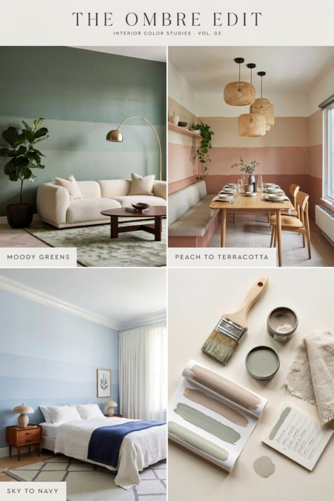
Choosing the right paint colors is arguably the most fun — and most intimidating — part of the project. The key is to pick shades that belong to the same color family so they blend naturally. Here are some of the most popular and versatile combinations for US homes:
Soft Neutrals
- Cream to taupe to espresso
- Ivory to warm gray to charcoal
- Off-white to greige to deep bronze
These combinations work beautifully in bedrooms and living rooms, creating a calm, sophisticated backdrop that pairs well with almost any furniture.
Blues and Greens
- Sky blue to navy
- Seafoam to teal to deep forest green
- Pale aqua to cobalt to midnight blue
These are fantastic for bedroom accent walls and nurseries, evoking a sense of serenity and calm. Coastal-style homes especially benefit from blue ombre effects.
Warm Tones
- Blush pink to dusty rose to burgundy
- Pale peach to terracotta to rust
- Soft yellow to goldenrod to burnt sienna
Warm ombre walls add coziness and character, making them ideal for dining rooms, home offices, or feature walls in open-concept spaces.
Grays and Monochromes
- Pale silver to slate to graphite
- Dove gray to pewter to jet black
Monochromatic gradients feel sleek and contemporary, perfect for modern apartments or minimalist interiors.
Tips for Choosing Your Colors
- Consider room size: Lighter colors at the top make a small room feel taller, while darker colors at the bottom ground the space.
- Test swatches first: Paint small sample patches on the wall and observe them at different times of day. Natural light can dramatically shift how a color reads.
- Stick to the same brand and finish: Mixing brands or finishes (e.g., matte with satin) can lead to uneven sheen and patchy results.
- Think about your furniture: Your ombre wall should complement, not compete with, your existing decor. Pull colors from throw pillows, rugs, or artwork for a cohesive look.
Pro Tips for a Better Finish
Even beginner DIYers can achieve a professional-looking gradient wall paint effect with the right approach. Here are some insider tips from experienced painters:
Work in Small Sections
The biggest mistake first-time ombre painters make is trying to tackle the entire wall at once. Paint tends to dry faster than you expect, especially in warm or dry climates. Work in manageable 3-foot sections to keep the paint wet and blendable.
Don’t Let Paint Dry Too Fast
If you’re working in a hot, dry room, close the windows and turn off ceiling fans while painting. You can also lightly mist the wall with water (using a spray bottle) between coats to extend your working time — just don’t overdo it, as too much moisture can dilute the paint.
Use Fresh Brushes for Blending
A brush that’s loaded with paint will create streaks instead of soft transitions. Keep a clean, dry brush or sponge specifically for blending, and swap it out if it gets too saturated.
Test Colors on the Wall First
Before committing to your final palette, paint a 2-foot by 2-foot test patch on the wall with all three colors and blend them. This gives you a realistic preview of how the colors will look at scale and under your room’s specific lighting.
Protect Floors and Nearby Trim
Even the most careful painters have accidents. Lay down a high-quality drop cloth (canvas is better than plastic for catching drips), and consider using painter’s tape with a built-in protective film on nearby trim for extra peace of mind.
Use Multiple Light Coats
One heavy coat of paint is more likely to streak and harder to blend than two or three thin coats. Apply each coat lightly, let it dry, and then build up the color gradually. This approach also gives you more opportunities to refine the gradient as you go.
Common Mistakes to Avoid
Even with the best intentions, certain pitfalls can derail your ombre project. Watch out for these frequent errors:
Skipping Wall Prep
Dirty, uneven, or glossy walls are the number one cause of paint failure. No amount of skill can overcome a poorly prepared surface. Always clean, patch, sand, and prime as needed before painting.
Using Colors That Are Too Far Apart
Choosing a pale pink and a deep navy for your ombre may sound exciting, but these colors are difficult to blend and often result in a muddy middle section. Stick to shades that are no more than three or four steps apart on a paint strip for the smoothest transition.
Overblending
It’s tempting to keep brushing and sponging the transition area until it looks “perfect,” but overblending can actually push too much paint into one spot and create visible patches. A few deliberate strokes are usually enough — step back and let the gradient do the work.
Not Planning the Gradient Direction
Before you pick up a brush, decide whether you want your ombre to go light-to-dark from top to bottom, bottom to top, or even side to side. Each direction creates a different mood. Top-to-light feels airy and uplifting; bottom-to-dark feels grounded and cozy.
Working Too Slowly
Ombre is a race against the drying time of your paint. If you take too long between sections, you’ll end up with harsh, unblended lines. Have all your tools and paint ready to go before you start, and work methodically but briskly.
Using Low-Quality Paint
Cheap paint often has less pigment and poor coverage, which means you’ll need more coats and more blending — both of which increase the risk of a patchy result. Invest in a mid- to high-quality interior paint from a reputable US brand like Benjamin Moore, Sherwin-Williams, or Behr.
Where an Ombre Accent Wall Works Best
One of the reasons ombre walls have exploded in popularity across the US is their versatility. Here are some of the most stunning applications:
Bedroom Accent Wall
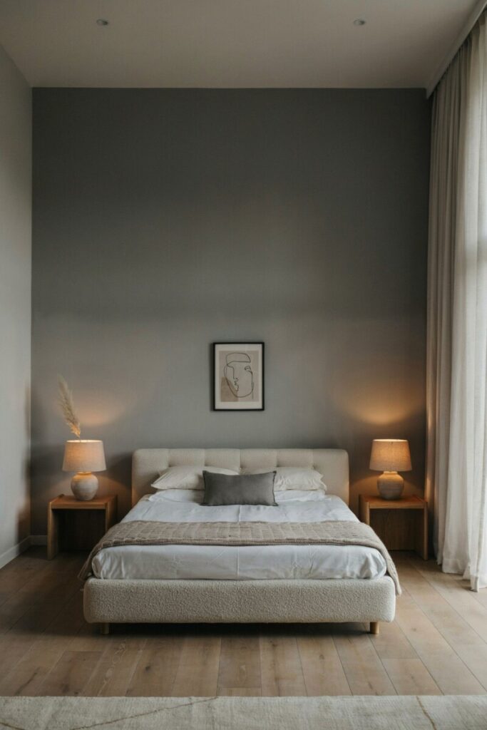
A soft, calming ombre behind the headboard instantly elevates a bedroom without overwhelming it. Neutral or cool-toned gradients promote relaxation, making them perfect for creating a sleep-friendly environment.
Nursery Wall
Nurseries benefit enormously from ombre walls, which add visual interest without the intensity of bright, solid colors. Pastel gradients (think lavender to soft pink or mint to sage) create a gentle, dreamy atmosphere perfect for little ones.
Living Room Feature Wall
In open-concept homes, an ombre accent wall can help define the living area without the need for physical dividers. A warm or rich gradient draws the eye and anchors the room’s seating arrangement.
Hallway
Long, narrow hallways can feel dreary and boxy, but an ombre effect adds depth and movement. A light-to-dark gradient can make the hallway feel longer or shorter depending on the direction you choose.
Home Office
A focused, intentional workspace benefits from a design element that inspires creativity. A monochromatic blue or gray ombre can boost concentration while adding a touch of personality to an otherwise functional room.
Dining Room
For a sophisticated, grown-up take on the trend, try a deep jewel-toned ombre in a dining room. Emerald to forest green, or navy to midnight blue, creates an intimate, restaurant-worthy atmosphere for entertaining.
Final Thoughts
Painting an ombre wall is one of those rare DIY projects that delivers a high-impact, custom-designed result without requiring years of experience or a professional’s budget. With a weekend, a few cans of paint, and a little bit of patience, you can completely transform the mood of any room in your home.
Whether you’re looking for fresh accent wall ideas, searching for home decor ideas on a budget, or simply want to try your hand at a new wall painting technique, an ombre wall is a beautiful place to start. It’s forgiving enough for first-time painters yet sophisticated enough to impress even the most design-savvy guests.
So pick your colors, clear your schedule, and grab your roller. Your walls are about to become the most interesting thing in the room.
Frequently Asked Questions
Can I paint an ombre wall over existing wallpaper?
Technically yes, but it’s not recommended. Wallpaper can peel, bubble, or show seams through the paint. For the best results, remove the wallpaper first and prep the underlying wall properly.
How long does an ombre accent wall take to complete?
Most DIYers can complete an ombre accent wall in one full day, including prep, painting, and drying time. Plan for 2 to 3 hours of active painting time plus several hours of drying.
What type of paint finish works best for ombre walls?
Matte, eggshell, and satin finishes are the most popular choices for ombre walls. Matte hides imperfections beautifully, while eggshell offers a soft, washable sheen that works well in high-traffic areas.
Can I do an ombre wall with just two colors?
Absolutely. A two-color ombre (light to dark) is often easier for beginners and still produces a stunning effect. You can always add a third shade later if you want a more complex gradient.
Is an ombre wall a good idea for a rental?
Yes — as long as you use removable paint and prep the wall properly. Many renters use ombre walls as a way to personalize their space, and the soft, neutral gradients are easy to paint over when it’s time to move out.