
Why Pattern Mixing Matters in Eclectic Interiors
Picture this: you walk into a living room and something just clicks. The oversized floral curtains sing alongside a geometric area rug. Stripes on the throw pillows punctuate the scene without stealing it. Nothing matches — yet everything belongs. That’s the magic of eclectic interior design done right.
Mixing patterns is the heartbeat of eclectic style. It’s what separates a room that feels flat and safe from one that feels collected, personal, and alive. But here’s the thing — there’s a fine line between “curated and cool” and “chaotic and confusing.” The difference almost always comes down to a handful of design principles that professional decorators use every day.
The good news? You don’t need a design degree to master them. In this guide, we’ll walk you through practical rules for mixing patterns confidently, show you real-world examples, share budget-friendly shopping strategies, and troubleshoot the most common mistakes people make when they try to mix patterns at home. By the end, you’ll have a clear roadmap for creating rooms that feel intentional, layered, and unmistakably you.
1. Start with a Unifying Color Palette
Think of your color palette as the invisible thread that stitches every pattern in the room together. Without it, even the most beautiful prints will fight each other for attention. With it, a bold zebra print can sit comfortably next to a delicate English floral — and somehow, it just works.
How to Build Your Palette
Start by choosing one dominant color and two to three supporting hues. Then anchor the whole scheme with at least one neutral — think warm white, charcoal, camel, or soft gray. Neutrals give the eye a place to rest and prevent the room from feeling overstimulated.
Here’s a simple exercise: pick the largest fixed element in your room. That might be your sofa, your wall paint, or a statement area rug. Pull two to three colors from that piece and use them as your palette foundation. Every pattern you introduce afterward should include at least one of those colors.
Real-World Palette Examples
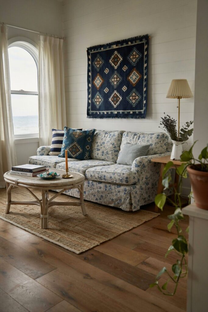
Coastal eclectic: A navy-based palette unites nautical stripes, indigo ikat, and soft white-and-blue florals. The shared blue family keeps everything cohesive even when the motifs are wildly different.
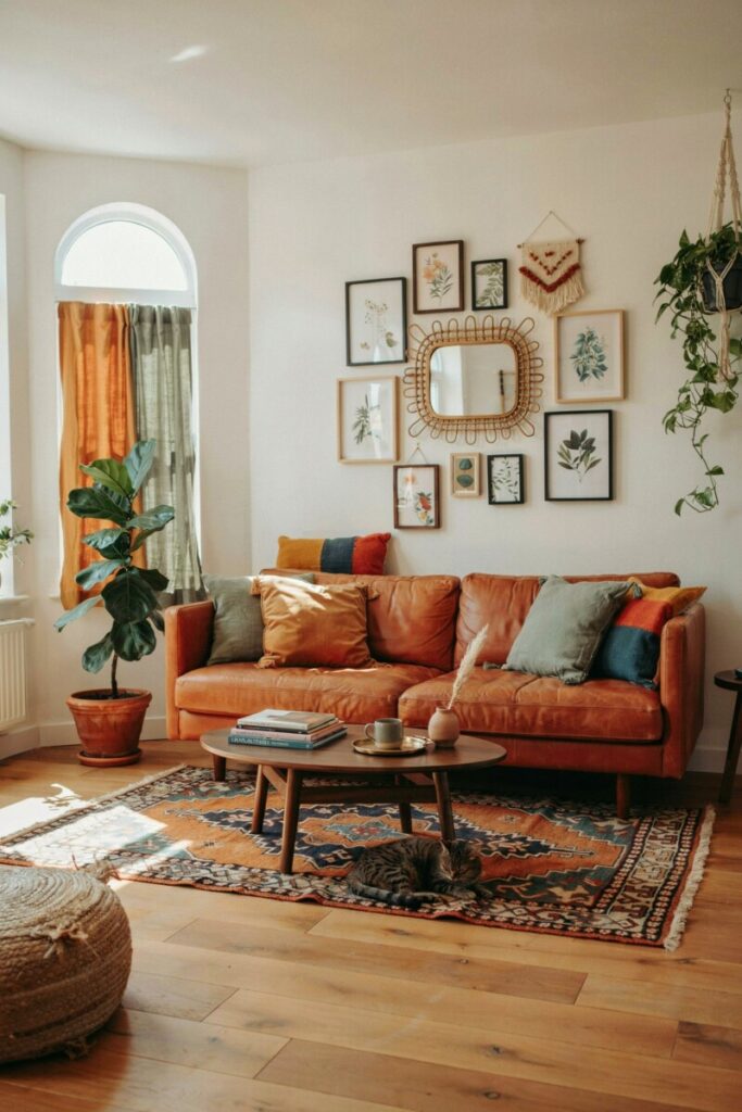
Boho eclectic: Earthy terracotta, mustard, and sage green tie together tribal kilims, botanical prints, and hand-blocked textiles.
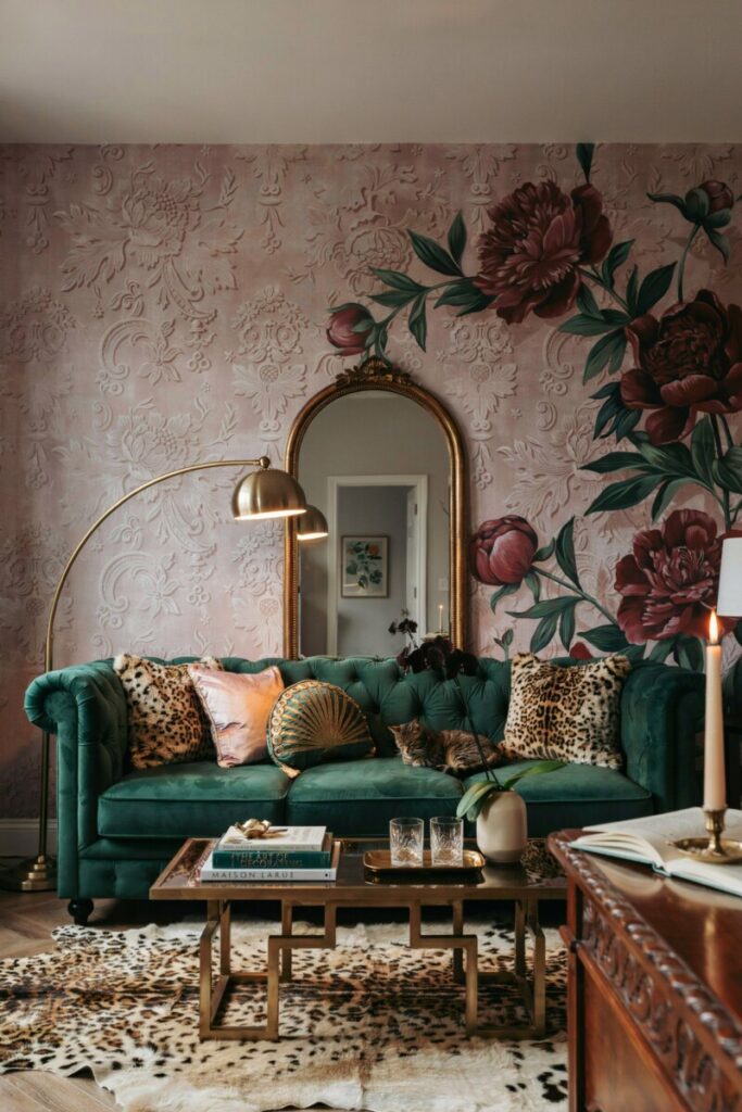
Moody maximalist: Deep emerald, blush pink, and brass-toned gold connect leopard print, Art Deco geometrics, and moody florals in a space that feels lush rather than loud.
Pro tip: If you’re nervous about color, start with a monochromatic palette — different patterns in varying shades of a single hue. It’s nearly impossible to get wrong and looks instantly sophisticated in eclectic home decor.
When you’re evaluating pattern combinations, ask yourself: Do these pieces share at least one color? If the answer is yes, you’re already halfway to a room that feels designed rather than random.
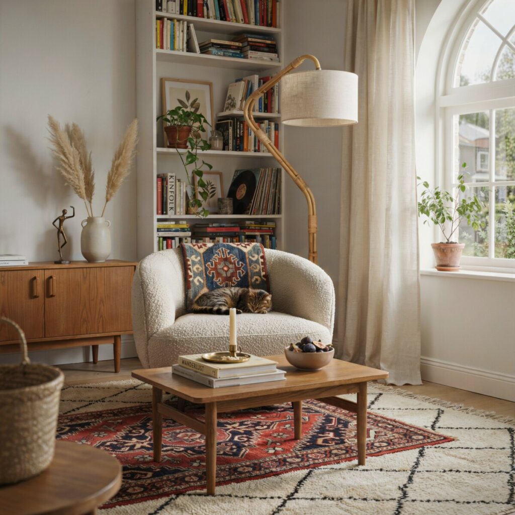
2. Master Scale and Proportion
If color is the glue, scale and proportion are the architecture. This is where most pattern-mixing attempts go sideways — not because the patterns are wrong, but because they’re all the same size.
The Three-Scale Rule
Professional stylists rely on a simple framework: use at least three different scales of pattern in any room.
| Scale | Size | Best Placement | Example |
|---|---|---|---|
| Large | Oversized, bold motifs (6″+ repeat) | Rugs, curtains, statement wallpaper | Oversized floral, large chevron |
| Medium | Mid-sized motifs (2–5″ repeat) | Upholstery, accent chairs, bedding | Ikat, medium toile, paisley |
| Small | Petite, subtle motifs (under 2″ repeat) | Throw pillows, lampshades, small accessories | Micro-dots, narrow stripes, tiny geometrics |
When all your patterns are the same scale, they compete instead of complement. The eye doesn’t know where to land. But when you layer a large-scale anchor pattern with a medium-scale secondary pattern and a small-scale accent, you create visual hierarchy — and the room instantly feels more composed.
Placement Tips
- Large-scale patterns belong on big surfaces: an area rug, drapery panels, or a feature wall. They set the tone.
- Medium-scale patterns work beautifully on upholstered furniture — an accent chair in a mid-sized geometric, for instance.
- Small-scale patterns shine as finishing touches: throw pillows, a patterned lampshade, or even the lining of a bookshelf.
Try the 3-scale rule: one large, one medium, one small. It’s the single most reliable formula for layering patterns without creating chaos.
Imagine a living room with oversized peony wallpaper (large), a medium-scale striped sofa (medium), and small polka-dot cushions (small). Three scales, one unified palette, and the room reads as intentional and dynamic. These pattern mixing tips work in virtually any room size or style.
3. Mix Pattern Types and Motifs
Once you’ve locked in your palette and varied your scales, it’s time to think about pattern families. Not all patterns play well together — but the best eclectic rooms combine motifs from different families to create visual tension and interest.
The Major Pattern Families
- Geometrics: Stripes, chevrons, hexagons, Greek key, triangles
- Florals: Oversized botanicals, ditsy florals, chintz, chinoiserie
- Organics: Ikat, shibori, marble, woodgrain, animal prints
- Classics: Toile, damask, paisley, plaids, tartans
- Abstracts: Brushstroke, watercolor, splatter, free-form
Combinations That Work
The golden rule: pair structured patterns with organic motifs for natural balance. A rigid geometric needs the softness of a floral or an ikat to keep the room from feeling too clinical.
Here are some tried-and-true combos:
| Style Direction | Pattern Combination |
|---|---|
| Bohemian eclectic | Ikat + large floral + tribal motif |
| Midcentury modern mix | Graphic geometric + subtle stripe + organic abstract |
| Classic eclectic | Toile + thin stripe + small-scale plaid |
| Maximalist | Leopard print + oversized floral + bold chevron |
Combos to Approach with Caution
- Two large-scale florals in the same room tend to clash unless they share a very tight palette.
- Multiple bold geometrics at the same scale can feel like a optical illusion — vary the scale or introduce an organic pattern to soften the effect.
- High-contrast patterns (think black-and-white checkerboard) can dominate; balance them with softer, lower-contrast prints.
For eclectic home decor, the goal is contrast with cohesion. Geometric patterns bring order; floral patterns bring softness; stripes bring rhythm. Use them in concert, not competition.
4. Use Texture and Solids to Rest the Eye
Here’s a secret that separates magazine-worthy rooms from overwhelming ones: not every surface needs a pattern. In fact, the rooms that mix patterns best are the ones that also know when to stop.
Texture contrast is your quiet superpower. A nubby linen throw, a plush velvet cushion, a woven jute basket, or a smooth leather ottoman — these elements add depth and richness without adding visual noise. They give the eye a place to breathe between patterns.
Practical Texture Pairings
- A velvet solid-color sofa paired with a patterned kilim rug and a hand-woven throw blanket.
- Textured grasscloth wallpaper behind a bed with patterned linen curtains and solid velvet throw pillows.
- A smooth leather armchair next to a patterned ottoman, grounded by a natural fiber rug.
Why Solids Matter
Solid-color pieces act as visual “white space” in a room — the same way margins make a page of text readable. When you intersperse solids (especially in your palette colors), you let the patterns around them pop instead of blend into mush.
Upholstery patterns are a bigger commitment than throw pillows or area rugs, so if you’re just starting out, keep larger furniture pieces in solids or subtle textures and introduce patterns through accessories you can swap seasonally.
If unsure, start with patterned cushions — less commitment, big impact. A $40 pillow cover lets you experiment with a bold print without the risk of reupholstering a $2,000 sofa.
Consider durability, too. In high-traffic family rooms, textured performance fabrics (think Sunbrella, Crypton) handle daily life better than delicate printed linens. Save your most intricate patterns for lower-traffic spaces like a bedroom or a formal sitting area.
5. Layering, Placement, and Focal Points
Layering patterns isn’t random — it follows a logic. Think of it like building an outfit: you start with the base layer and add pieces one at a time, checking the mirror as you go.
Start Big, Then Layer Down
- Anchor piece first: Choose your largest, most dominant pattern. This is usually an area rug, a wallpapered accent wall, or a statement sofa.
- Secondary pattern next: Add a medium-scale pattern on a different surface — curtains, an accent chair, or bedding.
- Accent patterns last: Introduce small-scale patterns through accessories — pillows, art, ceramics, books with patterned spines.
Creating a Focal Point
Every room needs a focal point — one element that commands attention and anchors the design. In a pattern-rich eclectic room, your focal point is usually your largest or boldest pattern. It might be:
- A bold patterned wallpaper on the wall behind your bed
- A statement rug in a saturated, large-scale print
- An upholstered headboard in an oversized floral
Once you’ve established that focal point, let every other pattern in the room support it rather than compete with it. This creates balance and rhythm — the design principles that make a room feel resolved.
Layout Tips by Room
- Living room: Distribute patterns across the room rather than clustering them on one side. If your sofa has a bold pattern on the left, balance it with a patterned lamp or art on the right.
- Bedroom: Layer bedding patterns from largest (duvet) to smallest (pillow shams, decorative cushions). A patterned headboard or wallpaper adds impact without overwhelming a rest-focused space.
- Small spaces: For small space pattern ideas, go vertical. Patterned curtains draw the eye upward and make ceilings feel taller. A single bold accent wall does more than several small patterned accessories scattered around.
Pull colors from an existing rug or artwork to build your palette. It’s the easiest shortcut to a room that looks professionally styled.
6. Budget-Friendly Shopping and Sourcing
You don’t need a decorator’s budget to pull off a layered, pattern-rich room. Some of the most stunning eclectic interiors are built on thrifted finds, remnant fabrics, and strategic splurges.
Where to Shop
- Thrift stores and estate sales: Vintage textiles — old kilims, hand-blocked Indian fabrics, mid-century drapery — add instant character and one-of-a-kind pattern.
- Discount fabric retailers: Stores like Joann, Fabric.com, and local fabric districts offer designer-print fabrics at a fraction of upholstery-shop prices. A single yard can become a set of custom pillow covers.
- Online marketplaces: Etsy, eBay, and even Facebook Marketplace are treasure troves for discontinued wallpaper, vintage rugs, and patterned textiles.
- Big-box stores with good pattern options: Target (Threshold, Project 62), World Market, IKEA (limited but solid basics), and HomeGoods/TJ Maxx for ever-changing patterned accessories.
- Remnant sales: Many fabric and carpet stores sell end-of-roll remnants at deep discounts — perfect for small projects like cushion covers or a single accent chair.
Mix High and Low
Invest in one quality anchor piece — a well-made sofa, a hand-knotted rug, or custom drapery — and fill in around it with budget-friendly accessories. A $3,000 vintage Oushak rug paired with $25 Target pillow covers can look infinitely more interesting than a room where everything came from the same catalog.
Before You Buy: A Quick Measurement Checklist
- ☐ Measure the furniture or surface (length, width, depth)
- ☐ Check the pattern repeat on fabrics (larger repeats need more yardage)
- ☐ Confirm fabric care instructions (dry clean only vs. machine washable)
- ☐ Order a swatch if buying online — colors shift on screens
These shopping tips and smart fabric selection strategies make eclectic styling accessible at any budget. And if you’re home staging a property for sale, pattern mixing can help buyers envision a lifestyle — just keep the palette restrained and the scale tasteful.
7. Case Study: From Beige Box to Eclectic Haven
The challenge: A 650-square-foot apartment living room in Chicago, rented by a couple in their early 30s. The space was a sea of beige — beige sofa, beige walls, beige rug. Functional but lifeless. They wanted personality without moving walls or breaking the lease.
The transformation:
- Color palette extracted from a single piece of art they already owned — a vintage travel poster in deep teal, warm ochre, and cream. Those three colors became the room’s DNA.
- Large-scale anchor: A 5×7 teal-and-cream geometric area rug ($189, World Market) replaced the beige builder-grade carpet square. Instantly, the room had a foundation.
- Medium-scale layer: Cream curtains with a medium-width ochre stripe ($79/pair, Target) added vertical interest and introduced the second palette color.
- Small-scale accents: Three throw pillows in small-scale patterns — a teal micro-chevron, an ochre mini-floral, and a cream-with-teal-dot — were layered on the existing beige sofa ($22 each, Etsy).
- Texture additions: A chunky cream knit throw, a rattan side table, and a velvet lumbar pillow in solid teal added tactile depth.
The result: A warm, layered, unmistakably eclectic living room that felt curated rather than decorated — all for under $500 and without a single lease-violating change.
Three Takeaways You Can Steal
- Start with one colorful piece you love and extract your palette from it.
- The rug sets the tone. Swap it first for maximum impact.
- Small patterned accessories are low-risk, high-reward. Pillows, throws, and small ceramics let you experiment freely.
These pattern mixing examples prove that eclectic interior design is as much about strategy as it is about style.
8. Common Mistakes and Troubleshooting
Even with the best intentions, pattern mixing can go off the rails. Here are the most common pitfalls — and how to fix them fast.
| Problem | Quick Fix |
|---|---|
| Too many competing colors | Simplify your palette to 3 colors max. Remove the outlier pattern that doesn’t share a hue. |
| Scale mismatch — everything looks the same size | Add a medium-scale pattern to bridge the gap between your large and small prints. |
| Pattern fatigue — the room feels exhausting | Introduce more solids and textured neutrals. Swap one or two patterned pillows for solid velvet or linen. |
| Scared to commit | Start with removable accents: pillow covers, a small rug, or peel-and-stick wallpaper in a powder room. |
| Patterns look “matchy” instead of curated | Break up matching sets. If your curtains and pillows are from the same fabric line, swap one for something unexpected. |
A note on rules: Once you understand these pattern rules, you’re free to break them. Some of the most stunning rooms bend every guideline — but they do it on purpose. Master the fundamentals first, then experiment with confidence. These pattern mixing tips are guardrails, not cages.
When mixing patterns feels overwhelming, remember: edit, edit, edit. If something doesn’t feel right, remove one element and reassess. Sometimes the fix is subtraction, not addition.
9. Your Pattern-Mixing Checklist
Pin this, screenshot it, or print it out. This is your at-a-glance reference every time you style a room:
- ☐ Choose a color palette — 1 dominant color + 2–3 supporting hues + 1 neutral
- ☐ Pick three scales — one large, one medium, one small
- ☐ Select one dominant anchor pattern — rug, wallpaper, or sofa
- ☐ Mix pattern families — combine structured + organic motifs
- ☐ Add texture and solids — give the eye places to rest
- ☐ Create a focal point — let one bold pattern lead the room
- ☐ Distribute patterns evenly — balance across the space for rhythm
- ☐ Shop smart — invest in anchors, experiment with accessories
- ☐ Measure before you buy — dimensions, repeat, and fabric care
- ☐ Edit ruthlessly — when in doubt, remove one piece and reassess
This pattern mixing checklist is your shortcut to confident eclectic home decor — whether you’re refreshing a single shelf or redesigning an entire floor.
Ready to Mix?
Grab that one patterned pillow you’ve been too nervous to buy, pull three colors from a piece of art on your wall, and layer in a textured throw. That’s it — you’ve just started mixing patterns like a pro.
We’d love to see what you create. Share your eclectic rooms with #EclecticPatternMix on Instagram, and subscribe below for our next deep-dive: Boho vs. Midcentury Eclectic — How to Blend Styles Without Losing Your Mind. Or download our printable Pattern-Mixing Cheat Sheet (linked in the sidebar) for a visual guide you can tape inside your design notebook.
Your home should tell your story — patterns included. Now go make it unforgettable.
