There’s a simple, budget-friendly trick that designers use to make a home feel curated and custom: they paint the interior doors. While everyone obsesses over wall color, the doors get overlooked—usually defaulting to builder-grade white or a tired beige. But a fresh coat of paint on your bedroom, bathroom, hallway, closet, or pantry doors can completely shift the mood of a room in a single afternoon.
Whether you’re a first-time DIYer, a renter who got the green light from your landlord, or a homeowner hunting for interior design trends that don’t require demolition, painted interior doors are your secret weapon. They add contrast, personality, and that “I hired someone” look for the cost of a quart of paint and a Saturday morning.
This guide walks you through seven creative interior door paint ideas, shows you exactly how to prep and paint, and helps you pick the perfect color and finish. Let’s open the door—literally—to your next favorite home improvement project.
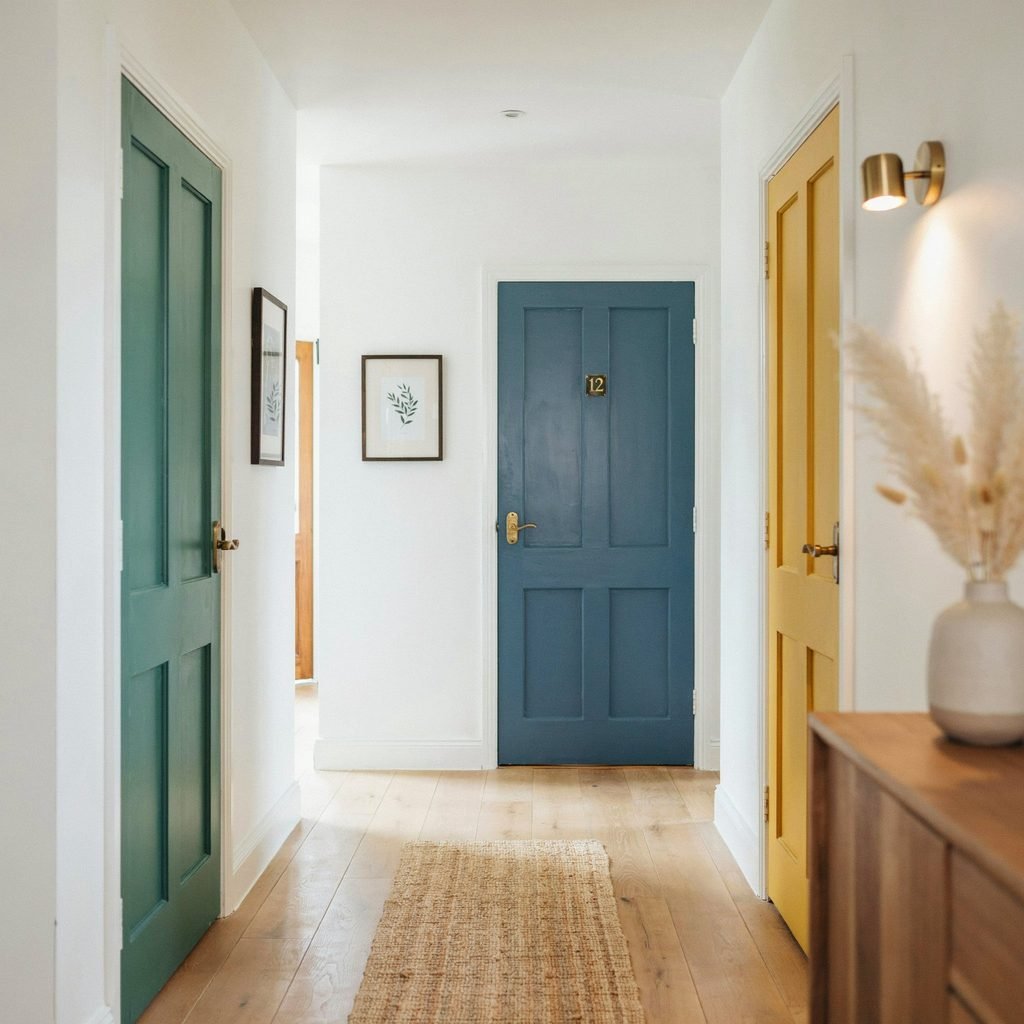
1. Paint the Door a Bold Accent Color
The visual effect: A single door in a saturated hue—think emerald green, sunflower yellow, or coral—acts like a piece of art framed by the doorway. It draws the eye and gives the room a focal point without touching the walls.
Best rooms and styles: Hallways, home offices, and kids’ bedrooms. Works beautifully in eclectic, mid-century, and bohemian interiors.
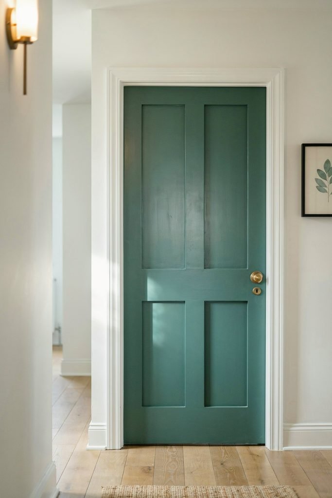
Suggested color families: Jewel tones (sapphire, ruby, emerald), warm citrus yellows, or rich terracotta.
What to paint: Both sides of the door. Keep the surrounding trim and frame white or neutral so the color pops.
Best finish: Semi-gloss for durability and a slight sheen that makes the color feel rich.
Step-by-step tips: Remove or tape hardware. Apply two thin coats with a foam roller, cutting in edges with an angled sash brush. Let each coat dry fully.
Design pairings: White walls with colored doors create maximum impact. Pair with brass or matte-black door hardware, warm wood flooring, and minimal decor so the door stays the star.
Mistakes to avoid: Don’t choose a bold color that clashes with existing furniture. Test a large swatch on the door first and view it in morning and evening light.
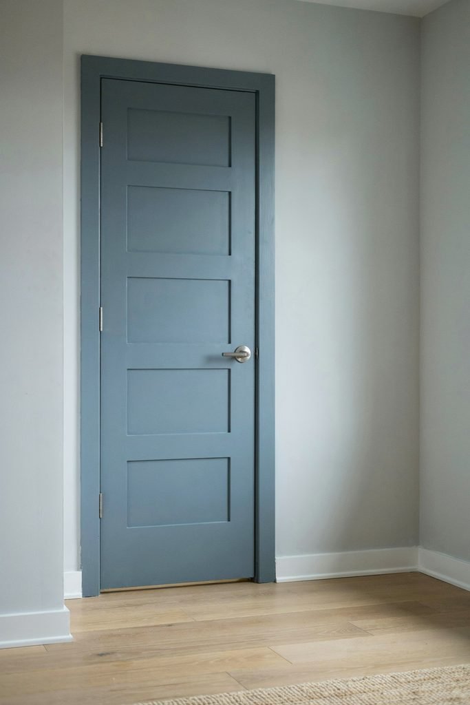
2. Use a Darker Shade Than the Wall Color
The visual effect: A tone-on-tone approach that feels sophisticated and layered. The door reads as a natural extension of the wall palette while adding depth and dimension.
Best rooms and styles: Bedrooms, dining rooms, and traditional or transitional homes. Ideal for anyone who wants colorful interior doors without going “loud.”
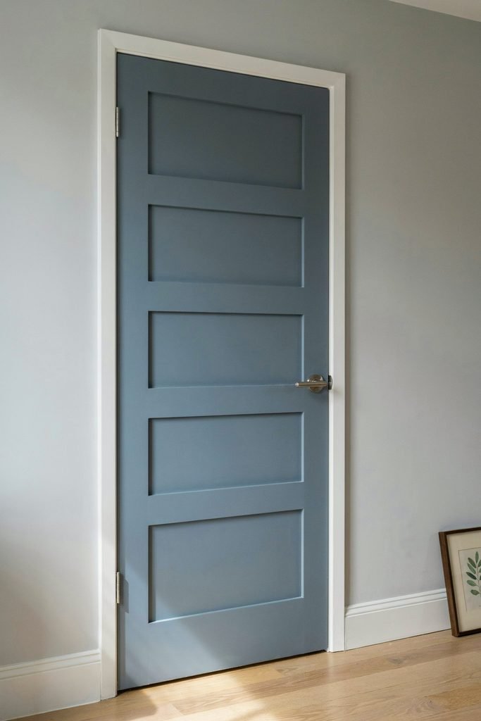
Suggested color families: If walls are soft gray, try a charcoal-blue door. If walls are warm cream, go a shade deeper into greige or taupe.
What to paint: The door face and edges. Keep the casing the same wall color for a seamless look, or go one shade darker for subtle framing.
Best finish: Satin for a soft, velvety appearance that suits cozy spaces.
Step-by-step tips: Use painter’s tape along the casing. Roll the flat panels, then brush the recessed details. Two coats usually suffice.
Design pairings: Layer with textured textiles—linen curtains, wool throws. Matte nickel or oil-rubbed bronze hardware complements deeper tones. Works well with light oak or walnut flooring.
Mistakes to avoid: If the shade is too close to the wall, the door disappears. Aim for at least two to three shades darker for visible contrast.
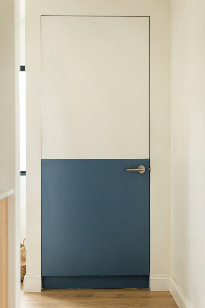
3. Create a Two-Tone or Color-Blocked Door
The visual effect: Splitting the door into two colors—top and bottom, or panel by panel—creates a graphic, modern statement. It’s one of the most eye-catching two-tone interior doors trends right now.
Best rooms and styles: Pantry doors, home offices, and contemporary or Scandinavian interiors.
Suggested color families: Navy bottom with crisp white top, sage green with cream, or black lower half with warm gray upper.
What to paint: The door itself. Leave the frame and surrounding wall neutral to let the color-blocking shine.
Best finish: Semi-gloss on both colors for easy wipe-down, especially in kitchens and pantries.
Step-by-step tips: Paint the entire door the lighter color first and let it cure. Apply painter’s tape at the dividing line. Paint the second color, then remove tape while slightly tacky for a clean edge.
Design pairings: Keep walls simple—white, off-white, or light gray. Add geometric-patterned rugs or black-framed art to echo the graphic energy. Choose simple, streamlined door hardware.
Mistakes to avoid: Uneven tape lines ruin the effect. Press tape edges down firmly with a putty knife. Don’t rush the drying time between coats.
4. Paint Only the Door Trim, Frame, or Casing
The visual effect: Painting door trim in a contrasting color while leaving the door itself white or natural creates an elegant “picture-frame” effect. It’s a subtle accent door idea that adds polish.
Best rooms and styles: Formal living rooms, traditional homes, and any space with detailed molding. Great for renters who want impact without fully committing to a colored door.
Suggested color families: Deep green, navy, warm brown, or classic black for the casing. Keep the door white or natural wood.
What to paint: The casing, jambs, and header only. Protect the door face with painter’s tape and a drop cloth.
Best finish: Semi-gloss or high-gloss on trim to differentiate it visually from the door and resist scuffs.
Step-by-step tips: Use a 2-inch angled sash brush for tight corners. Paint with the grain. Two thin coats prevent drips on vertical surfaces.
Design pairings: Pair painted door trim with matching baseboards or window casings for a cohesive look. White walls with colored trim feel fresh and intentional. Add simple glass or crystal knobs for elegance.
Mistakes to avoid: Overloading the brush causes drips on vertical trim. Wipe away runs immediately. Avoid getting paint on the door face—tape carefully.
5. Add a Painted Arch, Geometric Pattern, or Mural Effect
The visual effect: Painting a decorative arch around the doorway, a stripe pattern across the door, or a small mural turns the door into a custom art installation. This is DIY home decor at its most personal.
Best rooms and styles: Nurseries, creative studios, bohemian living spaces, and Mediterranean-inspired homes.
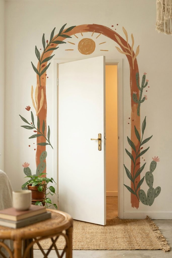
Suggested color families: Terracotta arches, pastel geometric stripes, or soft watercolor-style murals in blues and greens.
What to paint: The surrounding wall (for arch effects) or the door face (for patterns). Frame and trim can stay neutral.
Best finish: Matte or eggshell for wall murals; satin for door-surface patterns.
Step-by-step tips: Sketch your design lightly in pencil. Use painter’s tape or stencils for geometric shapes. Work in small sections. Seal with a clear matte topcoat if the design is intricate.
Design pairings: Keep furniture minimal so the artwork breathes. Natural wood floors, woven baskets, and plants complement organic shapes. Choose simple round or bar-style door hardware.
Mistakes to avoid: Freehanding without a plan leads to uneven lines. Use a level, compass, or projector for arches. Don’t layer too many colors—stick to two or three.
6. Use Black, Charcoal, or Deep Navy for a Modern Look
The visual effect: Black interior doors (or near-black shades like charcoal and deep navy) instantly sharpen a space. They feel architectural, grounded, and undeniably modern.
Best rooms and styles: Hallways, home offices, modern farmhouses, industrial lofts, and minimalist interiors.
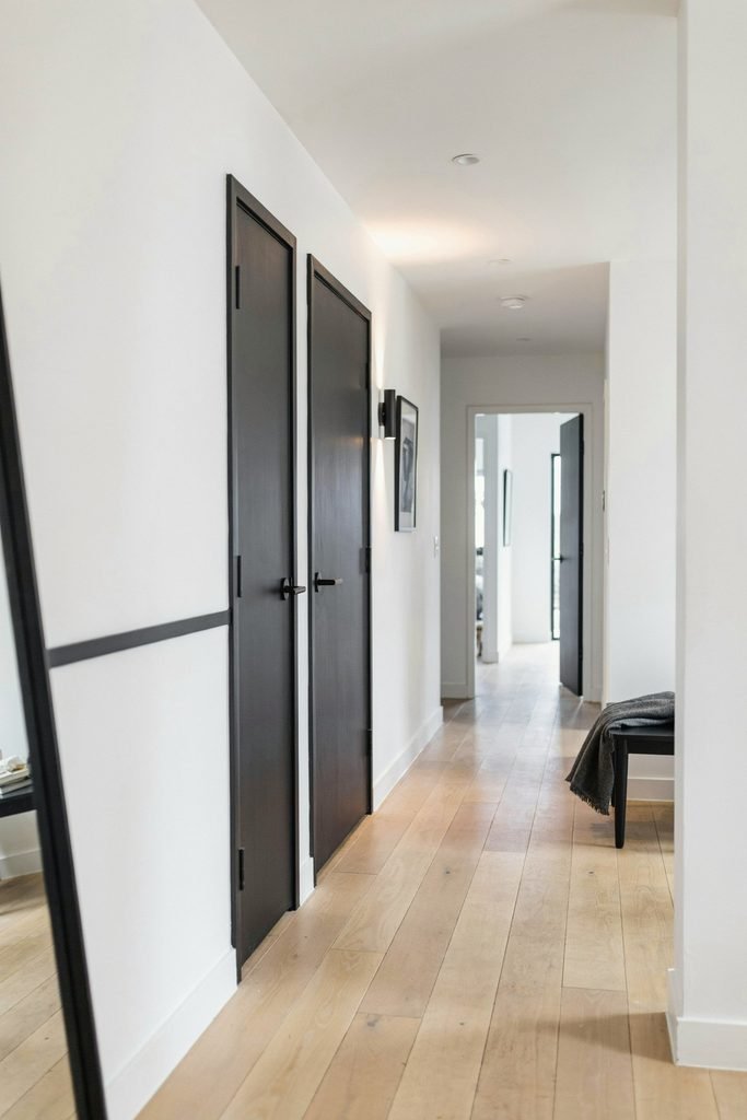
Suggested color families: True black, soft charcoal, ink navy, or dark forest green with black undertones.
What to paint: Both sides of the door. Paint the frame and casing the same dark color for a dramatic, enveloping look, or keep casing white for contrast.
Best finish: High-gloss for a lacquered, designer vibe, or satin for a softer modern feel.
Step-by-step tips: Dark colors show every imperfection, so sand thoroughly and use a tinted primer. Roll flat areas, brush details. Expect two to three coats for full, even coverage.
Design pairings: White or light gray walls make dark doors pop. Pair with matte-black hardware, warm wood accents, and metallic light fixtures. Light flooring (white oak, pale maple) balances the visual weight.
Mistakes to avoid: Skipping primer under dark paint leads to patchy coverage. Also, avoid pairing black doors with already-dark walls unless the room has abundant natural light.
7. Choose Soft Pastel or Muted Earthy Tones for a Cozy Style
The visual effect: Gentle hues—dusty rose, sage, muted lavender, warm clay—give doors a quiet, designer-inspired softness. The room feels calm, collected, and inviting.
Best rooms and styles: Bedrooms, bathrooms, reading nooks, and cottage, French-country, or Japandi interiors.
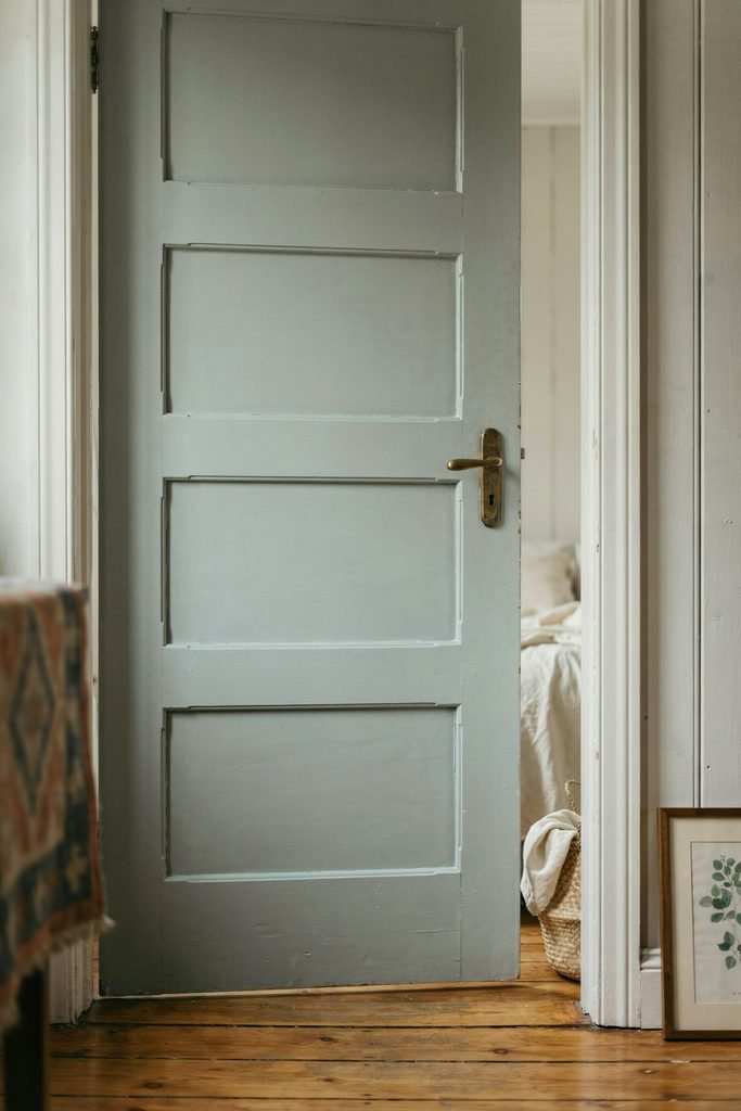
Suggested color families: Dusty pink, muted sage, pale terracotta, soft buttercream, or gentle blue-gray.
What to paint: The door face and edges. Keep trim white or one shade lighter than the door for a soft transition.
Best finish: Satin is ideal here—it reflects just enough light to keep pastels from looking flat.
Step-by-step tips: Prime with a white or light-gray primer so pastel colors stay true. Use a foam roller for smooth, streak-free coverage. Two coats are typically enough.
Design pairings: Pair with warm white walls, natural linen textiles, light wood flooring, and unlacquered brass or ceramic door hardware. Add dried florals or woven wall hangings nearby.
Mistakes to avoid: Pastels can look chalky under cool fluorescent lighting. Test swatches in the room’s actual lighting. Also, avoid pairing multiple pastels in one small room—let the door be the single soft accent.
How to Choose the Right Color for an Interior Door
Picking from interior door color ideas can feel overwhelming. Use this checklist:
- Natural light: North-facing or windowless rooms benefit from lighter, warmer shades. South-facing rooms handle dark or saturated colors well.
- Room size: Light doors make small rooms feel larger. Dark doors add drama to spacious areas.
- Existing wall paint: Decide if you want contrast (bold accent) or harmony (tone-on-tone).
- Undertones: Match warm walls with warm door colors and cool walls with cool tones to avoid clashing.
- Flooring and woodwork: A door color that echoes the undertone of your hardwood or tile ties the room together.
- Cabinet colors: In kitchens or pantries, coordinate the door with cabinetry for a unified look.
- Hardware finishes: Brass pairs warmly with earthy tones; matte black complements modern darks; polished nickel suits cool grays.
- Light vs. dark impact: Light doors recede and feel airy. Dark doors advance and feel intentional. Choose based on the mood you want.
DIY Preparation: How to Paint Interior Doors Step by Step
Proper prep is what separates a professional-looking result from a streaky mess.
- Clean the door. Wipe with a damp cloth and mild detergent to remove grease and dust. Let dry.
- Remove or tape hardware. Take off knobs, levers, and hinges if possible. Otherwise, wrap them in painter’s tape and foil.
- Fill dents and dings. Use lightweight spackle or wood filler. Let it dry, then sand smooth with 220-grit sandpaper.
- Sand the surface. Lightly scuff the entire door with 120- to 150-grit sandpaper so paint adheres. Wipe away dust with a tack cloth.
- Prime. Apply a bonding primer, especially if you’re painting over glossy surfaces, going from dark to light, or repainting old doors. Tint the primer toward your topcoat color for better coverage.
- Choose your paint. Water-based latex paint is easier to clean up, dries faster, and has lower odor—great for beginners. Oil-based paint offers a harder, smoother finish but requires solvents for cleanup and longer ventilation.
- Ventilate. Open windows and run a fan. This matters especially with oil-based products.
- Apply paint. Use a foam roller for flat panels (smooth, streak-free finish) and a 2- to 2.5-inch angled sash brush for recessed panels, edges, and detailed molding.
- Respect drying time. Follow the label—usually two to four hours between coats. Rushing causes tackiness and peeling.
- Reattach hardware only after the final coat has cured (24 hours minimum).
Paint-Finish Guidance: Satin vs. Semi-Gloss Door Paint
Choosing the best paint finish for interior doors matters as much as color.
- Satin: Soft sheen, hides minor imperfections, easy to clean. Great for bedrooms and living areas.
- Semi-gloss: Slightly shinier, highly durable, wipes clean easily. Ideal for high-traffic doors, bathrooms, kitchens, and kids’ rooms.
- High-gloss: Dramatic, reflective, very durable. Best for bold or dark colors where you want a lacquered, modern interior door design effect.
Tip: Semi-gloss and satin are the most popular choices for interior doors because they balance durability with easy cleaning. Always test a small painted swatch in the room’s actual lighting before committing—sheen looks different under warm bulbs versus daylight.
Common Mistakes to Avoid
- Skipping sanding or primer, leading to peeling.
- Applying one thick coat instead of two thin ones.
- Painting in high humidity or extreme cold, which affects drying.
- Choosing a color without testing it in the room.
- Forgetting to paint the door edges and top/bottom to prevent moisture damage.
- Reinstalling hardware before paint is fully cured.
Quick Comparison Table
| Door Paint Idea | Best For | Recommended Color Families | Best Finish | Style Result |
|---|---|---|---|---|
| Bold Accent Color | Hallways, offices, kids’ rooms | Jewel tones, coral, yellow | Semi-gloss | Playful, artistic focal point |
| Darker Shade Than Walls | Bedrooms, dining rooms | Deeper neutrals, muted blues | Satin | Layered, sophisticated |
| Two-Tone / Color-Blocked | Pantries, modern spaces | Navy/white, sage/cream | Semi-gloss | Graphic, contemporary |
| Painted Trim Only | Formal rooms, traditional homes | Green, navy, black casing | Semi-gloss / High-gloss | Elegant, framed look |
| Arch / Pattern / Mural | Nurseries, studios, boho rooms | Terracotta, pastels, earth tones | Matte / Satin | Artistic, personalized |
| Black / Charcoal / Navy | Hallways, lofts, modern homes | True black, ink navy, charcoal | High-gloss / Satin | Sleek, architectural |
| Soft Pastels / Earthy Tones | Bedrooms, bathrooms, cottages | Dusty rose, sage, clay | Satin | Cozy, designer-inspired |
FAQs
What is the best paint finish for interior doors?
Semi-gloss and satin are the top choices. They resist scuffs, wipe clean easily, and offer a subtle sheen that highlights the door’s profile without looking overly shiny.
Should interior doors be lighter or darker than walls?
Either works. Lighter doors keep a space airy; darker doors add contrast and drama. Choose based on the mood you want and the amount of natural light the room receives.
Can I paint interior doors without removing them?
Yes. Tape around the casing, lay a drop cloth, and paint carefully. Just be sure to prop the door open and paint edges thoroughly. Removing the door gives the smoothest result but isn’t required.
Do I need to sand an interior door before painting?
Light sanding with 120–150 grit is strongly recommended, especially over glossy or previously painted surfaces. It helps primer and paint bond properly.
Should door trim and doors be the same color?
Not necessarily. Matching them creates a seamless look; contrasting them adds definition. Painted door trim in a different hue from the door is a popular designer technique.
What colors make interior doors look more expensive?
Deep, saturated hues (navy, forest green, charcoal) in a high-gloss or semi-gloss finish, as well as warm neutrals like greige or soft taupe in satin, tend to read as high-end.
Conclusion: Start Small, Dream Big
You don’t need a full renovation to fall in love with your home again. Painting one interior door—maybe the pantry door, the bathroom door, or that closet you walk past every day—is one of the most budget-friendly interior updates you can make. It takes a free afternoon, a few supplies, and a little courage to pick a color that makes you smile.
So grab a sample pot, tape off that hardware, and give one small door a fresh identity. Once you see how a single painted door transforms a hallway or bedroom, you’ll be planning which door to paint next.
Your next favorite room update is one quart of paint away. Which door will you start with?