
Struggling to pick wall paint or couch colors that actually work together? You’re not alone. According to a 2025 Houzz survey, over 60% of US homeowners cite choosing a cohesive color palette as the single most stressful part of a redesign. Whether you’re refreshing a rental apartment in Brooklyn, tackling a full ranch-house renovation in Texas, or simply trying to figure out which throw pillows won’t clash with your new sofa, the answer has been sitting in art classrooms for over 200 years: the color wheel.
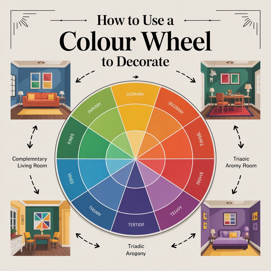
How to use a color wheel to decorate is essentially the practice of applying proven color theory principles—like complementary, analogous, and triadic schemes—to your home’s interiors so that every hue, fabric, and finish feels intentional rather than accidental. It’s the secret weapon professional interior designers rely on, and by the end of this guide, it’ll be yours too.
In this 2,500-word deep dive, we’ll walk you through color wheel basics for beginners, walk you step-by-step through applying these principles room by room, highlight the trendy color combinations of 2026 (hello, Benjamin Moore’s Silhouette AF-655 and Sherwin-Williams’ Universal Khaki SW 6150), and help you dodge the common mistakes that make even expensive rooms feel “off.” Grab a cup of coffee—let’s get colorful.
Understanding the Color Wheel Basics
Before we start picking paint swatches at your local Sherwin-Williams or Benjamin Moore, it helps to understand what you’re actually looking at.
The color wheel was invented by Sir Isaac Newton in 1706 and organizes hues into a circle that reveals how colors relate to one another. Here’s the breakdown:
Primary, Secondary, and Tertiary Colors
- Primary colors — Red, blue, and yellow. These are the foundation hues that cannot be created by mixing other colors together. Think of them as the “parents” of every other shade on the wheel.
- Secondary colors — Green, orange, and purple. Each is made by mixing two primary colors (blue + yellow = green, red + yellow = orange, red + blue = purple).
- Tertiary colors — The six in-between shades like red-orange, yellow-green, and blue-violet. These are created by mixing a primary color with its neighboring secondary color and give the wheel its full 12-hue richness.
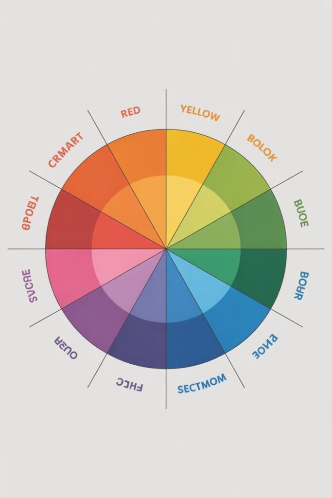
Warm vs. Cool Colors — And Why It Matters in Your Home
The color wheel splits cleanly in half:
- Warm colors (reds, oranges, yellows) evoke energy, coziness, and intimacy. They’re ideal for dining rooms, entryways, and social living spaces.
- Cool colors (blues, greens, purples) feel calming, expansive, and serene. They’re perfect for bedrooms, bathrooms, and home offices.
In US homes—especially open-concept layouts popular in suburban builds—understanding warm and cool colors helps you create visual “zones” without adding walls. A warm-toned living area can flow into a cool-toned reading nook, signaling a shift in mood without architectural changes.
Color Psychology in a Nutshell
Decorating with color psychology goes beyond personal preference. Research shows that blue can lower heart rate and promote focus (ideal for home offices), green reduces stress and connects us to nature (hello, biophilic design), and red can actually stimulate appetite—making it a classic choice for dining rooms but a risky one for bedrooms where rest is the goal.
Key Color Schemes Explained
This is where the magic happens. Each color scheme below is a proven formula for color harmony. Think of them as recipes: follow the structure, then adjust the ingredients (specific hues, saturation, and textures) to match your taste.
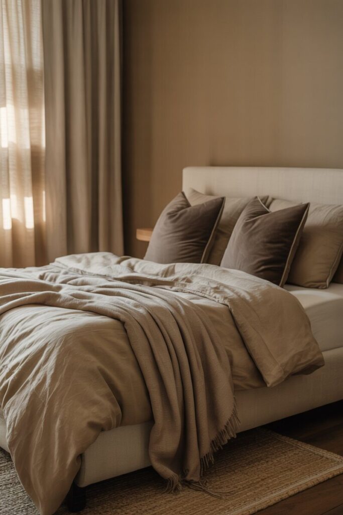
1. Monochromatic Color Scheme
Definition: A single hue expressed through various tints (lightened with white), tones (muted with gray), and shades (darkened with black).
When to use it: When you want a sophisticated, calming space that’s nearly impossible to get wrong. It’s the go-to for modern farmhouse and warm minimalist interiors trending heavily in 2026.
Real-world example: A bedroom painted in Sherwin-Williams’ Universal Khaki SW 6150 (the 2026 Color of the Year), paired with linen bedding in a lighter khaki tone, a mushroom-colored wool throw, and deep taupe accent pillows. Everything reads as one harmonious family.
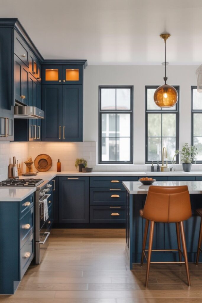
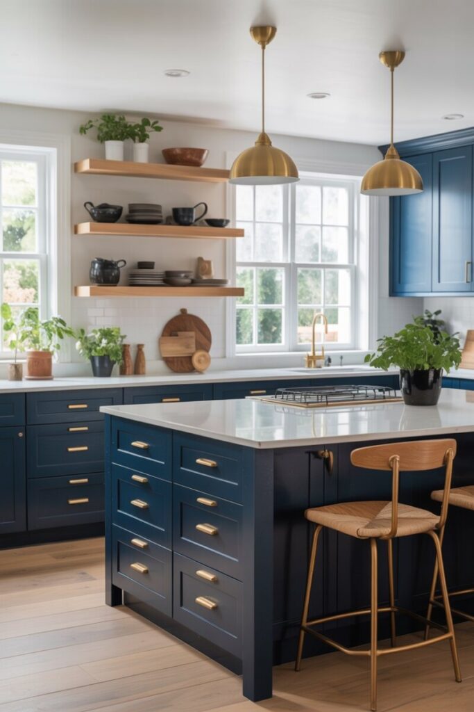
2. Complementary Color Scheme
Definition: Two colors directly opposite each other on the wheel—think blue and orange, red and green, or yellow and purple.
When to use it: When you want high contrast and visual energy. Complementary schemes are bold, so they work best as accent-driven palettes rather than wall-to-wall saturation.
Real-world example: A modern kitchen with navy blue cabinetry (Benjamin Moore’s Hale Navy), warm brass hardware (the orange family), and crisp white walls. The 2026 trend of amber and burnt caramel accents pairs beautifully with the trending desaturated sky blue seen across design publications like Vogue and Architectural Digest.
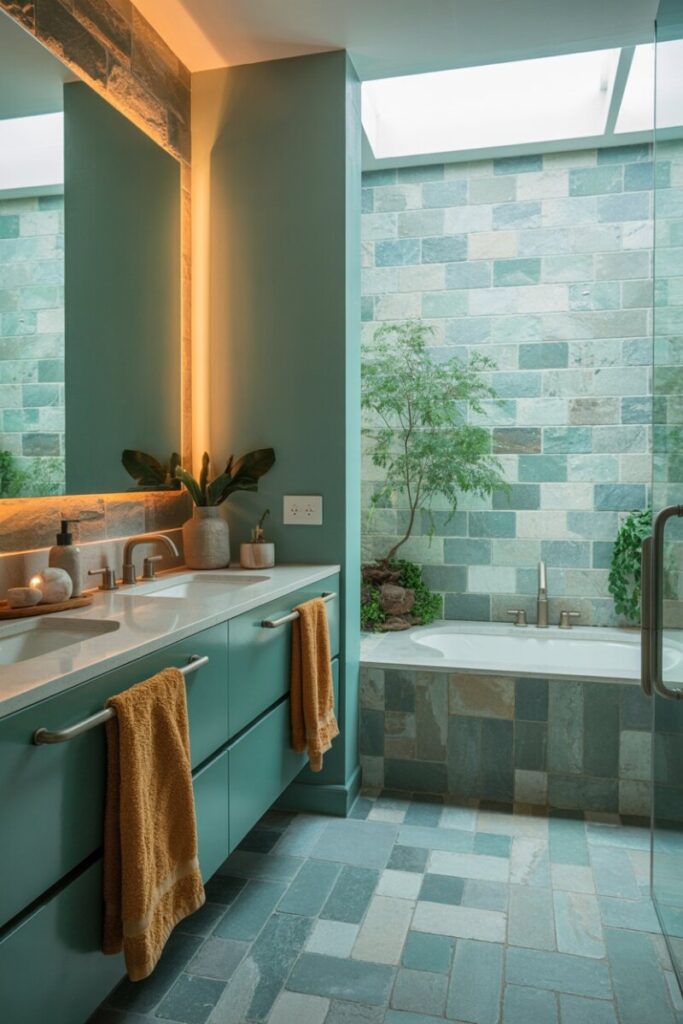
3. Analogous Color Scheme
Definition: Three colors sitting side-by-side on the wheel, such as green, blue-green, and blue.
When to use it: When you want a space to feel serene, cohesive, and naturally flowing—without the sameness of monochromatic. It mirrors how colors appear in nature (think a forest canopy or an ocean sunset).
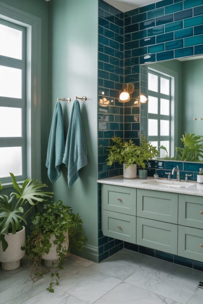
Real-world example: A spa-inspired bathroom in soft sage green walls, teal towels, and deep ocean-blue accent tile. This aligns perfectly with the biophilic design movement dominating US home decor in 2026.
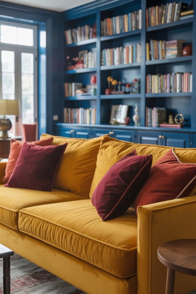
4. Triadic Color Scheme
Definition: Three colors evenly spaced around the wheel in a triangle—classic example: red, yellow, and blue.
When to use it: When you want a vibrant, playful room with strong visual balance. Triadic schemes are energetic and work beautifully in kids’ rooms, playrooms, or eclectic living spaces.
Real-world example: A cozy family room with a mustard-yellow velvet sofa, burgundy/oxblood throw pillows (one of 2026’s hottest hues according to Emily Henderson), and navy blue built-in bookshelves. The key is letting one color dominate while the other two play supporting roles.
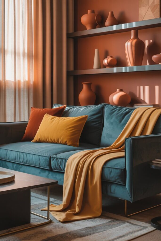
5. Split-Complementary Color Scheme
Definition: A base color plus the two colors adjacent to its complement. For example, if your base is blue, you’d pair it with red-orange and yellow-orange instead of straight orange.
When to use it: When you want the drama of a complementary scheme but with more nuance and less risk of clashing.
Real-world example: A living room anchored by a deep teal sofa (popularized by WGSN’s 2026 “Transformative Teal”) with rust-colored terracotta pottery and ochre throw blankets—perfectly aligned with the earthy, warm palette US homeowners are embracing this year.
💡 Pro Tip: Neutrals Are Your Secret Weapon
Every bold scheme above benefits from generous neutral breathing room. In 2026, the top neutrals trending in American homes include warm whites (Benjamin Moore’s Swiss Coffee OC-45), mushroom tones, cream, and khaki. Use them as your 60% dominant color and let your chosen scheme shine in the 30% and 10% layers.
Step-by-Step: How to Use the Color Wheel in Your Home
Here’s your actionable 7-step process to go from overwhelmed to confident:
Step 1: Choose Your Starting Point
Don’t start with paint—start with a piece you already love. That could be:
- A vintage Persian rug
- A favorite piece of artwork
- A patterned sofa or accent chair
- A mood board built on Pinterest or Canva
Your starting piece already contains a built-in color palette. Your job is to extract it.
Step 2: Decide on the Mood
Before touching a color wheel, ask yourself: How should this room feel?
| Mood | Best Color Temperature |
|---|---|
| Calm & restful | Cool tones (blues, greens, lavenders) |
| Energetic & social | Warm tones (reds, oranges, yellows) |
| Cozy & intimate | Deep, saturated neutrals (umber, chocolate brown, plum) |
| Modern & clean | Neutrals + one bold accent |
For 2026, Houzz reports that US homeowners are heavily favoring “warm comfort” and “lived-in restraint” over sterile minimalism.
Step 3: Pick a Color Scheme from the Wheel
Using the five schemes outlined above, identify which structure matches your mood and starting piece. If your rug is mostly navy and rust, you’re already working in a complementary blue-orange framework.
Step 4: Apply the 60-30-10 Rule
This is interior design’s golden ratio:
- 60% dominant color — Typically your walls or largest furniture piece (often a neutral)
- 30% secondary color — Upholstery, curtains, or an accent wall
- 10% accent color — Throw pillows, artwork, lamps, decorative objects
Example: In a living room, 60% warm white walls, 30% sage green sofa and curtains, 10% brass and amber accessories.
Step 5: Test Paint Swatches in Real Lighting
This step is non-negotiable. Colors transform dramatically between natural daylight, incandescent bulbs, and modern LEDs. Paint large swatches on at least two walls and observe them morning, noon, and night for 48 hours before committing. Sherwin-Williams’ Universal Khaki, for instance, reads more golden in south-facing rooms and more green-muted in north-facing ones.
Step 6: Layer Textures and Metals
Color alone doesn’t create a finished room—texture does. In 2026, US homeowners are layering linen upholstery, Venetian plaster walls, bouclé seating, unlacquered brass hardware, and reclaimed wood to add depth. Mixed metals (brass + matte black + brushed nickel) also add visual interest without introducing competing colors.
Step 7: Adjust for Room Size
- Small rooms: Light, cool colors visually expand space. Try a monochromatic pale blue or soft cream scheme.
- Large rooms: Darker, warmer colors create intimacy. Benjamin Moore’s 2026 pick, Silhouette AF-655—a luxurious burnt umber with charcoal undertones—is perfect for creating a cocooning effect in oversized primary bedrooms or libraries.
Room-by-Room Color Wheel Applications
🛋️ Living Room: The Social Hub
Best schemes: Analogous or split-complementary
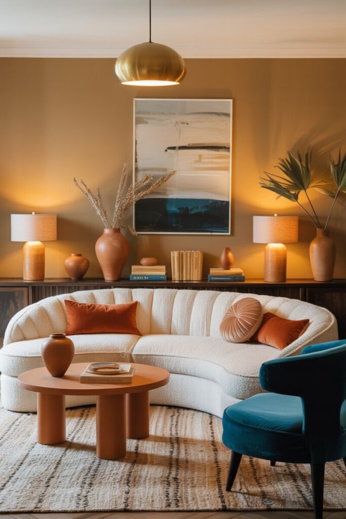
2026 palette pick: Pair Sherwin-Williams’ Universal Khaki walls with a deep teal accent chair, terracotta accessories, and warm brass lighting. This earthy, layered look reflects the “collected over time” aesthetic dominating American living rooms this year. Rounded, curved sofas in mushroom or cream boucle are trending alongside these warm palettes.
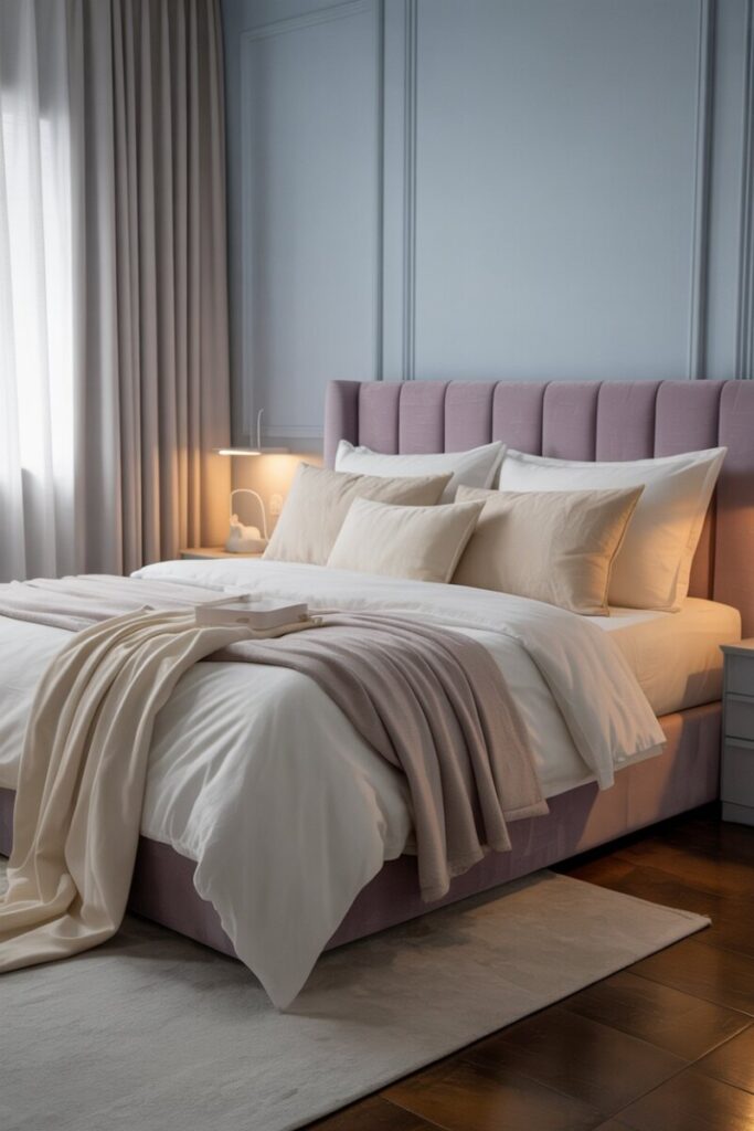
🛏️ Bedroom: Your Personal Retreat
Best schemes: Monochromatic or analogous
2026 palette pick: Soft desaturated sky blue walls with lavender and cream bedding create a calming, spa-hotel feel. Alternatively, lean into Benjamin Moore’s First Crush CSP-310 (a soft blush from their 2026 palette) with deeper plum accents for a romantic, cocooning boudoir. Avoid stimulating reds here—color psychology matters.
🍳 Kitchen: Energy and Appetite
Best schemes: Complementary or triadic
2026 palette pick: Navy cabinetry with warm brass fixtures and crisp white quartz counters is a timeless complementary pairing that continues to dominate US kitchen remodels. For a bolder move, try deep burgundy or oxblood lower cabinets—a 2026 standout—with cream uppers and natural oak shelving.
🛁 Bathroom: Spa-Like Serenity
Best schemes: Monochromatic or analogous
2026 palette pick: Teal and soft sage with natural stone tile reflects the biophilic trend. Warm amber and burnt caramel accents in towels or a vanity mirror frame feel particularly on-trend against Benjamin Moore’s Raindance 1572 (from their 2026 collection).
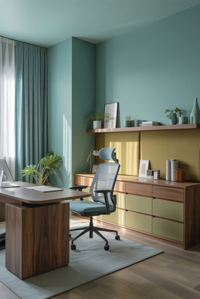
💼 Home Office: Focus Mode
Best schemes: Analogous cool tones or monochromatic
2026 palette pick: Soft greens and blues (WGSN’s “Transformative Teal” is ideal here) promote concentration and reduce eye strain. Pair with warm wood tones and khaki neutrals to avoid a sterile, corporate feel.
Common Mistakes to Avoid
Even with a color wheel in hand, these pitfalls trip up DIY decorators every time:
- Using too many bold colors at once. Stick to one or two saturated hues and let neutrals do the heavy lifting.
- Ignoring lighting conditions. That gorgeous emerald green might read as muddy black in a north-facing room with cool LED bulbs.
- Forgetting the undertones in neutrals. A beige with a pink undertone will clash with a beige that leans green. Always compare swatches side-by-side.
- Neglecting fixed elements. Your hardwood floors, countertops, and fireplace surround all have color. Your palette must harmonize with them, not fight them.
- Overlooking color psychology. A vibrant red dining room can energize conversation—but that same red in a bedroom may disrupt sleep.
- Skipping the sample step. Never buy a gallon based on a 2-inch chip from the store shelf.
Your Color-Confident Home Starts Today
Learning how to use a color wheel to decorate is one of the highest-leverage design skills you can develop. It transforms guesswork into a repeatable, confidence-building system—whether you’re picking a single accent pillow or planning a whole-home renovation. The trending palettes of 2026—warm earthy tones like umber, khaki, ochre, and teal—make this a particularly exciting year to experiment with color in US homes.
Your next step: Build a simple mood board this weekend. Pick one room, one inspiration piece, and one color scheme from this guide. Visit your local Benjamin Moore or Sherwin-Williams with a plan, not a prayer.
Have you used a color wheel to transform a room in your home? Share your before-and-after photos in the comments below—we’d love to see what you’ve created!
