
You know that feeling when you walk through a friend’s front door and everything just… works? The living room whispers the same language as the hallway; the kitchen nods at the dining area without competing for attention. Now picture the alternative: a jumble of disconnected paint colors that make your house feel more like a showroom clearance rack than a curated home. If you’ve been paralyzed by a rainbow of swatches or dread that your next paint job will clash with the one you did last summer, you’re not alone — and you’re in the right place.
Whether you own or rent, live in a cozy starter bungalow or a sprawling open-concept build, planning a whole home color scheme is less about talent and more about process. Done well, it saves money (fewer gallon-sized mistakes), reduces decision fatigue, and gives every room a quiet sense of belonging. By the end of this guide, you’ll have a repeatable, seven-step method to create a cohesive color palette for your entire home — one that balances flow with personality and looks professionally curated without the designer fee.
Pro tip: “Color” and “colour” both appear in online searches for this topic, so many top U.S. interior design sites use the American spelling while still optimizing for global traffic. We’ll stick with U.S. spelling throughout.
Step 1: Define Your Goals and Style
Before you open a single paint deck, define what you’re actually trying to achieve. A whole-home palette for a family of four with a toddler and a golden retriever has very different demands than a palette for a couple who entertains wine-savvy friends every Friday night.
Ask yourself these grounding questions:
- Who lives here? Children, pets, and aging-in-place needs influence sheen choice and stain resistance even more than color itself.
- How are rooms used? A home office needs focus; a bedroom needs rest; a kitchen needs brightness.
- How long will you stay? If selling is on the horizon within three to five years, lean into universally appealing neutral-heavy palettes that photograph well for listings.
- What is your design style? Modern farmhouse, mid-century, coastal, minimalist, traditional, eclectic — your style will nudge you toward warm or cool undertones, saturated or muted hues.
- How much natural light do you have? North-facing rooms read cooler; south-facing rooms read warmer.
Once you’ve answered these, run a mini-exercise: write down three adjectives that describe the vibe you want your home to feel. Calm, airy, and organic? Moody, dramatic, and curated? Playful, energetic, and bright? These adjectives become your North Star later when you’re choosing between two nearly identical shades of “greige.”
Step 2: Understand Color Basics and Color Theory (the Practical Version)
You don’t need a fine arts degree to plan a home color palette, but knowing four terms will make every decision easier:
- Hue — the pure color family (red, blue, green, etc.).
- Value — how light or dark it reads. A pale sky blue and a deep navy are the same hue but very different values.
- Saturation (chroma) — how vivid versus muted a color is. Think dusty sage versus lime green.
- Undertone — the sneaky secondary tone underneath a color (yellow, pink, green, blue, or violet). Undertones are the #1 reason two “beiges” look totally wrong next to each other.
Three Practical Rules to Steal
- Limit your home to 2–3 main hue families. This is the secret sauce of color flow in the home. For example, a house that lives in the blue-green and warm neutral families will feel coherent even if every room looks different.
- Use value contrast for depth. A flat palette with identical lightness everywhere feels washed out. Pair light walls with darker trim, darker accent walls, or deeper accessories.
- Keep undertones consistent within a zone. Pair warm undertones with warm, cool with cool — especially across rooms that share sightlines. This is where paint undertones explained guides save your sanity.
Use a simple color wheel to test relationships: complementary pairs (blue + orange) create energy; analogous neighbors (blue, blue-green, green) create calm; triadic combos offer bold balance. For most U.S. homeowners aiming for long-term livability, analogous-plus-neutral is the smartest play.
A word on color theory for interiors: blue reads as calming, green as restorative, warm neutrals as cozy, and saturated reds and oranges as energizing. Use these psychological cues as guidance, not gospel — your lived response to a color matters more than any chart.
Step 3: Audit Your Home and Build a Color Map
Walk your home with your phone and a notebook. This is the audit step, and it’s the one most DIYers skip to their regret.
Photograph and inventory every fixed element: flooring (hardwood tones, tile colors), countertops, cabinetry, built-ins, stone fireplaces, statement artwork, and large upholstered pieces you’re keeping. These are your anchors — finishes and furnishings that will not be repainted and therefore dictate what new paint can do.
Note natural light exposure for every room:
| Direction | Typical effect |
|---|---|
| North | Cool, bluish light; warm colors can feel energizing here |
| South | Bright, warm all day; cool colors get balanced nicely |
| East | Warm morning light, cooler afternoon |
| West | Dramatic warm afternoon glow; can blow out delicate pastels |
Now build a simple color map by zoning your home into three categories:
- Public zones — living room, dining, kitchen, entry, guest bath. These typically want the widest appeal and the most intentional flow.
- Private zones — primary bedroom, kids’ rooms, home office. Let personality and mood function take over here.
- Transitional zones — hallways, stairwells, landings. Use these as visual bridges; repeating a secondary neutral or a single accent here threads the house together.
Tools That Make This Easier
- Sherwin-Williams ColorSnap (visualize colors in your own photos)
- Benjamin Moore Color Portfolio (fan deck scanner + room visualizer)
- Pantone Studio (pulls palettes from photography)
- Adobe Capture (extracts exact color values from any image on your phone)
For a no-app approach, a simple spreadsheet with rooms down the left column and “current colors / fixed elements / desired mood / lighting” across the top works beautifully.
Step 4: Choose Your Base Neutrals and Accent Palette
This is where whole house color palette planning actually gets practical. Think in three tiers:
- Base colors (60–70% of the house): Walls and large ceiling planes. Usually a versatile off-white, warm white, or light neutral.
- Secondary colors (20–30%): Trim, cabinetry, a secondary wall color in a few rooms, or large upholstered surfaces in textiles.
- Accent colors (10–20%): Doors, a single statement wall, cabinetry islands, accessories, rugs, and art.
This 60-30-10 breakdown is a guideline, not law, but it gives your eye a place to rest.
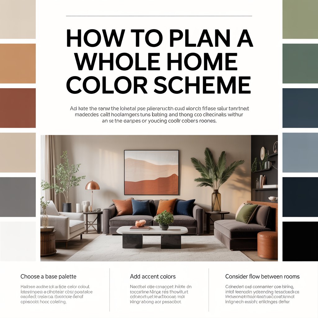
Three Whole-Home Palette Examples
- Calm Coastal: Warm white base, soft blue-gray secondary, deep navy accent. Works beautifully in open floor plans with lots of natural light.
- Modern Warm: Greige base, terracotta secondary, forest green accent. A rich yet restrained palette that bridges mid-century and contemporary styles.
- High-Contrast Modern: Crisp white base, charcoal secondary, mustard or ochre accent. Ideal for urban lofts or anyone who loves architectural detail to pop.
Undertonеs Are Everything
The shade you know colloquially as “greige” can lean yellow, pink, or violet depending on the brand and the specific formulation. Always test your base neutral next to your flooring, your countertops, and your largest fabric piece before committing. If you’re layering neutrals (say, a warm white wall with a cool trim), make that contrast intentional — one or two degrees of undertone difference reads as “something’s off” rather than “designed.”
Many designers recommend pairing a monochromatic base (same family, varied value) with a single bold accent used sparingly throughout the home. That one accent becomes your signature — it shows up in a throw pillow, a painted bookshelf interior, the powder-room vanity, and the front door.
Step 5: Create Room-by-Room Variations and Transitions
Open Floor Plan Color Ideas
If your living, dining, and kitchen share walls and sightlines, lean heavily on your base neutral for continuity and vary rooms through value shifts rather than hue changes. For example, keep walls the same off-white across all three zones, but paint the kitchen island in your secondary color and carry that same hue into dining room upholstery.
Segmented Homes With Closed Rooms
You have more freedom to vary hue from room to room. Use a repeating accent every 1–3 rooms to maintain connection — perhaps navy appears in the living room pillows, the hallway runner, and the primary bedroom curtains.
Room-Specific Guidance
- Kitchens: Backsplashes and cabinets are bigger color statements than paint in most kitchens. If cabinets are bold, keep walls quiet. If cabinets are white, a moody blue-gray wall is a sophisticated move.
- Bathrooms: Small rooms can handle deeper, more saturated color because you don’t live in them for hours. Jewel-box powder rooms are a designer favorite.
- Bedrooms: Softer, lower-saturation tones reduce visual stimulation. Test any color at 10 p.m. under your bedside lamp — warm bulbs will drastically shift perception.
- Home Offices: Focus-friendly palettes tend toward mid-value blues and greens with good contrast against white trim for readability and screen comfort.
- Hallways and stairwells: Either use them as neutral arteries or as gallery moments where your accent color makes its biggest impact.
Two Mini-Plans
Plan A — The Calm Coastal family home:
Living room: warm white walls, navy sofa. Kitchen: same warm white, blue-gray island. Primary bedroom: blue-gray walls one value deeper than the kitchen island, navy bedding, white trim throughout. Hallway: warm white with navy runner.
Plan B — The Modern Warm townhouse:
Entry: greige walls with terracotta front door interior. Living-dining: greige walls, forest green velvet dining chairs. Kitchen: greige walls, terracotta tile backsplash, forest green herb planter. Bedroom: greige one value lighter, terracotta throw, forest green accent pillow. You see how the same three hues recirculate in different roles.
Step 6: Test Samples, Observe Light, and Choose Finishes
This is the non-negotiable step. Paint sample testing on a large scale saves you from expensive, emotional repaints.
How to Sample Like a Pro
- Buy sample pots of your top 2–3 candidates per surface.
- Paint at least two 2′ × 2′ patches on different walls of the room — one in morning light, one in afternoon light.
- Live with them for three full days, including an evening with your usual lighting on.
- Photograph the patches in morning daylight, midday, and warm evening light.
Compare patches side by side rather than against the paint chip — paper swatches lie. Observe them next to your fixed elements, not in isolation.
Paint Finish Cheat Sheet
- Matte / flat: Hides imperfections; best for ceilings and low-traffic bedrooms. Harder to clean.
- Eggshell: The workhorse for living and dining walls. Soft sheen, wipeable.
- Satin: Good for kitchens, kids’ rooms, hallways. Durable and moisture-friendly.
- Semi-gloss: Trim, doors, cabinetry. Highly durable, more reflective.
- High-gloss: Statement pieces — library ceilings, accent doors, furniture. Forgives nothing.
Lighting Temperature Matters
LED bulbs now range from 2700K (warm, incandescent-like) to 5000K (cool, daylight-like). Pick one temperature throughout the house for visual consistency, or deliberately warm bedrooms and cool task areas. Whichever you choose, test paint samples under your chosen bulbs — not the construction-grade flood the builder left behind.
Step 7: Accessorize and Finalize with Finishes and Textures
A cohesive color palette in the home is rarely achieved by paint alone. Textiles, rugs, art, and metallics are the final layers that make a palette feel intentional rather than flat.
Use texture to create depth when your palette is restrained. A matte greige wall sings when paired with glossy trim, velvet cushions, a nubby wool rug, and warm brass hardware. The eye perceives visual richness even though the actual color count is modest.
Treat wood tones as a neutral. If your home has warm oak floors, that warmth should inform whether your greige leans yellow (harmonious) or violet (potentially discordant). If you have cool ash or gray-washed floors, cooler wall neutrals will feel more at home.
When shopping for furniture or rugs, bring a physical paint swatch or at minimum a high-quality photo of your wall color on your phone. Test fabric samples in your actual home light — a textile that looks perfect under showroom fluorescents can turn muddy in a north-facing living room.
Metallic finishes are subtle palette players. Polished brass warms a cool palette; brushed nickel cools a warm one; matte black acts as a graphic modern neutral across any scheme.
Common Mistakes and How to Fix Them
- Too matchy-matchy: Using the exact same color on every wall in every room feels institutional. Vary value, change the role (wall vs. trim vs. accent), introduce texture.
- Too chaotic: Five different hue families across five rooms. Return to Step 2 and prune down to 2–3 hue families.
- Ignoring undertones: Two beiges that should work together but don’t usually have clashing undertones. Check by placing them side by side on white paper.
- Choosing online without samples: Screen calibration varies wildly; a “sage” may arrive looking olive. Always sample in your own light.
- Skipping finish planning: A satin trim next to a matte wall is fine; a high-gloss wall next to a satin ceiling is distracting. Plan finishes alongside color.
Quick fixes for a palette that isn’t working: Mute an oversaturated accent with a lighter-value companion, add a neutral buffer (a large area rug, a linen sofa throw), or reduce the accent’s footprint to accessories only before repainting.
Your Printable Whole-Home Color Checklist
Click to expand the 10-step checklist
- ☐ Define three adjectives describing your desired vibe
- ☐ Photograph and inventory all fixed elements and large furnishings
- ☐ Audit natural light exposure room by room
- ☐ Zone your home into public, private, and transitional areas
- ☐ Choose one base neutral, one secondary color, and one to two accents
- ☐ Verify undertone consistency across your palette
- ☐ Paint 2′ × 2′ samples on multiple walls per room
- ☐ Observe samples across three days in morning, midday, and evening light
- ☐ Decide finish for every painted surface before ordering gallons
- ☐ Repeat your accent color at least every 1–3 rooms for flow
Recommended Tools & Further Reading
- Visualization tools: Sherwin-Williams ColorSnap Visualizer, Benjamin Moore Color Portfolio, Farrow & Ball Room Visualizer
- Palette apps: Pantone Studio, Adobe Capture, Coolors.co
- Sample services: Samplize peel-and-stick sheets (real paint, no mess)
- Good search queries to explore: “how to choose a whole house color palette,” “paint undertones explained,” “best paint finishes for high-traffic areas,” “color flow tips for open floor plans,” “paint color ideas for house interior”
Ready to Map Your Palette?
You now have the full framework to plan a whole home color scheme that looks deliberate, flows naturally, and still leaves room for personality in every room. Want to put it into practice this weekend? Download our free printable Color Map Worksheet (coming soon) or take our two-minute palette-style quiz to narrow down which of the three sample palettes above fits your home best. Drop a photo of your current space in the comments — we love helping readers troubleshoot specific undertone dilemmas in real time.
