You Love Pastels—But Will They Age Well?
You’ve been scrolling through Pinterest, pinning rooms washed in soft blush, sage, and powder blue. There’s something undeniably calming about pastel home decor. Yet every time you reach for that sample pot of mint green, a small voice whispers: Won’t this look like a 1980s bathroom in five years?
It’s a legitimate concern. Pastels have cycled in and out of favor for decades, and when done poorly, they can feel saccharine, juvenile, or trapped in a specific era. But here’s the good news: learning how to use pastel colors in a modern, sophisticated way is absolutely possible—and it starts with understanding why some pastel rooms feel timeless while others feel like a time capsule.
This guide walks you through every decision, from choosing the right modern pastel colors and pairing them with contemporary neutrals, to selecting textures, patterns, and furniture that keep your space feeling current. Whether you’re a homeowner planning a full repaint or a renter looking for budget-friendly pastel accents, you’ll find actionable steps that work.
Let’s get into it.
Why Pastels Get Labeled “Dated” in the First Place
Before we fix the problem, let’s diagnose it. Pastels earn their “dated” reputation for a handful of specific reasons—and they’re mostly avoidable.
The common culprits:
- Over-saturation. Candy-bright, high-chroma pastels (think Miami Vice pink or baby-shower blue) tend to feel tied to specific decades, especially the 1980s and early 2000s.
- Flat, uniform finishes. A room where every surface—walls, trim, curtains, furniture—is the same flat pastel creates a monotone, “theme room” effect that reads as costume rather than design.
- Too many matched pastels. Pairing a pastel wall with perfectly coordinated pastel bedding, pastel lampshades, and pastel rugs looks curated in the wrong way—like a catalog page from 1992.
- Wrong undertones. A cool-toned pastel layered against warm-toned wood or brass can look sickly or “off,” triggering the subconscious feeling that something isn’t quite right.
✅ Do / ❌ Don’t — Quick Example
Do: Pair muted sage with matte black hardware, warm oak floors, and cream walls for a contemporary look.
Don’t: Paint three walls in candy-bright pastel shades with high-gloss trim and matching pastel curtains—this creates a dated, “theme room” feel.
The fix isn’t to abandon pastels. It’s to use them with intention.
Choose the Right Pastel Tones (This Is Where Most People Go Wrong)
The single most important decision in any pastel color palette is tone selection. Get this right, and everything else falls into place.
Understanding Undertones
Every color has an undertone—a subtle hue beneath the surface that leans warm (yellow, red, orange base) or cool (blue, green, gray base). A “pink” paint can lean peachy-warm or violet-cool, and that difference determines whether it harmonizes with your existing wood floors, metal hardware, and neutral furnishings.
- Warm undertones (dusty rose, butter yellow, sage green) pair beautifully with natural wood, brass, gold, and cream-based neutrals.
- Cool undertones (powder blue, lavender, mint) pair best with chrome, nickel, gray-toned woods, and crisp whites.
Mixing warm and cool undertones in the same room without a deliberate strategy is the fastest path to a space that feels “off.”
Go Muted and Desaturated for Longevity
The most contemporary pastel interior schemes rely on desaturated pastels—colors that have been softened with gray or brown rather than left pure-bright. Think “dusty” rather than “baby.” These muted tones feel more sophisticated, photograph better, and age far more gracefully.
Paint brands like Farrow & Ball, Sherwin-Williams, and Benjamin Moore have excellent muted pastel collections. Look for names that include words like dusty, haze, fog, pale, or whisper—these tend to be the softer, more modern options.
Use One Anchor Pastel
A reliable rule: choose one anchor pastel for the room and let it lead. Additional pastels should appear only as small accents—never competing at the same scale. This prevents the “Easter basket” effect and gives your eye a clear focal point.
Example Palettes That Feel Modern
| Anchor Pastel | Neutral Pairing | Accent | Vibe |
|---|---|---|---|
| Dusty rose | Warm gray + light oak | Brushed brass | Cozy, Scandinavian |
| Sage green | Cream + warm white | Matte black | Organic, grounded |
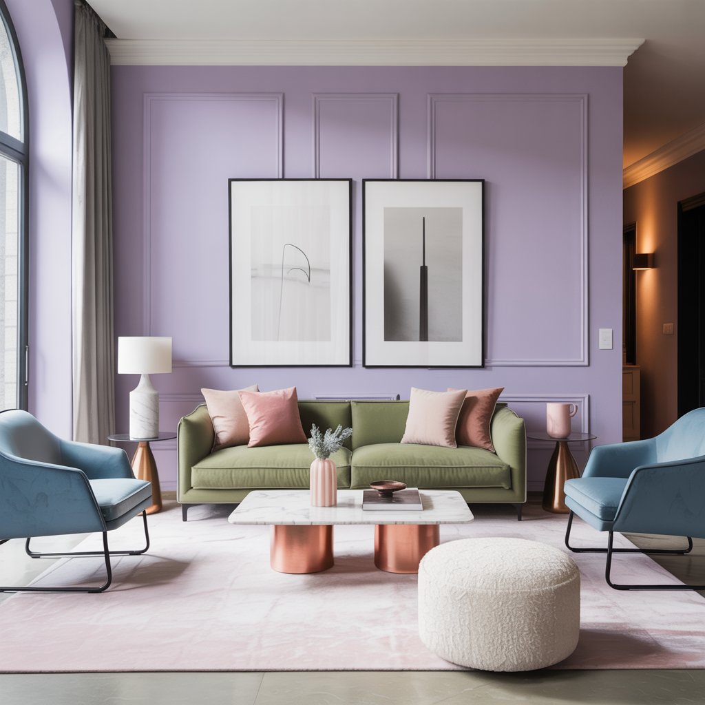
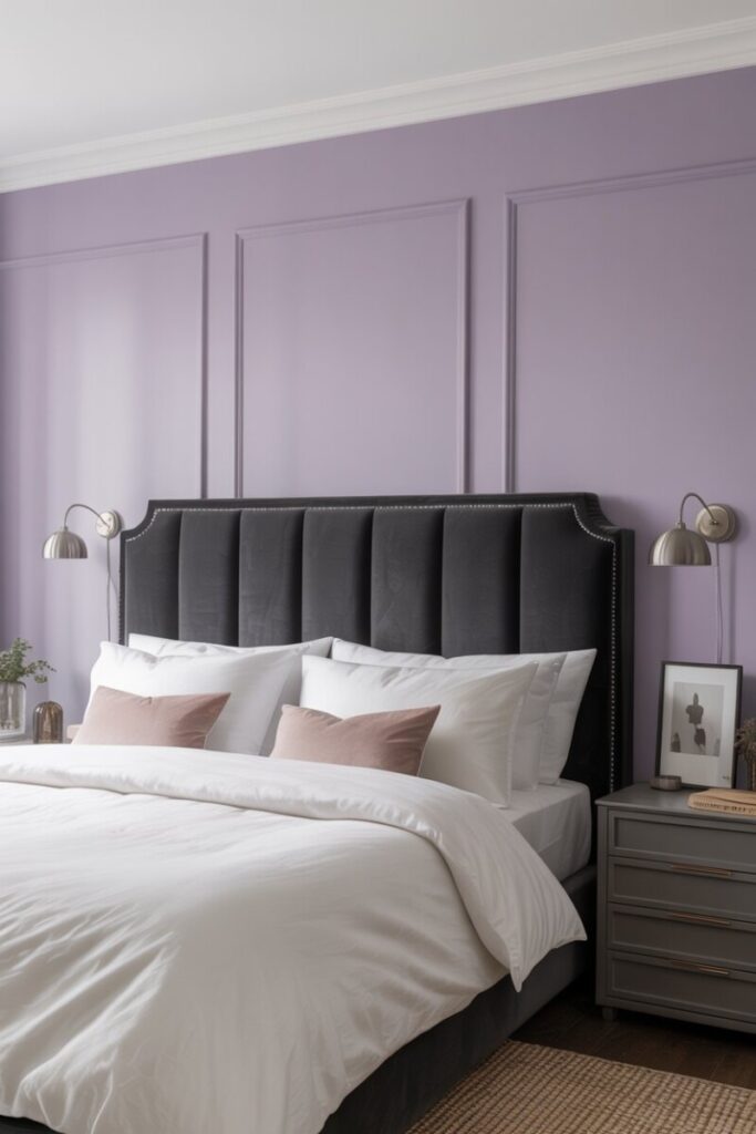
| Muted lavender | Charcoal + cool gray | Polished nickel | Calm, editorial |
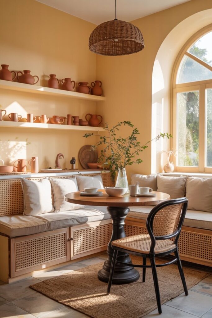
| Pale butter yellow | Greige + natural rattan | Terracotta | Warm, sunny |
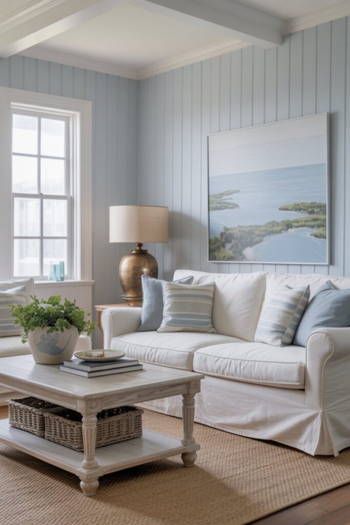
| Powder blue | Crisp white + bleached wood | Aged bronze | Coastal, airy |
(See the Palette Swatch Appendix at the end of this post for visual hex codes and swatch strips.)
Balance with Modern Neutrals and Contrast
Pastels don’t exist in isolation—they live alongside your walls, floors, trim, and hardware. The neutrals you choose will either modernize your pastels or drag them backward.
The Best Contemporary Neutrals for Pastels
- Warm whites (not stark hospital white—think creamy off-whites like Benjamin Moore’s Swiss Coffee or Sherwin-Williams’ Alabaster).
- Greige—that perfect gray-beige hybrid that works with nearly every undertone.
- Charcoal and deep gray—surprisingly effective at anchoring soft pastels and adding maturity.
- Matte black accents—used sparingly in hardware, picture frames, or light fixtures, black adds graphic contrast that immediately reads as modern.
Use the 60-30-10 Rule
A reliable pastel color palette follows this distribution:
- 60% neutral — walls, large furniture, flooring
- 30% pastel accent — a feature wall, sofa, curtains, or area rug
- 10% statement — bold contrast like black hardware, a dark wood piece, or saturated art
This ratio prevents the room from feeling overwhelmed by softness and ensures your pastels feel chosen rather than default.
The Power of Contrast
Contrast is the secret weapon of modern pastel styling. A blush-pink wall becomes chic rather than sweet when framed by dark walnut shelving. A powder-blue sofa feels editorial against a charcoal throw. Without contrast, pastels float—pleasantly, but without definition.
Styling tip: If your room feels too soft, add one “edge” element—a matte black lamp, a leather chair, or a piece of graphic black-and-white art. You’ll instantly add sophistication.
Mix Textures, Finishes, and Materials
Texture is arguably the most overlooked element in soft color decorating. A room done entirely in flat-painted pastel surfaces—no matter how beautiful the color—will feel flat, lifeless, and eventually dated.
Why Texture Matters So Much with Pastels
Because pastel hues are inherently low-contrast, texture becomes your primary tool for creating visual depth. The eye needs something to grab onto. In a neutral or dark room, color contrast does that work. In a pastel room, texture must carry the load.
Textures That Modernize Pastels
- Linen and washed cotton for curtains, slipcovers, and bedding—slightly rumpled, naturally organic.
- Bouclé and nubby weaves on accent chairs or throw pillows—adds a sculptural, contemporary feel.
- Natural wood (especially white oak, light walnut, or bleached ash) grounds soft colors and prevents a “plastic” look.
- Matte plaster or limewash finishes on walls add a soft, chalky depth that flat latex paint can’t replicate.
- Ceramics and handmade pottery—especially in matte glazes—add artisan character.
Mixing Finishes
A well-designed pastel room layers multiple finishes:
- Matte walls + a satin or eggshell trim
- Glossy ceramic vases against a matte-painted shelf
- Brushed or aged metals (not polished chrome everywhere) for a layered, collected-over-time feel
Wood Tones and Flooring
Warm-toned woods (oak, cherry, teak) complement warm pastels. Cool-toned woods (ash, bleached maple, gray-washed finishes) complement cool pastels. If you have existing flooring that doesn’t match your chosen pastel’s undertone, use area rugs as a bridge between the floor and your color scheme.
Pattern, Scale, and Layering
Pattern brings energy to a pastel room without requiring more color. But scale and selection matter enormously.
Choose Modern Patterns
Outdated pastel rooms often feature small, fussy florals or cutesy motifs. Instead, reach for:
- Geometric prints (large-scale chevrons, arches, or abstract shapes)
- Subtle ikat or block-print textiles with a handmade, global feel
- Scaled-up florals—oversized botanical prints feel contemporary and bold
- Monochrome patterns—a tone-on-tone stripe or damask in a single pastel family
Layer Thoughtfully
Layering rugs, throws, and pillows in varying textures creates coziness without chaos. Keep this guideline in mind: if you’re using pattern, balance it with solid textures. A patterned pastel rug pairs beautifully with solid linen cushions and a nubby throw—never with another competing pattern at the same scale.
Pastels in Specific Rooms
Pastel Kitchen Ideas
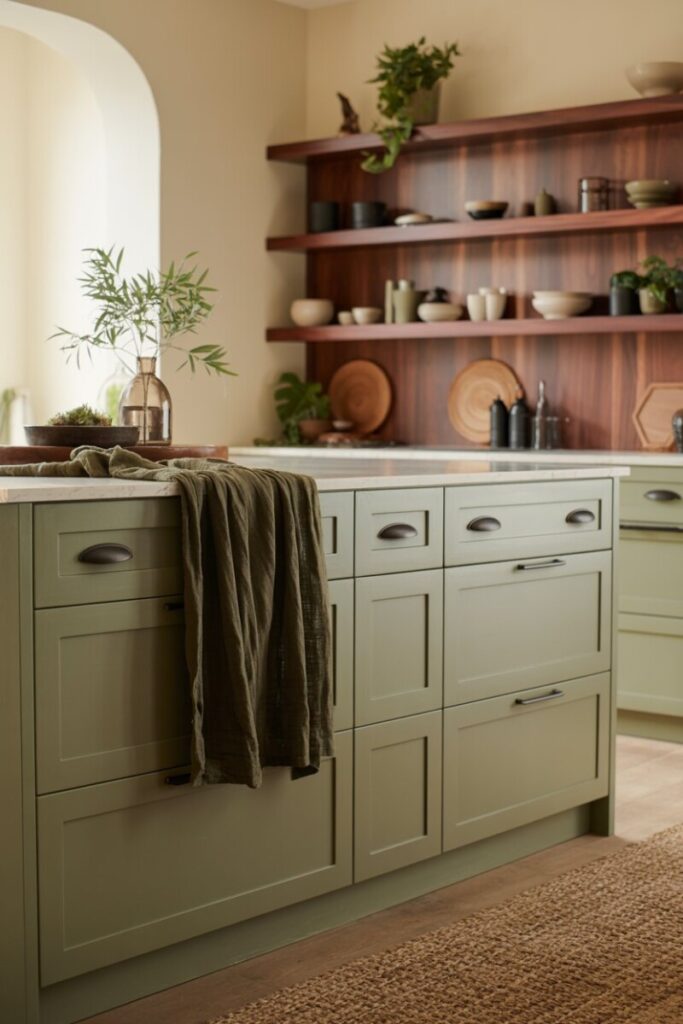
Pastel kitchen cabinetry is trending—and for good reason. Soft sage, pale blue, and blush lower cabinets paired with white uppers feel fresh and contemporary. Keep the look modern by choosing:
- Handleless or minimal-hardware cabinet fronts (slab or Shaker, not ornate)
- Quartz or honed stone countertops in white or light gray
- Matte black or unlacquered brass faucets and hardware for contrast
- A simple subway or zellige tile backsplash rather than patterned tile (which can compete)
If painting cabinets feels too permanent, a pastel backsplash or open-shelf styling with pastel ceramics offers a lower-commitment alternative.
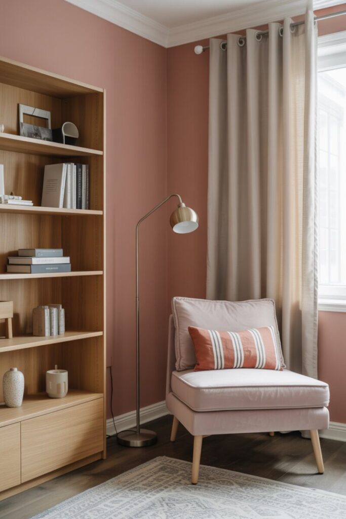
The Pastel Bedroom
Bedrooms are where pastels shine naturally—their calming psychology aligns perfectly with rest. Keep the scheme grounded with:
- Contemporary bedside tables in wood or matte black (avoid matching “bedroom sets”)
- Matte-finish walls rather than glossy
- Layered bedding in tonal pastel + white/cream combinations
- A single statement pendant or sconce in a contrasting metal
The Pastel Living Room
For living spaces, decide whether your pastel lives on the walls or in upholstery:
- Pastel walls: Pair with neutral (cream, gray, or tan) upholstery and let the room color be the star.
- Pastel sofa: Keep walls neutral or warm white, and pull accent colors through pillows, art, and a complementary rug.
Statement art—especially abstract pieces with a few saturated colors—prevents a pastel living room from feeling too timid.
Small Updates and Budget-Friendly Swaps
You don’t need a full renovation to bring modern pastel colors into your home. Try these low-commitment updates:
- Paint a single piece of furniture. A console table, nightstand, or bookshelf in a muted pastel becomes an instant focal point.
- Swap lampshades for pastel linen or paper shades.
- Add pastel textiles—a throw blanket, a pair of lumbar pillows, or a small area rug.
- Update hardware on existing cabinets and dressers—pairing new pastel paint with modern pulls transforms a piece completely.
- Use peel-and-stick wallpaper in a pastel pattern for a renter-friendly accent wall.
- Thrift and upcycle. Vintage furniture refinished in a desaturated pastel feels far more interesting and collected than brand-new matching sets. Sand, prime, and paint with a quality furniture paint (milk paint or chalk-style finishes work beautifully).
Final Checklist Before You Start
Before you buy a single can of paint, run through this quick checklist:
- [ ] Test large swatches on your wall (at least 2×2 feet)—small chips lie.
- [ ] View swatches in morning, afternoon, and evening light—pastels shift dramatically with lighting.
- [ ] Confirm your undertone matches your existing floors and fixed elements.
- [ ] Choose your finish (matte, eggshell, satin) before committing.
- [ ] Commit to one anchor pastel and build outward.
- [ ] Plan your contrast element (dark wood, black hardware, saturated art).
Maintenance Tips for Light Pastels
Pastel walls and furniture show scuffs, especially in high-traffic areas. Use washable matte or eggshell finishes on walls (brands like Sherwin-Williams’ Emerald line offer excellent scrubbability). Keep a small amount of touch-up paint on hand, and treat pastel upholstery with a fabric protector before use.
Ready to Try It?
Pastels aren’t going anywhere—and when used with the right undertones, textures, and contrast, they feel as modern as any “safe” neutral. Start small: build a mood board, order a few sample pots, and see how a dusty rose or muted sage transforms the light in your favorite room.
👉 Download our free printable Pastel Palette Cheat Sheet with swatches, hex codes, and recommended paint matches from Benjamin Moore, Sherwin-Williams, and Farrow & Ball. Pin it, share your results, and tag us—we’d love to see what you create.
—
🎨 Appendix: Ready-to-Use Palette Swatches & Mood-Board Captions
Five Modern Pastel Palettes (with Hex Codes & Paint Matches)
Palette 1 — “Dusk & Oak” (Warm, Scandinavian Pastel)
| Swatch | Name | Hex Code | Closest Paint Match |
|---|---|---|---|
| 🟫 | Warm Gray | #B8AFA6 | Benjamin Moore Revere Pewter HC-172 |
| 🩷 | Dusty Rose | #D4A5A5 | Farrow & Ball Pink Ground No.202 |
| 🟨 | Light Oak | #C9B18C | — (wood tone reference) |
| ⬜ | Cream White | #F5F0E8 | Sherwin-Williams Alabaster SW 7008 |
| 🟤 | Brushed Brass | #B08D57 | — (metal finish reference) |
Palette 2 — “Forest Hush” (Organic, Grounded Sage)
| Swatch | Name | Hex Code | Closest Paint Match |
|---|---|---|---|
| 🟩 | Muted Sage | #A3B18A | Benjamin Moore October Mist 1495 |
| ⬜ | Warm Cream | #F2EDE4 | Sherwin-Williams Shoji White SW 7042 |
| ⬛ | Matte Black | #2C2C2C | — (hardware reference) |
| 🟫 | Dark Walnut | #5C4033 | — (wood tone reference) |
| 🟩 | Deep Olive (accent) | #4A5D3A | Farrow & Ball Bancha No.204 |
Palette 3 — “Quiet Editorial” (Cool, Sophisticated Lavender)
| Swatch | Name | Hex Code | Closest Paint Match |
|---|---|---|---|
| 🟪 | Muted Lavender | #B8A9C9 | Farrow & Ball Brassica No.271 |
| 🩶 | Charcoal | #4A4A4A | Benjamin Moore Kendall Charcoal HC-166 |
| ⬜ | Cool White | #F0F0F0 | Sherwin-Williams Extra White SW 7006 |
| 🪙 | Polished Nickel | #C0C0C0 | — (metal finish reference) |
| 🟪 | Deep Plum (accent) | #5B3A6B | Benjamin Moore Caballoon #1384 |
Palette 4 — “Morning Light” (Warm, Sunny, Earthy)
| Swatch | Name | Hex Code | Closest Paint Match |
|---|---|---|---|
| 🟨 | Pale Butter Yellow | #F0E4A8 | Farrow & Ball Lancaster Yellow No.243 |
| 🟫 | Greige | #C4B9AB | Benjamin Moore Edgecomb Gray HC-173 |
| 🟤 | Natural Rattan | #C9A96E | — (material reference) |
| 🟧 | Terracotta (accent) | #C66B3D | Sherwin-Williams Cavern Clay SW 9073 |
| ⬜ | Warm Off-White | #FAF6EE | Benjamin Moore Swiss Coffee OC-45 |
Palette 5 — “Coastal Calm” (Cool, Airy, Beachy)
| Swatch | Name | Hex Code | Closest Paint Match |
|---|---|---|---|
| 🩵 | Powder Blue | #A8C4D4 | Benjamin Moore Smoke 2108-20 |
| ⬜ | Crisp White | #FFFFFF | Sherwin-Williams High Reflective White SW 7757 |
| 🟫 | Bleached Wood | #D9C9B1 | — (wood tone reference) |
| 🟤 | Aged Bronze | #6B4E3D | — (metal finish reference) |
| 🩵 | Slate Blue (accent) | #5B7B8A | Farrow & Ball Parma Gray No.27 |