
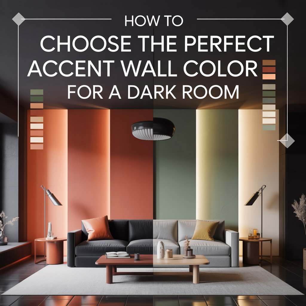
When your living room—or that cozy bedroom—feels too dark, the instinct is often to repaint everything white. But the smarter, moodier route is to pick the right accent wall color for a dark room. With the right hue, finish, and lighting tweaks, a dark room can feel intentional, cozy, and even larger than its square footage suggests.
This guide walks you through the exact steps to choose a color that brightens and balances your space, plus real palettes and shopping tips so you can skip the guesswork. Whether you’re working with a north-facing living room, a windowless basement, or a small apartment bedroom that barely sees daylight, you’ll learn how to evaluate what you have, test what works, and commit to a shade you’ll love for years.
Why Accent Walls Matter in Dark Rooms
A well-chosen accent wall does more than add a splash of personality. In a room starved for natural light, it becomes a strategic design tool. It creates a focal point that pulls the eye to a specific area—behind a sofa, the headboard wall, or the TV media wall—so the rest of the room recedes visually. That single move makes a cramped space feel purposeful rather than gloomy.
Accent walls also manipulate depth. A lighter, warmer accent pulls a wall forward and makes a narrow room feel wider. A deeper, saturated accent pushes a wall back and adds drama without shrinking the room, as long as the finish and lighting are dialed in. This is why the best accent wall color for a dark room is rarely just “whatever looks pretty on the chip.” It’s a color chosen for how it interacts with your light sources, your flooring, and your furnishings.
In low-light conditions, every surface competes for what little illumination bounces around. Paint absorbs or reflects light differently depending on its value (lightness) and its finish. Pick thoughtfully, and you’ll get a room that feels curated. Pick carelessly, and even a $60 gallon of premium paint can look flat, dingy, or muddy by nightfall.
Step 1 — Evaluate the Room’s Light and Features
Before you browse swatches, study the room itself. The best paint colors for rooms with little light depend entirely on what light you do have and what surfaces already live in the space.
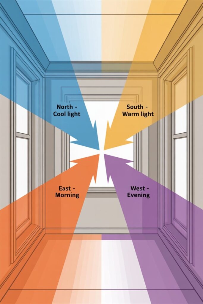
Start with the windows. Note their size, placement, and direction. North-facing rooms in the US get cool, indirect light that leans blue-gray all day—warm accent colors often balance them beautifully. South-facing rooms get warm golden light, so cool blues and greens read true-to-chip. East-facing rooms are bright and warm in the morning, then shadowed and cool by afternoon. West-facing rooms do the opposite.
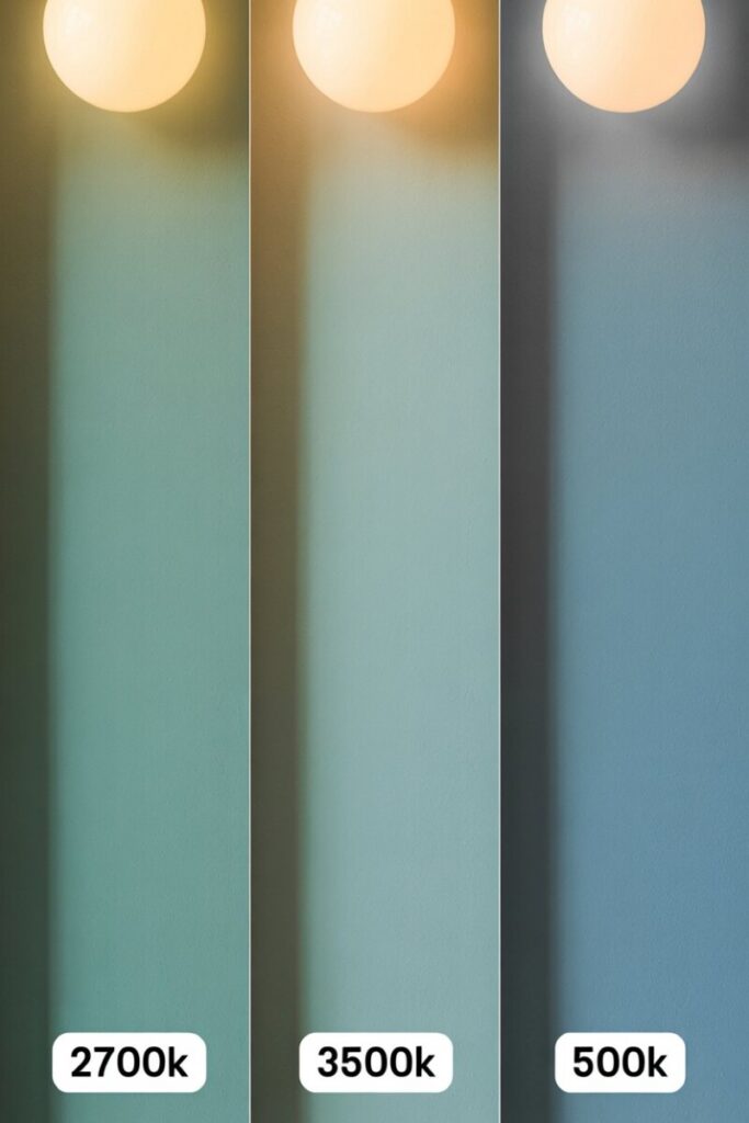
Then assess artificial light. Count your fixtures. What’s the bulb temperature? Warm bulbs (2700K) make cool paint colors read muddy; cool bulbs (4000K+) drain the life out of warm neutrals. If your lighting is outdated, plan to update it before—or alongside—your paint choice.
Finally, inventory your fixed finishes. Flooring (warm oak vs cool gray laminate?), trim (bright white or creamy off-white?), countertops, and large upholstered pieces all carry undertones you’ll need to match or intentionally contrast.
Quick Room-Assessment Checklist
- [ ] Window direction (N/S/E/W) and approximate square footage of glass
- [ ] Number and type of light fixtures, plus bulb Kelvin rating
- [ ] Dominant floor color and undertone
- [ ] Trim color and finish
- [ ] Two to three largest furniture pieces and their colors
- [ ] Ceiling height (low ceilings under 8 feet benefit from lighter accent values)
Step 2 — Understand Color Basics Without Jargon
You don’t need a design degree to pick the right dark room paint colors. You just need three ideas:
Hue is the color family—blue, green, red, yellow, and so on. Value is how light or dark that hue is. A pale sky blue has high value; a midnight navy has low value. Saturation is intensity. A dusty sage is low-saturation; a neon lime is high.
In a dark room, value matters more than hue. A medium-value sage green will feel airy and reflective; that same sage at a lower value (darker) will absorb light and can read almost black in a corner with no window. This is why colors that brighten a room almost always land in the mid-to-high value range, and why the best accent wall color for dark room setups often sits two to three shades lighter than the “mood board photo” you saw online.
Saturation is the quiet trap. Highly saturated colors—think cobalt, kelly green, or fire-engine red—look vibrant in the store but can overwhelm a dim space. Muted, grayed-down versions of the same hue (dusty blue, olive, brick red) read softer and more sophisticated when light is scarce.
A simple rule of thumb: lighter values visually enlarge a room; saturated colors, even light ones, can read unexpectedly dark in low light. If your heart is set on drama, choose a deeper value with a low-saturation undertone—like a charcoal with a hint of blue rather than a pure black.
Step 3 — Choosing the Right Color Family for Mood and Function
The debate between warm vs cool paint colors resolves itself once you name what the room needs to do. Warm hues—soft taupes, blushy pinks, terracottas, creamy yellows—invite intimacy. Cool hues—slate blues, sage greens, soft lavenders—promote calm and focus.
Room-by-Room Recommendations
Living room. You want welcoming without claustrophobic. A warm greige with a whisper of pink undertone feels inviting on a north-facing wall, while a deep navy accent wall in a small room adds sophistication without closing in, especially when paired with light trim and layered lamps. Check out greige accent wall ideas from Benjamin Moore’s Revere Pewter or Sherwin-Williams’ Agreeable Gray family for a safe, gorgeous middle ground.
Bedroom. Sleep calls for low-stimulation cool tones. Soft teal, watery blue-green, or a pale lavender-gray turn a dark bedroom into a restful cocoon. Avoid high-saturation reds or oranges here—they read energizing.
Home office. Focus-friendly greens (sage, olive, or a grayed eucalyptus) reduce eye strain and photograph well on video calls. A medium-toned green accent behind your desk creates a professional backdrop without stealing the show.
Basement family room. Here’s where you can get bold. Basement accent wall colors that work include deep jewel tones—emerald, plum, sapphire—because basements rarely fight sunlight. Pair with warm wood tones and layered lighting to avoid a cave-like feel.
Step 4 — Test, Sample, and Plan Lighting
This is the step most people skip, and it’s the step that separates a great paint job from a costly redo. Testing paint samples correctly takes about a week and costs under $30.
Paint two-foot squares on poster board—not directly on the wall. Poster board lets you move the sample to different walls and see how the color behaves as light shifts throughout the day. Live with the samples for at least 48 hours. Check them at 8 a.m., noon, 6 p.m., and under your evening lamps. A color you love at lunchtime might look bruised and heavy by dinner.
Order sample pots from Benjamin Moore, Sherwin-Williams, or Behr in the specific finish you plan to use—paint finish for dark rooms changes the color dramatically (more on that in Step 5). Peel-and-stick samples from brands like Samplize are also excellent for renters or anyone avoiding wall damage.
Lighting Adjustments That Make or Break Your Color
- Swap any bulbs below 2700K or above 4000K unless intentionally styled for that look. The sweet spot for most rooms is 2700K–3000K warm white.
- Add at least one mirror on a wall perpendicular to the accent wall to bounce existing light.
- Layer three light sources—ambient (overhead), task (lamps), and accent (sconces or picture lights)—instead of relying on a single ceiling fixture.
- If your accent color still feels heavy at night, add a lighter-colored throw, artwork, or shelf styling on the accent wall to break up the mass of color.
Step 5 — Finishes, Textures, and Complementary Elements
Finish is the silent hero of any accent wall color for dark room project. Flat and matte finishes absorb light and hide wall imperfections, but they can look flat in low light. Eggshell and satin reflect softly—ideal for most accent walls in dark rooms because they add a gentle luminosity without looking shiny. Semi-gloss and high-gloss amplify color beautifully but reveal every drywall flaw; reserve them for trim, built-ins, or an intentional high-gloss “lacquer room” statement.
Texture adds depth where color alone can’t. Consider:
- Textured wallpaper (grasscloth, linen-look, subtle metallic) on the accent wall for tactile richness.
- Wood paneling or board-and-batten painted in your accent color for architectural interest.
- Panel molding in a contrasting trim color to frame the accent wall.
- Velvet, bouclé, or linen upholstery in coordinating tones on nearby furniture.
Sometimes the most successful small dark room design ideas rely on an unexpected pop rather than a conventionally “bright” choice. A terracotta accent in a north-facing office, a mustard behind a bedroom headboard, or a deep plum in a powder room can enliven a dark space without demanding more square footage or more light.
Quick Color Palettes and Shopping Picks
Here are four tested accent wall color combinations from Benjamin Moore accent wall colors, Sherwin-Williams dark room colors, and Behr’s accessible lineup. Each palette includes one accent, two coordinating neutrals, a trim color, and fabric/accessory cues.
| Palette Name | Accent Wall | Coordinating Walls | Trim | Fabric & Accessories |
|---|---|---|---|---|
| Coastal Calm | BM Hale Navy HC-154 | SW Sea Salt SW 6204 | BM White Dove OC-17 | Oatmeal linen, brass accents, driftwood |
| Warm & Grounded | SW Urbane Bronze SW 7048 | BM Revere Pewter HC-172 | BM Swiss Coffee OC-45 | Cream bouclé, terracotta throw, walnut wood |
| Moody Elegance | BM Kendall Charcoal HC-166 | SW Alabaster SW 7008 | SW Pure White SW 7005 | Velvet plum, antique gold, marble |
| Sunset Pop | Behr Cayenne PPU2-17 | BM Edgecomb Gray HC-173 | BM Chantilly Lace OC-65 | Rust linen, olive velvet, warm oak |
Shopping tips: Buy 8 oz. sample pots first. Once committed, purchase a gallon of premium interior paint (Benjamin Moore Regal Select or Sherwin-Williams Emerald) in eggshell or satin for most accent walls. A gallon typically covers 350–400 sq ft, enough for one accent wall with two coats. Budget roughly $75–$95 per gallon plus supplies.
Common Mistakes and Troubleshooting
Even seasoned DIYers stumble. Here are the four most common missteps and how to recover:
- Going too dark too fast. Fix: pull the color two shades lighter on the same strip, or use the moody shade only below the chair rail.
- Skipping sample testing. Fix: you can still test. Paint poster boards now before committing.
- Ignoring undertone mismatch. A warm-beige wall against cool-gray trim looks sickly. Match cool-with-cool or warm-with-warm, unless you’re intentionally contrasting.
- Using gloss to “brighten.” Gloss reflects light, yes—but also every bump. Use satin or eggshell instead, and reserve gloss for trim.
Quick rescue moves: add a large mirror, swap to 3000K bulbs, introduce a light-colored area rug, or hang a piece of oversized art in a pale frame on the accent wall.
Your Action Plan
- [ ] Assess window direction, bulbs, floor, and trim
- [ ] Pick 3–4 swatches in your target value range
- [ ] Paint poster boards and live with them for 48+ hours
- [ ] Confirm finish (eggshell or satin for most dark rooms)
- [ ] Update bulbs to 2700K–3000K if needed
- [ ] Add one mirror and one lighter-textile accessory
- [ ] Commit to one gallon of premium paint
- [ ] Paint two thin coats with proper dry time between
Ready to start? Order a single sample pot today and tape it to your wall tonight—or download our free cheat-sheet of 20 paint colors for dark rooms with room-by-room pairings linked below.
Bonus: 4 Ready-Made Color Palettes with HEX Codes and Swatch Pairings
Here are four curated palettes you can copy straight into a mood board, share with your painter, or use in design apps like Canva or Adobe Color. Each includes the accent wall color with its closest HEX match, coordinating neutrals, trim, and accessory recommendations.
Palette 1 — Coastal Calm (Bedroom or Living Room)
| Role | Paint / Reference | HEX | Notes |
|---|---|---|---|
| Accent Wall | Benjamin Moore Hale Navy HC-154 | #434F5E | Deep, grayed navy—reads elegant, not gloomy |
| Coordinating Wall | Sherwin-Williams Sea Salt SW 6204 | #C8CFC9 | Soft green-gray neutral |
| Trim / Ceiling | Benjamin Moore White Dove OC-17 | #F1EFD9 | Warm white that softens edges |
| Accessories | Oatmeal linen, unlacquered brass, driftwood | #D9CEA3 / #B08D57 | Add texture, not more color |
Palette 2 — Warm & Grounded (Cozy Living Room)
| Role | Paint / Reference | HEX | Notes |
|---|---|---|---|
| Accent Wall | Sherwin-Williams Urbane Bronze SW 7048 | #54504A | Deep warm greige with brown undertone |
| Coordinating Wall | Benjamin Moore Revere Pewter HC-172 | #CCC5B7 | The universally loved greige |
| Trim / Ceiling | Benjamin Moore Swiss Coffee OC-45 | #F2EBD9 | Creamy off-white |
| Accessories | Cream bouclé throw, terracotta ceramic, walnut wood | #EFE6D2 / #B85C38 | Grounds the palette in earth tones |
Palette 3 — Moody Elegance (Dining Room or Home Office)
| Role | Paint / Reference | HEX | Notes |
|---|---|---|---|
| Accent Wall | Benjamin Moore Kendall Charcoal HC-166 | #4C4F52 | A near-black with a faint blue base |
| Coordinating Wall | Sherwin-Williams Alabaster SW 7008 | #EDE7DB | Soft, neutral white |
| Trim / Ceiling | Sherwin-Williams Pure White SW 7005 | #EEEDE9 | Crisp but not clinical |
| Accessories | Plum velvet, antique gold hardware, white marble | #6C3A5B / #B6925A | Jewel and metal for richness |
Palette 4 — Sunset Pop (Basement or Creative Office)
| Role | Paint / Reference | HEX | Notes |
|---|---|---|---|
| Accent Wall | Behr Cayenne PPU2-17 | #A0522D | Warm terracotta with spice |
| Coordinating Wall | Benjamin Moore Edgecomb Gray HC-173 | #C9C3B4 | Classic light warm gray |
| Trim / Ceiling | Benjamin Moore Chantilly Lace OC-65 | #F4F0E8 | Clean, bright white |
| Accessories | Rust linen, olive velvet, warm oak furniture | #A44A32 / #6B6A3E | Earthy, saturated warmth |
Pro tip: Drop the HEX codes into any free color-picker tool (Coolors.co, Adobe Color) to auto-generate complementary shades for pillows, rugs, and artwork. When ordering paint, always reference the brand name + code number (e.g., “BM HC-154”) rather than the color name alone—names can be duplicated across lines.
