
There is a reason the checkerboard pattern never truly goes out of style. From the classic floors of vintage diners to the runways of high fashion, this iconic grid has a unique ability to feel both retro and fiercely modern. Recently, the checkerboard rug has made a massive comeback in interior design, popping up in stylish apartments and cozy family homes alike. It is the ultimate statement rug, offering a punchy, graphic element that instantly elevates a space.
But let’s be real: bringing a high-contrast, geometric pattern into your home can feel intimidating. If you are wondering how to style a checkerboard rug without making your space look like a dizzying optical illusion or a chaotic college dorm, you are not alone. The secret to mastering checkerboard rug styling lies in understanding balance. With the right scale, thoughtful color choices, and strategic furniture placement, this bold pattern can serve as a stunning focal point without overpowering your room. Whether you are decorating a sprawling living room or figuring out small space decorating in a studio apartment, this guide will show you exactly how to make the checkerboard trend work for you.
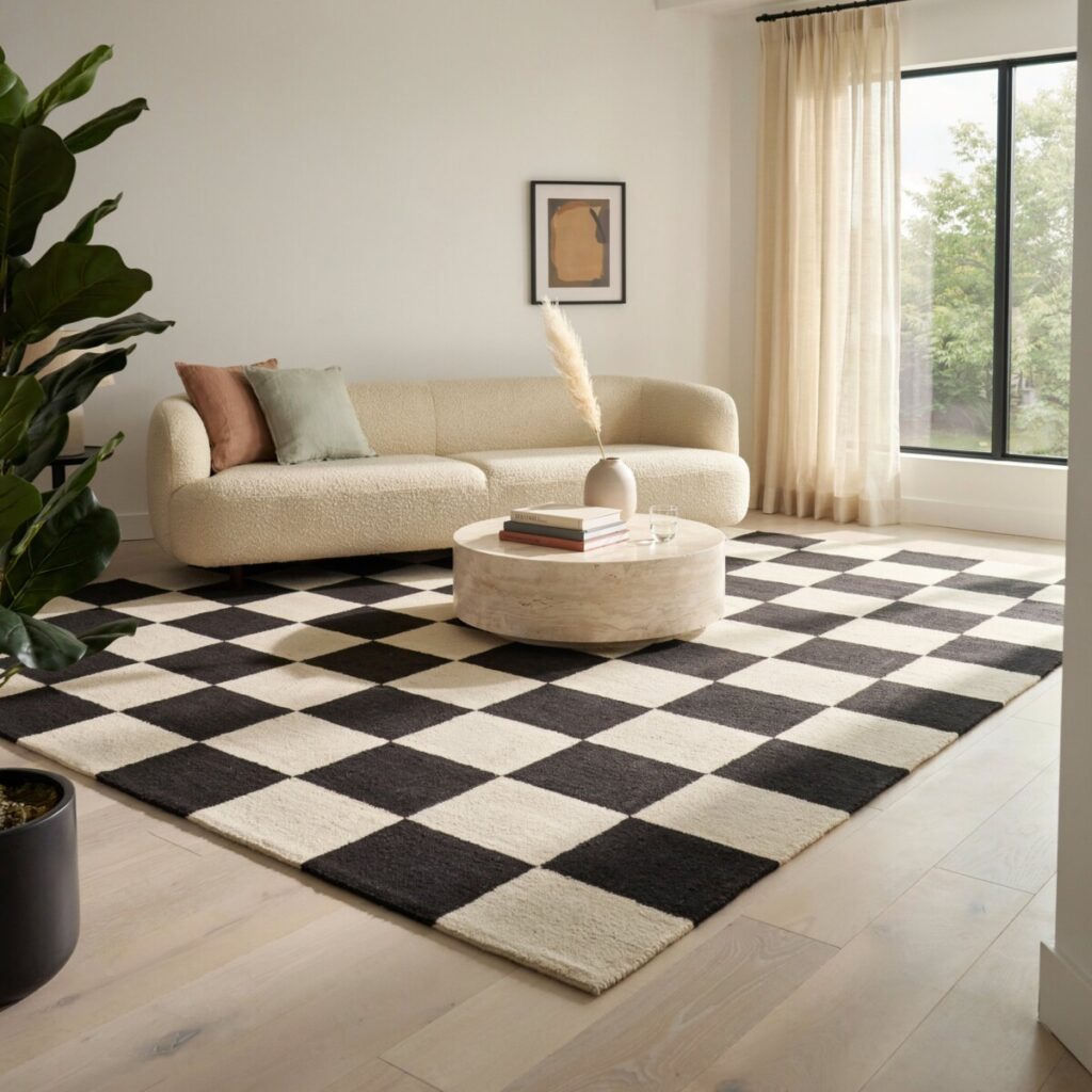
What Makes a Checkerboard Rug Feel Overwhelming?
Before we dive into the solutions, it helps to understand the problem. Why do some graphic rugs look incredibly chic while others induce visual fatigue? The answer usually comes down to three culprits: extreme contrast, improper scale, and poor placement.
When you introduce high-contrast flooring or decor into a room—like a stark black and white rug in a tiny, poorly lit space—the human eye struggles to process the sharp, repetitive lines. This creates a “vibrating” effect that can make a room feel chaotic and visually noisy. Furthermore, if the scale of the check is too tight and small, it can look busy and cluttered from a distance.
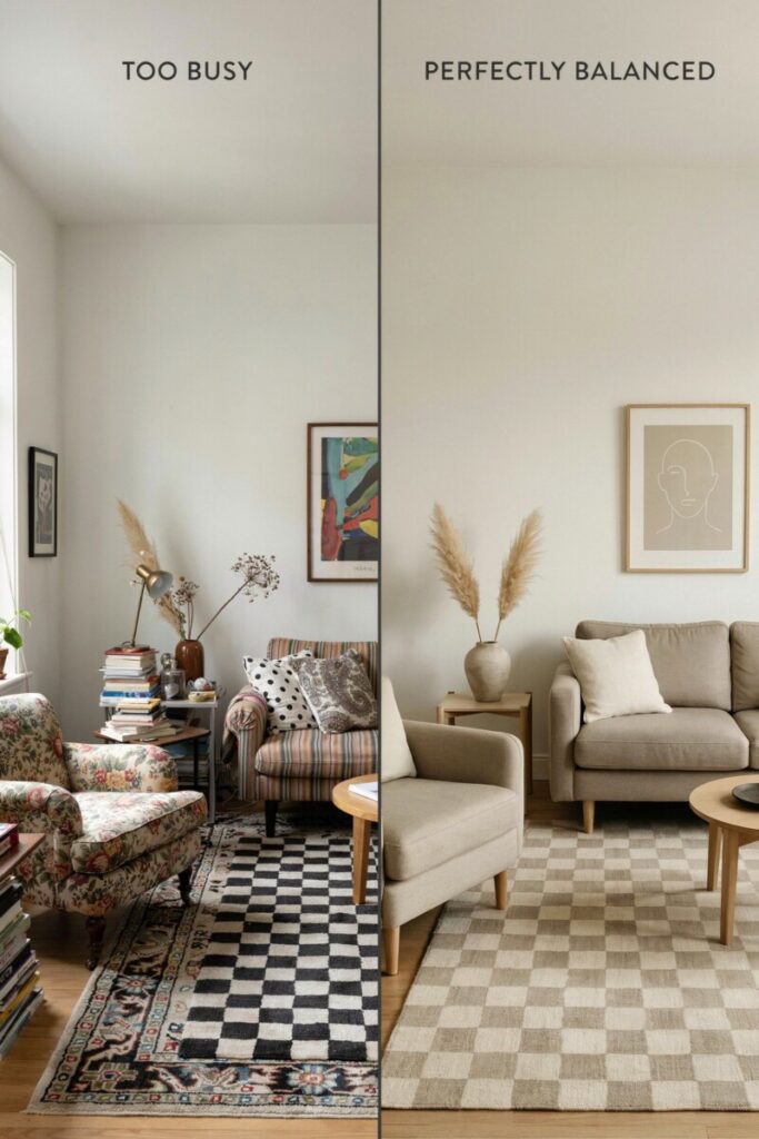
Another common mistake is pattern clash. A checkerboard rug demands attention. If you pair it with busy floral wallpaper, heavily patterned upholstery, and complex gallery walls, the room loses its visual balance. The eye needs a place to rest. When every surface is competing for attention, the checkerboard pattern shifts from being a stylish anchor to an overwhelming distraction. Recognizing these pitfalls is the first step toward creating a harmonious, well-designed space.
Choose the Right Scale and Color
When it comes to scale and proportion, size absolutely matters. The scale of the squares on your rug will dramatically impact how the room feels. As a general rule, larger checks (think 12-inch to 24-inch squares) are much more forgiving and tend to make a room feel expansive and grounded. They read as a bold, intentional design choice. On the other hand, micro-checks or very tight grids can look frantic, especially in larger rooms where the pattern blurs together when viewed from a distance. Always consult a rug size guide to ensure the overall dimensions of the rug fit your space, but pay equal attention to the scale of the pattern itself.
Color is equally crucial. While a classic black and white rug is a timeless choice for monochrome decor, it is also the highest contrast option available. If you are nervous about overwhelming your space, consider softening the palette. A checkerboard rug in cream and taupe, soft gray and white, or even muted pastels (like sage green and blush) provides the same graphic appeal with a fraction of the visual intensity.
Tonal check patterns—where the two colors are very close in value, such as navy and charcoal, or beige and light brown—are fantastic fail-safes. They offer the structural geometry of the grid without the jarring contrast. By opting for low-contrast checks, you reduce visual noise, allowing the rug to act as a subtle textural element rather than a shouting graphic rug. This approach is especially effective in bedrooms and cozy reading nooks where a calming atmosphere is paramount.
Anchor the Rug with Furniture and Layout
A beautiful rug can only do its job if it is placed correctly. Proper rug placement is the backbone of good interior design. To prevent your checkerboard rug from looking like a floating, disconnected island, you need to anchor with furniture.
In a living space, aim to have at least the front legs of your major furniture pieces (like sofas and accent chairs) resting on the rug. This physically and visually ties the furniture to the pattern, integrating it into the room’s layout. If the rug is large enough, placing all furniture legs on the rug creates a highly luxurious, custom feel.
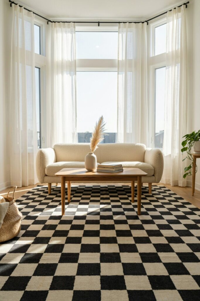
To break up the repetitive geometry of the checkerboard, use solid, substantial furniture pieces. A chunky, solid-colored sofa in a neutral tone (like oatmeal, charcoal, or navy) will ground the space. Pair it with a solid wood coffee table or a sleek glass table to let the pattern show through without adding more visual weight. The solid blocks of color from your furniture act as a palate cleanser for the eyes, interrupting the grid and providing necessary negative space.
Proportion also plays a massive role here. A rug that is too small for the room will make the space feel disjointed and the pattern will feel cramped. In a checkerboard rug living room setup, an 8×10 or 9×12 rug is usually ideal to anchor a standard seating area. The rug should extend at least 12 to 18 inches beyond the sides of your sofa to ensure the room feels balanced and properly scaled.
Balance Patterns and Textures
Mastering pattern mixing is an art form, but it doesn’t have to be complicated. The golden rule when styling a statement rug is to let it be the star of the show. If your rug is the dominant pattern, your secondary patterns should be subtle, sparse, and intentionally chosen.
If you want to mix patterns, play with scale. If your checkerboard features large, bold squares, introduce a secondary pattern with a completely different scale, such as a delicate, small-scale stripe on a throw pillow or a subtle, large-scale organic floral on the curtains. Avoid pairing your checkerboard with other strict geometric patterns like houndstooth, tight gingham, or bold chevrons, as they will visually clash and create a jarring effect.
Texture is your best friend when styling bold patterns. Because a checkerboard rug is visually “flat” and graphic, introducing rich, tactile elements will soften its impact and add depth to the room. Think about layering rugs—perhaps placing a plush, solid-colored hide or a chunky knit blanket over the edge of the checkerboard. Incorporate velvet cushions, woven jute baskets, linen drapery, or a nubby wool throw. These varied textures absorb light and add physical softness, contrasting beautifully with the crisp, structured lines of the checkerboard.
Finally, embrace negative space. Not every inch of the floor or wall needs to be filled. Allowing the edges of the rug to breathe against a solid hardwood floor or a plain wall gives the eye a place to rest, ensuring the room feels curated rather than cluttered.
Styling by Room: Living Room, Bedroom, Entryway, Dining Room
Different rooms have different functional needs and spatial dynamics. Here is how to adapt your checkerboard rug styling for every area of the home.
The Living Room:
In a checkerboard rug living room, traffic flow and comfort are key. Use the rug to define the conversation area. If you love the look of layering rugs, try placing a smaller, solid-colored vintage rug on top of a large, flatweave checkerboard sisal or wool rug. This adds immense character while breaking up the grid. Ensure the rug is large enough that walking around the coffee table doesn’t mean constantly stepping on and off the pattern.
The Bedroom:
A checkerboard rug bedroom setup should feel inviting, not stimulating. Place a large rug under the bed, ensuring it extends at least two to three feet out from the sides and the foot of the bed. This creates a soft, patterned landing pad for your feet in the morning. To keep the room serene, use color blocking with solid, calming bedding and avoid busy headboards. If a large rug is out of budget, use two matching checkerboard runners on either side of the bed instead.
The Entryway:
The entryway is the perfect place to take a risk. Use a checkerboard runner or a small square rug to create an instant, welcoming focal point. Because entryways are usually small and lack large furniture, the rug can truly shine. Pair it with a simple, sleek console table and a minimalist mirror to keep the space from feeling cramped.
The Dining Room:
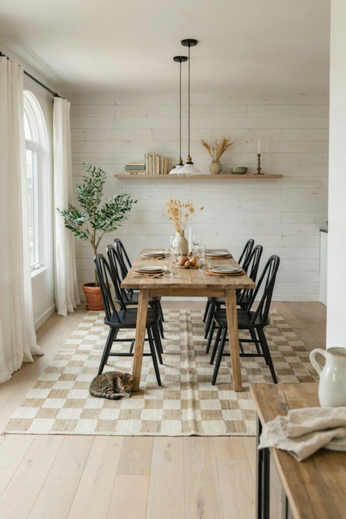
When placing a rug under a dining table, size is everything. The rug must be large enough that when chairs are pulled out, they remain entirely on the rug. A checkerboard pattern here is fantastic because it hides crumbs and spills better than a solid light-colored rug. Opt for a low-pile or flatweave material so chairs can glide easily without catching on the fibers.
Styling for Different Aesthetics
The beauty of the checkerboard pattern is its incredible versatility. It can adapt to almost any design style depending on how you style the surrounding elements.
Minimalist:
For a clean, minimalist look, stick to a strict monochrome palette. A high-contrast black and white rug paired with sleek, low-profile furniture in black, white, or gray creates a striking, gallery-like space. Keep accessories to an absolute minimum and focus on clean architectural lines.
Midcentury Modern:
Channel the 1960s and 70s by pairing a checkerboard rug with warm, rich wood tones like walnut or teak. Incorporate curved furniture, tapered legs, and pops of retro colors like mustard yellow, burnt orange, or olive green. The geometric rug perfectly complements the organic curves of midcentury silhouettes.
Eclectic:
If you love a maximalist, collected-over-time vibe, an eclectic approach is for you. Mix a vintage checkerboard rug with colorful, abstract art, a velvet sofa in a jewel tone, and an assortment of globally inspired throw pillows. The key here is confidence; just ensure you still have one or two solid-colored anchor pieces to prevent total chaos.
Modern Farmhouse:
To achieve a modern farmhouse look, avoid stark black and white. Instead, choose a rug with softened, warm neutrals like beige, cream, and soft gray. Pair it with rustic textures, shiplap walls, wrought iron accents, and cozy, slipcovered furniture. The checkerboard nods to classic country kitchen floors but feels updated and fresh.
Practical Tips, Care, and Mistakes to Avoid
Beyond aesthetics, practical decorating tips will ensure your rug looks great and lasts for years. First, always use a high-quality, non-slip rug pad. This is especially crucial for flatweave or lightweight graphic rugs, as it prevents slipping on hardwood floors, adds a layer of cushion, and extends the life of the rug fibers.
When it comes to cleaning, vacuum your checkerboard rug regularly to prevent dirt from grinding into the base of the fibers. For high-contrast black and white rugs, be mindful that white squares will show dirt and pet hair more readily, while black squares will show light dust and lint. A quick sweep with a rubber broom or a lint roller is a great interim fix between deep cleans.
Avoid the most common mistakes: buying a rug that is too small (always measure twice!), placing a high-contrast rug in a room with competing high-contrast wallpaper or furniture, and ignoring traffic flow. If you draw inspiration from checkerboard tile inspiration in kitchens and baths, remember that a rug is softer and less permanent, giving you the freedom to experiment without committing to hardwired flooring.
Quick Styling Checklist and Conclusion
Ready to take the plunge? Use this quick checklist before you buy and place your new rug:
- [ ] Scale: Are the squares large enough to read well in my specific room size?
- [ ] Contrast: Does the color contrast match the vibe of the room (high for bold, low for calm)?
- [ ] Size: Is the rug large enough to anchor my furniture properly?
- [ ] Balance: Do I have enough solid-colored furniture and negative space to let the rug breathe?
- [ ] Texture: Have I incorporated soft, tactile elements to balance the graphic lines?
Learning how to style a checkerboard rug is all about finding the sweet spot between bold expression and harmonious balance. Don’t be afraid to experiment! If you are hesitant, start small. Try a checkerboard runner in your hallway, swap out your throw pillow covers, or test the waters with a small rug in a low-stakes space like a powder room.
Try these tips and share a photo of your beautifully styled space on Instagram with #MyCheckedRoom, or download our free, printable rug-size guide to ensure your next purchase is a perfect fit!