
Scandinavian design has long been prized for its clean lines, bright rooms, and calm simplicity — but minimal doesn’t have to mean colorless. With a few thoughtful choices, you can keep that Nordic clarity while adding cozy, personality-rich hues that make your home feel lived-in and luminous.
Across the United States, from compact urban apartments in Chicago to sprawling suburban homes in Austin, homeowners have embraced the Scandinavian-inspired home for its clutter-free, breathable aesthetic. Yet, as our lives become more eclectic, an all-white or strictly grayscale room can sometimes feel a bit too stark or museum-like. The good news? You don’t have to abandon the core tenets of Nordic minimalism to make your space feel warm and uniquely yours. By understanding how to thoughtfully introduce color, you can create a home that feels both serene and deeply personal. In this guide, we will explore practical tips, decorating strategies, and room-by-room examples to help you master the art of colorful Nordic decor while preserving that beloved, airy minimalism.
What is Scandinavian Design? Core Principles
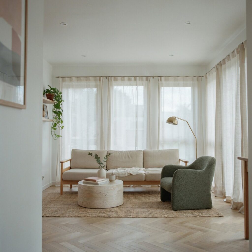
At its heart, Scandinavian interior design is a celebration of simplicity, functionality, and a deep connection to the natural world. Originating in the Nordic countries of Denmark, Norway, Sweden, Finland, and Iceland, this aesthetic was heavily shaped by the region’s long, dark winters. Because natural light is a precious commodity for much of the year, the traditional Nordic home evolved to feature light-filled rooms, reflective surfaces, and a predominantly neutral base to maximize whatever sunlight was available.
But Scandinavian design is far more than just white walls. It is deeply rooted in the use of natural materials. Light woods like ash, oak, and birch are foundational, bringing organic warmth and subtle texture to a space. The style also champions functional furniture—pieces that are beautiful, yes, but also serve a distinct, practical purpose in daily life. There is a profound respect for craftsmanship and an emphasis on investing in timeless pieces rather than fast, disposable trends.
Culturally, the concept of hygge (a Danish and Norwegian word for a mood of coziness and comfortable conviviality) is central to the aesthetic. Hygge isn’t about visual clutter; it’s about creating a sanctuary that feels inviting and safe. When we talk about minimal Scandinavian color schemes, we aren’t talking about cold, sterile environments. We are talking about a deliberate curation of space where every item has a purpose, and the overall atmosphere promotes a sense of calm, balance, and well-being.
Why Add Color? Benefits and Design Reasons
If the traditional Nordic palette relies so heavily on warm neutrals and light woods, why introduce color at all? The answer lies in the evolution of modern lifestyles and the psychology of our living spaces.
While minimalism offers a visual break from the chaotic outside world, an entirely neutral space can sometimes lack emotional resonance. Adding color to Scandinavian design brings warmth, personality, and a sense of seasonal versatility to your home. Color has a profound psychological impact; soft pastels in minimal design can lower stress and promote tranquility, while deeper, earthier tones can make a large, open-concept American living room feel grounded, intimate, and cozy.
Furthermore, US homeowners often gravitate toward spaces that reflect their individual journeys, travels, and tastes. A strictly monochromatic room can sometimes feel impersonal. By introducing bold accent colors in Nordic interiors—perhaps a vibrant piece of artwork or a richly dyed textile—you allow your space to reflect your personal narrative.
The most important design reason to add color, however, is to create visual interest and focal points without resorting to clutter. In a minimalist home, you cannot rely on an abundance of knick-knacks to draw the eye. Instead, a single, thoughtfully placed splash of color acts as a powerful design tool. It guides the viewer’s gaze, establishes a mood, and proves that color can absolutely coexist with minimalism when used with intention and restraint.
How to Choose a Color Palette for Nordic Minimalism
The secret to successfully blending color with Nordic minimalism lies in curation. You aren’t throwing a rainbow against the wall; you are carefully selecting a cohesive palette that respects the clean lines of the architecture. Here is how to build a Scandinavian color palette that works.
Start with neutral anchors
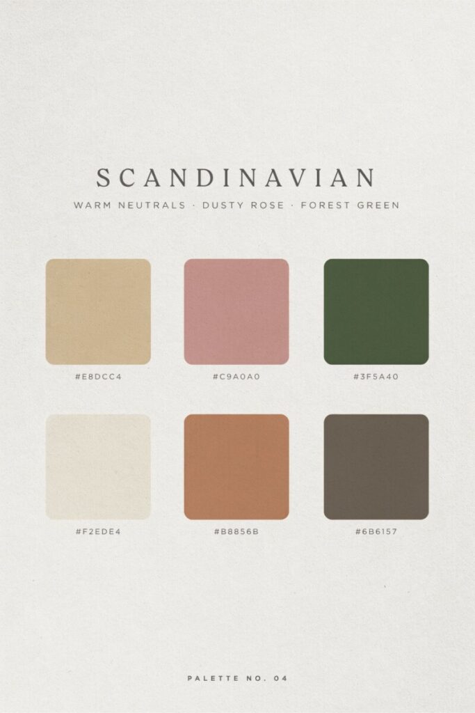
Every successful colorful Nordic decor scheme begins with a canvas of warm neutrals. Think of your walls, large foundational furniture pieces (like your main sofa or bed frame), and flooring as your anchors. Crisp whites, off-whites, warm grays, and soft beiges provide the necessary breathing room that defines the Scandinavian look. These neutral bases ensure that when you do introduce color, it pops beautifully rather than competing with a busy background.
Pick 1–2 intentional accent colors
To maintain a clutter-free feel, limit your primary accent colors to one or two distinct hues. The contemporary Nordic style often favors nature-inspired shades. Muted color palettes featuring sage green, dusty rose, powder blue, or pale terracotta are incredibly popular because they mimic the subtle tones found in the Nordic landscape. If you prefer a moodier, more dramatic space, you might opt for deeper accents like mustard yellow, rich forest green, or a moody navy blue.
Embrace tonal layering
Tonal layering is a designer’s best friend in minimalist spaces. Instead of using five completely different colors, choose one accent color and use variations of that same hue across different elements in the room. For example, if your accent is blue, you might use a pale powder blue on the walls, a muted slate blue for the curtains, and a deep navy for a throw pillow. This creates a rich, sophisticated depth without introducing visual chaos.
Balance contrast and harmony
Scandinavian design is all about contrast and balance. You want to balance the cool tones of your accent colors with the inherent warmth of your natural materials. A cool, icy blue wall looks incredibly striking when contrasted against warm oak wood accents and woven wool textiles. Conversely, a warm terracotta accent wall pairs beautifully with light birch wood and crisp white linens. Use small pops of saturated color to anchor a room, but always ensure they are balanced by ample negative space.
Practical Ways to Add Color Without Clutter
The biggest fear when decorating a minimalist home is crossing the line from “curated” into “cluttered.” The key to adding color to Scandinavian design is to apply it in broad, intentional strokes rather than tiny, scattered fragments.
Paint strategies and accent wall ideas
Paint is the most cost-effective way to transform a room. While an all-white room is classic, consider painting a single accent wall in a muted, earthy tone like soft olive or warm greige. For a more contemporary Nordic style twist, try painting the trim, doors, and baseboards in a contrasting color while leaving the walls white. In smaller spaces or awkward nooks, color-blocking (painting a specific geometric shape or a half-wall) can define a zone—like a home office corner—without overwhelming the room.
Focus on textiles and layering textures
Scandinavian textiles are the unsung heroes of Nordic decor. Because minimalist rooms lack ornate patterns and heavy drapery, texture does the heavy lifting. Introduce color through a chunky knit throw in a rich mustard, a flat-weave rug featuring subtle geometric patterns in dusty rose, or linen cushion covers in varying shades of sage. Mixing solids with small-patterned pieces keeps the eye engaged. The tactile nature of wool, linen, and cotton adds to those essential cozy hygge touches while delivering your color payload.
Select functional furniture with a twist
You don’t need to buy a bright red sofa to make a statement. Keep your primary, large-scale functional furniture in neutral tones, and introduce color through smaller, secondary pieces. A streamlined armchair in a deep teal fabric, a painted wooden coffee table, or a vibrant ceramic side table can serve as a stunning focal point. Always ensure these pieces maintain the clean lines and tapered legs characteristic of Scandinavian furniture brands.
Curate artwork and ceramics
When it comes to wall art, opt for large, simple pieces with broad color fields rather than busy, highly detailed prints. A single, oversized canvas featuring abstract blocks of warm neutrals and a single stripe of bold coral commands attention without feeling messy. Similarly, group handmade pottery, colored glass vases, and artisanal ceramics on open shelving or a dining table. Grouping these items creates a curated “moment” of color rather than scattered visual noise.
Incorporate greenery and colored planters
Plants are a non-negotiable element of a Scandinavian-inspired home. The vibrant, living green of varied foliage—from trailing pothos to structural monsteras—adds a necessary punch of color. Elevate this by placing your plants in colored ceramic planters or woven baskets that tie into your room’s accent palette.
Don’t forget the lighting
Lighting fixtures offer a fantastic opportunity for subtle color. Swap out standard white or black lampshades for ones in soft pastels or deep jewel tones. Look for pendant lights with colored cords or bases in brushed brass or matte terracotta. Always use warm light bulbs (around 2700K) to ensure your carefully chosen colors feel inviting rather than harsh.
Edit ruthlessly
The golden rule of adding color to a minimalist space is to edit ruthlessly. Adopt a “one room, one statement color” rule, or limit your accents to 2–3 consistent hues that flow throughout your entire home. If a room feels too busy, remove a colorful accessory rather than adding another.
Case Studies: Room-by-Room Examples
Theory is wonderful, but seeing these principles in action is where the real inspiration strikes. Let’s walk through how to apply colorful Nordic decor in three key areas of the home.
The Living Room: Grounded and Inviting
Imagine a typical American open-concept living room. Start by anchoring the space with a low-profile, neutral linen sofa and a light oak coffee table. To introduce color, place a sleek, mid-century modern armchair upholstered in a deep, muted forest green across from the sofa. Layer the floor with a large, vintage-inspired rug featuring faded rust and cream tones. On the walls, create a simple gallery wall using identical light wood frames, featuring abstract prints that pull the rust, green, and cream colors together. Finish with a chunky knit throw draped casually over the sofa and a tall, structural plant in a terracotta pot. The result is a space that feels bright and airy, yet incredibly warm and grounded.
The Bedroom: A Tonal Sanctuary
The bedroom should be the ultimate hygge retreat. Instead of a stark white headboard, opt for a muted, dusty blue upholstered headboard. Layer the bed with tonal bedding: crisp white sheets, a soft gray duvet cover, and a lumbar pillow in a deeper slate blue. Keep the bedside tables simple and made of natural birch. Instead of matching table lamps, choose a single, sculptural bedside lamp in a warm brass finish with a soft linen shade. The color here is achieved through tonal layering, creating a soothing, cocoon-like environment that promotes restful sleep without visual clutter.
The Kitchen: Bold and Functional
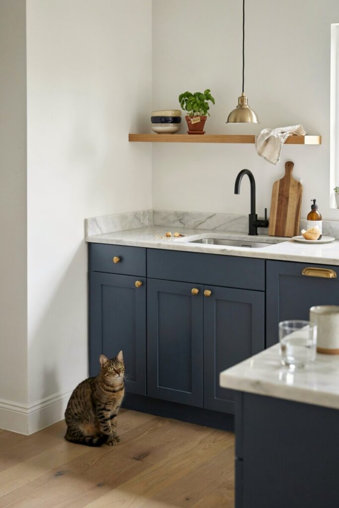
Kitchens are a fantastic place to take a slightly bolder risk with minimal Scandinavian color schemes. If you are doing a renovation, consider painting the lower cabinets in a deep, moody navy blue or a rich sage green, while keeping the upper cabinets (or open shelving) crisp white or light wood. This grounds the space while keeping the upper half light and airy. Use open shelving to display a curated collection of handmade ceramics in varying shades of your accent color. Swap out standard hardware for matte black or unlacquered brass to provide a beautiful, sharp contrast against the colored wood.
Small Apartment Strategies
If you are renting a small urban apartment, you can’t paint the cabinets or the walls. Instead, use vertical color to draw the eye upward. Hang a large, colorful tapestry or a vibrant piece of framed textile art. Use narrow, colorful runners in the kitchen or hallway to define zones without eating up floor space. Rely heavily on removable wallpaper for a single powder room or entryway nook, and use slipcovers to temporarily transform a dated, neutral rental sofa into a colorful centerpiece.
Shopping and Sourcing Ideas
You don’t need an unlimited budget to achieve a high-end, colorful Scandinavian look. The beauty of this style is its accessibility and its emphasis on timelessness over trend-chasing.
Budget-Friendly Finds
For foundational pieces and clever storage solutions, Scandinavian furniture brands like IKEA remain unmatched. You can easily customize their plain wooden dressers or cabinets with a coat of low-VOC paint in your chosen accent color. Target’s Threshold and Project 62 lines are also excellent US-based resources for affordable, Scandi-inspired textiles, ceramic vases, and minimalist wall art. Don’t overlook local thrift stores; finding a solid wood, vintage piece and reupholstering it in a modern, colorful fabric is a fantastic way to score a unique, sustainable item.
Mid-Range and Design-Forward
If you are looking to invest in functional furniture that will last a lifetime, look to brands like West Elm, Article, and CB2, which frequently carry mid-century and Nordic-inspired silhouettes. For authentic, design-forward pieces, explore the collections of Muuto and HAY. These brands are famous for their playful yet restrained use of soft pastels in minimal design, offering everything from colored glass carafes to beautifully dyed wool throws.
Sustainable Choices and DIY
Scandinavian design is deeply tied to environmental consciousness. Whenever possible, choose sustainable materials like reclaimed wood, organic cotton, and natural linens. Look for locally made textiles from regional artisans to support small businesses and reduce your carbon footprint. Finally, embrace quick DIY projects. Painting the interior of an open bookshelf, sewing your own cushion covers from high-quality fabric remnants, or re-staining a flea-market find with a natural, matte wood oil are all excellent ways to inject personalized color into your home.
Conclusion and Quick Checklist
Adding a twist of color to Scandinavian design is all about intentionality. By maintaining a foundation of warm neutrals and natural materials, you create a serene canvas that allows purposeful, nature-inspired hues to truly shine. Whether you are drawn to the calming effects of soft pastels or the grounding energy of deep, earthy tones, the goal remains the same: to create a light-filled, functional, and deeply inviting space that reflects your personal style. You can absolutely honor the clutter-free ethos of Nordic minimalism while surrounding yourself with the colors that bring you joy.
Before you pick up a paintbrush or order a new sofa, run your design plan through this quick 5-point checklist:
- Start with a neutral base: Ensure your walls and large foundational pieces provide a bright, breathable canvas.
- Limit your palette: Stick to 1–3 intentional accent colors to prevent the space from feeling chaotic.
- Layer textures: Use wool, linen, and wood to add depth and hygge without relying on visual clutter.
- Prioritize function: Ensure every colorful piece you bring into the home serves a purpose or brings genuine joy.
- Edit ruthlessly: When in doubt, take it away. Negative space is just as important as the color itself.