
When sunlight pours through gauzy curtains onto a beige linen sofa, the room feels quieter—less staged, more lived-in. A single terracotta planter sits on a raw wood coffee table, casting a long, warm shadow against cream walls. This isn’t just a fleeting aesthetic; it is the defining look of the moment. Over the past few years, a profound shift has occurred in how we design our personal spaces. The stark, clinical modernism and cool, gallery-white minimalism that dominated the 2010s are steadily giving way to something far more inviting.
Today, the warm minimalist palette—anchored by cream, beige, and terracotta—is rising to the forefront of interior design. Homeowners and renters alike are seeking environments that feel both profoundly calm and deeply cozy. We are trading icy grays and high-gloss finishes for earthy, tactile surfaces that invite you to sit down, relax, and stay awhile. This evolution reflects a broader cultural desire for comfort and authenticity in our homes.
In this guide, we will explore why this cream, beige, and terracotta palette has captured our collective imagination, how to seamlessly integrate these warm neutral interiors into every room of your house, and where to find the best pieces to bring your vision to life, regardless of your budget.
What is Warm Minimalism?
At its core, warm minimalism is a pared-back design philosophy that prioritizes simplicity, but refuses to sacrifice comfort. It takes the foundational rules of traditional minimalism—clean lines, uncluttered surfaces, and an edited selection of belongings—and softens them using a warm neutral color palette and organic, natural materials.
For years, the prevailing minimalist aesthetic leaned heavily into Scandinavian or hyper-modern styles. Think cool slate grays, stark optic whites, polished chrome, and sharp, unforgiving angles. While visually striking in photographs, these spaces often felt cold, sterile, and uninviting in daily life. Warm minimalism offers a necessary corrective. It embraces the “less is more” ethos but applies it to elements that foster a sense of sanctuary.
The core principles of this design style revolve around intentionality. Every object in a warm minimalist home is chosen for its utility, its beauty, or its emotional resonance. The muted color range—spanning from soft, buttery creams to deep, grounding terracottas—creates a soothing backdrop that reduces visual noise. Instead of relying on bold, contrasting colors to create interest, warm minimalism focuses heavily on the interplay of light and texture. A room might feature a monochromatic beige scheme, but the rich weave of a jute rug, the nubby surface of a boucle armchair, and the smooth, matte finish of a plaster wall create a dynamic, deeply layered environment. It is cozy minimalism at its finest: uncluttered, yet full of life.
Why Cream, Beige, and Terracotta Now?
The current warm neutrals trend is not merely a cyclical design fad; it is a direct response to our current psychological and cultural climate. On an emotional level, these earthy hues provide a profound sense of comfort, safety, and grounding. After years of global uncertainty and a pandemic-driven hyper-focus on our domestic spaces, our return-to-nature instincts have kicked into high gear. We want our homes to feel like restorative sanctuaries, and an earth tone palette naturally mimics the calming landscapes of the natural world.
Culturally, this shift is deeply intertwined with the slow living decor movement and the rise of biophilic design. As consumers become more conscious of sustainability and environmental impact, there is a growing desire for authenticity, heritage, and craft. Terracotta, which literally translates to “baked earth,” embodies this perfectly. It is an ancient, humble material that carries the visible mark of human craftsmanship. Furthermore, the resurgence of vintage and artisanal goods has pushed warm, lived-in tones to the forefront, as they naturally complement aged wood, patinated brass, and handmade ceramics.
From a practical standpoint, these colors are incredibly flexible and timeless. Unlike highly saturated trend colors that can feel dated within a few seasons, cream and beige provide an enduring foundation that allows you to easily swap out accessories. Additionally, these hues perform exceptionally well in the digital age. They photograph beautifully for social media, reflecting natural light in a way that feels bright yet intimate, avoiding the blown-out, clinical glare of pure white.
The data supports this cultural shift. Pinterest’s recent trend reports have highlighted warm minimalism as a dominant force in interior design, noting massive surges in searches for artisan craftsmanship and earthy textures. In fact, searches for “terracotta tiles texture” recently jumped by over 800% on the platform, while “warm neutral interiors” and “cozy minimalism” continue to dominate shelter magazines and design blogs. People are actively seeking spaces that feel deeply personal and enduringly stylish.
How to Use the Palette in Different Spaces
Translating this palette into your home requires a thoughtful approach to scale, lighting, and balance. The goal is to introduce color gradually, allowing the tones to enhance the architecture rather than overwhelm it.
The Living Room
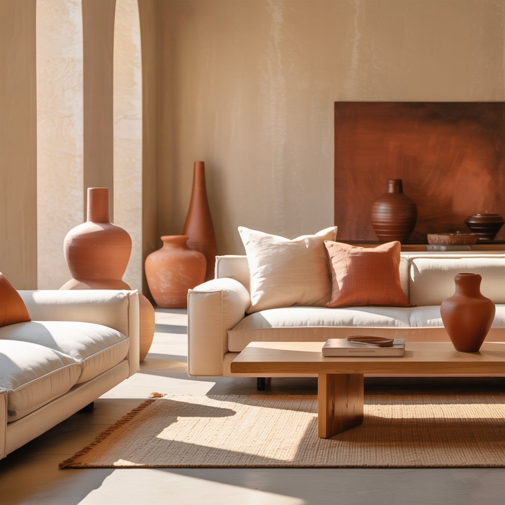
For beige living room ideas, start by enveloping the space in cream walls to maximize natural light. Anchor the room with a substantial piece of beige upholstery, such as a deep-seated linen sectional or a textured boucle sofa. Introduce terracotta decor through organic accents: a pair of unglazed clay planters holding lush, deep-green foliage, or a stack of handmade ceramic bowls on the coffee table. Layering throw textures is crucial here; drape a chunky knit blanket in oatmeal over the sofa arm to soften the clean lines. Ground the entire arrangement with warm, mid-tone wood furniture, like a walnut coffee table or an oak console, to bridge the gap between the light walls and darker accents.
The Kitchen
The kitchen is where this palette truly shines, balancing culinary functionality with warmth. Cream kitchen cabinets offer a timeless, airy alternative to stark white, hiding smudges a bit better while feeling incredibly welcoming. Pair them with beige countertops—think honed travertine, warm quartzite, or a matte sandstone. For a striking focal point, introduce terracotta through a handmade zellige tile backsplash or open shelving displaying earthenware dishes and rustic serving platters. When selecting hardware, swap out cool stainless steel for unlacquered brass or brushed bronze; the warm, living finishes will patina beautifully over time and harmonize perfectly with the earthy tones.
The Bedroom
The bedroom should be the ultimate exercise in cozy minimalism. Dress the bed in soft, washed cream linens that look beautifully rumpled and inviting. Choose a beige upholstered headboard in a tactile fabric like velvet or heavy cotton to add visual weight without introducing harsh colors. A terracotta bedside lamp with a paper or linen shade will cast a warm, amber glow in the evening, promoting relaxation. Layer a vintage, faded terracotta rug at the foot of the bed to add history and warmth underfoot. Keep window treatments simple and sheer to allow morning light to filter in softly.
The Bathroom
Bathrooms benefit immensely from this palette, transforming from utilitarian spaces into spa-like retreats. Consider large-format cream tiles or a seamless microcement plaster finish on the walls to eliminate grout lines and create a serene, continuous surface. Incorporate beige textiles through plush, high-quality waffle-weave towels and a soft bath mat. Because raw terracotta is porous, opt for moisture-safe terracotta alternatives in the bath, such as glazed ceramic soap dispensers, terrazzo with warm aggregate, or sealed terracotta-look porcelain tiles on the floor. Incorporate negative space by keeping countertops clear, storing daily essentials in beautiful, woven baskets or flush, integrated cabinetry.
Textures, Materials, and Finishes
In a warm minimalist home, texture does the heavy lifting that color usually does in other design styles. Because the palette is intentionally restrained, the tactile quality of your materials becomes the primary source of visual interest.
Natural materials are the undisputed heroes of this aesthetic. Linen and cotton provide a relaxed, breathable quality for upholstery and drapery, while wool adds a dense, comforting weight to rugs and throw blankets. Terracotta and raw clay introduce an earthy, porous roughness that feels inherently grounding. Unvarnished or matte-finished woods—such as white oak, ash, and walnut—bring organic warmth and beautiful grain patterns that synthetic materials simply cannot replicate. Rattan, jute, and woven seagrass add an essential woven element that lightens the visual weight of heavier furniture pieces.
The finishes you choose for your walls and surfaces are equally critical. Flat, matte paints absorb light beautifully, creating a soft, velvety appearance that enhances warm neutrals. Limewash paint has seen a massive resurgence; its mottled, chalky texture adds instant depth and character to cream walls, making them feel historic and artisanal. Honed stone, honed marble, and raw, unglazed ceramics are preferred over high-gloss counterparts because their muted sheen feels more organic and approachable.
Mastering tactile contrast is the secret to preventing a neutral room from looking flat. Pair the smooth, cool surface of a plaster wall with the heavy, nubby weave of a chunky knit throw. Contrast the sleek, refined glaze of a ceramic vase with the rough, splintery texture of a raw wood dining table. The interplay of linen and terracotta introduces an earthy, organic friction that makes a space feel curated rather than purchased from a single catalog.
Maintenance is a practical consideration with these natural elements. Raw terracotta must be sealed properly to prevent water stains and oil absorption, especially in kitchens and dining areas. Light-colored linen and cream fabrics require prompt spot-cleaning and may benefit from performance fabric treatments if you have children or pets. Embrace the natural aging process; a slight patina on leather or a soft wrinkle in linen only adds to the authentic, lived-in charm of the space.
Fashion and Lifestyle Crossover
The appeal of the warm minimalist palette extends far beyond the walls of your home; it is a holistic lifestyle aesthetic that translates beautifully into fashion, tabletop styling, and daily rituals.
In the realm of fashion, this palette forms the ultimate foundation for a versatile capsule wardrobe. Imagine a curated closet filled with high-quality essentials: oversized cream cashmere knits, perfectly tailored beige wide-leg trousers, and crisp off-white cotton button-downs. These neutral basics mix and match effortlessly, reducing decision fatigue and promoting a more sustainable, slow-fashion mindset. You can introduce pops of color through terracotta accessories—a rich, rust-colored leather tote bag, a silk scarf with subtle earthy geometric prints, or warm-toned suede loafers. This approach ensures your personal style feels cohesive, elegant, and effortlessly put-together.
The crossover into tabletop and home entertaining is equally compelling. Hosting a dinner party becomes an exercise in quiet luxury when you set the table with handmade earthenware dishes in varying shades of clay and sand. Drape a heavy beige linen table runner down the center, and scatter a few small terracotta planters holding fresh herbs or low-slung dried florals. The result is a cohesive, intimate dining experience that feels deeply intentional and connected to the earth.
For those who love documenting their lifestyle on social media, mastering the photography of these tones is essential. Warm neutrals thrive in natural, diffused light. Shoot near a large window during the golden hour to capture the rich, glowing undertones of cream and terracotta. Pay close attention to your camera’s white balance; auto-settings often overcompensate and wash out warm tones, making beige look sickly yellow or gray. Manually adjusting the warmth or shooting in RAW format will ensure your tonal layers look as inviting on screen as they do in person.
Budget-Friendly Swaps and Where to Shop (US)
Adopting this aesthetic does not require an expensive renovation. You can achieve the look through strategic shopping and budget-friendly swaps across a variety of US retailers.
For foundational pieces, big-box stores offer excellent options. IKEA is a fantastic resource for affordable linen-blend curtains and cream textile sofa covers. Target’s Threshold line frequently stocks beautiful beige ceramic vases, woven baskets, and textured throw pillows that look far more expensive than their price tags suggest. Wayfair is also a reliable destination for budget-friendly furniture in warm wood tones.
For mid-range investments, retailers like West Elm, Article, and CB2 excel at warm minimalist furniture, offering beautifully tailored beige sectionals and cream boucle accent chairs.
However, the true soul of warm minimalism lies in supporting small makers. Scour Etsy for independent ceramicists creating stunning, one-of-a-kind terracotta planters and handmade dinnerware. Finally, do not underestimate the thrift store. Sourcing vintage terracotta oil jars, mid-century beige leather chairs, or solid wood pieces you can refurbish with warm stains is not only budget-friendly but ensures your home is filled with unique items that have a genuine story to tell.
Quick Styling Mistakes to Avoid + Color Pairing Cheats
Even well-intentioned neutral rooms can fall flat. The most common mistake is a “matchy-matchy” beige room that lacks depth. Similarly, overloading a space with terracotta makes it feel heavy, while cool, blue-toned LED lighting will completely muddy your warm tones, making them look dingy.
Avoid these pitfalls with quick cheats:
- The Contrast Rule: Introduce one contrasting accent to anchor the space. A deep-green potted plant or a sleek, matte black metal lamp provides necessary visual punctuation.
- The Rule of Three: Ensure three distinct tonal levels for visual interest: light cream (walls), mid-tone beige (furniture), and deeper terracotta (accessories).
- The Golden Formula: Follow the classic ratio: 60% cream for large surfaces, 30% beige for furniture and rugs, and 10% terracotta for accessories.
Conclusion: Your Weekend Room Refresh
Ultimately, the rise of the warm minimalist palette is about more than just picking the right paint color; it is about creating an emotional sanctuary. By balancing visual calm with tactile warmth, cream, beige, and terracotta transform houses into intentional, deeply lived-in homes that support our well-being and reflect our desire for authenticity.
Ready to embrace the shift? Try this simple 3-Step Room Refresh Checklist this weekend:
- Choose a base: Paint one focal wall in a creamy, warm off-white.
- Layer texture: Swap out two synthetic throw pillows for nubby beige linen or wool.
- Add earth: Introduce 1–3 raw terracotta accents and a lush, trailing houseplant.
We want to see your transformations! Try a single swap this weekend and share your before-and-after photos on social media using #WarmMinimalistHome. Let’s build cozier, more beautiful spaces together.
