
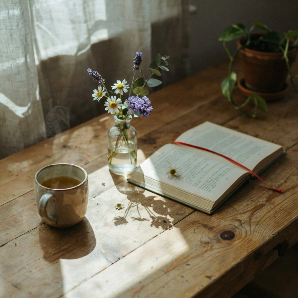
Imagine waking up to soft morning light filtering through linen curtains, the pale green of sage walls catching the glow like a meadow at dawn. A ceramic mug of tea sits on a weathered oak table beside a vase of wildflowers—lavender, daisies, and sprigs of eucalyptus. Everything feels slow, intentional, wrapped in the gentle palette of the natural world.
This is the essence of cottagecore—a design movement that romanticizes rural life, handcraft, and seasonal beauty. And at its heart? Color. The right cottagecore color palettes transform a room from merely decorated into something that feels lived-in, storied, and deeply peaceful. Whether you’re drawn to misty greens, dusty roses, or sun-warmed wheat tones, the countryside aesthetic is about choosing hues that whisper rather than shout.
In this guide, you’ll discover four ready-to-use color palettes with specific paint recommendations, room-by-room applications, material pairings, and styling tips designed for US homes. From cozy farmhouse decor touches to full-room transformations, we’ll cover everything you need to create your own dreamy, nature-inspired sanctuary—on any budget.
What Makes a Cottagecore Palette?
Cottagecore color palettes are rooted in the natural world. Think of the colors you’d find on a long walk through an English garden or an American farmhouse field: the soft green of new growth, the blush of a peony, the warm tan of dried wheat, the deep plum of late-summer berries.
The defining characteristics of a true countryside aesthetic palette include:
- Muted, nature-inspired hues — never neon, never stark. Colors are softened as if seen through morning mist or aged by sunlight.
- Soft contrasts — rather than bold black-and-white pairings, cottagecore leans into tonal layering (cream next to oatmeal, sage beside moss).
- Layered neutrals — warm whites, stone grays, and earthy beiges create the foundation that lets accent colors breathe.
- Vintage-inspired colors — hues that feel like they’ve been pulled from a faded watercolor, a grandmother’s quilt, or a botanical illustration.
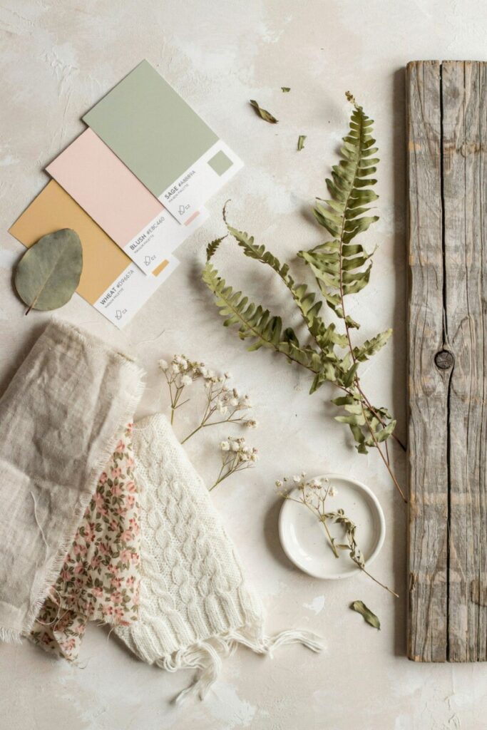
From a color psychology standpoint, these palettes do more than look pretty. Warm neutrals and greens promote calm and grounding. Soft pinks and lavenders evoke comfort and nostalgia. Deep berries and forest tones add intimacy and richness—perfect for gathering spaces.
To complete the look, pair your nature-inspired colors with matte and eggshell paint finishes (never high gloss), natural textiles like linen and cotton, woven materials such as wicker and rattan, and wood surfaces with visible grain or a lightly distressed finish. These textures amplify the organic, handcrafted feeling that defines cottagecore interior design.
Palette 1 — Soft Meadow Greens
| Element | Colors |
|---|---|
| Main Colors | Sage, moss, muted olive |
| Accent Colors | Cream, butter yellow, weathered wood tones |
| Best For | Living rooms, kitchens, sunrooms, bedrooms |
Green is the heartbeat of any botanical color palette, and soft meadow greens are perhaps the most versatile entry point into cottagecore. Sage reads as a neutral in most lighting conditions, making it an ideal wall color that pairs effortlessly with both warm and cool accents. Moss and olive add depth without heaviness, while butter yellow and cream keep the palette feeling sun-drenched and optimistic.
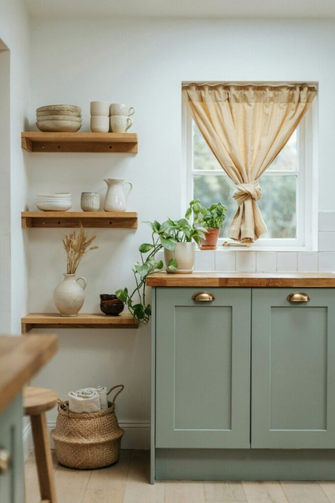
Where to use it: Paint your living room walls in a soft sage (Benjamin Moore’s Saybrook Sage HC-114 or Sherwin-Williams’ Clary Sage SW 6178 are excellent US-market options in eggshell finish). Use moss green on kitchen cabinets or a bedroom accent wall. Layer in butter yellow through throw pillows, dish towels, or a small-scale floral wallpaper.
Material & texture pairings: Linen curtains in cream or oatmeal. Rattan baskets for storage. Painted cabinets with lightly distressed edges. Terracotta pots filled with trailing herbs. Woven seagrass rugs.
Room Vignette: A sunlit kitchen with sage-painted shaker cabinets, open shelving displaying cream-colored stoneware, and a butcher-block island. A vase of fresh-cut dill and chamomile sits beside a stack of well-worn cookbooks. Butter-yellow café curtains frame a window overlooking a small herb garden.
Practical Tip: For US homes, choose an eggshell or satin finish for walls—it hides imperfections better than flat/matte while still offering the soft, non-reflective look that cottagecore demands. Reserve semi-gloss for trim and cabinetry only.
Quick Shopping List:
- Sage green paint sample (test on 2 walls before committing)
- Natural linen curtain panels
- Rattan or wicker storage baskets
- Butter-yellow ceramic pitcher or vase
- Potted trailing plants (pothos, ivy, string of hearts)
Palette 2 — Vintage Rose & Blush
| Element | Colors |
|---|---|
| Main Colors | Dusty rose, blush pink, mauve |
| Accent Colors | Olive green, warm beige, antique brass |
| Best For | Bedrooms, reading nooks, bathrooms, dressing areas |
There’s a reason dusty rose dominates muted pastel palette trends on Pinterest and Instagram: it’s feminine without being saccharine, romantic without feeling dated. When done right, vintage rose reads as a sophisticated, grown-up neutral that plays beautifully with greens and warm beiges.
Where to use it: A blush-pink bedroom wall creates an enveloping, calming atmosphere. Use dusty rose in textiles—duvet covers, throw blankets, velvet lumbar pillows. For a bolder move, try a small-scale faded floral wallpaper on a powder room ceiling or behind a bed’s headboard wall.
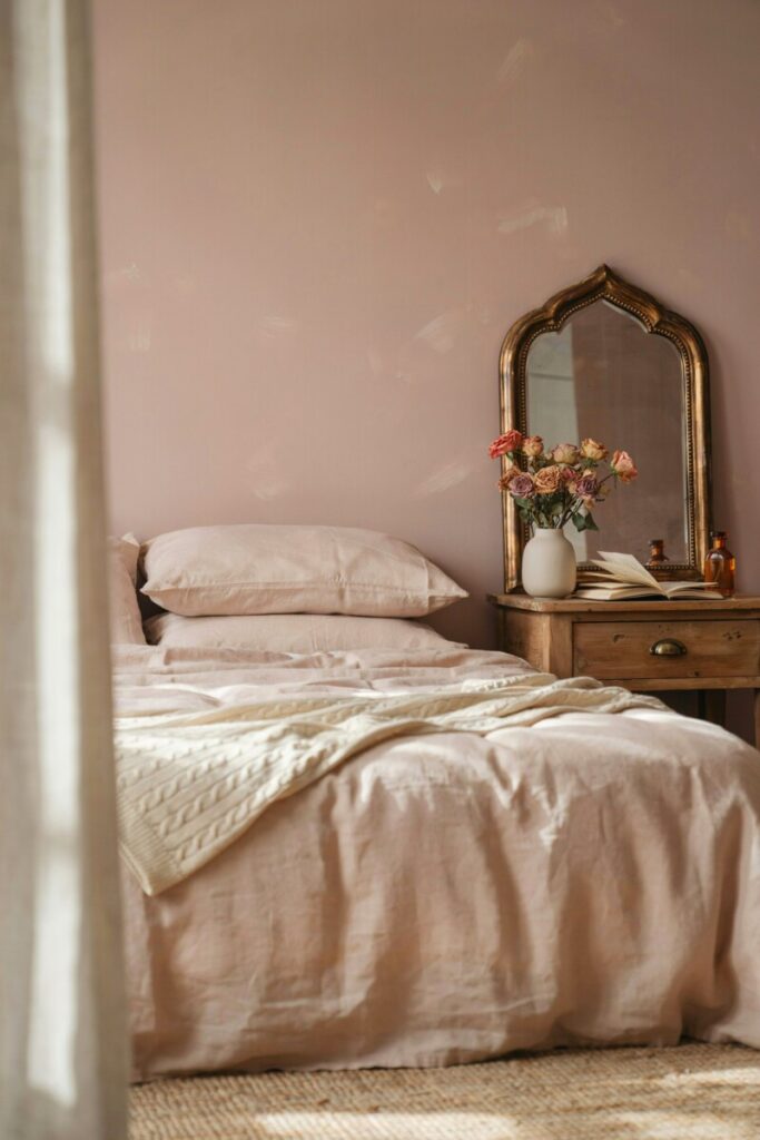
Pairings: Faded floral prints (look for chintz-style patterns in muted tones). Antique brass drawer pulls and curtain rods. Crocheted or cable-knit blankets in cream. Olive green plants and dried eucalyptus stems to keep the palette grounded.
Room Vignette: A bedroom wrapped in blush linen bedding layered with a cream cable-knit throw. An antique brass mirror leans against a dusty rose wall, reflecting a small vase of dried garden roses. A stack of vintage novels sits on a weathered nightstand beside a brass reading lamp.
Practical Tip — Mixing Patterns: The key to mixing florals and stripes in a cottagecore space is scale variation. Pair one large-scale print (like an oversized floral duvet) with a small-scale print (a tiny ditsy floral pillow) and a solid textured neutral (a waffle-knit throw). Keep the color family consistent across all patterns to maintain harmony.
Quick Shopping List:
- Dusty rose or blush linen duvet cover
- Faded floral throw pillows (mix 2–3 sizes)
- Antique brass hardware (cabinet pulls, hooks, or a small mirror)
- Crocheted or chunky-knit blanket in cream
- Dried flower arrangement (roses, baby’s breath, lavender)
Palette 3 — Sunlit Wheat & Earth
| Element | Colors |
|---|---|
| Main Colors | Warm wheat, oatmeal, terracotta |
| Accent Colors | Deep brown, rust, soft cream |
| Best For | Kitchens, dining rooms, entryways, living rooms |
If you’re drawn to the farmhouse color palette but want something warmer than the typical all-white shiplap look, sunlit wheat and earth tones deliver. This palette evokes a late-summer harvest field—golden, grounded, and deeply comforting. Soft neutral tones like oatmeal and wheat serve as a canvas, while terracotta and deep brown add warmth and visual weight.
Where to use it: Terracotta- toned zellige-style tiles make a stunning kitchen backsplash. Paint walls in a warm wheat or oatmeal (Benjamin Moore’s Manchester Tan HC-81 or Sherwin-Williams’ Kilim Beige SW 6106). Use deep brown and rust on wooden furniture—a farmhouse dining table, open shelving brackets, or a leather-topped stool.
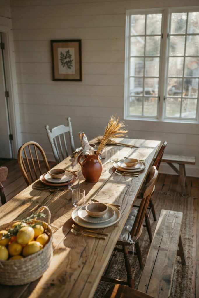
Pairings: Unglazed ceramic bowls and pitchers. Woven jute or wool rugs. Open wooden shelving with visible grain. A sturdy farmhouse table as a dining or workspace centerpiece.
Room Vignette: A dining room anchored by a long, reclaimed-oak farmhouse table surrounded by mismatched ladder-back chairs. Oatmeal linen napkins are loosely rolled in a terracotta pitcher. An oversized woven pendant light hangs above, casting warm light across shelves of unglazed stoneware and dried wheat stalks.
Practical Tip — Using Terracotta Indoors: Terracotta tiles and planters are porous and can stain or absorb moisture. For tiles, use a penetrating sealant (available at any US home improvement store) before installation. For terracotta planters, seal the interior with a waterproof coating to prevent water damage to wooden surfaces. Unglazed ceramics add beautiful texture but should be hand-washed rather than put in the dishwasher.
Quick Shopping List:
- Warm wheat or oatmeal paint (eggshell finish)
- Terracotta backsplash tiles or planters
- Woven jute area rug
- Unglazed ceramic dinnerware set
- Dried wheat stalks or pampas grass arrangement
Palette 4 — Berry & Forest
| Element | Colors |
|---|---|
| Main Colors | Blackberry, cranberry, deep forest green |
| Accent Colors | Cream, muted gold, warm brass |
| Best For | Dining rooms, studies, accent walls, seasonal styling |
For those who find traditional rustic color schemes too light or airy, the berry and forest palette offers a moodier, more dramatic take on cottagecore. Think of a twilight garden in late autumn—deep purples, rich cranberries, and evergreen shadows. These vintage-inspired colors feel collected and storied, perfect for spaces meant for lingering over candlelit dinners or curling up with a good book.
Where to use it: A deep forest green or blackberry accent wall in a dining room creates an intimate, cocoon-like atmosphere. Paint built-in bookshelves or cabinetry in cranberry for a rich, jewel-toned detail. Layer in cream and muted gold through textiles, candle holders, and picture frames to prevent the space from feeling too dark.
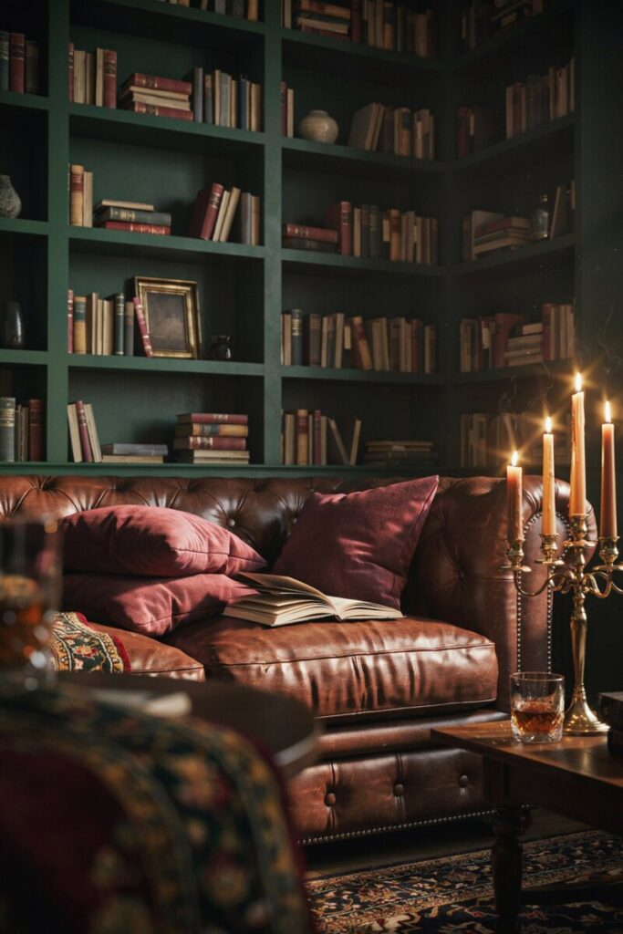
Pairings: Velvet cushions in plum or forest green. Dark-stained or walnut-finished wood furniture. Botanical prints in gold frames. Beeswax candles in brass holders. Heavy linen drapes.
Room Vignette: A moody dining room with a deep forest-green accent wall behind a dark walnut sideboard. Cranberry velvet drapes pool softly on the floor. A brass candelabra with tapered beeswax candles sits atop a linen runner, flanked by vintage botanical prints in muted gold frames.
Practical Tip — Balancing Dark Hues in Small Rooms: Deep colors can make small spaces feel cave-like if not handled carefully. Counteract this by: (1) maximizing natural light with sheer curtains, (2) adding at least two mirrors to bounce light around the room, (3) keeping the ceiling and trim in a bright warm white, and (4) incorporating at least three light-colored textiles or decor items to create visual relief.
Quick Shopping List:
- Deep forest green or blackberry paint (matte finish for drama)
- Velvet throw pillows in plum or cranberry
- Brass candle holders or a small candelabra
- Botanical art prints (botanical illustrations, fern studies)
- Heavy linen or velvet curtain panels
How to Build Your Own Cottagecore Palette
Prefer to create a custom country cottage colors scheme? Follow this simple five-step process:
- Choose a base neutral. Start with a warm white, cream, oatmeal, or soft gray. This will cover roughly 60% of your room (walls, large furniture).
- Add 1–2 dominant nature tones. Pick colors inspired by something you love—a garden flower, a favorite landscape, a vintage textile. Sage green, dusty rose, and wheat are forgiving starting points.
- Pick 1–2 accent colors. These show up in smaller doses: pillows, art, ceramics, hardware. Think butter yellow, terracotta, muted gold, or deep plum.
- Test in your actual lighting. Paint large swatches (at least 2’×2′) on multiple walls. Observe them at morning, afternoon, and evening light over 2–3 days before committing.
- Incorporate texture as a “color.” In cottagecore, the texture of raw linen, woven rattan, or distressed wood functions almost like a neutral color—adding visual depth without adding hue.
Tools to use: Physical paint swatches from your local hardware store. Mood-board apps like Canva, Milanote, or Pinterest’s board feature. Fabric swatches ordered from upholstery suppliers or salvaged from thrifted textiles.
Quick Buying Checklist:
- ☐ Paint samples (at least 3 shades per palette)
- ☐ Fabric swatches or thrifted textile inspiration
- ☐ One “hero” vintage or thrifted piece to anchor the room
- ☐ Natural-fiber textiles (linen, cotton, wool)
- ☐ At least one handcrafted or artisan-made accent item
Styling & Staging Tips
The magic of cottagecore isn’t just in the paint—it’s in the layers. Here’s how to style your cozy farmhouse decor for maximum charm:
Layer textiles generously. Drape a linen throw over a sofa arm. Stack two to three throw pillows in varying sizes and patterns. Use a tablecloth or runner even for everyday meals. Layering creates the “collected over time” look that defines the aesthetic.
Mix new and vintage. A room of all-new furnishings feels like a catalog; a room of all-vintage feels cluttered. Aim for a 70/30 or 60/40 ratio. A modern sofa pairs beautifully with a thrifted side table. New linen bedding looks stunning with a vintage quilt folded at the foot of the bed.
Bring in florals and greenery. Fresh-cut flowers from a garden or grocery store, potted herbs on a kitchen windowsill, dried lavender bundles, or trailing houseplants all reinforce the nature-connected feeling at cottagecore’s core.
Try small DIY projects. Distress a thrifted picture frame with sandpaper and a thin coat of white paint. Hand-paint a small wooden sign with a favorite botanical name or quote. Decant store-bought soap into a vintage glass bottle. These small touches cost almost nothing but elevate the entire space.
For Instagram-ready photos: Shoot in natural daylight (morning or golden hour). Style vignettes in odd numbers (three objects grouped together). Balance color across the frame—if your left side is heavy with green, add a green element to the right.
Seasonal swaps: In spring and summer, lean into florals, fresh greens, and lighter linens. In autumn and winter, swap in berry tones, heavier wool textiles, dried arrangements, and warm candlelight.
Shopping and Budget Ideas
You don’t need a designer budget to achieve a cottagecore look. Here are the best US-friendly sources:
- Thrift stores & estate sales: Goldmines for vintage ceramics, wooden furniture, brass hardware, linens, and botanical prints. Look for solid-wood pieces you can sand and repaint.
- Flea markets & antique malls: Ideal for one-of-a-kind accent pieces—old pitchers, quilt fragments, weathered frames.
- Budget paint lines: Sherwin-Williams’ Emerald line, Benjamin Moore’s Ben line, and Behr Premium Plus (at Home Depot) all offer beautiful, rich colors at accessible price points.
- Affordable textile retailers: Target’s Threshold and Casaluna lines, World Market, and IKEA’s natural-fiber selections offer cottagecore-friendly textures without luxury pricing.
Upcycling tips:
- Sand and lightly glaze thrifted wooden furniture for an aged, time-worn finish.
- Dye plain white linen or cotton items with natural dyes (avocado pits create a beautiful blush; onion skins yield warm gold).
- Decant everyday items—dish soap, hand lotion, dried beans—into vintage glass bottles or ceramic containers for open-shelf styling.
Frequently Asked Questions
Q: How do I test paint colors accurately before committing?
A: Buy sample pots and paint at least two 2’×2′ swatches on different walls. Live with them for 48–72 hours, checking at various times of day. Artificial lighting dramatically shifts color—test with the bulbs you’ll actually use.
Q: Can I mix cottagecore with modern furniture?
A: Absolutely. A clean-lined modern sofa in a soft neutral upholstery looks beautiful layered with cottagecore textiles, vintage accents, and nature-inspired colors. The contrast actually makes both styles feel more intentional and fresh.
Q: My rental won’t let me paint. How can I still use these palettes?
A: Lean heavily on textiles—curtains, bedding, rugs, and throw pillows in your chosen palette. Removable wallpaper (available in many cottagecore-friendly prints) works on accent walls. A large vintage rug in muted earth tones can transform an entire room.
Your Cottagecore Journey Starts This Weekend
You don’t need to overhaul your entire home to embrace the beauty of cottagecore color palettes. Start small: paint a single accent wall, swap out your throw pillows, or spend a Saturday afternoon at a local thrift store hunting for one perfect vintage piece. Choose the palette that speaks to you—meadow greens, vintage rose, sunlit wheat, or berry forest—and let it guide your next project.
We’d love to see your spaces! Tell us in the comments which palette you’re drawn to, and share your progress on Instagram or Pinterest with #MyCottagecorePalette. Looking for your first weekend project? Don’t miss our upcoming guide: “Cottagecore DIY Projects Under $50 — 10 Easy Ways to Add Countryside Charm This Weekend.”
Happy designing, and may your home always feel like a long, slow afternoon in the garden. 🌿