
Breezy botanicals, coastal mornings, and sun-washed gardens—captured in color.
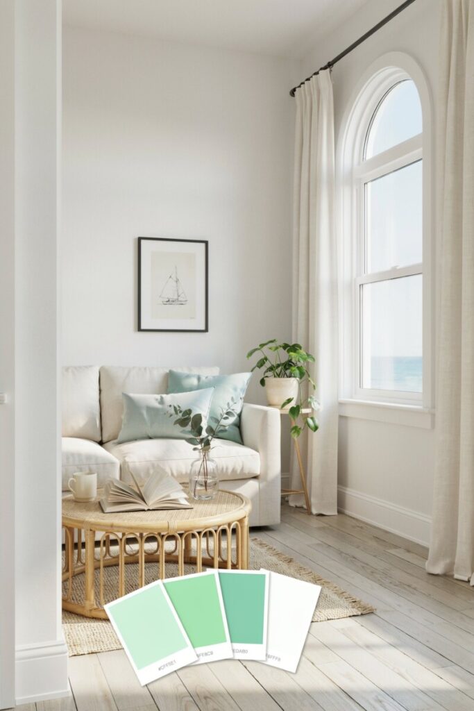
There’s a reason mint and sage show up in every summer scroll, swatch book, and bridal Pinterest board. These soft, botanical greens tap into what color psychologists call biophilic calm—a deep, instinctive sense of ease we feel when surrounded by nature. And in 2026, the trend is only getting stronger: Pantone’s Spring/Summer forecast highlights Sage Green (15-0318 TCX) as a “seasonless shade” that evokes balance and relaxation, while top interior designers like Shea McGee are calling sunwashed sages, soft mints, and pale stone tones the defining summer look of the year.
Whether you’re refreshing a living room, planning a backyard wedding in Charleston, building a summer capsule wardrobe, or rebranding your small business for the season, mint and sage green palettes for summer give you a versatile, mood-lifting foundation. Unlike cooler, trendier hues, these greens play well with neutrals, brass, linen, terracotta, and warm wood—making them one of the highest-ROI color choices you can make this season.
In this guide, you’ll get 12 curated palettes with hex codes, real-world applications, styling pairings, and quick DIY ideas you can actually use this weekend.
🧭 How to Use This Guide
Each palette below is designed as a plug-and-play toolkit:
- Home décor: Pick one dominant color, one secondary, and one accent for rooms, accent walls, or textiles.
- Outdoor spaces: Use mints for shaded porches, sages for garden-facing rooms.
- Summer wardrobes: Sage reads as a neutral; mint works as a pop.
- Weddings: Mints lean romantic, sages lean organic-modern.
- Brand & social media: Use hex codes directly in Canva, Figma, or your website theme.
Accessibility note: Always check contrast before placing body text over light mint or sage backgrounds. Aim for a 4.5:1 contrast ratio minimum (WCAG AA) — dark charcoal, deep forest, or espresso brown usually work beautifully.
🎨 The 12 Palettes
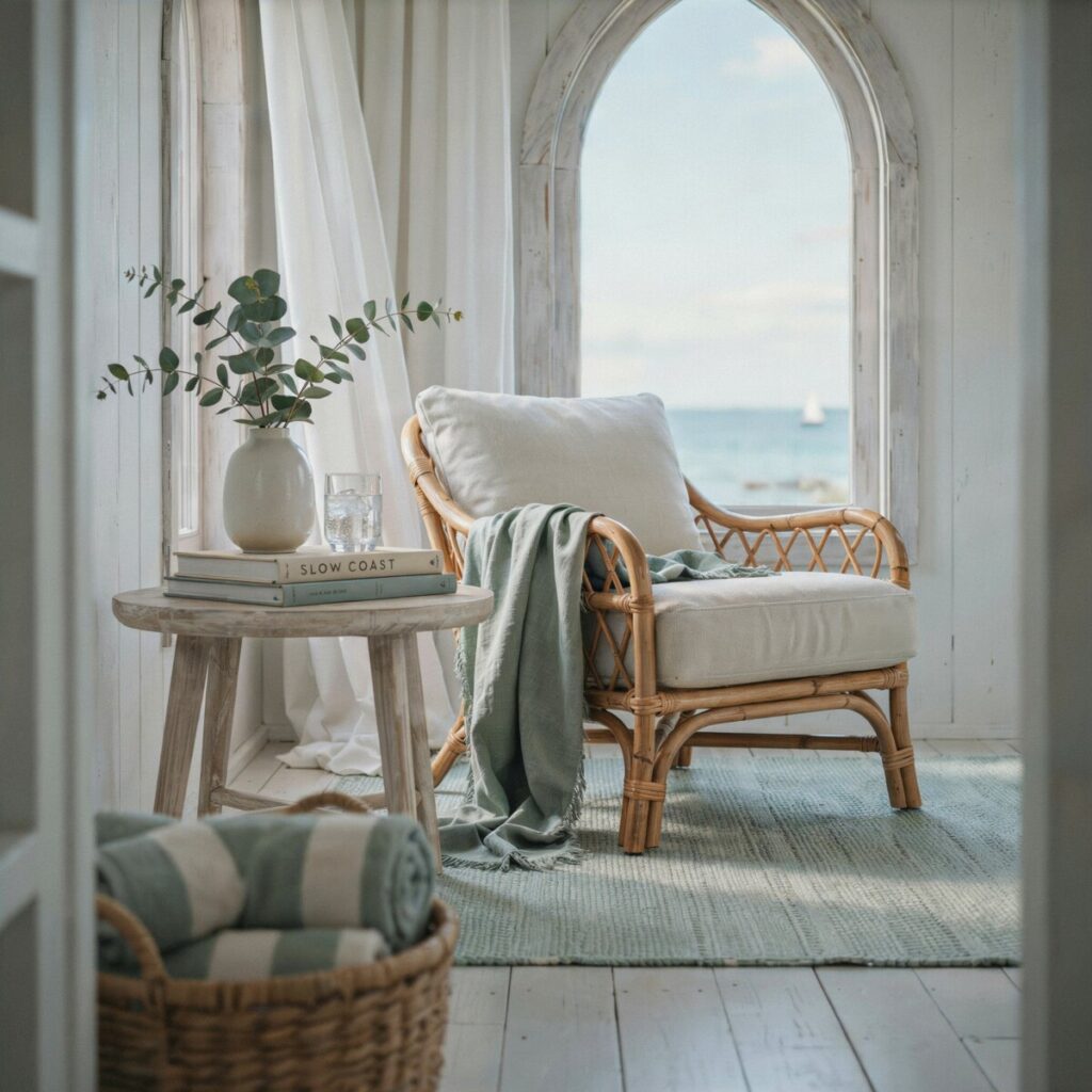
1. Coastal Mint Breeze
Swatches: #CFF5E1 · #9FE8C9 · #6EDAB0 · #F6FFF8
Mood: Barefoot mornings on a Cape Cod porch—salt air, iced tea, linen curtains lifting in the breeze.
Best for: Coastal living rooms, beach-cottage rentals, Instagram branding for wellness or clean-beauty brands.
Pair it with: Bleached oak, woven rattan, matte white ceramics, and driftwood accents.
Quick DIY: Paint a built-in bookshelf #6EDAB0 and style with white pottery and dried pampas.
2. Soft Sage Meadow
Swatches: #DCEBD9 · #BFD6BF · #9FBF9F · #F7F9F6
Mood: A quiet herb garden at golden hour—grounded, botanical, effortlessly French-country.
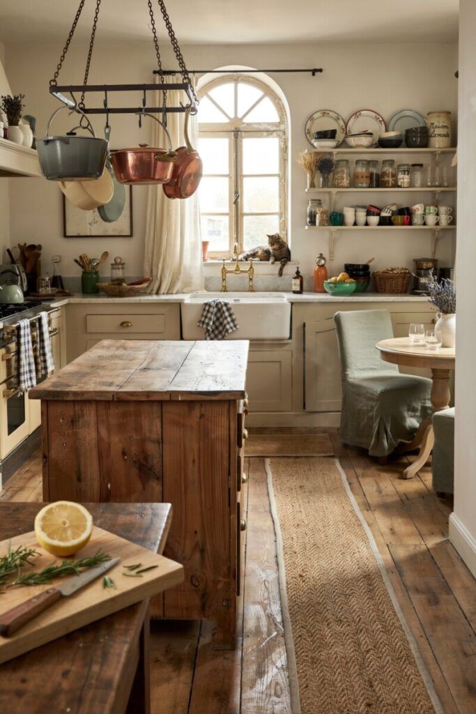
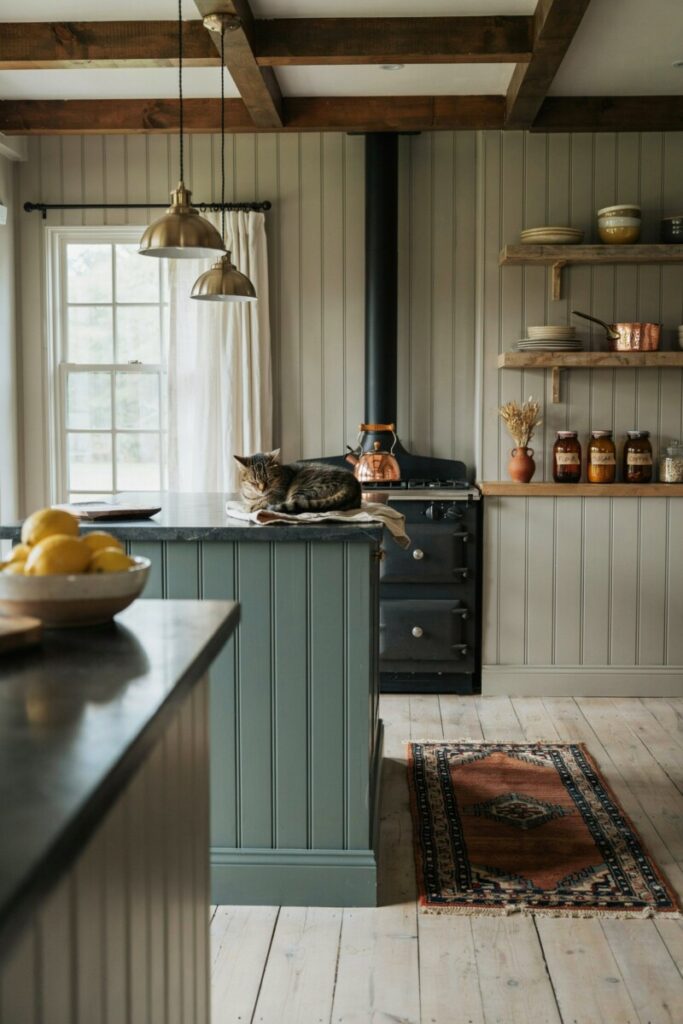
Best for: Kitchen cabinetry, breakfast nooks, summer bridesmaid dresses (sage is the #1 requested bridesmaid hue in the US for 2025–2026).
Pair it with: Unlacquered brass, honed marble, and raw linen roman shades.
Quick DIY: Swap upper cabinet paint to #BFD6BF and add brass cup pulls from Rejuvenation.
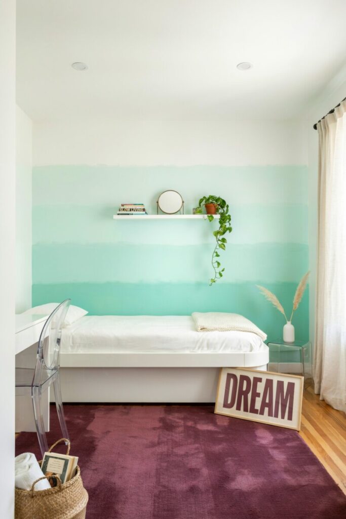
3. Citrus & Mint Spritz
Swatches: #DFF8F1 · #A8EBD6 · #6ED3B3 · #FFDFA8
Mood: Aperol spritzes on a rooftop—playful, citrusy, unapologetically cheerful.
Best for: Gen-Z & millennial brand identities, pool-party invites, kids’ rooms with a modern twist.
Pair it with: Lacquered white, acrylic furniture, and bold typography in a deep aubergine.
Quick DIY: Create a gradient ombre accent wall moving from #DFF8F1 at the ceiling down to #6ED3B3 at the baseboard.
4. Vintage Sage Linen
Swatches: #E6EDE6 · #C7D7C7 · #92B083 · #F2EFEA
Mood: Sun-faded heirloom quilts and a French farmhouse kitchen—warm, heritage-rich, tactile.
Best for: Cottagecore interiors, boutique hotel branding, heirloom-inspired wedding stationery.
Pair it with: Reclaimed barn wood, oil-rubbed bronze, and ticking-stripe textiles.
Quick DIY: Reupholster a thrifted armchair in #92B083 linen from Fabric.com.
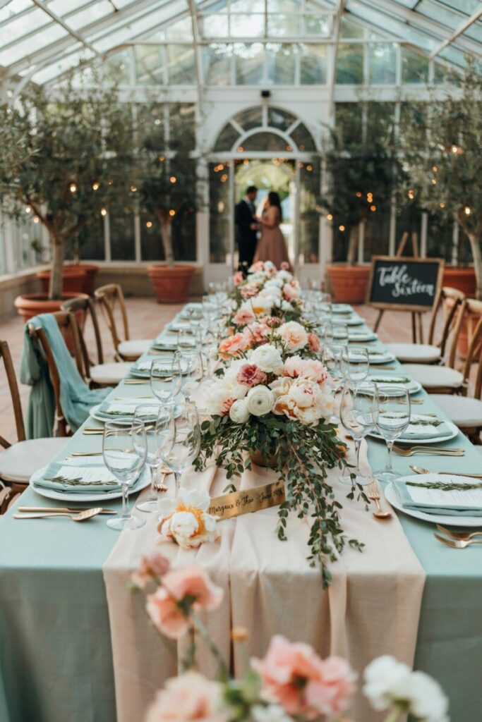
5. Mint & Blush Garden
Swatches: #E8FFF6 · #C9F3E2 · #7FD9B3 · #FFD6DE
Mood: A greenhouse wedding at The Breakers—romantic, feminine, soft-petal pretty.
Best for: Summer weddings, nurseries, beauty brand packaging, feminine home offices.
Pair it with: Rose gold, blush velvet, and white peony arrangements.
Quick DIY: Pair a #7FD9B3 throw with blush lumbar pillows on a white bouclé sofa (try Target’s Threshold line for budget-friendly swaps).
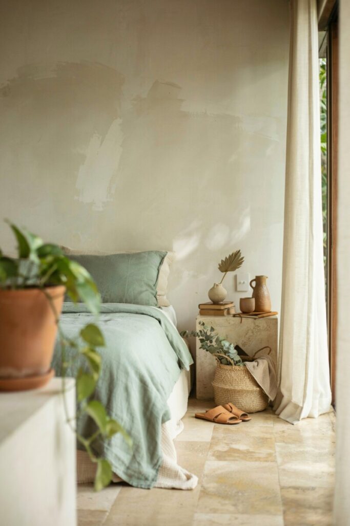
6. Sage & Sand Retreat
Swatches: #EDEBE3 · #CFC9B8 · #98B08F · #D9CBAF
Mood: A Tulum wellness retreat filtered through a J.Crew catalog—earthy, grounded, effortless.
Best for: Spa bathrooms, primary suites, boutique wellness branding, menswear-leaning summer wardrobes.
Pair it with: Travertine, limewash walls, seagrass baskets, and tan leather.
Quick DIY: Limewash a bedroom accent wall in a tone close to #EDEBE3 and layer with #98B08F bedding from Parachute.
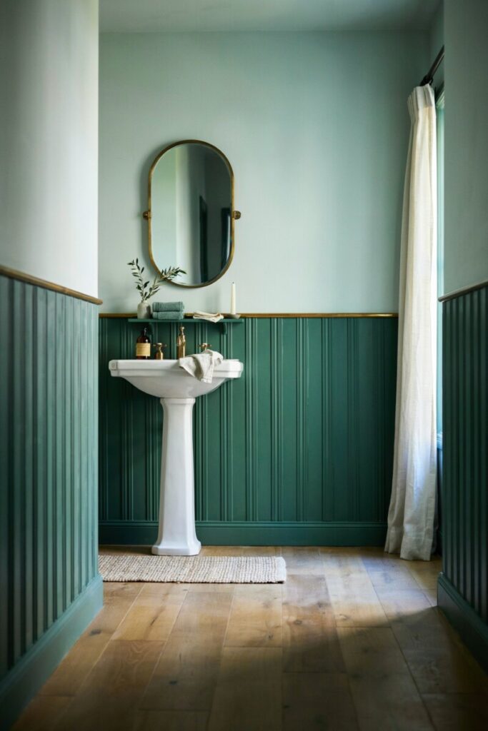
7. Emerald Mint Contrast
Swatches: #DFF4EE · #8FE0B8 · #4CB57C · #0F3B2E
Mood: A moody library garden after rain—dramatic, sophisticated, editorial.
Best for: Powder rooms, dining rooms, high-end brand identities, and fashion lookbooks.
Pair it with: Polished nickel, black marble, and dark-stained walnut.
Quick DIY: Paint a powder room #0F3B2E on the lower two-thirds and #DFF4EE above with a brass picture rail.
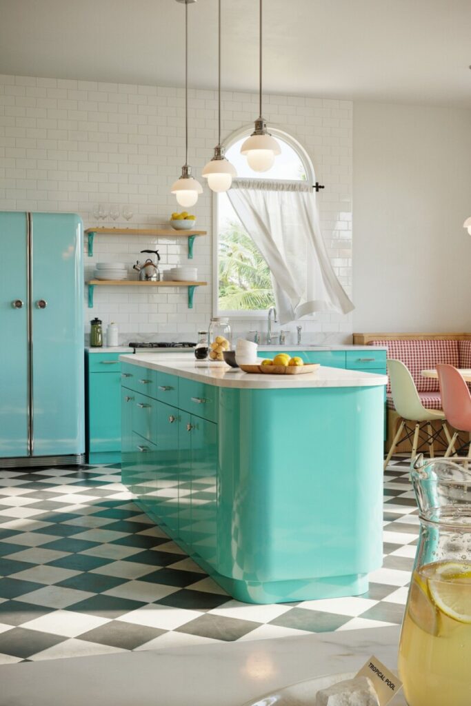
8. Seafoam Classic
Swatches: #E2F8F6 · #BDEEEA · #7FD9D0 · #FFFFFF
Mood: Vintage Palm Beach meets ’50s diner—clean, retro, optimistic.
Best for: Retro-inspired kitchens, ice cream shop branding, summer capsule wardrobes.
Pair it with: Chrome, checkerboard tile, and glossy subway backsplash.
Quick DIY: Swap cabinet hardware for chrome bin pulls and paint the island #7FD9D0 (Benjamin Moore’s Tropical Pool is a close match).
9. Mossy Mint Terrace
Swatches: #EAF7EE · #CFEBD5 · #99D1A8 · #6B8F6B
Mood: An overgrown English terrace in late afternoon—lush, layered, quietly romantic.
Best for: Sunrooms, garden-facing porches, botanical illustration branding, outdoor entertaining.
Pair it with: Terra cotta pots, wrought iron, moss-filled stone, and teak.
Quick DIY: Layer a jute rug with #99D1A8 outdoor cushions from World Market for an instant terrace refresh.
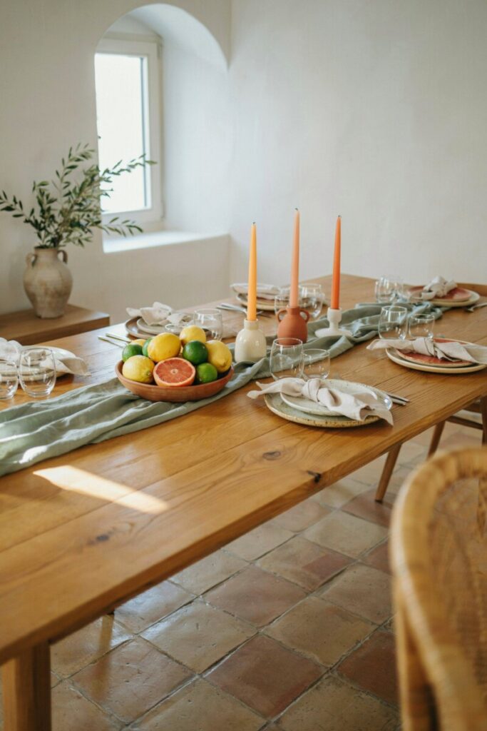
10. Sage Citrus Sunset
Swatches: #F3F7EE · #CDE6CE · #9FCC93 · #FFC67A
Mood: A Sicilian lemon grove at dusk—warm, travel-infused, golden-hour glow.
Best for: Dining rooms, entertaining spaces, travel-blog branding, summer event styling.
Pair it with: Hand-thrown ceramics, olive wood, and terracotta tiles.
Quick DIY: Style a dining table with #FFC67A taper candles, #9FCC93 linen runners, and citrus-centerpiece bowls.
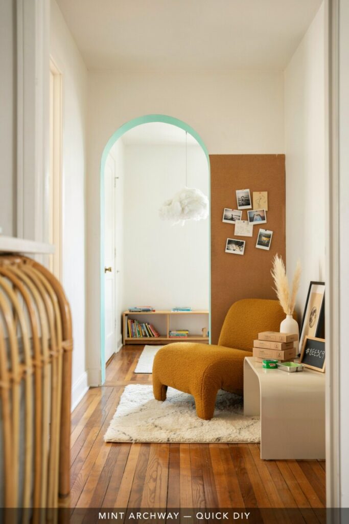
11. Pastel Mint Retro
Swatches: #F0FFF9 · #CFF5EB · #8EE3C9 · #C6F0E0
Mood: A Wes Anderson set design reimagined as a Brooklyn apartment—whimsical, curated, playful.
Best for: Creative studios, kids’ spaces, indie brand packaging, TikTok content sets.
Pair it with: Cork, mustard accents, curved furniture, and shag rugs.
Quick DIY: Paint a hallway arch in #8EE3C9 for an instant statement (use FrogTape for crisp edges).
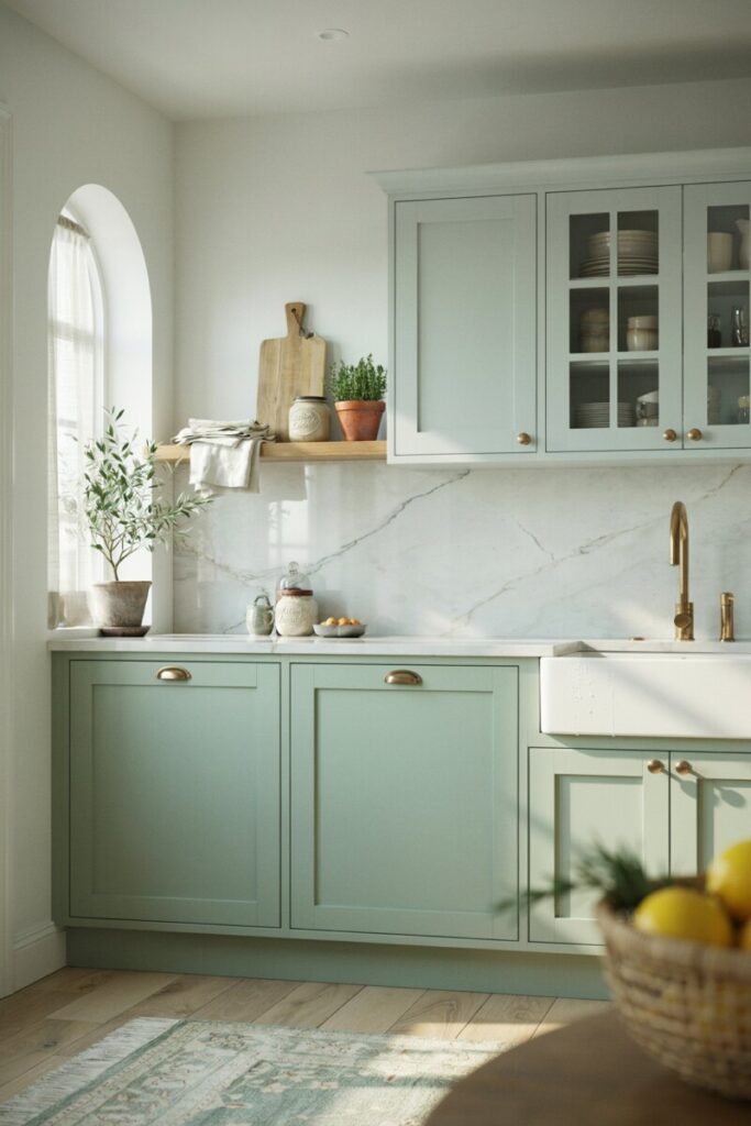
12. Olive-Sage Contrast
Swatches: #EEF3EA · #C9D7C4 · #8EA678 · #5D6B50
Mood: A Provençal farmhouse kitchen at dawn—rustic, herbal, quietly luxurious.
Best for: Kitchen remodels, rustic-chic weddings, organic skincare branding, menswear suiting.
Pair it with: Soapstone counters, unlacquered brass, and butcher block.
Quick DIY: Install #5D6B50 shiplap on a kitchen island for an architectural focal point.
🔍 Quick Accessibility & Contrast Tip
Mint and sage are naturally light-valued colors, which means white body text over them is often unreadable. When designing branding, websites, or signage:
- Use dark charcoal (
#2C2C2C), deep forest (#0F3B2E), or warm espresso (#3B2A1F) for body text. - Run every pairing through a free tool like WebAIM Contrast Checker.
- Reserve the lightest mints for backgrounds only—never for button text or fine print.
This small step keeps your summer design beautiful and ADA-compliant.
🍂 Seasonal Transition: Summer Palettes into Fall & Winter
The beauty of sage is that it’s inherently four-season. You don’t have to scrap your summer palette in September—just deepen it.
- Swap metals: Trade polished brass for oil-rubbed bronze or aged copper.
- Warm the undertones: Introduce terracotta, burnt ochre, or muted clay as accent colors alongside your existing sage.
- Layer texture: Add chunky knits, shearling throws, and velvet pillows in coordinating deeper greens like Pantone’s Sycamore (19-5917 TCX).
- Go darker on walls: Move your mint accent wall to a deeper sage or olive without changing any furniture.
- Soften lighting: Shift from cool daylight bulbs (4000K) to warm amber (2700K) — instantly autumnal.
These swaps let you keep your summer investments while welcoming cozy-season layers.
