
More parents now prefer nurseries that feel calm, timeless, and inclusive—spaces that grow with a child instead of being tied to a single moment or stereotype. The days of hyper-saturated, primary-colored baby rooms are fading, replaced by a desire for spaces that feel like a natural, beautiful extension of the home’s overall aesthetic. If you are expecting or refreshing a child’s space, you are likely searching for gender-neutral nursery color palettes that balance sophisticated style with cozy comfort.
In this guide, we will explore sophisticated palettes, offer pairing guidance, share actionable styling tips, and show you how to make the space grow with your child. Whether you are a first-time parent navigating modern nursery design or a seasoned caregiver looking for fresh neutral nursery ideas, this guide will help you create a beautiful, adaptable room. Let’s dive into the art of crafting a space that is as stylish as it is soothing.
Why Choose Gender-Neutral and Sophisticated?
Cultural and design shifts have radically changed how we approach the nursery. Today, inclusivity and flexibility are paramount. By stepping away from rigid gender norms, you create a welcoming environment that celebrates the child’s individuality rather than a predetermined stereotype. Beyond the cultural benefits, there are highly practical reasons to embrace sophisticated nursery colors.
First, consider longevity and resale value. A timeless, neutral room appeals to a broader range of future homebuyers and saves you from having to completely repaint and redecorate if you welcome another child of a different sex. Second, calming nursery colors actively contribute to a peaceful atmosphere. Babies (and sleep-deprived parents) benefit immensely from environments that lack visual overstimulation. Muted, earthy, and neutral tones lower the heart rate and encourage rest. Finally, a sophisticated base allows for flexible reuse. When the nursery eventually transitions into a toddler room, playroom, or even a home office, a refined color palette ensures the space remains functional and beautiful for years to come.
Palette Principles: What Makes a Palette Sophisticated
What exactly elevates a room from a standard baby room to a space with timeless nursery design? The secret lies in understanding color temperature, saturation, and tonal layering. Sophistication rarely comes from bright, pure colors; instead, it emerges from muted, dusty, or earthy tones that feel complex and grounded.
When exploring nursery palette ideas, rely on the 60-30-10 rule to achieve perfect balance. Your base color (60%) should be a versatile neutral—think warm whites, soft taupes, or pale grays—applied to the walls and large rugs. Your secondary color (30%) adds depth and personality, used on curtains, the glider, or an accent wall. Finally, your accent color (10%) provides a deliberate pop of contrast through throw pillows, art, or hardware.
Texture is the unsung hero of sophisticated spaces. A monochromatic room can fall flat without it. By layering nubby linens, smooth leathers, woven rattan, and plush velvets, you create visual interest without relying on chaotic patterns. Neutrals act as your anchor, allowing these rich textures and subtle accent colors to shine, resulting in a deeply curated, high-end look.
8 Ready-to-Use Color Palettes with Mood Notes
1. Warm Clay + Soft Cream + Sage Accent
This palette evokes the feeling of a sun-drenched desert morning. Soft cream walls keep the room airy, while warm clay tones in textiles add a grounding, earthy coziness. A touch of muted sage green brings in a subtle botanical element.
- Wall Treatment: Matte soft cream paint with a subtle lime-wash finish for depth.
- Furniture/Trim: Light oak or rattan crib and dresser; crisp white trim.
- Textiles: Clay-colored linen curtains and a sage green waffle-knit crib skirt.
- Styling Tip: Add a terracotta pottery lamp on the dresser to reinforce the earthy vibe.
Warm Clay + Soft Cream + Sage = an earthy, sun-drenched sanctuary.
2. Misty Blue + Pale Gray + Warm Wood
Perfect for those who love a coastal or Scandinavian feel without the cliché “baby blue” look. Misty blue is a grayish, desaturated hue that feels incredibly serene, anchored by pale gray and warmed up significantly by natural wood tones.
- Wall Treatment: Pale gray walls with a misty blue accent wall behind the crib.
- Furniture/Trim: Mid-tone walnut or teak furniture; soft white trim.
- Textiles: Chunky knit gray throw blankets and sheer linen curtains.
- Styling Tip: Incorporate a woven jute rug to add natural warmth and texture underfoot.
Misty Blue + Pale Gray + Warm Wood = modern coastal calm.
3. Mushroom Taupe + Blush-Neutral + Black Accent
This is the ultimate scandi-chic palette. Mushroom taupe provides a rich, enveloping neutral base, while a barely-there blush-neutral softens the space. The surprise element is the matte black accent, which adds graphic, grown-up contrast.
- Wall Treatment: Mushroom taupe walls painted in a velvety matte finish.
- Furniture/Trim: Painted white or light wood crib; matte black drawer pulls and curtain rods.
- Textiles: Blush-neutral bouclé glider and cream cotton sheets.
- Styling Tip: Hang black-and-white minimalist line-art prints in thin black frames above the changing table.
Mushroom Taupe + Blush-Neutral + Black = scandi-chic with subtle contrast.
4. Olive Green + Sand + Warm White
An organic, gender neutral nursery decor favorite. Olive green is deeply soothing and connects the indoors with nature, while sand and warm white keep the space from feeling too dark or heavy.
Olive Green + Sand + Warm White = an organic, botanical retreat.
- Wall Treatment: Warm white walls with olive green wainscoting or beadboard on the lower half.
- Furniture/Trim: Unfinished or lightly sealed natural wood crib; sand-colored trim.
- Textiles: Olive velvet lumbar pillows and a sand-colored washable rug.
- Styling Tip: Place a large potted faux olive tree in a woven basket in the corner for instant height and greenery.
Quick Shopping List for the Olive + Sand Palette:
- Crib Finish: Natural white oak or sustainable bamboo.
- Rug Type: Flatweave wool or washable cotton in a sand/oatmeal hue.
- Curtain Fabric: Light-filtering linen in warm white.
- Accent Pillow Color: Deep olive green in a textured velvet or corduroy.
5. Dusty Lavender + Stone + Brass Accent
Elevated soft color without the pink clichés. Dusty lavender is a grayish-purple that reads as a sophisticated neutral rather than a childish pastel. Paired with cool stone grays and warmed by unlacquered brass, it feels incredibly luxurious.
- Wall Treatment: Stone gray walls with a dusty lavender ceiling for a surprising, enveloping effect.
- Furniture/Trim: White painted wood furniture with brushed brass hardware.
- Textiles: Lavender silk or sateen crib sheets and a stone-gray Moroccan trellis rug.
- Styling Tip: Use a brass mobile with delicate geometric shapes to catch the light and add a touch of glam.
Dusty Lavender + Stone + Brass = elevated soft color without the clichés.
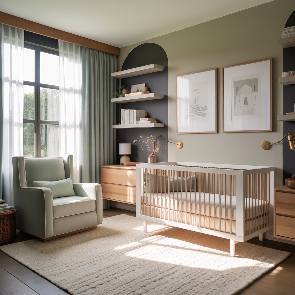
6. Charcoal + Dove Gray + Mustard Accent
For the design-savvy parent who wants a bold, graphic space. Charcoal provides deep, moody drama, dove gray softens the transition, and a muted mustard yellow injects a joyful, energetic pop of color that remains sophisticated.
- Wall Treatment: Dove gray walls with a charcoal painted arch or geometric accent behind the crib.
- Furniture/Trim: Dark espresso or black painted crib; bright white trim for sharp contrast.
- Textiles: Mustard yellow throw blanket and charcoal gray blackout curtains.
- Styling Tip: Use mustard yellow sparingly—perhaps just in the piping of a pillow or the spine of books on a floating shelf.
Charcoal + Dove Gray + Mustard = bold, graphic, and sophisticated.
7. Terracotta + Soft Peach + Ivory
A warm, modern-retro palette that feels like a sunset. Terracotta brings a rich, baked-earth warmth, while soft peach adds a gentle, nurturing glow. Ivory keeps the palette light and breathable.
- Wall Treatment: Ivory walls with a soft peach color-blocked arch.
- Furniture/Trim: Light birch or pine furniture; terracotta-painted wooden drawer knobs.
- Textiles: Ivory macramé wall hangings and peach cotton muslin swaddles displayed in baskets.
- Styling Tip: Incorporate arch-shaped mirrors or rounded furniture edges to echo the soft, retro curves of the 1970s.
Terracotta + Soft Peach + Ivory = warm, modern-retro sunset vibes.
8. Muted Teal + Warm Beige + Natural Wood
A midcentury-inspired palette that feels both vintage and thoroughly modern. Muted teal is a complex, grayish-blue-green that feels deeply relaxing, while warm beige and natural wood prevent it from feeling cold.
- Wall Treatment: Warm beige walls with muted teal built-in shelving or bookcases.
- Furniture/Trim: Teak or walnut midcentury-style dresser and crib; beige trim.
- Textiles: Leather or faux-leather changing pad and a woven rattan light fixture.
- Styling Tip: Add a vintage-style record player on a low media console for soothing lullabies and a cool midcentury focal point.
Muted Teal + Warm Beige + Natural Wood = midcentury-inspired tranquility.
Practical Tips: Paint, Finishes, Lighting, and Texture Choices
When bringing your nursery color ideas to life, the physical materials you choose are just as important as the colors themselves. For nursery walls, an eggshell or satin paint sheen is ideal; it offers a soft, sophisticated glow while being durable enough to wipe clean of inevitable smudges. For trim and baseboards, a semi-gloss finish provides a subtle, elegant contrast and stands up to scuffs.
Because babies are highly sensitive to airborne chemicals, selecting a non-VOC paint nursery safe formula is essential. Look for zero-VOC certifications and GreenGuard Gold labels from trusted brands like Benjamin Moore Aura, Farrow & Ball, or Clare. Always pair matte or eggshell walls with a slightly glossier trim to create architectural depth.
Lighting can make or break your sophisticated palette. Nursery lighting tips always emphasize layered, adjustable light. Avoid harsh, cool-toned overhead lights. Instead, opt for warm bulbs (2700K to 3000K) to make earthy and neutral tones look rich and inviting. Install a dimmer switch on the main overhead light, and rely on a plug-in wall sconce or a small table lamp with a linen shade for soft, ambient nighttime feedings.
Finally, lean heavily into texture to elevate your nursery paint colors. A flat beige room becomes a luxurious retreat when you add a high-pile wool rug, woven seagrass storage baskets, heavy linen drapery, and a bouclé upholstered glider. Texture absorbs sound, making the room quieter and more soothing for the baby.
Safety Sidebox: Designing with Care
- Paint & Air Quality: Always use zero-VOC paints and allow the room to ventilate for at least 48 hours before the baby moves in.
- Crib Safety: Ensure your crib meets current CPSC standards. Avoid drop-side cribs, and ensure slats are no more than 2 3/8 inches apart.
- Cords & Mobiles: Keep all curtain cords, blind pulls, and monitor cords strictly out of reach. Remove crib mobiles once the baby can push up on their hands and knees (usually around 5 months).
Furniture and Accessory Coordination
Mastering nursery furniture coordination is about balancing visual weight and material finishes. If your walls are a cool, pale gray, warm up the space with a honey-oak or walnut crib. If your walls are a warm terracotta or cream, a crisp white or light birch crib will provide a fresh, clean contrast. Avoid buying entire matching furniture sets; mixing a painted dresser with a natural wood crib creates a much more curated, designer look.
When selecting gender neutral nursery decor, let your rugs and curtains do the heavy lifting. A large, washable rug (like those from Ruggable or Lorena Canals) anchors the room and provides a soft landing pad for tummy time. Hang curtains high and wide—close to the ceiling and extending past the window frame—to make the room feel taller and more grand.
For art and mobiles, avoid overly juvenile themes. Instead, opt for abstract landscapes, botanical prints, or simple geometric shapes that complement your color palette. When incorporating pattern, limit it to one or two elements, like a subtly patterned roman shade or a striped throw pillow, to keep the space from feeling overwhelming. Prioritize multipurpose storage, like a dresser with a removable changing topper, to ensure the furniture lasts well beyond the diaper years.
Longevity and Transition Ideas
The true mark of a successful nursery is how well it adapts. Nursery transition ideas focus on creating a flexible shell that can easily evolve into a toddler or big-kid room. The secret is maintaining a neutral, sophisticated base (walls, large furniture, and flooring) and using interchangeable accents to signal the room’s current phase.
When it’s time to transition, you don’t need to repaint. simply swap out the crib for a toddler bed or a full-size mattress, and change the textiles. Replace the baby mobile with a striking pendant light, and swap the changing table topper for a wooden desk or a cozy reading nook. By keeping your calming nursery colors intact on the walls, you ensure the room remains a restful sanctuary. Introduce playful, age-appropriate elements through easily changeable items like bedding, removable wall decals, and colorful toy storage bins, allowing the child’s personality to shine without compromising the room’s foundational elegance.
Quick DIY and Budget-Friendly Swaps
You don’t need a massive renovation budget to achieve a high-end look. Nursery decorating tips often rely on clever, low-cost updates. If painting the whole room feels daunting, try painting a single accent wall, an arch, or even just the ceiling for a dramatic “fifth wall” effect.
Update standard, builder-grade dresser knobs with modern leather pulls, brushed brass handles, or custom wooden knobs. Swap out a basic crib skirt for a tailored, box-pleated linen cover, or simply use a beautiful throw blanket draped over the glider to add instant color. Frame affordable, printable digital art in high-quality, oversized thrifted frames for a gallery-wall feel. Finally, consider peel-and-stick wallpaper for a temporary, renter-friendly way to add sophisticated pattern and texture without the long-term commitment.
Bring Your Vision to Life
Designing a sophisticated, gender-neutral nursery is an investment in your home’s aesthetic and your family’s peace of mind. By choosing muted, earthy, and timeless palettes, you create a calming sanctuary that grows seamlessly with your child. Pick your favorite palette from this guide, try one styling tip today, and enjoy building a beautiful space you’ll love for years to come.
