
When it comes to interior design, neutral paint colors are the undisputed champions of versatility. They serve as the perfect backdrop for your life, allowing your furniture, art, and personality to take center stage. Yet, there is a lingering misconception that painting your walls a neutral shade means settling for a bland, builder-grade, or “boring” aesthetic. Nothing could be further from the truth.
The secret to a stunning home isn’t about avoiding neutrals; it’s about choosing the right ones. In this guide, we will explore the best neutral paint colors that feel modern, cozy, and incredibly sophisticated. Whether you are looking for neutral paint colors that don’t feel boring for a major renovation or just want to refresh a single room, we will break down exactly how to choose the right hue, test it properly, and style it beautifully in your home.
What Makes a Neutral “Not Boring”?
A neutral wall only feels flat when it lacks depth, context, or contrast. The secret to a captivating space lies in understanding undertones, playing with depth, and layering your design elements.
Modern neutral paint colors are rarely just “beige” or “gray.” They are complex, chameleon-like shades that shift with the light. Neutrals with warm undertones (like subtle hints of yellow, red, or peach) make a room feel inviting and grounded, while cool undertones (like blue or green) create a crisp, serene atmosphere.
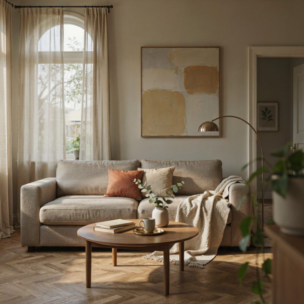
Beyond the paint itself, texture and contrast are your best friends. A room painted in a single flat shade will always feel dull. But when you layer a warm greige wall with crisp white trim, natural wood furniture, and textured woven rugs, the neutral becomes a rich, dynamic canvas.
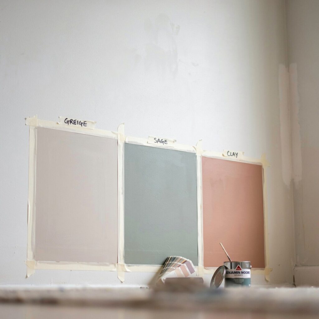
Click to expand: Understanding Greige vs. Gray Differences
One of the most common questions designers get is about the greige vs gray differences.
- Gray is a mix of black and white, often leaning cool with blue or purple undertones. It feels modern and crisp but can feel chilly in north-facing rooms.
- Greige is a blend of gray and beige. It takes the modern, sophisticated edge of gray and warms it up with the earthy, cozy qualities of beige. Greige is incredibly forgiving and works beautifully in almost any lighting condition, making it a top choice for whole-home palettes.
How to Test Neutrals at Home
Learning how to choose a neutral paint color requires seeing the paint in your actual space. Lighting, shadows, and surrounding furniture drastically alter how a color reads. If you want to find the best neutral wall colors for your specific home, follow this foolproof testing method.
- Buy large samples: Skip the tiny one-inch paper swatches; they hide undertones and mislead the eye. Purchase large peel-and-stick samples or buy sample pots of paint.
- Paint large swatches: If using liquid paint, brush two coats onto a piece of white poster board (not directly on the wall, so you can move it).
- Move it around: Place the board on multiple walls. A wall opposite a window will look lighter, while an adjacent wall will show the true depth of the color.
- Observe at different times: Check the color in the crisp morning light, the warm golden hour, and at night with your artificial lamps turned on.
- View with your furnishings: Hold the sample next to your sofa, flooring, and fixed elements like stone fireplaces or wood cabinets.
Common Testing Pitfalls to Avoid
- The “North-Facing” Trap: If your home faces north, the natural light will be cool and bluish. A cool gray might end up feeling icy and institutional. Try a warmer greige to balance the light.
- Ignoring the Trim: Always test your wall color right next to your existing trim or your planned trim color. A warm white trim can make a cool gray wall look accidentally purple.
- Rushing the Process: Never buy a gallon of paint after looking at a sample for five minutes. Live with the sample for at least 48 hours.
Top 12 Neutral Paint Colors That Don’t Feel Boring
Here are our top paint color recommendations, featuring warm greige paint colors, creamy whites, and sophisticated taupes from top US brands. (Note: Always visit the official brand pages for the most accurate digital color swatches, as screen resolutions vary.)
The Warm & Inviting Greiges
1. Benjamin Moore Revere Pewter (HC-172)
- The Hue: A legendary, medium-toned warm greige that effortlessly bridges the gap between gray and beige.
- Best Rooms: Living rooms and open-concept spaces with ample natural light.
- Pairings: Crisp white trim (like BM White Dove) and rich walnut wood tones.
- Styling Tip: Layer with textured linen throw pillows and matte black hardware for a modern, grounded feel.
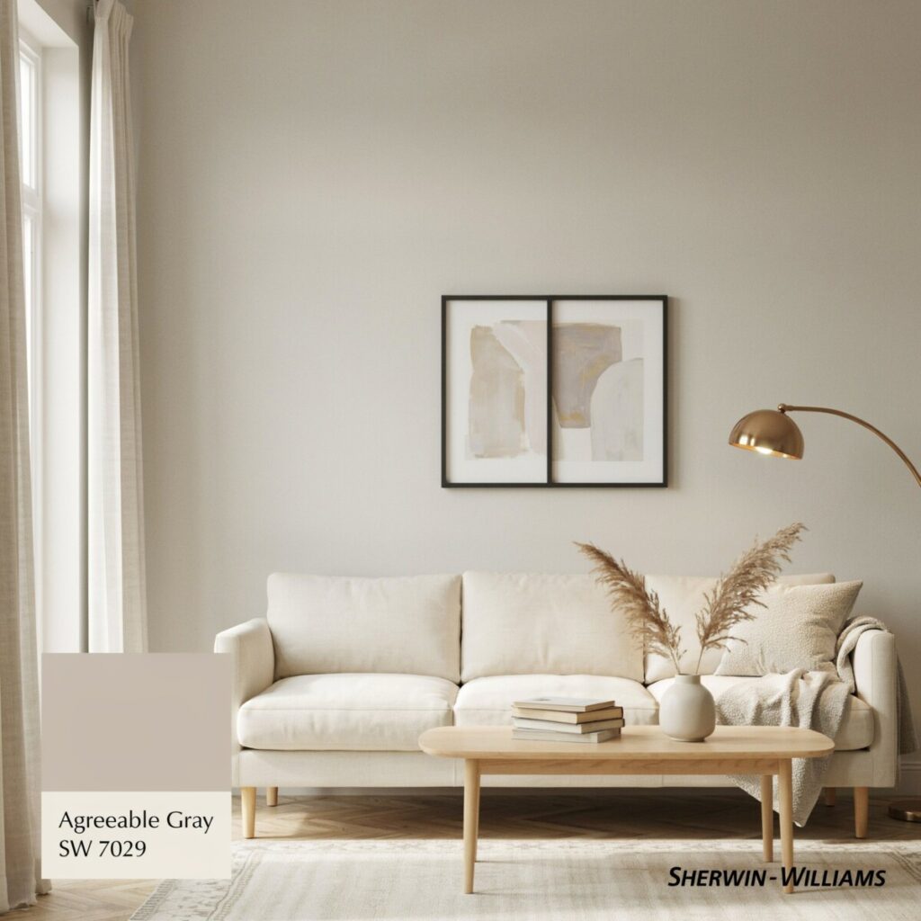
2. Sherwin-Williams Agreeable Gray (SW 7029)
- The Hue: A highly versatile, light-to-medium greige with a very subtle taupe undertone that prevents it from looking flat.
- Best Rooms: Hallways, main living areas, and bedrooms.
- Pairings: Warm brass fixtures and soft cream textiles.
- Styling Tip: Use as a whole-home neutral to create a seamless, flowing floor plan.
3. Sherwin-Williams Accessible Beige (SW 7036)
- The Hue: A soft, warm beige with a faint gray backbone, keeping it from looking too yellow or dated.
- Best Rooms: South-facing rooms where it will glow beautifully in the sunlight.
- Pairings: Navy blue accents and dark espresso wood furniture.
- Styling Tip: Add a jute or sisal rug to enhance its natural, earthy warmth.
4. Sherwin-Williams Anew Gray (SW 7030)
- The Hue: A soft greige that leans just slightly cool, offering a crisp, clean, and highly sophisticated look.
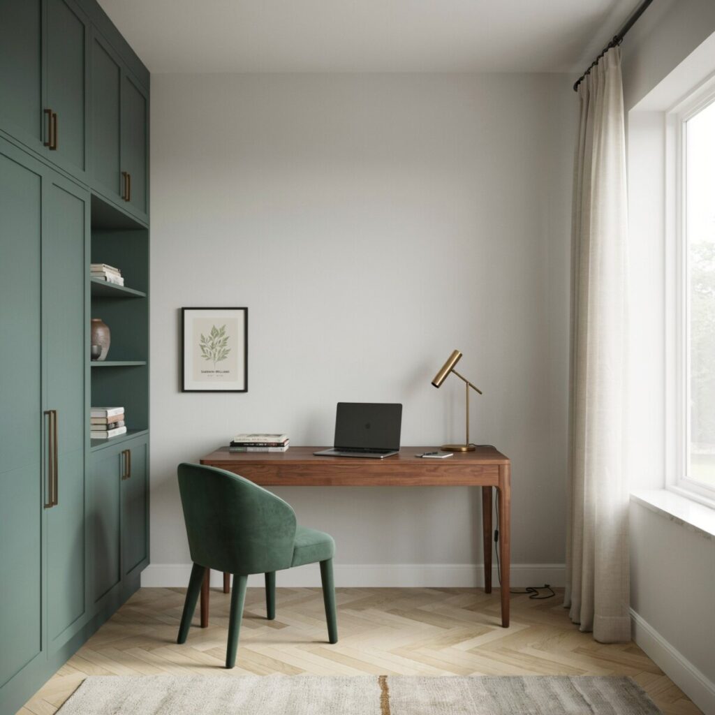
- Best Rooms: Home offices and modern kitchens.
- Pairings: Stainless steel appliances and bright white quartz countertops.
- Styling Tip: Contrast with deep forest green cabinetry or accent chairs.
The Light & Airy Soft Grays
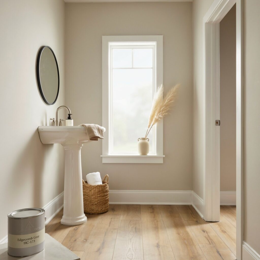
5. Benjamin Moore Edgecomb Gray (HC-173)
- The Hue: A very light, creamy greige that reads as a soft, warm off-white in bright rooms.
- Best Rooms: Neutral paint colors for small rooms like powder baths or narrow hallways, as it recedes and opens up the space.
- Pairings: Bright white trim and pale oak flooring.
- Styling Tip: Keep the decor minimalist and airy to let the light-reflecting qualities shine.
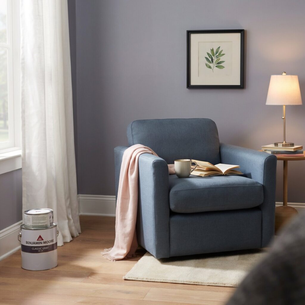
6. Benjamin Moore Classic Gray (OC-23)
- The Hue: An incredibly light, soft gray with a whisper of purple/warm undertone that keeps it feeling cozy, not sterile.
- Best Rooms: Bedrooms and reading nooks.
- Pairings: Soft blush pinks, dusty blues, and brushed nickel hardware.
- Styling Tip: If you’re renting and can’t change the trim, this color plays very nicely with standard builder-white baseboards.
7. Farrow & Ball Cornforth White (No. 228)
- The Hue: A brilliant “cool warm” gray that sits perfectly on the fence, shifting between a warm stone and a cool gray depending on the light.
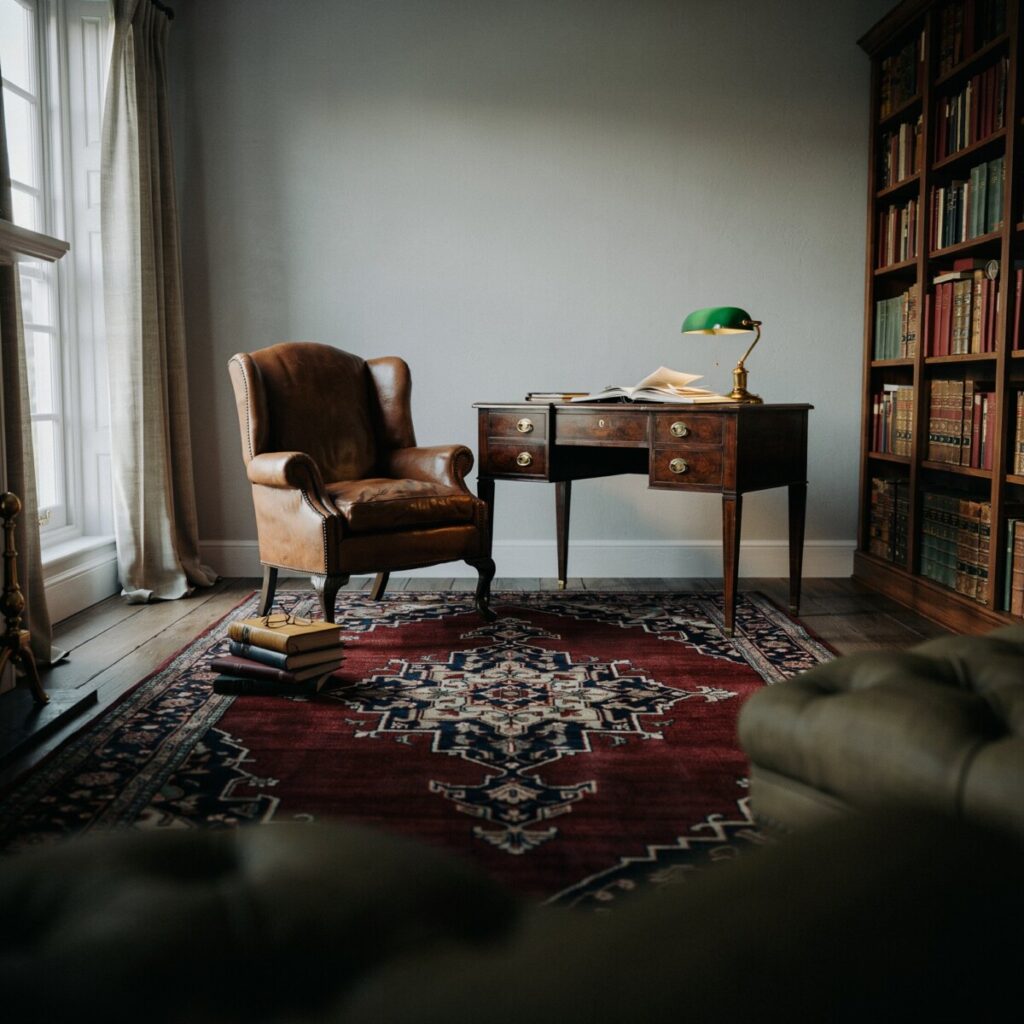
- Best Rooms: Dining rooms and studies.
- Pairings: Dark, moody wood antiques and vintage Persian rugs.
- Styling Tip: Use in a matte or chalky finish to highlight its historical, architectural depth.
The Bright & Creamy Whites
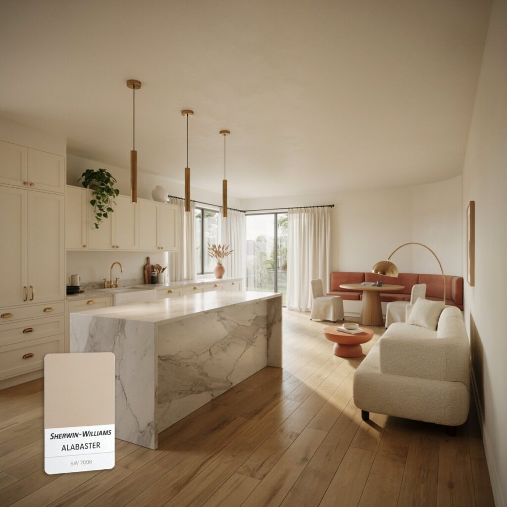
8. Sherwin-Williams Alabaster (SW 7008)
- The Hue: A soft, creamy white with subtle yellow/beige undertones. It is bright but never harsh or blinding.
- Best Rooms: Kitchens, living rooms, and sunrooms.
- Pairings: Warm wood tones, terracotta accents, and unlacquered brass.
- Styling Tip: Use on both walls and ceiling for a seamless, enveloping, and expansive feel.
9. Benjamin Moore White Dove (OC-17)
- The Hue: A slightly warmer, highly adaptable white that lacks the starkness of pure white. It is a designer favorite for a reason.
- Best Rooms: Excellent for trim, doors, and cabinets, but also beautiful on walls in cozy dens.
- Pairings: Almost any wall color, but especially stunning against deep charcoals or navy blues.
- Styling Tip: Use White Dove on your trim and a slightly darker greige on the walls for a classic, high-contrast look.
The Rich & Moody Taupes
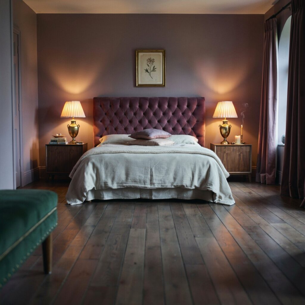
10. Farrow & Ball Elephant’s Breath (No. 229)
- The Hue: A rich, warm, mid-tone gray with a distinct magenta/lilac undertone that makes it feel incredibly luxurious and earthy.
- Best Rooms: Primary bedrooms and intimate sitting rooms.
- Pairings: Velvet upholstery, dark wood, and antique gold accents.
- Styling Tip: Pair with warm, dimmable lighting to bring out its cozy, enveloping qualities in the evening.
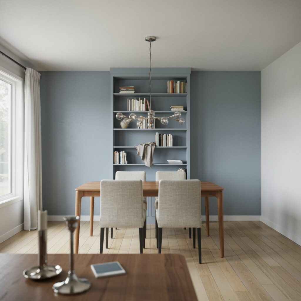
11. Benjamin Moore Stonington Gray (HC-170)
- The Hue: A cooler, stormy gray with a slight blue undertone. It provides excellent depth and acts as a fantastic “darker neutral.”
- Best Rooms: Accent walls, dining rooms, and exterior shutters.
- Pairings: Crisp, bright whites and polished chrome or polished nickel.
- Styling Tip: Use it on built-in bookshelves or kitchen islands to ground the room without using black.
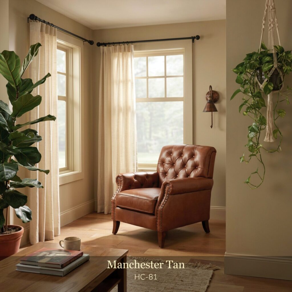
12. Benjamin Moore Manchester Tan (HC-81)
- The Hue: A muted, earthy neutral that leans heavily into a soft, sophisticated khaki/beige with green undertones.
- Best Rooms: Sunrooms, mudrooms, and Craftsman-style homes.
- Pairings: Sage greens, leather furniture, and oil-rubbed bronze.
- Styling Tip: Bring in plenty of live indoor plants; the green undertones in the paint will make the foliage pop.
Room-by-Room Quick Guide
Finding the best neutral paint colors for living room spaces or quiet bedrooms depends on the mood you want to cultivate. Here is a quick cheat sheet for your home.
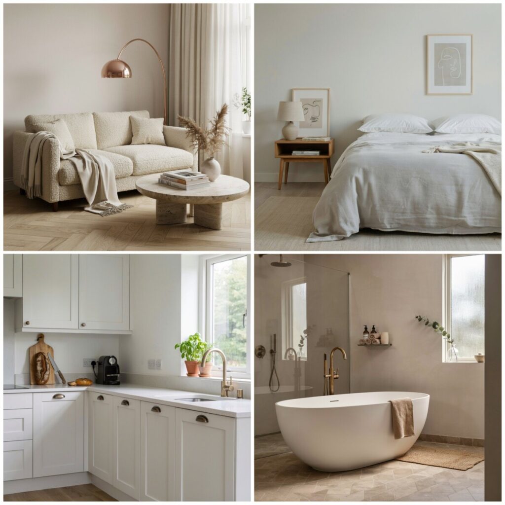
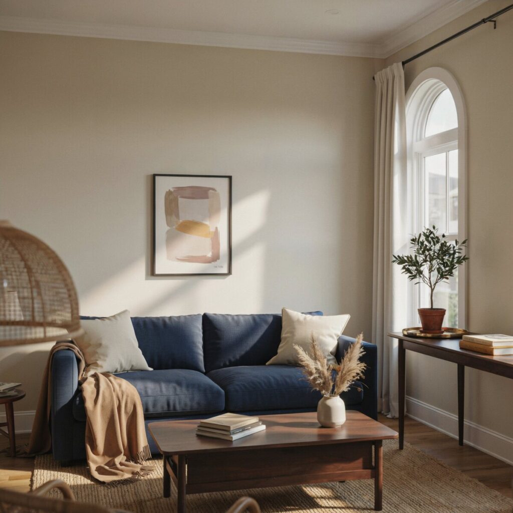
- Living Room: Aim for a sociable, cozy feel. A warm greige like Agreeable Gray or Revere Pewter creates a welcoming backdrop. Consider an accent wall in a deeper shade like Stonington Gray behind the television or sofa to add architectural interest.
- Bedroom: Prioritize rest and relaxation. Creamy, calming neutrals like Classic Gray or Alabaster lower the heart rate and create a restful vibe. Avoid high-contrast colors here; keep the palette soft and monochromatic.
- Kitchen: Clean, warm whites like White Dove or light greiges are perfect for cabinets and walls. They pair beautifully with natural wood open shelving and brass hardware, keeping the heart of the home feeling bright and hygienic.
- Bathroom: Always choose a mildew-resistant paint formula. For small, low-light bathrooms, use slightly warmer neutrals like Edgecomb Gray to prevent the space from feeling like a sterile clinic. Crisp whites work best in large, sun-drenched primary baths.
- Hallways and Trim: Hallways connect your rooms, so use a versatile, mid-tone neutral that flows well with adjacent spaces. For trim, use a slightly lighter or brighter white (like White Dove) to frame the walls. In entryways, don’t be afraid to use a deep neutral to create a dramatic, memorable first impression.
Pairing Neutrals with Color and Materials
A neutral room only feels “boring” if you stop at the paint. The magic happens when you layer materials and introduce thoughtful accent colors.
Adding Warmth and Texture
If your walls are a cool gray, you must introduce warmth through your furnishings. Natural wood tones (like white oak, walnut, or rattan) instantly warm up a space. Incorporate brushed brass or unlacquered brass hardware and lighting for a touch of vintage glamour. Textured textiles—think chunky knit throws, bouclé chairs, and nubby linen curtains—add visual weight and physical comfort, ensuring the room feels lived-in and inviting.
Adding Modern Contrast
To keep a neutral space from feeling too “safe,” introduce sharp, modern contrasts. Matte black light fixtures, black window mullions, or dark iron hardware provide a striking graphic element against light greige walls.
Don’t be afraid of color! Neutrals are the ultimate team players. Deep jewel tones like navy blue, emerald forest green, and rich burgundy look incredibly sophisticated against warm taupes. For a softer, more romantic look, introduce dusty pink, terracotta, or muted sage green through your pillows, art, and ceramics. These accents lift neutral walls and give the eye a place to rest.
Finish and Sheen Recommendations
Choosing the right paint sheen is just as important as choosing the color. The sheen affects both how the color is perceived and how easy it is to clean.
- Flat/Matte: Absorbs light, hiding wall imperfections beautifully. It makes colors look rich and velvety. Best for low-traffic areas like guest bedrooms and ceilings. Avoid in kitchens and kids’ rooms, as it is hard to clean.
- Eggshell: The gold standard for living areas, dining rooms, and bedrooms. It has a very subtle, soft luster (like an eggshell) that reflects a tiny bit of light, making the room feel brighter while still being wipeable.
- Satin: Slightly more reflective and highly durable. Ideal for high-traffic areas like hallways, kids’ rooms, kitchens, and bathroom walls.
- Semi-Gloss: Very shiny and highly moisture-resistant. Reserve this for trim, baseboards, doors, and bathroom cabinets. The contrast between an eggshell wall and semi-gloss trim beautifully frames your room.
Pro Tip: Always buy high-quality paint. Premium paints hold their color better, resist scuffs, and provide a much more luxurious finish, regardless of the sheen you choose. [Internal Link: Read our complete guide to paint finishes and sheens here.]
Final Checklist and Actionable Next Steps
Ready to transform your space? Before you head to the hardware store, run through this quick checklist to ensure your project is a success:
- [ ] Sample properly: Buy large peel-and-stick samples or sample pots of your top three choices.
- [ ] Test in natural light: Place samples on multiple walls and observe them morning, noon, and night.
- [ ] Compare with fixed elements: Hold the samples next to your flooring, cabinets, and favorite furniture pieces.
- [ ] Pick your trim color: Ensure your wall color and trim color have compatible undertones.
- [ ] Select the right finish: Choose eggshell for living spaces and semi-gloss for trim.
- [ ] Live with it: Paint a three-by-three-foot patch on a poster board and live with it for a week before committing to a gallon.
For more inspiration, bookmark the official color visualizer tools on the Benjamin Moore and Sherwin-Williams websites. You can upload photos of your own rooms and digitally “paint” the walls to see how these beautiful, non-boring neutrals look in your unique space.
