
There’s a reason model homes feel so effortless. It isn’t the furniture budget or the staging — it’s color continuity. A thoughtful whole-house color palette ties every room together, makes small homes feel larger, and quietly boosts resale value (buyers consistently rank “move-in ready flow” near the top of their wish lists).
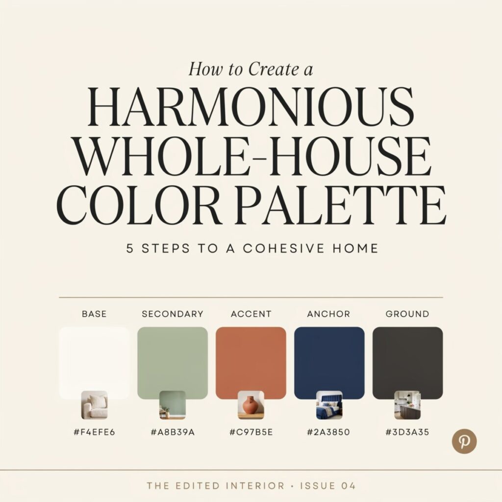
A whole-house color palette is simply a curated set of five to seven paint colors — a few core neutrals, one or two coordinating tones, and a handful of accents — that you repeat and remix from the foyer to the finished basement. When done well, rooms feel connected without looking matchy-matchy.
In this guide, you’ll learn how to pick base neutrals, map colors room by room, work with undertones and natural light, and avoid the most common mistakes DIY decorators make. By the end, you’ll have a practical plan you can start this weekend.
Why Color Continuity Matters
Walk into a home where every room is a different, unrelated color and you’ll feel it immediately — a subtle visual fatigue, a sense that the house is a collection of spaces rather than a single story. A cohesive color palette does the opposite. It guides the eye, calms the nervous system, and makes square footage feel generous.
This matters especially in the homes most Americans actually live in:
- Open-concept homes, where the living room, kitchen, and dining area share one long sightline. Disjointed colors read as clutter.
- Older suburban colonials and ranches, where narrow hallways connect bedrooms. Continuity keeps those transitions from feeling choppy.
- Urban condos and apartments, where every inch counts and color flow can make a 900-square-foot unit feel like 1,200.
Real estate data backs this up. Staged homes with a restrained, neutral-leaning palette tend to photograph better for listings and appraise more consistently. A whole-house color palette isn’t just aesthetic — it’s a small investment with measurable return.
Start with a Foundation: Choosing Your Base Neutrals
Every successful palette begins with two or three base neutrals. These are the quiet workhorses — the colors that show up on most of your walls, trim, and ceilings. Everything else (accents, artwork, textiles) layers on top.
What counts as a base neutral?
A base neutral isn’t necessarily “white.” It’s any low-saturation color that recedes visually and plays nicely with many other tones. Popular families in US homes right now include:
- Greige (a grey-beige hybrid) — the single most versatile choice since ~2018 and still a top pick among paint color trends 2026.
- Warm beige and cream — coming back strong as maximalism and warm minimalism both favor cozy, sunlit rooms.
- Soft whites with subtle undertones — not the stark gallery whites of the 2010s, but warmer off-whites.
- Warm greys with taupe or green undertones — cooler than greige but less severe than concrete grey.
Don’t forget trim and ceiling
Trim color is a secret weapon. One consistent trim color throughout the home — even if wall colors change room to room — is the fastest glue for color continuity. Ceilings, often ignored, can either disappear (soft white) or contribute tonal depth (a paler shade of the wall color).
Three neutral starter combinations
- Warm greige walls + crisp white trim + soft cream ceiling
Best for: Open-concept main floors with mixed wood tones. The greige warms up north-facing rooms; the white trim keeps things airy. - Soft ivory walls + warm white trim + pale taupe ceiling
Best for: Traditional and modern farmhouse homes where you want a lived-in, sunlit feel without yellowing. - Pale mushroom walls + off-white trim + same-tone ceiling
Best for: Small-town ranch homes or urban condos where tonal layering stretches perceived square footage.
Build a Color Map: Room-by-Room Strategy
Once you have your neutrals locked in, it’s time to assign them. Think of your home as a map with four zones:
- Main living spaces (living room, kitchen, dining) → your primary base neutral
- Private retreats (bedrooms, reading nooks) → a coordinating softer neutral or a muted tint from the same color family
- Accent rooms (home office, dining room, powder room) → a darker or more saturated tone for drama
- Pop moments (pillows, a single cabinet, artwork) → your accent color family
The sightline rule
Stand in your front doorway. What rooms can you see from there? Stand in the kitchen — what peeks around the corner? Connected sightlines must use related colors. A bold red dining room visible from a sage-green living room will feel chaotic. A deep navy dining room visible from a soft greige living room? Elegant.
Hallways and transitional spaces
Hallways should almost always be your main base neutral or a shade lighter. They’re the visual “breath” between stronger rooms. Paint them a bold color and every adjoining room competes.
A three-room flow example
| Room | Wall Color | Trim | Rationale |
|---|---|---|---|
| Living room | Soft greige | Crisp white | Anchors open space; works with any upholstery |
| Adjacent dining room | Deep navy | Same crisp white | Dramatic but shares trim, tying it to the living room |
| Hallway connecting to bedrooms | Soft greige (same as living room) | Same crisp white | Acts as a palate cleanser; eases the transition |
The repeat of trim and the recurring greige creates color flow without repetition fatigue.
Choosing Accent Colors and Where to Use Them
Accent colors are where personality lives — but they need guardrails.
Where to find your accent colors
Pull them from something already in the home:
- A favorite rug or piece of upholstery
- A painting you’ll never part with
- The natural palette outside your windows (coastal homes lean seafoam and sandy tan; mountain homes lean moss and stone)
The distribution rule
Use the 60-30-10 ratio as a loose guide:
- 60% — your dominant neutral (walls, large furniture)
- 30% — a secondary tone (curtains, an accent wall, area rugs)
- 10% — pops of true accent (pillows, vases, cabinet interiors)
For a calmer home, try 70-20-10 and give the middle 20% to tonal variations of your neutral.
Where to place accents
- Pillows and throws (easy to swap seasonally)
- A single bold accent wall behind a bed or sofa
- Painted cabinetry in kitchen or bath islands
- Trim or interior door paint for a surprisingly modern touch
- Powder room ceilings — a playful, low-commitment spot
Two accent-family examples
- Coastal accents: seafoam, sandy tan, soft coral. Pair with greige or soft white bases.
- Modern bold accents: mustard, deep teal, burnt terracotta. Pair with warm grey or mushroom bases for high contrast and balance.
Understanding Undertones and Lighting
This is where many DIY color projects quietly fail. Two “white” paints in the same room can look beige next to blue — that’s undertones at work.
Warm vs cool undertones
- Warm undertones lean yellow, red, or peach. They feel cozy and pair beautifully with oak, walnut, and brass.
- Cool undertones lean blue, green, or violet. They feel crisp and pair well with maple, chrome, and marble.
- Neutral undertones sit in the middle — greige is the classic example.
The lighting test (don’t skip it)
Color changes dramatically with light. Before committing:
- Buy sample pots of your top 3 candidates.
- Paint large swatches (at least 2′ × 2′) on at least two walls in the room.
- Check them at three times: morning, midday artificial, and evening lamp light.
- Notice how north-facing rooms pull cool, while south-facing rooms pull warm — the same paint can look like two different colors.
LED bulbs also bias color. Warm LEDs (2700K) flatter warm undertones but muddy cool ones; daylight bulbs (5000K) do the reverse. Pick the bulb before you finalize the paint.
Textures, Finishes, and Coordinating Materials
Color doesn’t live on walls alone. The finish you choose — matte, eggshell, satin, semi-gloss — changes how a color reads. Matte absorbs light and reads softer and darker; gloss reflects and reads brighter and sharper. A satin navy looks entirely different from a matte navy.
Texture adds a second dimension:
- Natural wood floors warm up cool palette choices.
- Stone and tile introduce their own undertones (travertine brings warmth; Carrara marble brings cool grey).
- Metal hardware (brass, matte black, brushed nickel) reads as an accent color whether you mean it to or not.
Coordinate finishes room to room — for example, use eggshell on all living-space walls and satin on all trim throughout the home — and your palette will feel professionally designed, even if you did it yourself.
Accessibility note: color contrast and readability
When pairing colors for signage, labels, or contrast-heavy spaces (like a home office), aim for high contrast between text and background — dark charcoal on warm ivory, not pale grey on pale beige. For color-blind-friendly homes, lean on value contrast (light vs. dark) rather than hue contrast (red vs. green). Tools like WebAIM’s contrast checker work just as well for design choices around the house.
Color Palettes by Popular US Styles
Need a shortcut? Here are four palette families that work beautifully across whole-home applications.
Modern Farmhouse
Colors: Warm white, soft greige, muted sage, matte black accents.
Use it for: Shiplap walls, painted cabinetry in sage, black window mullions. Pair with natural oak and linen.
Coastal
Colors: Soft white, pale seafoam, sandy taupe, driftwood grey.
Use it for: Beach houses, lake properties, or anywhere you want an airy retreat. Avoid nautical clichés — keep shells for the shelf, not the palette.
Midcentury Modern
Colors: Warm ivory, mustard, burnt orange, walnut-tone browns, teal.
Use it for: Homes with original wood paneling or vintage furniture. Keep walls neutral and let accents carry the era.
Minimal / Scandinavian
Colors: Off-white, pale grey, warm birch tones, single soft accent (dusty pink or sage).
Use it for: Small condos and rentals. The restraint maximizes light and perceived space.
Common Mistakes to Avoid
Even experienced decorators slip up. Watch for these:
- Overloading on trendy brights. A neon accent wall looks fresh in year one and dated by year three.
- Ignoring undertones. Mixing a yellow-beige with a blue-grey in the same sightline reads as “something’s off” even if you can’t name why.
- Skipping large-swatch testing. A 2-inch chip on a paint-deck does not predict wall behavior.
- Mismatched trim. Different trim colors in adjacent rooms are the #1 flow-killer.
- Inconsistent finishes. Eggshell in one room, flat in the next, semi-gloss in the third — keep the finish schedule consistent.
Quick Checklist and Action Plan
- [ ] Pick one base neutral for main living spaces and buy a sample pot.
- [ ] Choose one consistent trim color for the entire home.
- [ ] Paint 2’×2′ swatches on at least two walls per room.
- [ ] Observe swatches in morning, afternoon, and evening light.
- [ ] Map sightlines and confirm connected rooms share color family.
- [ ] Assign one coordinating neutral for bedrooms.
- [ ] Pick one deeper tone for a single accent room (office, dining, powder).
- [ ] Choose one accent color family (3–4 tones) for textiles and decor.
- [ ] Create a simple color mood board — physical or digital — before buying paint.
- [ ] Commit to one consistent finish schedule (e.g., eggshell walls, satin trim, matte ceilings).
Final Design Tips
A harmonious whole-house color palette isn’t about perfection — it’s about decisions made with intention. Pick your neutrals first, respect sightlines, test on the actual walls, and let accent colors do the talking in small, confident doses. A home that flows color-wise feels larger, calmer, and unmistakably yours.
Start by picking one base neutral and testing it in your living room this weekend.
