
Imagine stepping into your bathroom after a long day and feeling the tension melt away — not because of fluffy towels or a luxe soaking tub, but because the walls, lighting, and finishes wrap you in a calm, spa-like atmosphere. The right color can do that. A well-chosen palette doesn’t just look good; it shifts your mood, softens the edges of a busy day, and makes even a modest powder room feel like a private retreat.
If you’ve been scrolling Pinterest and wondering how to bring that boutique-spa feeling home, you’re in the right place. Below, we’re sharing 15 vibrant bathroom color ideas that trade tired beiges and builder-grade whites for palettes with personality, depth, and serious wow factor. From coastal greens to jewel-toned teals and moody charcoals, each pick is paired with finish recommendations, lighting tips, and budget-friendly styling moves so you can actually pull the look off — whether you’re renovating a primary bath or giving a rental a renter-friendly refresh.
Ready to discover the spa-like bathroom colors that designers are loving right now? Let’s dive in.
Quick Tips for Picking the Perfect Bathroom Color Palette
Before committing to a gallon, run through this quick checklist:
- Natural light: North-facing baths benefit from warm tones; south-facing rooms can handle cool hues.
- Room size: Darker colors recede in big spaces but can cocoon a small one beautifully.
- Fixed undertones: Match your palette to the undertones in tile, countertops, and fixtures (warm beige stone vs. cool gray porcelain).
- Mood goal: Decide if you want calming, energizing, or dramatic.
- Maintenance: Matte finishes hide imperfections; satin and semi-gloss wipe clean easily.
A little color psychology for bathrooms goes a long way. Cool blues and greens lower heart rate and feel restorative. Warm terracottas and blushes feel cozy and grounding. Jewel tones — emerald, teal, deep navy — create the theatrical richness of a five-star hotel. Once you know how you want the room to feel, narrowing down your bathroom color palette becomes much easier.
15 Vibrant Bathroom Color Ideas for a Spa-Like Retreat
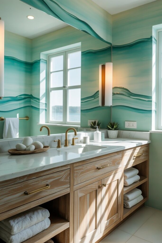
1. Sea Glass Green — Refreshing Coastal Calm
Pale, translucent green instantly recalls weathered sea glass and breezy shorelines. It’s one of the most universally flattering calming bathroom colors because it reads as a neutral while still delivering personality. Use it on all four walls for a cocooning effect, or reserve it for the vanity cabinetry against white shiplap.
Pair it with: White oak vanities, honed marble, and unlacquered brass. Lighting: 3000K bulbs keep the green from turning minty. Finish: Satin washable walls. Try: Benjamin Moore Seacliff Heights. Styling tip: Layer in woven rattan baskets and linen towels in sand and ivory.
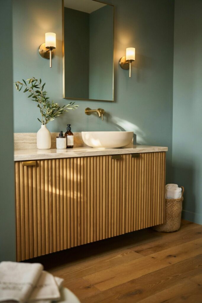
2. Soft Jade — Subtle Luxury with Warm Wood
A shade deeper than sea glass, soft jade has a muted warmth that pairs beautifully with walnut and teak — the wood tones commonly found in high-end spas. It’s sophisticated without feeling somber, making it ideal for primary baths.
Pair it with: Fluted wood vanities, travertine tile, and brushed gold. Lighting: Warm 2700K sconces flanking the mirror. Finish: Semi-gloss on cabinetry, matte on walls. Try: Farrow & Ball Green Bay. Styling tip: Add a single oversized ceramic vessel in cream to anchor the space.
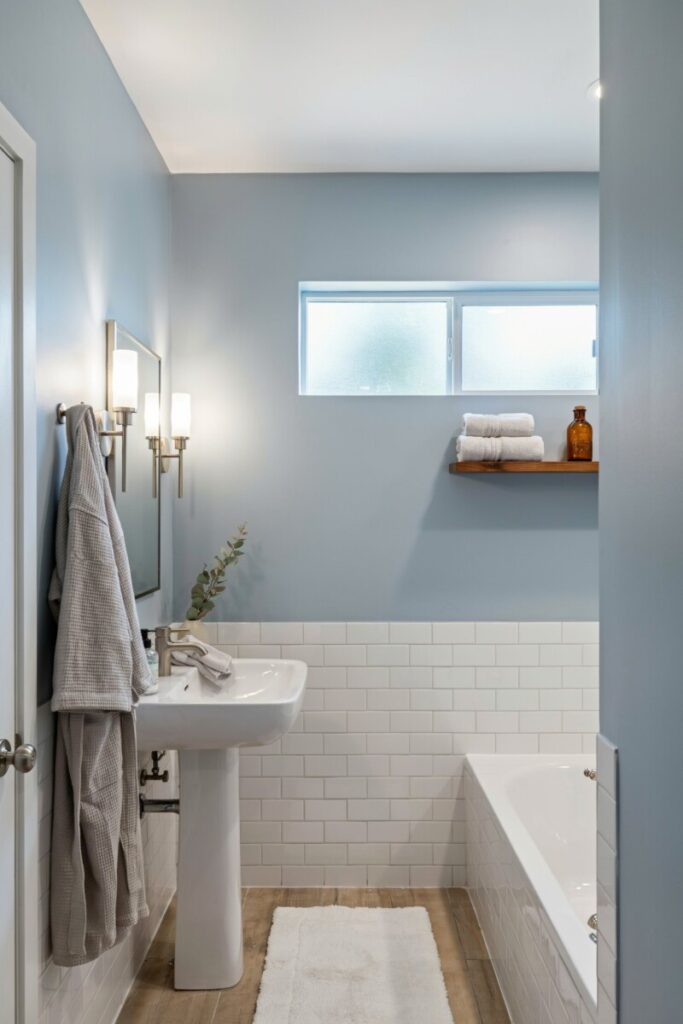
3. Misty Blue — Airy Spa Serenity
A foggy, grayed-out blue feels like a morning by the water — quiet, cool, and expansive. It’s one of the best small bathroom color tricks because the gray undertone keeps it from shrinking the room the way saturated blues can.
Pair it with: White subway tile, polished nickel, and pale gray grout. Lighting: 3500K “bright white” overhead for crispness. Finish: Eggshell on walls for soft sheen. Try: Sherwin-Williams Sleepy Blue. Styling tip: Keep textiles tonal — pale gray robes and cloudy white bath mats.
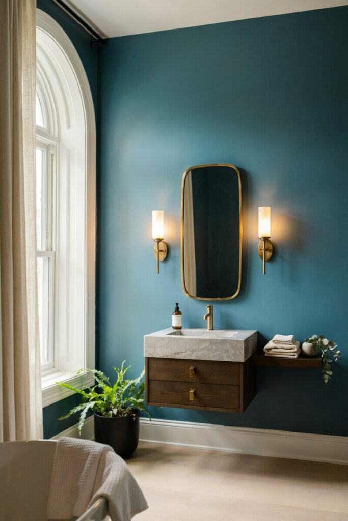
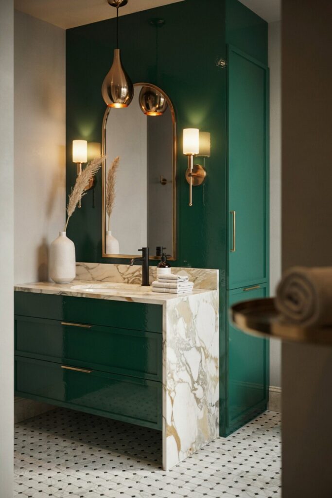
4. Deep Teal — Jewel-Toned Richness
This is where bold bathroom colors really shine. Deep teal is moody, enveloping, and undeniably luxurious — the signature shade of boutique hotel baths from Manhattan to Palm Springs. Use it as a statement bathroom color on a vanity or accent wall rather than everywhere if you’re new to drama.
Pair it with: Carrara marble, unlacquered brass, and dark walnut. Lighting: Layered warm sconces are essential — cool light turns teal flat. Finish: Satin walls, high-gloss trim for contrast. Try: Benjamin Moore Aegean Teal. Styling tip: A single brass-framed mirror and a potted fern complete the look.
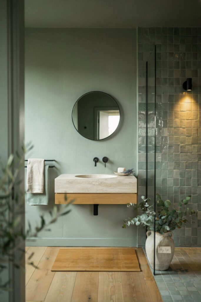
5. Sage Green — Organic, Earthy Retreat
Sage is the workhorse of neutral spa colors. It’s grounding, gender-neutral, and works with virtually every fixture finish. It’s also a favorite for coastal bathroom colors palettes when paired with natural stone and seagrass.
Pair it with: Light oak, zellige tile, and matte black hardware. Lighting: 3000K, ideally with a dimmer. Finish: Matte for a plastered, old-world feel. Try: Sherwin-Williams Clary Sage. Styling tip: Mix in live eucalyptus in the shower and a teak bath mat.
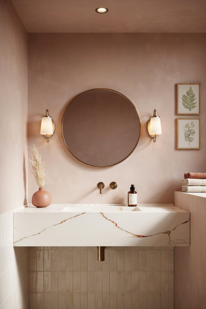
6. Blush Pink — Soft, Warm Sophistication
Forget saccharine — a dusty, grayed blush reads as elevated and unexpected. It’s especially flattering on skin tones at the mirror, which is why designers love it in powder rooms.
Pair it with: Marble with rust veining, brushed brass, and cream tile. Lighting: Warm 2700K to lean into the rosy glow. Finish: Matte walls, satin ceiling. Try: Farrow & Ball Setting Plaster. Styling tip: Frame botanical prints in brass and stack folded towels in cream and terracotta.
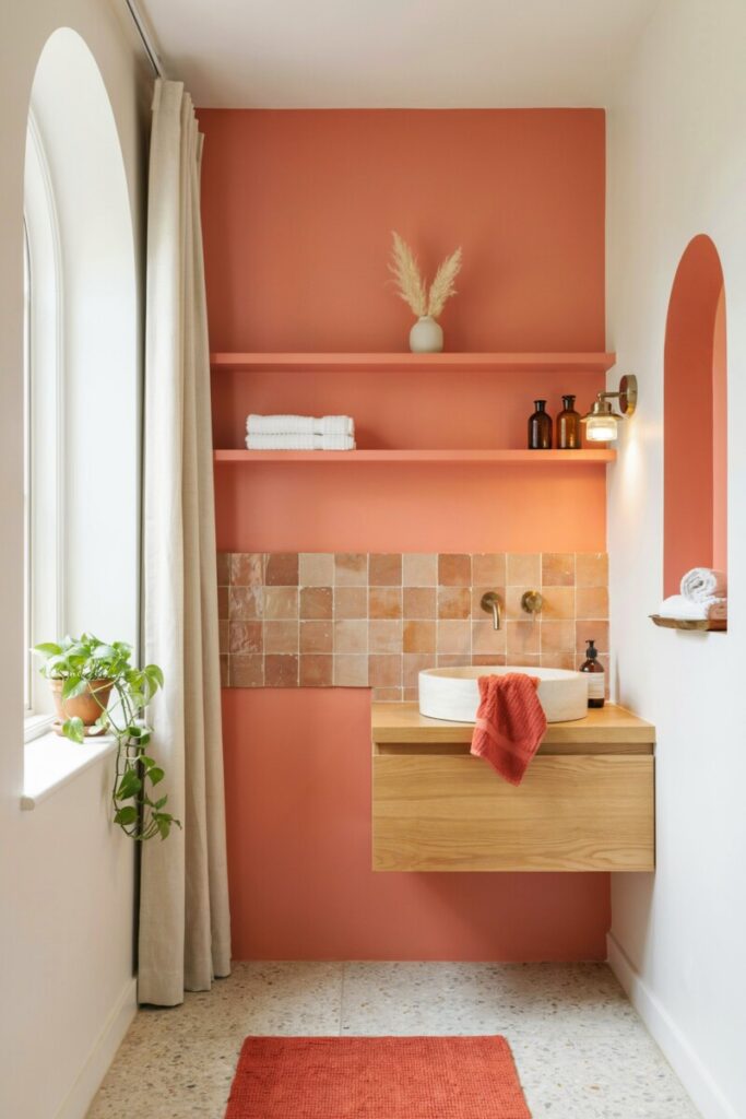
7. Coral Accent — Energetic Focal Point
Coral is best deployed sparingly — as a painted niche, the inside of open shelving, or a single accent wall behind the vanity. It brings the energy of a Mediterranean retreat without overwhelming.
Pair it with: White walls, terracotta tile accents, and aged brass. Lighting: Natural daylight wherever possible. Finish: Semi-gloss accent for depth. Try: Sherwin-Williams Coral Reef. Styling tip: Echo the coral in a bath mat or hand towel — don’t let it live only on the wall.
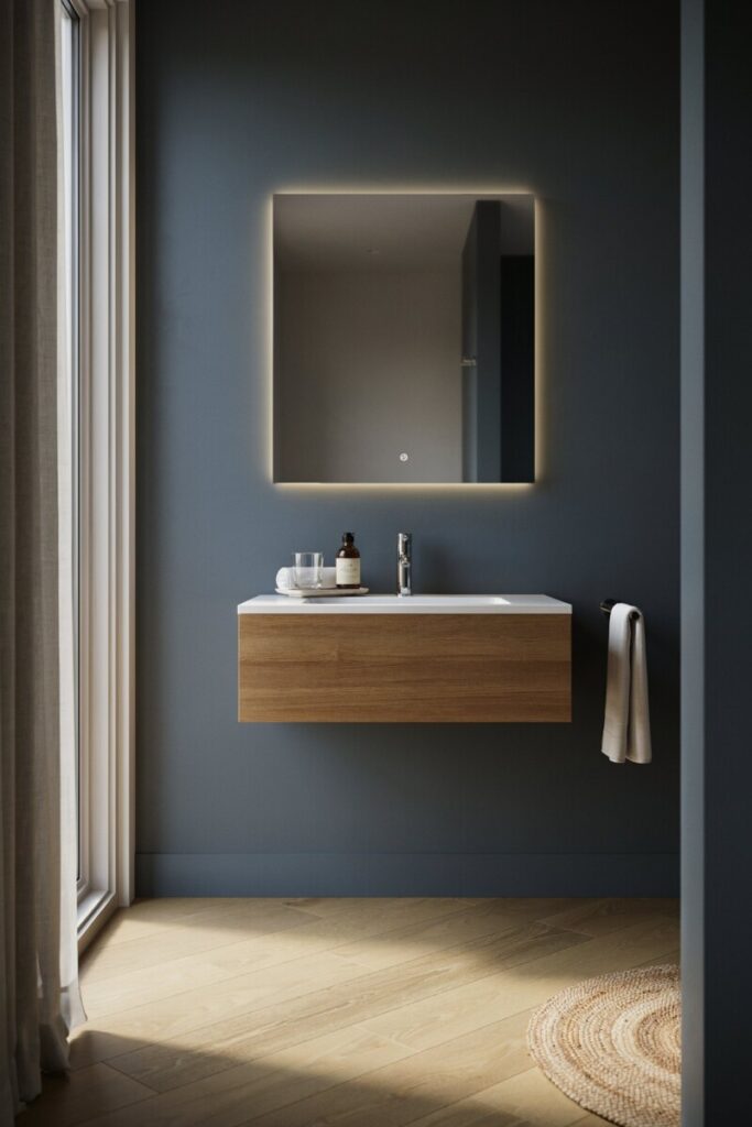
8. Charcoal Gray — Modern, Moody Spa
Charcoal is the grown-up alternative to black. It’s dramatic but breathable, especially in rooms with generous natural light or glossy tile that bounces the shade around.
Pair it with: White quartz, light wood, and polished chrome. Lighting: 3000K task lighting at the mirror is non-negotiable. Finish: Satin walls resist moisture; matte reads more luxe. Try: Benjamin Moore Kendall Charcoal. Styling tip: A backlit mirror floating on a charcoal wall is chef’s kiss.
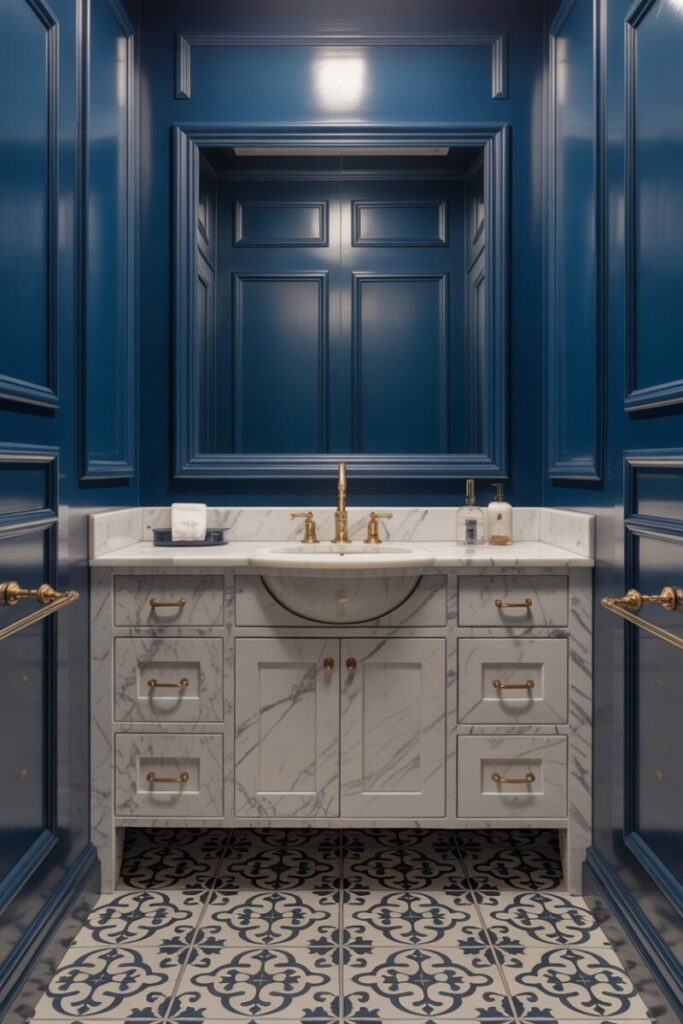
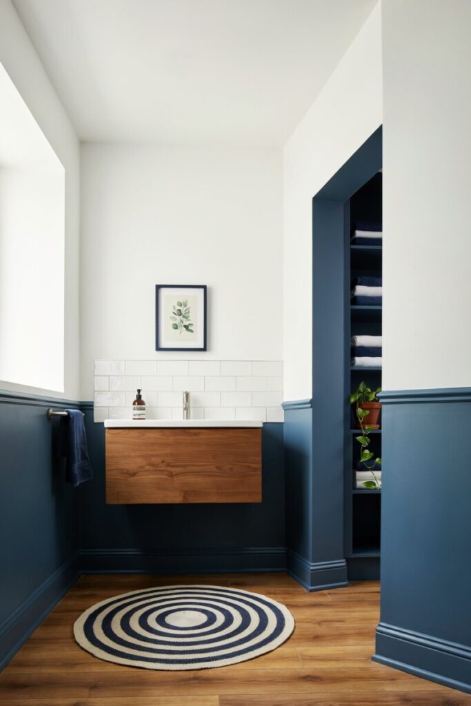
9. Navy Blue — Classic Depth with Brass Accents
Navy is perennial for a reason. It anchors a room with quiet authority and looks particularly rich against warm brass — the combo that defines modern luxury bathroom color schemes.
Pair it with: Carrara or Calacatta marble, brass, and white trim. Lighting: Mix 2700K sconces with 3500K overhead. Finish: Semi-gloss on beadboard, matte above. Try: Sherwin-Williams Naval. Styling tip: Paint the ceiling the same navy for the “jewelry box” effect designers love.
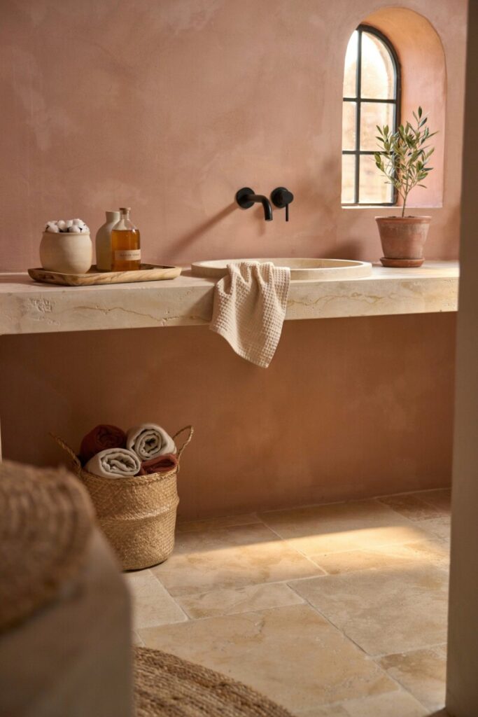
10. Warm Terracotta — Sunlit, Mediterranean Spa Feel
Terracotta channels the warmth of a Tuscan afternoon. It’s inherently cozy and works surprisingly well in northern climates where you crave sun-soaked energy.
Pair it with: Limewash walls, iron fixtures, and tumbled limestone. Lighting: 2700K, layered and dimmable. Finish: Matte or limewash for texture. Try: Behr Cajun Red (test first — it runs bold). Styling tip: Lean into earthy accessories: olive wood trays, raffia baskets, unglazed ceramics.
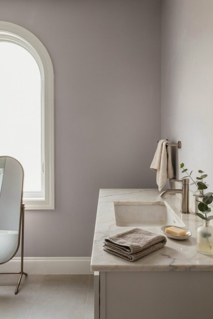
11. Lavender Gray — Soft, Restorative Calm
A whisper of lavender with a gray undertone leans serene rather than sweet. It’s a sleeper pick for spa-like bathroom colors — unexpected and genuinely restful.
Pair it with: Polished nickel, pale marble, and soft white trim. Lighting: 3000K keeps the gray dominant. Finish: Eggshell for a velvety look. Try: Benjamin Moore Lavender Mist (custom muted). Styling tip: Keep accessories monochrome — cream, gray, silver — to avoid veering nursery.
12. Emerald Green — Lush, High-End Statement
Emerald is the definition of opulence. Used on a vanity, in tile, or on a single accent wall, it transforms a bathroom into something that feels borrowed from a five-star hotel.
Pair it with: Gold-veined marble, polished brass, and black accents. Lighting: Warm 2700K sconces; cool light flattens emerald. Finish: High-gloss on cabinetry for that lacquered look. Try: Sherwin-Williams Grandview. Styling tip: A single oversized brass light fixture above the mirror seals the glamour.
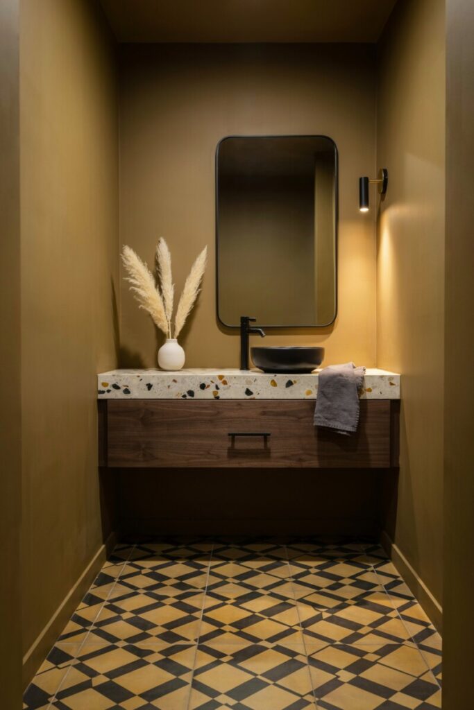
13. Sunny Mustard — Cheerful, Boutique-Spa Vibe
Mustard is the wildcard that keeps growing on you. Deepened with a touch of brown, it reads sophisticated rather than retro — especially in a powder room where you can take a bigger swing.
Pair it with: Dark walnut, black fixtures, and terrazzo. Lighting: 3000K warm whites bring out the gold notes. Finish: Satin on walls for rich depth. Try: Farrow & Ball India Yellow. Styling tip: Ground it with matte black mirrors and graphic floor tile.
14. Crisp White with Colored Trim — Clean Canvas with Personality
Not all bathroom paint ideas have to be all-in. Painting trim, wainscoting, or built-ins in a bold color while keeping walls bright white delivers impact without heavy commitment.
Pair it with: Any tile; almost any metal finish. Lighting: 3500K to keep whites crisp. Finish: Semi-gloss on trim, matte on walls. Try: Trim in Benjamin Moore Hale Navy or Salamander. Styling tip: Let the trim color appear once more — in towels, art, or a small rug — to tie the room together.
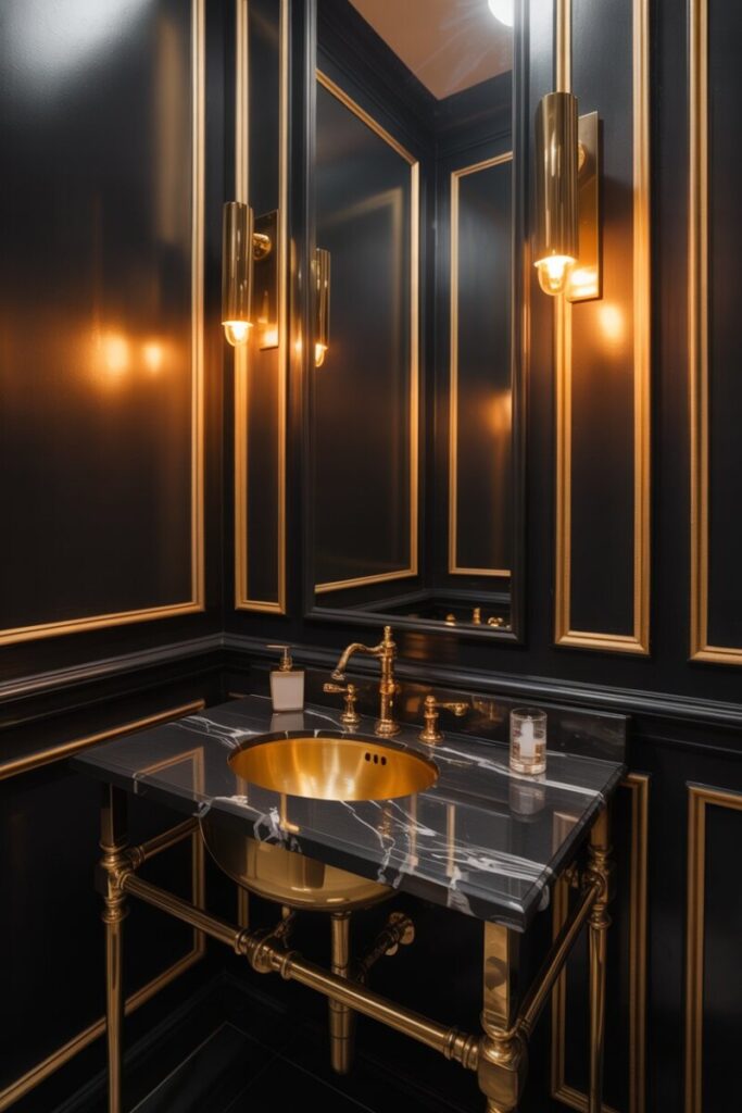
15. Black-and-Gold Accent Scheme — Dramatic, Luxe Micro-Spa
For powder rooms and small ensuites, going all-in on black with polished gold accents delivers a cinematic, club-lounge feel. It’s a jewel-toned bathroom move that actually feels expansive when done right.
Pair it with: Black marble, gold fixtures, and warm wood floors. Lighting: Statement brass sconces + backlit mirrors. Finish: Semi-gloss black for depth. Try: Sherwin-Williams Tricorn Black. Styling tip: Use gold sparingly — three to five touches max — to keep it luxe, not costume.
Small-Bathroom Considerations and Renter-Friendly Options
Vibrant doesn’t have to mean overwhelming. A few small bathroom color tricks go a long way: paint the ceiling the same color as the walls to blur boundaries, use large-format tile to reduce visual clutter, and reserve high-gloss finishes for a single accent. Vertical stripes, slim vertical shiplap, and a single oversized mirror all amplify the sense of space.
Renters aren’t left out. Renter-friendly bathroom updates include peel-and-stick tile in bold patterns, removable wallpaper on a single wall, swapping in colorful towels and rugs, lining open shelving with adhesive contact paper, and hanging large-scale art rather than painting. A painted adhesive panel propped behind the vanity is a designer secret — it delivers drama without touching the drywall.
Finishes, Lighting, and Texture Tips
The difference between a flat paint job and a spa-worthy room often lives in the details.
- Matte vs. satin finish: Matte hides wall imperfections and reads more sophisticated, but satin stands up to humidity and wipes clean. Use matte on upper walls, satin around the shower and sink.
- Semi-gloss for trim and cabinetry reflects light and resists moisture beautifully.
- Bathroom lighting ideas: Layer three sources — ambient (ceiling), task (mirror sconces), and accent (niche lighting or a pendant). Aim for 2700–3000K in most baths; go to 3500–4000K only in modern, white-heavy schemes.
- Texture does the heavy lifting: Natural stone, fluted wood, woven textiles, and matte metals keep vibrant palettes from looking flat. A single textured element — think limewash walls or ribbed tile — adds depth paint alone cannot.
Go-To Paint Brands and Quick Product Recommendations
These US-favorite brands deliver reliable color and performance in high-moisture rooms:
- Benjamin Moore: Aura Bath & Spa (matte, moisture-resistant)
- Sherwin-Williams: Emerald Interior (mildew-resistant)
- Farrow & Ball: Modern Emulsion (wipeable, rich pigment)
- Behr: Premium Plus (great budget pick with built-in primer)
- PPG: Diamond line for durability
Always prime with a moisture-resistant primer (Benjamin Moore Fresh Start or Zinsser Mold Killing Primer) before painting, especially in showers and steam-prone areas. For hardware, match your palette: brushed brass warms up greens, navy, and blush; matte black anchors sage, terracotta, and mustard; polished chrome is timeless with blues and grays.
Your Spa-Like Bathroom Starts With a Single Swatch
You don’t need a full renovation to transform your bathroom — you need a palette you love and the courage to test it. Pick one of these vibrant bathroom color ideas, order a sample pot, and paint a 2-foot swatch behind your mirror. Live with it for three days at different times of day. You’ll know.
Have you tried one of these luxury bathroom color schemes or have bathroom paint ideas of your own? Drop a photo in the comments — we’d love to see your spa-like transformation, and our community is always happy to help you pick the perfect pairing.
