
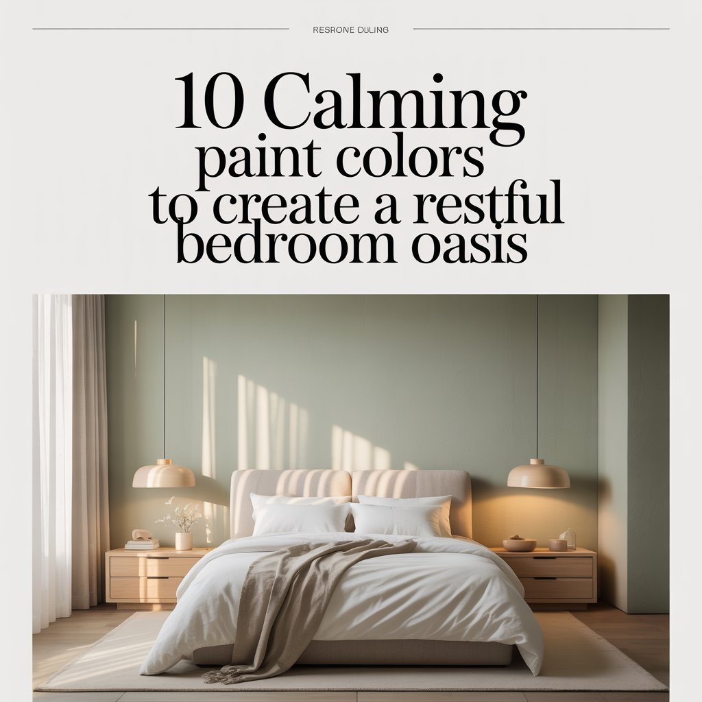
Why Your Bedroom Color Matters More Than You Think
Your bedroom should feel like a sanctuary—the one room in your home where the world fades out and sleep becomes effortless. Yet for many of us, it’s also the room we put the least thought into. We inherit whatever beige or builder-white the previous owner left behind and call it a day. Here’s the problem: paint color plays a far bigger role in your mood, your perceived temperature, and even your sleep quality than most homeowners realize.
A soft, muted hue can make a cramped rental feel airy at sunset. A warm neutral can make a north-facing room feel less institutional by morning. And the right shade, paired with the right finish, can quite literally cue your body to wind down. The trick is understanding how light, undertones, and saturation work together—because a “calming blue” in one home can read as cold and clinical in another.
Below, you’ll find a curated list of 10 calming paint colors proven to support restful sleep, complete with real paint codes from Benjamin Moore, Sherwin-Williams, and Behr, plus styling pairings, finish recommendations, and quick staging ideas. Whether you’re refreshing a master suite or giving a guest room a gentle update, there’s a shade here that will work with your light, your furniture, and your sleep goals.
How Color Affects Mood and Sleep (and 6 Tips for Picking the Right Paint)
Research in environmental psychology consistently shows that cool, low-saturation colors—think pale blues, muted greens, and soft grays—lower heart rate and reduce perceived stress. A widely referenced Travelodge survey found that people sleeping in blue bedrooms averaged the longest sleep (nearly 8 hours) compared to those in purple or red rooms, which tend to stimulate the brain. This isn’t about mysticism; it’s about how your optic nerve signals your circadian system.
“Choosing the right paint color can shave minutes off your bedtime routine—soft hues help lower alertness and cue relaxation.”
Before you commit to a gallon, keep these six paint-selection rules in mind:
- Test in your actual light. A color that looks serene in the store will shift dramatically under your bedroom’s north, south, east, or west exposure.
- Mind the undertone. Grays can read blue, green, or violet. Whites can be yellow, pink, or gray. Always ask for the paint chip’s LRV (Light Reflectance Value) and undertone family.
- Choose the right finish. Bedrooms rarely need more than eggshell or satin—both wipe clean and hide imperfections better than matte or high-gloss.
- Scale with room size. Deeper hues cozy up large rooms; lighter tints expand small ones.
- Sample big, not small. Paint 2′ × 2′ swatches on at least two walls and observe across morning, afternoon, and evening light for 48 hours.
- Coordinate with your fixed elements. Flooring, trim, and your headboard shouldn’t fight the wall color.
Quick reference: Best paint finish by use
| Finish | Sheen | Best for |
|---|---|---|
| Matte/Flat | None | Low-traffic ceilings, accent walls |
| Eggshell | Low | Most bedroom walls |
| Satin | Soft | High-use bedrooms, kids’ rooms |
| Semi-gloss | Medium | Trim, doors, built-ins |
10 Calming Paint Colors for a Restful Bedroom Oasis
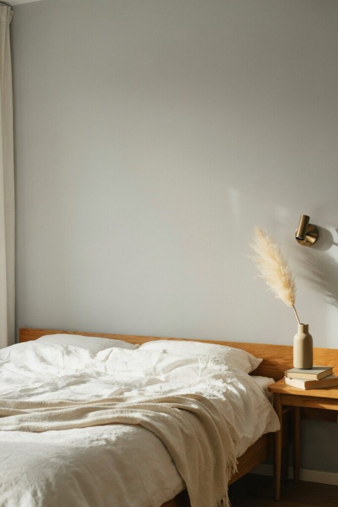
1. Soft Dove Gray — Cozy, Neutral, Universally Flattering
Soft Dove Gray reads as a warm hug in paint form. It’s the rare neutral that pairs with nearly any bedding, doesn’t clash with wood tones, and works in both modern farmhouses and urban condos. Unlike cooler grays that can feel corporate, a dove gray with warm beige undertones keeps a bedroom feeling grounded and intentional.
- Undertones & light: Warm beige-gray. Excellent in north-facing rooms where it adds warmth without going yellow.
- Best for: Mid-to-large bedrooms; works beautifully behind upholstered headboards.
- Styling: Crisp white linen sheets, a natural oak bed frame, matte brass sconces, and a chunky wool throw.
- Finish: Eggshell or satin.
- Paint codes: Benjamin Moore Revere Pewter HC-172 (LRV 55). Behr equivalent: Silver Drop 790C-2.
- Hex:
#CCC5B7 - Photo staging: Morning light hitting a white linen duvet, a stack of hardcovers on the nightstand, and a single dried pampas stem in a brass vase.
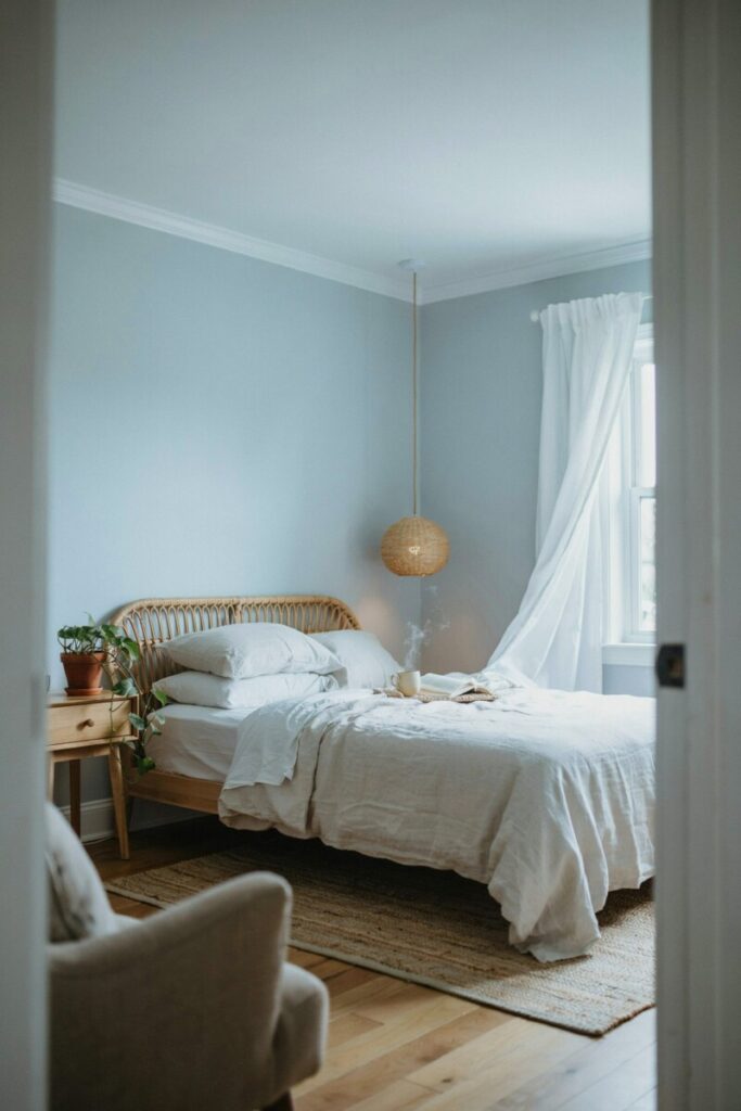
2. Misty Blue — Serene, Coastal, Quietly Uplifting
Misty blue is the color of a foggy morning over the Atlantic—cool, but not cold. It has a remarkable ability to make a room feel larger and airier, which is why it’s a perennial favorite for coastal and Scandinavian-inspired bedrooms.
- Undertones & light: Cool blue with strong gray mute. Glows in south-facing and east-facing rooms; can read flat in low-light north rooms.
- Best for: Small bedrooms, guest rooms, and attic spaces where you want to “lift” the ceiling.
- Styling: Washed linen bedding, a rattan headboard or pendant, crisp white trim, and a jute rug.
- Finish: Eggshell (satin if kids or pets).
- Paint codes: Sherwin-Williams Sleepy Blue SW 6225 (LRV 52). Benjamin Moore: Icecap 795.
- Hex:
#9DB4C0 - Photo staging: Bed dressed in rumpled white linen, a woven tray with a tea mug, and a window with sheer curtains blowing gently.
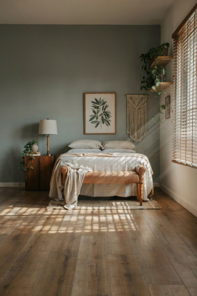
3. Serene Sage — Restorative, Nature-Connected, Grounding
Sage has exploded in popularity because it bridges the gap between neutral and color. A muted gray-green brings the outdoors in and is particularly well-suited to bedrooms with houseplants or views of greenery.
- Undertones & light: Gray-green with subtle warmth. Performs beautifully in east-facing morning light.
- Best for: Mid-sized bedrooms, primary suites with botanical or biophilic design themes.
- Styling: Deep-stained walnut nightstands, a macramé wall hanging, lots of trailing pothos, and cream canvas bedding.
- Finish: Low-sheen eggshell.
- Paint codes: Benjamin Moore October Mist 1495 (LRV 46). Sherwin-Williams: Clary Sage SW 6178.
- Hex:
#8A9A87 - Photo staging: The headboard wall with an oversized botanical print, a leather bench at the foot of the bed, and morning sun filtering through bamboo blinds.
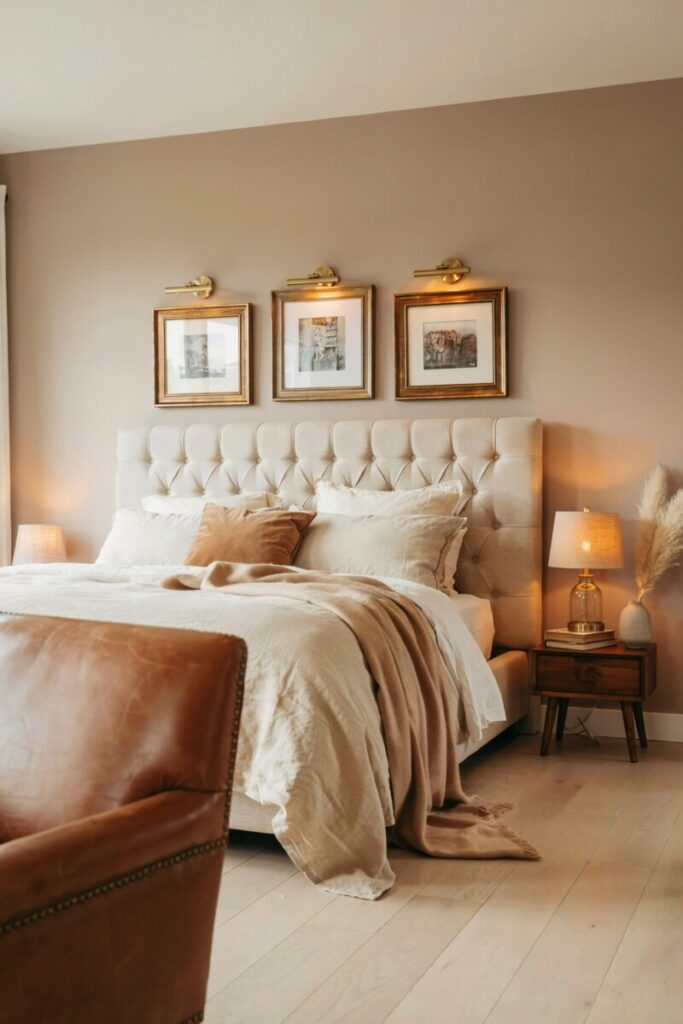
4. Warm Taupe — Timeless, Cozy, Imperfection-Forgiving
Taupe is the unsung hero of calming bedroom palettes. It reads as neutral but carries enough warmth to prevent a room from feeling sterile. It’s also one of the most forgiving colors on imperfect drywall.
- Undertones & light: Warm beige with faint pink or gray undertones depending on brand. Thrives under warm artificial lighting at night.
- Best for: Any room size; ideal for bedrooms you want to feel “lived-in” and luxurious.
- Styling: Layered neutrals—cream, camel, and chocolate—textured throw pillows, a cognac leather accent chair, and unlacquered brass hardware.
- Finish: Satin for durability.
- Paint codes: Benjamin Moore Edgecomb Gray HC-173 (LRV 63). Behr: Even Better Beige N230-2.
- Hex:
#D4C7B4 - Photo staging: A tufted beige headboard, a cashmere throw draped at the foot of the bed, and brass picture lights illuminating an art wall.
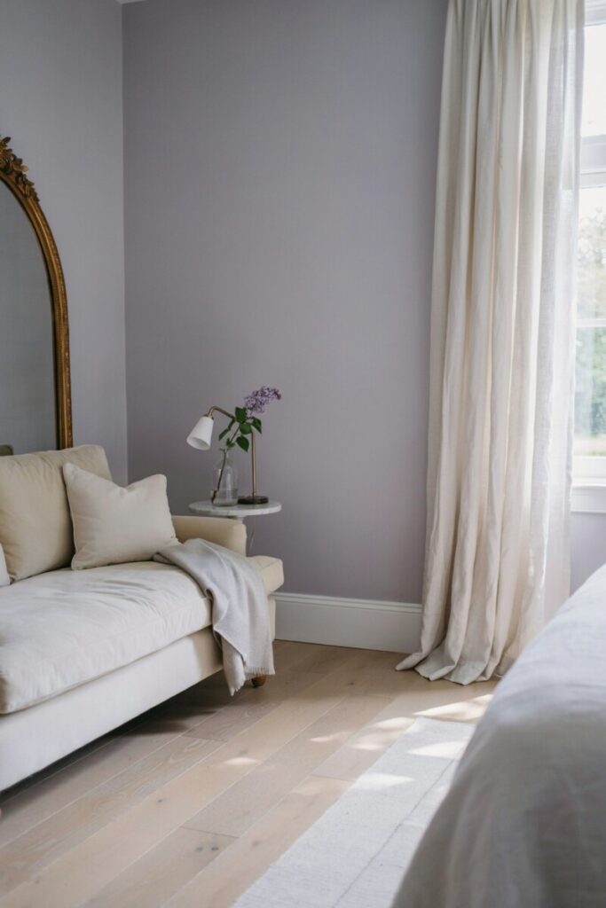
5. Powdered Lavender — Soothing, Unexpected, Gently Romantic
Forget the juvenile purple of childhood bedrooms. Powdered lavender is a dusty, sophisticated hue that sits at the quieter end of the violet spectrum. It’s a favorite among designers for guest bedrooms and dressing rooms because it flatters skin tones and feels spa-like.
- Undertones & light: Cool lilac with heavy gray mute. Best in south or west light, which brings out the warmth.
- Best for: Guest rooms, dressing rooms, and small-to-mid bedrooms where you want a statement without shouting.
- Styling: Soft velvet bench or pillows, polished chrome or brass accents, white bedding, and a single peony or lilac bloom.
- Finish: Eggshell.
- Paint codes: Sherwin-Williams Elation SW 6536 (LRV 64). Benjamin Moore: Organdy 1248.
- Hex:
#CFC6D8 - Photo staging: A velvet chaise in the corner, a gilded mirror, and sheer curtains pooling at the floor.
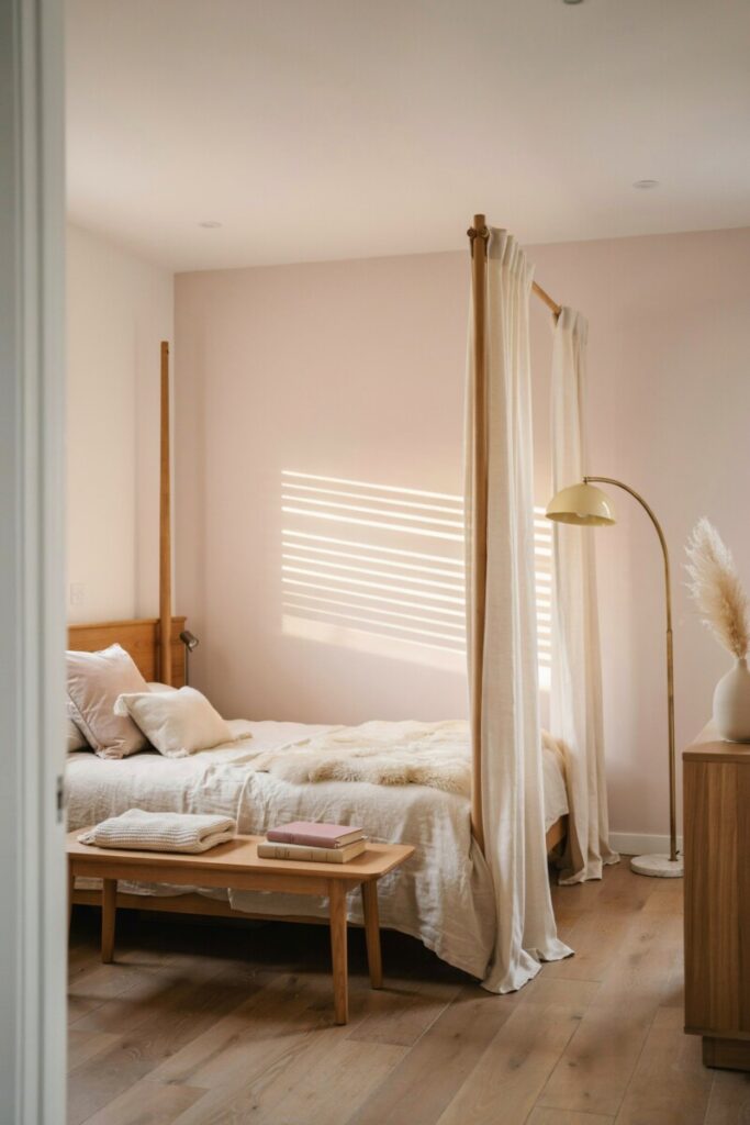
6. Pale Blush — Warm, Flattering, Barely-There
Pale blush is the “nude lip” of paint colors: so subtle it reads as neutral, yet it adds a warm glow that makes every surface (and person) look better. It’s particularly flattering in west-facing rooms where it catches the golden hour.
- Undertones & light: Warm pink with gray base. Transforms in afternoon and evening light.
- Best for: Primary suites, reading nooks, and bedrooms with warm wood furniture.
- Styling: Warm woods (oak, walnut), cream textiles, gold or brass accents, and blush velvet throw pillows.
- Finish: Satin or eggshell.
- Paint codes: Benjamin Moore First Light 2102-70 (LRV 69). Sherwin-Williams: Rosé SW 6290.
- Hex:
#EAD8D2 - Photo staging: A canopy bed with linen drapes, a brass arc lamp, and a sheepskin throw on a wooden bench.
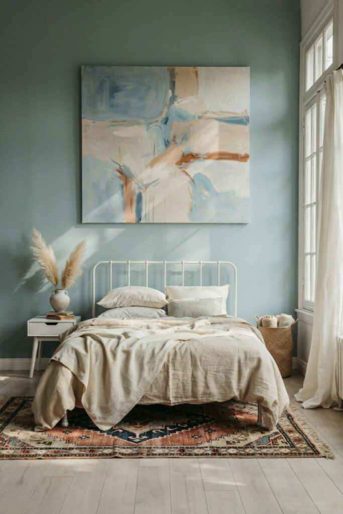
7. Coastal Teal (Muted) — Fresh, Balanced, Quietly Vibrant
A muted teal threads the needle between blue’s calm and green’s vitality. It’s restful without being sleepy—perfect for people who want their bedroom to feel energized in the morning and restorative at night.
- Undertones & light: Blue-green with gray mute. Stunning in south-facing rooms with abundant natural light.
- Best for: Coastal homes, mid-sized bedrooms, and spaces with light wood flooring.
- Styling: White oak or maple furniture, white linen, a patterned Kilim or Moroccan rug, and woven baskets.
- Finish: Eggshell.
- Paint codes: Sherwin-Williams Sea Salt SW 6204 (LRV 63). Benjamin Moore: Hazy Skies 738.
- Hex:
#B4C7C4 - Photo staging: A white-painted iron bed frame, layered neutral bedding, and a large abstract art piece in complementary blues and creams.
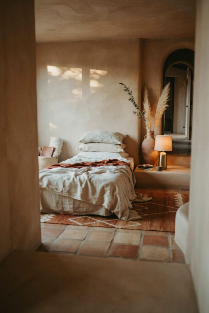
8. Clay Beige — Earthy, Grounding, Subtly Terracotta
Clay beige is the color of sun-baked adobe. It has a slight red-orange warmth that grounds a room and works beautifully in spaces you want to feel intimate and cocoon-like.
- Undertones & light: Warm with reddish-orange base. Glows in west-facing golden-hour light.
- Best for: Large primary suites, Southwestern or Mediterranean-style homes, and bedrooms with terracotta tile or brick accents.
- Styling: Terracotta pots, woven seagrass baskets, raw linen bedding in oatmeal or cream, and leather accessories.
- Finish: Satin.
- Paint codes: Sherwin-Williams Tuscan Beige SW 6127 (LRV 51). Benjamin Moore: Shaker Beige HC-45.
- Hex:
#C4A58F - Photo staging: A low platform bed, a large clay vase with dried branches, and an earthy wool rug in rust and cream.
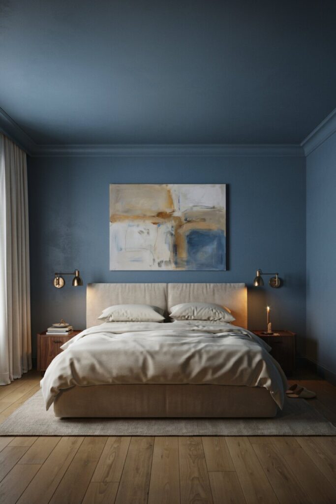
9. Smoky Blue-Gray — Moody, Cocooning, Sophisticated
For those who love a dramatic bedroom, smoky blue-gray delivers. It’s deep enough to feel intimate and cocooning, but the gray undertone keeps it from feeling cave-like. Many designers now use it on all four walls—and even the ceiling—for maximum impact.
- Undertones & light: Blue with deep gray depth. Beautiful in south-facing rooms; can go cold in dim north rooms.
- Best for: Large primary bedrooms, attic suites, and anyone craving a boutique-hotel vibe.
- Styling: Cream or ivory bedding (high contrast), a velvet upholstered headboard, warm brass or bronze accents, and rich wood tones.
- Finish: Eggshell for walls; semi-gloss for trim and doors for subtle contrast.
- Paint codes: Benjamin Moore Gentleman’s Gray 2062-20 (LRV 8). For a softer take: Hale Navy HC-154 (LRV 8) or Sherwin-Williams Distance SW 6243.
- Hex:
#324A5F - Photo staging: All four walls and ceiling painted the same hue, a cream velvet bed, brass swing-arm sconces, and an oversized abstract piece.
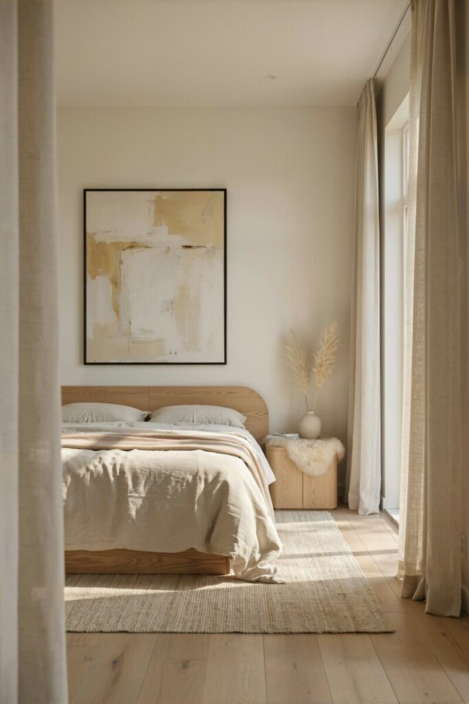
10. Soft Warm White — Minimalist, Light-Reflective, Never Stark
Sometimes the most calming color is the absence of obvious color. A warm white reflects daylight beautifully at noon and glows warmly under bedside lamps at night—without the clinical feel of a pure white.
- Undertones & light: Warm ivory or cream. Works in every exposure and is often the safest choice for rooms with mixed light sources.
- Best for: Minimalist bedrooms, small spaces you want to feel larger, and rooms with colorful art or textiles.
- Styling: Monochrome layers of cream, white, and bone; natural fiber rugs (sisal, jute); and varied wood tones.
- Finish: Eggshell or satin.
- Paint codes: Benjamin Moore White Dove OC-17 (LRV 85). Sherwin-Williams: Alabaster SW 7008.
- Hex:
#EDE7DC - Photo staging: A sculptural oak bed frame, a single statement art piece, linen curtains, and a sheepskin at the bedside.
At-a-glance: Color swatches & codes
| # | Color | Brand & Code | Hex | Best Light |
|---|---|---|---|---|
| 1 | Soft Dove Gray | BM Revere Pewter HC-172 | #CCC5B7 | North |
| 2 | Misty Blue | SW Sleepy Blue SW 6225 | #9DB4C0 | South/East |
| 3 | Serene Sage | BM October Mist 1495 | #8A9A87 | East |
| 4 | Warm Taupe | BM Edgecomb Gray HC-173 | #D4C7B4 | Any (warm bulbs) |
| 5 | Powdered Lavender | SW Elation SW 6536 | #CFC6D8 | South/West |
| 6 | Pale Blush | BM First Light 2102-70 | #EAD8D2 | West |
| 7 | Coastal Teal | SW Sea Salt SW 6204 | #B4C7C4 | South |
| 8 | Clay Beige | SW Tuscan Beige SW 6127 | #C4A58F | West |
| 9 | Smoky Blue-Gray | BM Gentleman’s Gray | #324A5F | South |
| 10 | Soft Warm White | BM White Dove OC-17 | #EDE7DC | Any |
Renter-Friendly Options & Temporary Updates
Not ready to paint—or not allowed to? You can still capture the restorative feel of these hues without touching a roller:
- Peel-and-stick wallpaper in muted sage, misty blue, or soft white (brands like Tempaper and Wallshoppe offer removable options).
- Fabric-covered headboards or large upholstered panels in your chosen color to anchor the wall visually.
- Textile layering—curtains, duvets, and oversized throws in your calming palette can shift the entire mood.
- Accent walls with removable decals or large-scale framed tapestries.
- Lighting swaps—warm-white smart bulbs (2700K) make even neutral walls feel cozier at bedtime.
Not sure which hue fits your light and furniture? Try three 4″ × 4″ paint samples, observe in morning and evening light, then commit.
Quick shopping checklist: tools you’ll actually need
- [ ] 2–3 sample pots (8 oz) of your shortlisted colors
- [ ] Foam brushes or small rollers for sample swatches
- [ ] Painter’s tape (for clean swatch edges)
- [ ] Drop cloth for floor protection
- [ ] Quality angled trim brush (2–2.5″)
- [ ] 9″ roller + extension pole for walls
- [ ] Low-VOC paint in finish of choice (eggshell or satin)
- [ ] Color-matched caulk for trim touch-ups
Final Tips & Your Next Steps
Choosing the right bedroom paint color is one of the highest-ROI upgrades a homeowner—or renter—can make. It’s inexpensive, it’s reversible, and it compounds every single night in better sleep and deeper relaxation. Start small:
- Pick three colors from this list that suit your light and personal style.
- Order samples directly from the brand (Benjamin Moore, Sherwin-Williams, or Behr all ship test pots).
- Live with the swatches for at least 48 hours—watch them at dawn, midday, and under your bedside lamps.
- Commit and paint one accent wall first if you’re nervous; you can always expand to all four.
Need a second opinion? Many paint brands now offer free virtual color consults, and most local design studios offer 30-minute paint-pick sessions for a flat fee. It’s a small investment for a bedroom that truly feels like your own oasis.
