
The kitchen is the undisputed heartbeat of the home. It’s where morning coffee fuels your day, where family gathers after school, and where friends linger long after dinner is over. Yet, so many of us settle for safe, sterile whites and predictable grays, missing out on the transformative power of color. If you’re craving a space that feels alive, vibrant, and uniquely yours, it’s time to explore energizing color schemes for modern kitchens.
In this comprehensive guide, we’ll dive into the latest design trends, break down six stunning modern kitchen color palettes, and share practical tips for executing a colorful kitchen design on any budget. Whether you are a US homeowner planning a full-scale renovation or a renter looking for temporary, damage-free updates, you’ll find actionable advice to bring bold kitchen colors into your space without sacrificing functionality. Let’s ditch the beige and discover how to make your kitchen the most inviting, high-energy room in the house.
Why Bold and Bright Works for Modern Kitchens
There is a distinct reason top interior designers are moving away from the all-white farmhouse look and embracing vibrant kitchen palettes. Bold kitchen colors do more than just look good in a magazine; they fundamentally change how a space feels and functions. In today’s open-plan homes, the kitchen often flows directly into the living and dining areas. Using bold hues helps define the kitchen zone, creating a visual anchor that grounds the larger space and adds much-needed architectural interest.
Understanding color psychology in kitchens is key to making the right choice for your lifestyle. Warm tones like sunny yellows, terracotta, and rich corals are known to stimulate the appetite and encourage sociability, making them perfect for families who love to host and entertain. On the other hand, cool tones like deep teals and electric blues can introduce a sense of calm, focus, and cleanliness, which is ideal if your kitchen doubles as a homework station or a quiet morning retreat.
Bold colors also reflect your personality in a way that neutral cabinets simply cannot. A kitchen should feel like a lived-in, joyful space. While muted tones are great for hiding imperfections, bold colors shine in well-lit kitchens with higher ceilings, where they can absorb and reflect natural light beautifully. However, as we’ll explore later, even smaller or darker kitchens can benefit from the right bright kitchen color ideas when applied strategically. Investing in energizing color schemes for modern kitchens is ultimately an investment in your daily happiness.
Top Color Trends for 2026
As we look at the kitchen color trends 2026 is bringing to the forefront, the focus is heavily on saturated, nature-inspired hues mixed with unapologetic pops of joy. Homeowners are shifting toward maximalism and biophilic design, seeking spaces that promote wellness, emotional connection, and a break from the digital world. Here are the top hues dominating the US market this year:
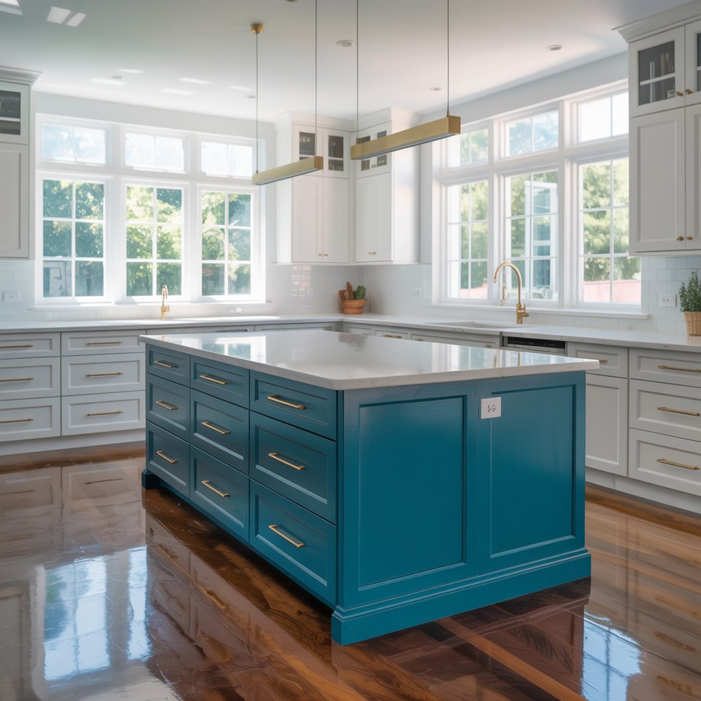
- Saturated Teal: A rich, blue-green that feels both grounding and luxurious. It pairs beautifully with warm metals and natural wood, offering a moody yet vibrant backdrop.
- Sunny Marigold: An optimistic, golden-yellow that brings instant warmth. It’s a fantastic choice for an island base or a walk-in pantry door.
- Spiced Coral: A lively, pink-orange that adds a youthful, energetic vibe without being overwhelmingly sweet. It thrives in spaces with abundant natural sunlight.
- Rich Olive Green: A staple of biophilic design, this earthy tone bridges the gap between neutral and bold, bringing the calming essence of the outdoors inside.
- Raspberry / Jewel-Toned Pink: Moving past the pale millennial pink of the 2010s, deep raspberry adds a sophisticated, moody warmth that feels incredibly high-end and unexpected.
- Electric Blue: A high-energy, vivid blue that acts as a modern neutral when paired with crisp whites, glass accents, and stainless steel.
These colors reflect a broader cultural desire for homes that feel like personal sanctuaries. Rather than designing strictly for resale value with sterile neutrals, US homeowners are increasingly prioritizing colorful kitchen designs that bring them daily joy and self-expression.
Palette Ideas and Pairings
Choosing a single color is easy; building a cohesive room is where many DIYers get stuck. Here are six ready-to-use modern kitchen color palettes, complete with application tips and material pairings, to help you master color pairing.
Palette A: The Nautical Contrast
- Colors: High-contrast navy cabinets, sunlit yellow island, crisp white counters.
- Application: Paint the perimeter cabinets navy and use the yellow for statement cabinets on a large center island.
- Pairings: White quartz countertops, brushed brass hardware, and light oak flooring to keep the space from feeling too heavy.
Palette B: Earthy Jewel
- Colors: Saturated teal cabinets, warm walnut wood tones, unlacquered brass hardware.
- Application: Teal on all lower cabinets, with open walnut wood shelving above to display colorful ceramics.
- Pairings: Honed marble or soapstone countertops and a textured terracotta floor tile for a Mediterranean-meets-modern vibe.
Palette C: The Subtle Pop
- Colors: Spiced coral accent wall, soft dove gray cabinets, white subway tile.
- Application: Use the coral for an accent wall kitchen setup behind open shelving, or paint the ceiling for a “fifth wall” surprise.
- Pairings: Matte black fixtures, white quartz, and a vintage-style runner rug to tie the gray and coral together.
Palette D: Modern Forest
- Colors: Olive green lower cabinets, creamy off-white uppers, matte black fixtures.
- Application: A classic two-tone cabinets approach that keeps the upper half of the kitchen feeling airy while grounding the bottom.
- Pairings: Butcher block countertops and a dark, slate-look porcelain floor tile.
Palette E: Monochromatic Warmth
- Colors: Mustard and terracotta variations layered with natural textures.
- Application: Try color blocking with mustard walls, terracotta barstools, and rust-colored linen textiles.
- Pairings: Warm wood cabinets, leathered granite counters, and woven rattan pendant lights.
Palette F: The Electric Gallery
- Colors: Electric blue backsplash, pale birch cabinets, polished chrome appliances.
- Application: Keep the cabinets neutral and let a high-gloss, electric blue Zellige tile backsplash be the undeniable star.
- Pairings: Stainless steel appliances, white marble counters, and mirrored accents to bounce the blue around the room.
Small Kitchens and Low-Light Spaces: How to Use Bold Color Safely
A common myth is that bold colors will make a small kitchen feel cramped or a dark kitchen feel like a cave. In reality, small kitchen color tips often point to the exact opposite: a well-chosen, bright color can blur the boundaries of a room, making it feel dynamic and larger than its square footage suggests.
If your kitchen lacks natural light or is on the smaller side (which is incredibly common in older US homes, galley layouts, and apartments), avoid using dark, moody colors on all four walls and the cabinetry. Instead, use bright colors in small, intentional doses. Paint the inside of open shelving a vibrant marigold, install a brightly colored range hood, or use a bold hue on the window trim.
Prefer warm brights over cool darks. Colors like peach, soft coral, and buttery yellow naturally reflect light and make a space feel sunnier. Additionally, pay close attention to your paint sheen. Using a satin or semi-gloss finish on painted cabinets or walls will help bounce whatever light you have around the room. Finally, consider the reflective properties of your backsplash. A glossy, brightly colored glass tile will amplify light far better than a matte, dark stone. Always test your bright kitchen color ideas with large sample boards moved around the room at different times of day.
Cabinets, Backsplashes, and Countertops: Where to Be Bold
When deciding where to inject color, you have three main canvases: cabinets, backsplashes, and countertops. Each comes with its own level of commitment, cost, and maintenance.
Cabinets: Updating kitchen cabinet colors is the most impactful change you can make. Painting existing cabinets is highly cost-effective (typically ranging from 2,000 to 5,000 USD for a professional US kitchen repaint), but requires meticulous prep work for a durable, chip-resistant finish. If you want bold kitchen colors without overwhelming the space, opt for a colored island while keeping the perimeter neutral.
Backsplashes: The backsplash is the perfect place to take a design risk. Because it covers a relatively small square footage, you can splurge on high-end, handmade, or brightly colored tiles. If you tire of the color, replacing tile is much easier than replacing cabinets. Don’t forget about colored grout! Using a bright, contrasting grout with simple white tiles is a massive trend that adds instant personality with minimal effort.
Countertops: While white and gray quartz remain popular, statement countertops are gaining serious traction. Think rich, green soapstone, vibrant terrazzo, or butcher block stained in a warm, colorful hue. When coordinating hardware and appliance finishes, remember that matte black grounds bright colors, brass warms them up, and chrome or stainless steel gives them a crisp, modern edge. Properly sealing natural stone and maintaining grout lines will ensure your colorful choices stand the test of time in a high-traffic cooking zone.
Temporary and Budget-Friendly Ways to Experiment
Not everyone is ready to rip out tile or hire a professional painter. If you are renting or just want to test the waters, there are plenty of budget-friendly ways to achieve a colorful kitchen design.
- Peel-and-Stick Backsplash: Modern peel-and-stick tiles have come a long way. You can find vibrant, realistic-looking options for 2 to 5 USD per square foot. A 30-square-foot backsplash update can cost under 150 USD.
- Cabinet Film and Hardware: Apply high-quality architectural vinyl to cabinet doors, or simply swap out basic nickel knobs for colorful, enameled hardware or bright leather pulls (5 to 15 USD each).
- Textiles and Art: A brightly colored vintage runner, bold Roman shade, or large-scale, colorful canvas art can change the entire mood of the room for under 200 USD.
- Removable Wallpaper: Apply a vibrant, peel-and-stick wallpaper to the back of open shelves or as a faux backsplash (30 to 60 USD per roll).
- Small Appliances: While major appliances are expensive, swapping out a small appliance (like a colorful toaster or a stand mixer) adds a functional pop of color.
For renters, focus on items you can take with you: rugs, lighting fixtures (swap them out and keep the landlord’s in a closet), and shelf liners. These allow you to enjoy bold kitchen colors without risking your security deposit.
Working with Color: Practical Steps and Mistakes to Avoid
Executing a bold kitchen requires a solid plan. Follow this step-by-step approach to ensure your vision translates beautifully from a Pinterest board into reality.
- Assess Light and Layout: Note where natural light enters and how your artificial lighting is layered (ambient, task, and accent).
- Choose Your Dominant Color: Pick one bold hue to be the star of the show (usually the cabinets or the island).
- Select 1–2 Accents: Choose complementary or contrasting colors for textiles, hardware, and accessories.
- Order Sample Swatches: Never buy a gallon of paint based on a tiny paper swatch or a digital screen.
- Test in Space: Paint large poster boards and tape them to the walls and cabinets. Observe them in the morning, afternoon, and under your nighttime artificial lights.
- Finalize Finishes: Ensure your countertop and floor samples harmonize with your chosen paint color before purchasing.
📋 Quick Checklist: Common Color Mistakes to Avoid
- Too Many Competing Colors: Stick to the 60-30-10 rule (60% dominant, 30% secondary, 10% accent) to avoid visual chaos and clutter.
- Ignoring Undertones: A “white” wall might have cool blue undertones that clash horribly with a warm, yellow-based green cabinet. Always check the undertones of your neutrals.
- Skipping Samples: Lighting changes everything. A color that looks perfect in the hardware store might look muddy or overly aggressive in your specific kitchen.
- Forgetting the Ceiling: If your walls are bold, a stark, cool white ceiling can look jarring. Consider softening the ceiling color to a warm off-white to blend the edges of the room.
Professional Help and Resources
If you feel overwhelmed by the sheer number of modern kitchen color palettes, it might be time to call in a professional. Hiring an interior designer or a specialized color consultant can save you thousands of dollars in costly mistakes. In the US, a color consultation typically ranges from 150 to 500 USD for a one-time session, while full kitchen design services can range from 2,000 to 10,000+ USD depending on the scope and your local market.
When preparing for a consultation, gather inspiration photos and be honest about your lifestyle (e.g., “I have toddlers, so I need durable, wipeable surfaces”).
For DIYers, take advantage of free online tools. Brands like Sherwin-Williams and Benjamin Moore offer incredible digital color visualizers that let you upload a photo of your kitchen and “paint” the cabinets digitally. Additionally, prioritize your health and indoor air quality by choosing eco-friendly paints. Look for zero-VOC or low-VOC (Volatile Organic Compounds) paint lines, which are widely available at major US home improvement stores and ensure your kitchen remains safe to cook in while the paint cures.
Conclusion
Transforming your kitchen with bold and bright colors is one of the most rewarding home updates you can undertake. Whether you are committing to a full cabinet repaint or simply hanging a vibrant piece of art, energizing color schemes for modern kitchens have the power to elevate your daily routines and make your home truly unforgettable. Don’t let the fear of making a “wrong” choice keep you stuck in a sea of builder-grade beige. Start small, test your swatches, and embrace the joy of color.
We want to hear from you! Which bold color are you most excited to try in your kitchen? Share your thoughts in the comments below, and don’t forget to subscribe to our newsletter to download our free, printable Kitchen Color Planning Checklist!
