
You know the feeling. It’s 2 p.m., you’re three hours into a spreadsheet, and the beige wall behind your monitor seems to be actively draining your will to live. Your “home office” is really just a desk wedged between the laundry hamper and a door that won’t quite close — and somehow, every Zoom call makes the space feel even smaller.
You’re not imagining it. Research in environmental psychology consistently shows that the colors surrounding us at work directly influence focus, stress levels, and creative output. And in a small home office, where every square foot doubles as storage, gym, and occasional dining area, those color choices matter even more. A poorly chosen palette can make a 60-square-foot corner feel like a closet. The right one can make it feel like a sanctuary.
The good news? You don’t need a gut renovation, a five-figure budget, or a design degree to fix it. This guide walks you through practical, budget-friendly color strategies that actually work in compact spaces — from choosing a mood-driven palette and applying the 60-30-10 rule, to clever paint placement, lighting tweaks, and $20 upgrades that change how a room feels by Friday. Whether you’re refreshing a closet office, carving out a creative corner in the living room, or finally dealing with that builder-grade beige, let’s make your small home office a place you genuinely want to sit down in.
Why Color Matters in Small Workspaces
Color psychology for workspaces isn’t interior-design folklore — it’s a well-documented field. Studies from institutions like the University of Texas and the American Psychological Association have shown that specific hues trigger measurable cognitive and emotional responses:
- Blue tones are linked to sustained focus, lower heart rates, and analytical thinking — ideal for deep work.
- Green tones reduce eye strain, promote calm, and support long-duration concentration (which is partly why they’re common in hospitals and libraries).
- Yellow and warm tones stimulate creativity, optimism, and social energy — great for brainstorming or client-facing calls.
- Red accents increase alertness and urgency but can raise stress in excess.
But here’s where small offices diverge from big ones: saturation and lightness matter far more than hue alone. A fully saturated cobalt blue might energize a 300-square-foot studio but will swallow a 60-square-foot nook whole. Likewise, a pale mint can feel expansive and airy on four walls, while the same shade used only as an accent may look washed out.
Color also changes how we perceive physical space. Lighter, cooler tones tend to recede visually, making walls feel farther away — a classic space-enhancing paint trick. Warmer, darker tones advance, creating intimacy but potentially closing a room in. In a multi-functional space (bedroom desk, kitchen corner, converted closet), you’re also juggling competing moods: the same room needs to feel professional at 10 a.m. and relaxing at 8 p.m. Lighting conditions — north-facing windows vs. single overhead bulb — compound the effect, which is why paint colors for small rooms should always be tested before committing.
Choose a Mood-First Palette
Before you pick a specific shade of anything, decide what you need the room to do for you. Most remote workers fall into one of three mood goals:
1. Calm & Focused — for deep work, writing, and analytical tasks
Go with cool neutrals as your base (soft off-whites, warm grays, greige) paired with muted blues or sage greens as secondary colors. A dusty blue accent wall behind your monitor, for example, reduces visual fatigue and keeps the eye comfortable during long screen sessions.
Suggested palette: Benjamin Moore Classic Gray (walls), Hale Navy (accent), crisp white (trim and desk).
2. Energetic & Creative — for makers, marketers, and brainstorm-heavy roles
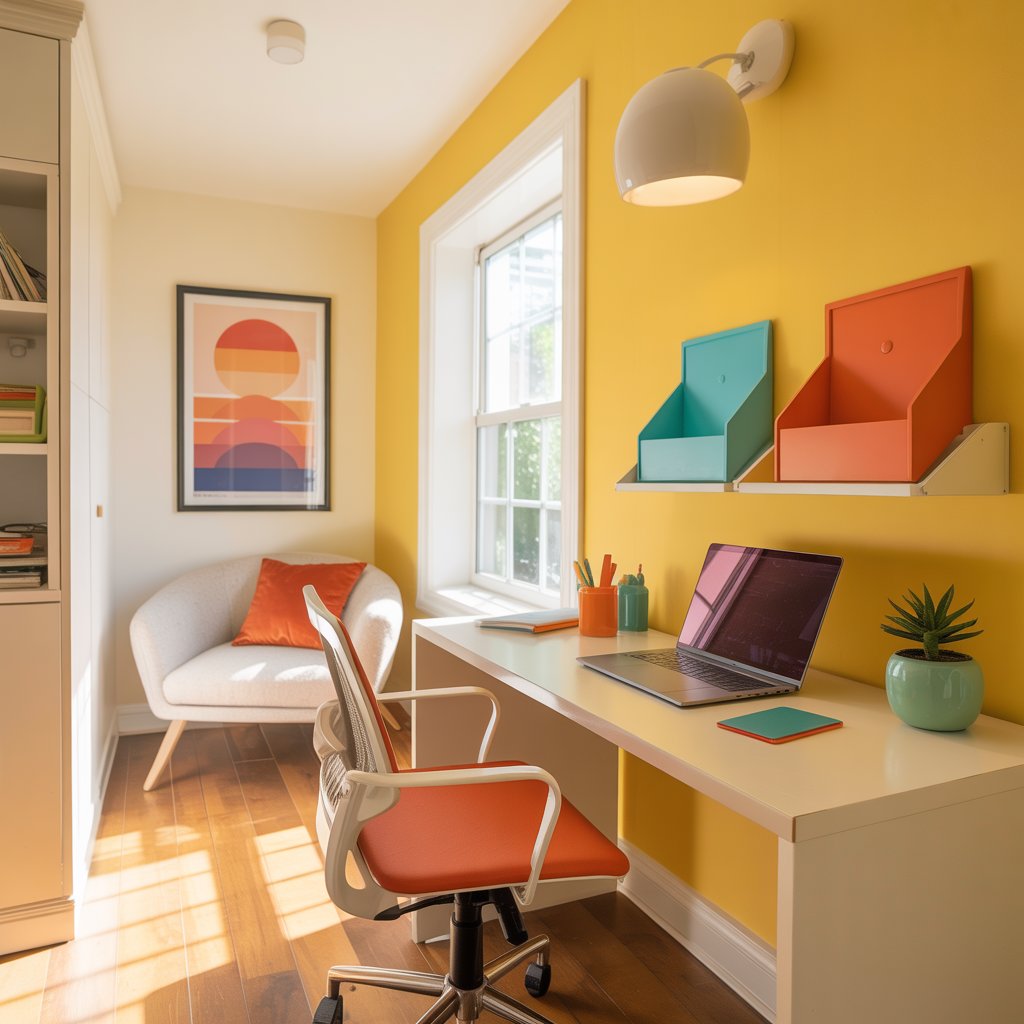
Use warm neutrals (cream, warm taupe, soft terracotta) as the dominant shade and bring in saturated pops of sunny yellow, coral, or tangerine through accessories and one small accent surface. This is a creative office color scheme that avoids the “kindergarten classroom” trap by anchoring brights in warm, grounded bases.
Suggested palette: Sherwin-Williams Alabaster (walls), Canyon Clay (built-in shelf), mustard yellow (desk accessories and art).
3. Balanced & Cheerful — for multi-purpose offices shared with living spaces
Warm neutrals plus muted greens and a teal or dusty aqua accent give you a livable, mood-enhancing decor scheme that doesn’t scream “office.” This works beautifully when your desk is visible from the couch.
Suggested palette: Farrow & Ball School House White (walls), Green Bay (accent cabinetry), unbleached linen (textiles).
Apply the 60-30-10 Rule
The 60-30-10 rule is the backbone of every successful small office color palette:
- 60% dominant color — walls, major furniture (typically your lightest or most neutral tone)
- 30% secondary color — an accent wall, large rug, or built-in shelving
- 10% accent color — cushions, lampshades, artwork, a single decorative object
In a tiny home office design, the 10% does disproportionate heavy lifting. A single teal pencil holder or coral desk lamp reads as intentional, not chaotic.
Pick the Right Paint Finish
The best paint finish for small rooms is usually eggshell or satin. Flat paint absorbs light and shows scuffs (bad news near a desk chair), while high-gloss amplifies every drywall imperfection. Satin gives a soft sheen that reflects light gently — helping a compact office color idea feel brighter without being glare-heavy on video calls.
💡 Quick tip: For trim and built-ins in a small space, go one shade lighter than the wall color in a satin or semi-gloss finish. This adds subtle definition without fragmenting the room visually.
Use Color Strategically in Small Spaces
Once you have a palette, where you apply color matters as much as what you choose. Here are placement strategies tailored to compact office color ideas.
The Accent Wall — Done Right
An accent wall behind the desk or monitor is the single highest-impact, lowest-effort move in a budget home office makeover. It anchors the workspace, gives Zoom calls a polished backdrop, and draws the eye inward — making the room feel intentionally zoned rather than randomly furnished.
Do: place the accent on the wall you face or the wall behind your camera.
Don’t: put a dark accent wall opposite the only window in the room; it’ll absorb natural light and feel cave-like.
Ceiling Tricks That Raise the Room
Painting the ceiling a shade lighter than the walls (or pure white) is one of the oldest space-enhancing paint tricks because it works. Lighter ceilings visually lift, while same-color ceilings (“color drenching”) blur boundaries and make walls feel taller — especially effective with soft blues or warm greens.
For very low ceilings, try a very pale sky blue overhead. It subtly mimics open sky and has been used in European compact interiors for centuries.
Two-Tone Walls and Vertical Stripes
A horizontal two-tone wall — darker color on the bottom third, lighter on top — grounds the space and creates a subtle chair-rail effect without adding molding. This is especially clever in closet offices and alcoves where full accent walls feel overwhelming.
Narrow vertical stripes (painted or via peel-and-stick wallpaper small spaces solutions) elongate walls and draw the eye upward — a smart move in rooms with standard 8-foot ceilings.
Color Zoning in Multi-Use Rooms
If your office shares space with a bedroom or living room, use color to define the “work zone” without a physical divider. A different wall color on just the desk wall, a contrasting area rug, or even a painted floor stencil can signal “this area is for work” to your brain — which measurably improves task-switching and focus for remote workers.
🎨 Image idea: A small home office corner showing a two-tone wall in sage green and off-white, with a compact desk and floating shelves. Alt text: “Two-tone sage and white wall color zoning a small home office desk area.”
Accents, Textiles, and Accessories
You don’t need to paint a single wall to shift a room’s mood. Accents and soft goods are where colors for productivity really start to flex — and they’re fully renter-friendly.
Furniture as Color
Your desk, chair, and shelving are large visual surfaces. A white or light-oak desk recedes and keeps the room airy. A walnut or black desk anchors and adds gravitas. If you’re renting or budget-conscious, consider spray-painting an existing desk a muted color — navy, olive, or terracotta — for an unexpected focal point.
Upholstered desk chairs in soft greens, rust, or teal add warmth and absorb sound — a double win in small, echoey rooms.
Soft Goods That Shift Mood
- Curtains: Floor-to-ceiling drapery in a tone slightly deeper than the wall color adds height and coziness. Linen-look polyester is affordable and light-filtering.
- Rugs: A small (5×7) rug with a subtle pattern ties the zone together. Geometric patterns in calming office colors like soft blue and ivory feel modern without overstimulating.
- Throw cushions: Two or three on a small reading chair or daybed introduce the 10% accent color painlessly.
Texture matters as much as hue. Nubby linen feels calming; sleek velvet reads more energetic. Mix two textures within the same color family for depth without clutter.
Plants, Art, and Wall Organizers
Living greenery is a free mood-enhancing decor hack — the eye reads natural green as restorative, and a single pothos or snake plant on a shelf improves perceived air quality whether or not it measurably does.
A small gallery wall of three to five framed prints in coordinating frames introduces color contrast for focus: pick artwork that features your accent color to tie the room together. Felt pinboards in mustard, blush, or teal add function and warmth.
$20 Budget Swaps That Deliver
- Peel-and-stick wallpaper behind open shelving or on a closet-office back wall
- Removable wall decals in geometric or botanical patterns
- Spray-painted lamp bases in your accent color
- Washi tape frames around postcards or fabric swatches for instant art
- A single colorful desk organizer set in your 10% accent tone
🎨 Image idea: Flat lay of mood-boosting color swatches, fabric samples, a peel-and-stick wallpaper strip, and a small potted plant on a white desk. Alt text: “Flat lay of small home office color palette swatches and affordable mood-boosting accessories.”
Light, Reflectivity, and Color Interaction
You can pick the perfect Benjamin Moore shade and still end up with a room that feels wrong — and the culprit is almost always lighting and paint color working against each other.
Natural vs. Artificial Light
North-facing rooms cast cool, bluish light that can make warm paint colors look muddy. South-facing rooms bathe everything in warm gold, which can oversaturate already-warm hues. East-facing rooms shift dramatically from morning warmth to cool afternoon; west-facing rooms do the reverse.
Rule of thumb: In north-facing small offices, lean warmer in your palette. In south-facing rooms, you have more freedom to use cool tones.
Artificial lighting compounds this. A 2700K “warm white” LED bulb makes blues look gray and yellows look richer. A 5000K “daylight” bulb makes everything crisper but can feel clinical. For home office color combinations that work all day, aim for 3000K to 3500K bulbs in task and ambient fixtures — warm enough to feel human, cool enough to stay alert.
Mirrors and Reflective Surfaces
A medium mirror placed opposite or adjacent to a window doubles natural light and visually expands the room. Glossy or satin paint finishes, metallic lamp bases, and glass shelves all bounce light around. In a windowless closet office, a high-gloss ceiling paired with warm task lighting is a game-changer.
The Swatch Test (Don’t Skip This)
Buy sample pots of your top two colors. Paint a 12×12-inch swatch on the wall — or on a piece of poster board you can move around. Check it:
- At 9 a.m. (morning light)
- At noon (peak daylight)
- At 8 p.m. (under your actual lamps)
A color you love at noon may look dead at night. This five-dollar test saves hundreds in repainting.
💡 Quick test: Swatch at noon and 8 p.m. If the color still feels right under your evening lamp, it’ll work.
Color for Focus vs. Creativity: Three Room Recipes
Here are three complete small home office color ideas setups you can replicate — each optimized for a different work style and budget.
🧠 The Focus Nook
Best for: writers, analysts, heads-down remote workers
- Walls: Soft blue-gray (e.g., Sherwin-Williams Rainwashed)
- Desk: White laminate or light birch
- Chair: Charcoal mesh task chair
- Accent: A single large green plant (fiddle leaf fig or monstera)
- Lighting: 4000K LED desk lamp + 3000K overhead
- Accessories: Linen desk pad, white floating shelves, one piece of abstract art
Pros: Instantly calming, great on video calls, works in any orientation.
Cons: Can feel low-energy for highly collaborative roles.
🎨 The Creative Corner
Best for: designers, marketers, content creators
- Walls: Warm off-white with one terracotta accent wall behind monitor
- Desk: Natural wood with visible grain
- Chair: Rust or mustard upholstered task chair
- Accent: A colorful vintage-style rug (think kilim patterns in coral and cream)
- Lighting: 2700K warm bulbs in a statement pendant + warm desk lamp
- Accessories: Gallery wall of 5 mixed frames, pegboard with colorful supplies, brass desk accessories
Pros: Energizing, highly photogenic, sparks ideas.
Cons: Can overstimulate during long deep-work sessions; use dimmers.
🧘 The Calming Multi-Use
Best for: bedroom offices, shared living spaces, hybrid workers
- Walls: Warm neutral (greige or soft linen white)
- Desk: Wall-mounted drop-leaf or slim console
- Chair: Upholstered dining-style chair in muted teal
- Accent: Teal painted floating shelf or small bookcase
- Lighting: Dimmable 3000K sconces, blackout curtains
- Accessories: Linen curtains, a woven jute rug, two ceramic desk objects in tonal greens
Pros: Disappears into the home when not in use, excellent for evening work, renter-friendly.
Cons: Less visually “professional” on camera without a styled backdrop.
🎨 Image idea: Side-by-side mood boards showing the three room recipes with color swatches, furniture photos, and lighting fixtures. Alt text: “Three mood-boosting color palette mood boards for small home office setups: Focus Nook, Creative Corner, and Calming Multi-Use.”
Common Mistakes and How to Avoid Them
Even with the best intentions, small offices go wrong in predictable ways:
- Over-saturating the space. A fully saturated accent color on all four walls will close a small room in. Keep bold hues to one wall or to accessories.
- Ignoring undertones. A “gray” with a purple undertone next to a “white” with a yellow undertone will clash. Check swatches together, in the room.
- Too many accent colors. More than two accent colors in a small space reads as clutter. Stick to the 60-30-10 rule.
- Skipping lighting tests. Paint looks different under showroom fluorescents than under your 2700K bedside lamp. Always test at home.
- Forgetting the fifth wall. A flat white ceiling under warm walls misses a chance to add height or softness.
Quick fixes: If a room feels too busy, pull back to two colors. If it feels flat, add one textured accent (a woven basket, a velvet cushion). If it feels dark, add a mirror opposite the window before repainting.
Wrapping Up: Pick One Change to Try This Week
Color is the single most affordable, most reversible design tool you have — and in a small home office, it does the heaviest lifting. The right mood-boosting colors won’t give you a bigger desk or more closet space, but they can make the space you have feel brighter, calmer, and genuinely yours.
You don’t have to overhaul everything. This week, pick just one: paint an accent wall behind your desk, swap your rug for something in a calming office color, change your bulbs to 3000K, or add a single plant. Notice how the room — and your workday — feels different.
📋 Free download: Grab our printable 1-page Color-Picking Checklist — covering your mood goal, the 60-30-10 plan, the lighting swatch test, and a shopping list for every budget. Join our email list for weekly small-space design tips delivered to your inbox.
Have a small-office color win you’re proud of? Share your before-and-after in the comments — we feature reader makeovers every month.
