
Imagine stepping into a room where an emerald velvet sofa anchors the space, afternoon sunlight catching a gilded mirror so that every curve and stitch reads as deliberate indulgence. Or picture a Met Gala red carpet where a floor-sweeping emerald gown is pinned at the shoulder with a single sculptural gold brooch—every flash of the paparazzi bulbs amplifies both hues. That instant impression—rich, cultivated, timeless—explains why emerald green and gold remains the go-to luxury color combo for designers, stylists, and brands aiming to signal prestige.
Unlike trend-led pairings that burn bright for a season and fade, this duo has endured across centuries, continents, and categories. It flatters nearly every skin tone on the red carpet, photographs beautifully under candlelight, and reads as quietly powerful whether it appears on a boutique hotel lobby wall or a cosmetics box on a vanity shelf.
In this guide, we’ll trace the emerald and gold duo’s storied past, unpack the color psychology behind its magnetic appeal, walk through its best modern applications across fashion, interiors, weddings, and branding, and leave you with practical rules for using it tastefully at any budget.
1. Historical and Cultural Roots: A Lineage of Wealth
Long before Pantone named emerald its Color of the Year back in 2013 (and long before the “old money aesthetic” dominated TikTok in 2026), civilizations reserved this pairing for the people and objects at the very top of the hierarchy.
Gold has been the universal currency of prestige since the pharaohs. It does not tarnish, it catches firelight like nothing else on earth, and its scarcity made it sacred in Egyptian tombs, Byzantine mosaics, and Mughal court paintings alike. Emerald green—named for the gemstone Cleopatra famously prized above all others—added fertility, rebirth, and the divine to the equation. The ancient Romans dedicated emeralds to Venus; medieval lapidaries claimed the stone could reveal truth.
In Western design history, the pairing crystallized during three key eras that still inform American taste today:
- Victorian opulence (mid-1800s): Malachite tabletops, gilt-bronze fireplace surrounds, and emerald silk ballgowns trimmed with gold passementerie signaled new industrial wealth.
- Art Nouveau and Art Deco (1890s–1930s): René Lalique’s jewelry, Cartier’s emerald-and-gold “Tutti Frutti” pieces, and the geometric emerald lacquer screens of Eileen Gray fused the organic with the machine-age.
- Old Hollywood glamour (1930s–1950s): Think of the Plaza Hotel’s Palm Court, the lobby of The Greenbrier, and Adrian’s gowns for Joan Crawford—emerald satin bias-cut against yellow-gold lamé.
Cross-culturally, the same logic appears: Mughal emperor Shah Jahan inlaid emeralds and gold into the Peacock Throne; the Habsburg empress Elisabeth wore emerald parures with gold settings for court portraits; Colombian emeralds, long considered the finest in the world, became the crown jewels of European royalty and, by extension, the aspirational American elite of the Gilded Age. The message has always been the same: this is not an accident; this is inheritance.
2. Color Psychology and Visual Impact
Why does the combination hit so hard at a neurological level? The answer sits at the intersection of color theory, cultural conditioning, and human vision.
Gold triggers reward circuits. In branding psychology, gold signals prestige, warmth, and enduring value. It is the color of first-place medals, bullion, and wedding bands—associations that prime the viewer to expect quality before a product is ever touched.
Emerald green triggers balance and rarity. Green occupies the center of the visible spectrum, making it the easiest color for the human eye to process—and therefore the most restful. But emerald is not a pastoral sage or a lime-pop green; it is a high-saturation, blue-leaning jewel tone that connotes depth, renewal, and exclusivity. Karen Howes, CEO of the internationally recognized interior design firm Taylor Howes, described it precisely: “There’s something subtly invigorating yet unassumingly decadent about green—it feels luxurious without pretension.”
Together, they create visual hierarchy. On the color wheel, green sits opposite red; gold functions as a warm neutral with yellow-orange undertones. This near-complementary tension produces a contrast that is striking yet stable—high-impact without being loud. High saturation in the emerald meets high reflectance in the gold, so the eye is pulled in a predictable loop: green absorbs, gold reflects, and the two keep the viewer engaged.
Finish changes everything. A matte emerald wall paired with polished brass reads as modern and confident. The same emerald lacquered high-gloss against brushed or antique gold reads as vintage-glam and cinematic. Pairing two glossy surfaces tips toward costume; pairing two matte surfaces can feel flat. The most refined interiors and garments hold one reflective element against one absorbent one—a principle we’ll revisit.
3. Where It Works: Fashion, Interiors, Events, and Branding
Fashion: Emerald Gowns and Gold Accents
The 2026 red-carpet season has been a master class in the pairing. Britt Lower arrived at the Golden Globes in a ruffled, asymmetrical emerald Loewe gown with gold statement earrings; Georgina Rodríguez let a 13.86-carat round emerald Chopard collar necklace do the talking against a smoky mauve gown; Isha Ambani layered 1,800 carats of diamonds and heirloom emeralds against a hand-painted gold Gaurav Gupta saree at the Met Gala. The formula is consistent: let emerald carry the body of the look, let gold light the way out.
For everyday luxury styling, pair an emerald silk blouse with delicate gold hoop earrings and a gold watch for the office; for evening, an emerald velvet blazer over a black chemise, cufflinks in brushed gold, and gold strappy sandals or loafers. The rule is simple: one color dominates, the other highlights.
Interiors: Jewel-Tone Rooms That Feel Lived-In
Interior designers are forecasting emerald as the defining jewel tone of 2026. Nicole Hirsch of Nicole Hirsch Interiors noted in Good Housekeeping‘s trend roundup that clients are gravitating toward jewel tones in living rooms, dining rooms, and powder rooms because they “create a sense of mood and sophistication—a subtle departure from the rest of the home, yet still cohesive.”
Practical applications:
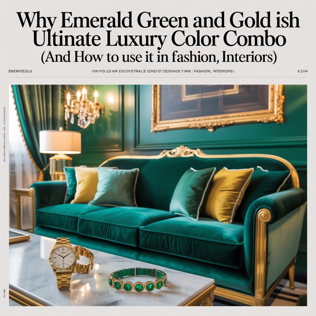
- The statement sofa: an emerald velvet sofa on slim brushed-brass legs, anchored by a cream boucle chair and a sisal rug.
- Jewel-box walls: matte emerald paint with applied molding strips, a gilded mirror, and thin brass picture lights.
- Kitchens and baths: deep-emerald cabinetry with unlacquered brass hardware and a honed marble countertop.
- Lighting matters: choose bulbs at 2700K for a warm, candlelit cast that deepens the green and softens the gold.
Events & Weddings: Regal Without Theatrical
The emerald green and gold wedding palette is trending strongly through 2026, particularly for fall, winter, and destination celebrations. Tuscan wedding planners specifically recommend brushed or antiqued gold finishes rather than mirror-polished ones—candlelight over spotlights, hand-lettered gold calligraphy on deep-green card stock, and wax seals in emerald on cream envelopes. For florals, lean on ruscus, eucalyptus, Italian olive branches, and warm-white blooms like garden roses and ivory peonies; avoid cool whites, which fight the warm metallics. Bridesmaids in emerald satin photograph beautifully against nearly every skin tone, and a groom in a velvet emerald dinner jacket with gold lapel pins is an unforgettable signature.
Branding & Packaging: The “Old Money” Unboxing
Luxury houses across spirits, fine jewelry, fragrance, and boutique hospitality have long used emerald and gold to signal a premium tier. The 2026 “Old Money” aesthetic has amplified the trend: emerald leatherette boxes with precision-embossed champagne-gold foiling, crushed velvet inserts, and serif logotypes are currently the default language of high-end jewelry packaging. The lesson for smaller brands is that one restrained touch of gold on a deep emerald field (a ribbon, a logo stamp, a foil edge) signals quality more effectively than an entire box covered in metallics.
4. Practical Styling and Design Rules
To keep the palette luxurious rather than gaudy, follow four simple rules:
Proportion first. Use the 60/30/10 or 70/25/5 formula. In a living room: 70% neutral base (cream walls, warm wood floor), 25% emerald (sofa, drapes), 5% gold (lamp, frame, handles). Let emerald carry more visual weight than gold—gold is the seasoning, not the dish.
Texture over bling. Pair emerald velvet with brushed, hammered, or antiqued gold, not high-polish. Matte green absorbs; matte gold whispers. Reserve polished brass for small, deliberate accents—a door pull, a single candlestick.
Mind the undertones. Emerald comes in two families: blue-leaning (cool) and yellow-leaning (warm). Cool emerald pairs crisply with bright yellow-gold and champagne gold; warm emerald sings against antique and rose-gold finishes. Never mix cool chrome with warm gold in the same scheme—it reads as a mistake rather than intention.
Breathing room with neutrals. Emerald + gold + one anchoring neutral prevents visual fatigue. The safest companions are: warm cream, charcoal, deep navy, blush, terracotta, and natural walnut. Avoid pairing with stark blue-white or neon; both drain emerald of its richness.
Budget-friendly shortcuts. Velvet-look throw pillows from Etsy or Target, brass spray paint on thrifted picture frames, a single gilded mirror above an emerald-painted accent wall—these moves deliver 90 percent of the impact at a fraction of the cost of bespoke pieces.
Care and upkeep. Velvet should be lint-brushed weekly and steam-cleaned annually to preserve the nap. Unlacquered brass develops a patina—decide upfront whether you want the aged look or plan to polish quarterly with Brasso. UV-protective window film prevents emerald fabrics from fading to a sad olive.
5. Contemporary Case Studies
The Greenbrier, West Virginia. Dorothy Draper’s iconic 1940s interiors at the resort are a textbook study in emerald and gold—still refreshed and still packed. The Dorothy Draper Brazilliance wallpaper, paired with emerald velvet banquettes and gilded sconces, proves the combination outlasts every trend cycle.
Taylor Howes’ Park Crescent living room, London. The firm layered deep emerald upholstery with brushed-brass piping and antiqued-gold floor lamps against soft ivory walls—a master class in letting gold function as an architectural accent rather than decoration.
Black Bride’s “Luxe Emerald and Gold” styled shoot. Planner Veronica Murray-Lockamy paired pewter damask linens with emerald velvet napkins, gold-rimmed crystal flutes, and a three-tier cake in emerald fondant with a gold rim—showing how the palette reads as formal without feeling heavy when balanced against soft pastels like blush.
JITAI’s “Amber Theater” jewelry packaging. The firm’s 2026 collection uses emerald crushed velvet trays inside champagne-gold-embossed leatherette boxes—exactly the visual vocabulary that high-net-worth American consumers now expect from fine-jewelry unboxings.
6. Common Pitfalls and How to Avoid Them
- Over-gilding. If every surface shines, nothing does. Restrict gold to three to five visible objects per room.
- Wrong green. Olive, sage, and mint are not emerald—they read casual and muddy against gold. Commit to the saturated jewel tone.
- Cold lighting. LED bulbs above 3500K flatten emerald and turn gold brassy. Stick to 2700K–3000K.
- Mismatched metallics. Mixing yellow gold, rose gold, and chrome in one space breaks the spell. Pick one metal family and stay there.
- Costume syndrome. An all-emerald outfit with all-gold jewelry reads like community theater. Use black, ivory, or nude as a breather.
7. Quick Visual Moodboard Ideas
- Emerald velvet sofa, matte cream walls, brass arc floor lamp, gold-framed botanical prints.
- Emerald silk slip dress, delicate gold chain layering, nude strappy heels, gold box clutch.
- Emerald lacquer cocktail table with gilded geometric inlays, clear tray, brass sculpture.
- Wedding sweetheart table: emerald velvet runner, taper candles in antique gold holders, ivory garden roses.
- Powder room: emerald-painted ceiling, brass wall sconces, marble vanity, gilded mirror.
- Vanity flat-lay: emerald leather jewelry box, gold-foil perfume tray, pearl studs, tortoiseshell sunglasses.
- Brand flat-lay: emerald rigid gift box, champagne-gold satin ribbon, cream tissue, gold-embossed logo card.
Conclusion: Your Turn to Go Green and Gold
Emerald green and gold works because it is both ancient and current—ancient enough to carry the weight of royalty and ritual, current enough to feel fresh on a 2026 red carpet, in a Brooklyn apartment, or on a Napa Valley wedding table. It is the rare color combination that signals wealth without shouting, depth without heaviness, and warmth without sentimentality.
Pick one move this season. Paint a single accent wall emerald. Swap your everyday hoops for brushed-gold studs. Replace your linen throw pillows with one velvet emerald pair on a brass-trimmed tray. The palette forgives small experiments and rewards bold ones.
