
Bedrooms are more than a place to sleep — they’re a retreat where color sets mood, comfort, and style. If you’re tired of the same beige-or-gray choices, these eight unexpected bedroom color combinations prove that bold, surprising pairings can create serene, cozy, and sophisticated bedrooms across US homes — from compact city apartments to suburban master suites.
The trick isn’t avoiding color. It’s pairing hues that shouldn’t work together — but absolutely do. A warm terracotta with a soft blush, say, or a deep jewel-toned navy layered over forest green. These combinations feel fresh because they break the “safe” rules we’ve all learned, but they succeed because of careful attention to undertone, finish, and balance.
In this post, you’ll discover eight designer-approved bedroom color palette ideas — plus practical tips for using them in small bedrooms, guest rooms, kids’ spaces, and primary suites. You’ll also get finish recommendations, neutral anchors, and real-world styling tricks so you can test these looks before committing to a full repaint.
A Quick Primer on Bedroom Color Basics
Before choosing bold bedroom color schemes, it helps to revisit a few fundamentals. Warm colors (reds, oranges, yellows) feel energetic and grounding; cool colors (blues, greens, purples) tend to recede and calm. That said, every hue sits on a spectrum — a “cool” red has blue undertones, while a “warm” blue leans slightly green.
Tonal schemes use variations of one color family for a soothing, monochrome feel. Contrast schemes place opposite colors beside each other for drama. Neither is better — the right choice depends on the mood you want.
Finish matters too. Matte paint absorbs light and softens bold hues; satin and eggshell reflect more light, making small bedrooms feel airier but also amplifying wall imperfections.
One tip before you buy a gallon: Test large paint sample panels (at least 2×2 feet) on multiple walls and observe them at morning, noon, and night. Natural daylight and evening bulbs can turn a serene lavender into something dingy-looking fast.
The 8 Unexpected Bedroom Color Combinations
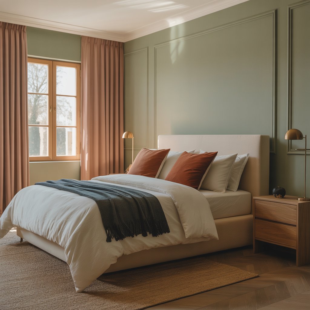
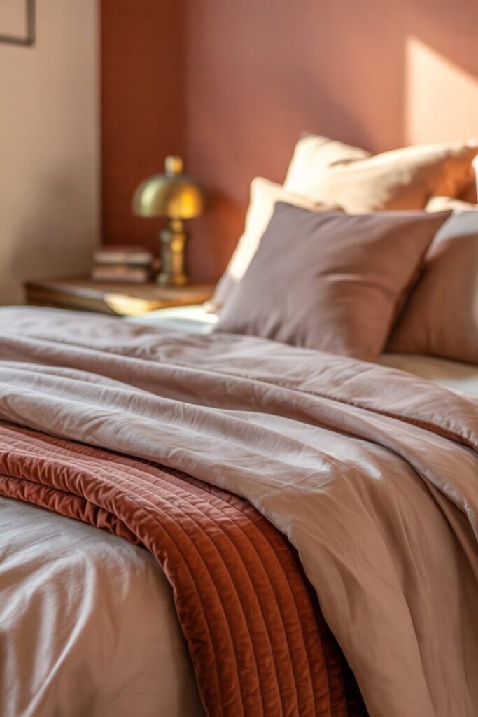
1. Terracotta + Dusty Pink
Why it works: Both colors share warm, earthy undertones, so they feel related rather than clashing. Terracotta brings grounded warmth; dusty pink adds quiet softness. Together they evoke sun-baked clay and dried roses — a palette that feels both vintage and current.
Where it works best: Master bedrooms, guest rooms, and boho-leaning interiors. It’s a fantastic pick for west-facing rooms where afternoon light warms everything up.
How to use it: Paint the walls a soft terracotta in matte finish and use dusty pink through bedding, throw pillows, and a small accent rug. Keep trim in a warm ivory rather than stark white. Aged brass hardware and a terracotta-toned ceramic lamp tie the story together.
Ratio: 60% terracotta, 25% dusty pink, 15% ivory/brass neutrals.
Styling tip: Layer a linen duvet in blush over a terracotta quilt folded at the foot of the bed. The texture difference prevents the two close hues from reading as “matchy.”
Example palette: Soft terracotta, muted blush, warm ivory, aged brass.
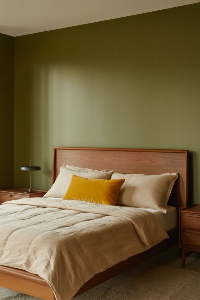
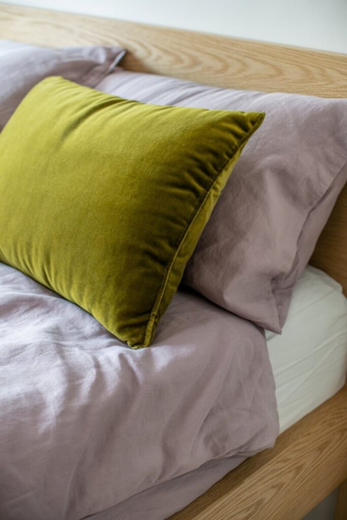
2. Olive Green + Mustard Yellow
Why it works: Olive is a muted, sophisticated green that doesn’t feel “nature-themed,” while mustard adds a shot of vintage-modern warmth without veering citrusy. The combination has a 1970s-inspired coolness that has cycled back in a more refined way.
Where it works best: Guest rooms, teen bedrooms, home offices doubling as guest spaces, and midcentury-inspired homes.
How to use it: Use olive as the dominant wall color (satin finish works beautifully on trim and built-ins too) and bring in mustard through a single statement throw, velvet pillow, or small accent chair. Walnut or teak furniture finishes amplify the vintage-modern feel. A black metal bed frame or lamp adds contemporary edge.
Ratio: 70% olive, 20% mustard, 10% walnut/black accents.
Styling tip: Mustard reads very differently next to cool whites — pair it with cream or oat undertones instead to keep the warmth coherent.
Example palette: Sage-olive, sun-warmed mustard, creamy oat, dark walnut.
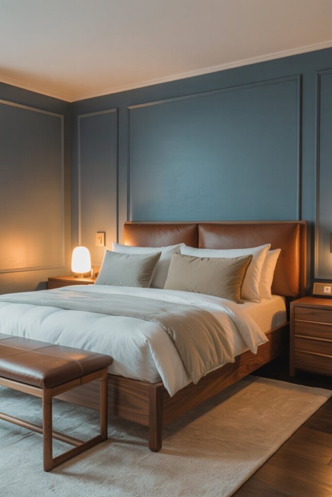
3. Slate Blue + Chocolate Brown
Why it works: Slate blue is a desaturated, slightly gray blue that feels calm and grown-up. Chocolate brown provides a rich counterweight — warmer than black, softer than navy. It’s a moody, cozy combination that feels especially luxurious in evening light.
Where it works best: Primary suites, north-facing rooms (the brown warms them up), and any bedroom where you want a dramatic, hotel-like mood.
How to use it: Paint all four walls in a deep slate blue, then introduce chocolate brown through wood furniture — a walnut dresser, a leather bench, or a wood-framed bed. Brushed nickel or oil-rubbed bronze hardware finishes the look. Bedding in a soft ivory or pale mushroom tone keeps the room from going too dark.
Ratio: 55% slate blue, 30% chocolate brown, 15% ivory/mushroom.
Styling tip: Layer lighting deliberately — a warm-toned table lamp, a reading sconce, and a dimmable overhead. Moody rooms depend on lighting layers.
Example palette: Deep slate blue, rich chocolate, soft mushroom, brushed nickel.
4. Muted Lavender + Chartreuse
Why it works: Lavender and chartreuse sit near-opposite on the color wheel, creating a complementary pairing that energizes without overwhelming. Keeping both slightly muted (dusty lavender, olive-chartreuse rather than neon) keeps the vibe serene with a playful twist.
Where it works best: Kids’ and teens’ bedrooms, creative guest rooms, and cottage-style homes.
How to use it: Use lavender on walls (eggshell finish keeps it from feeling flat) and bring chartreuse in through small accents — a single pillow, a throw, or a small patterned rug. White or light oak furniture prevents the palette from becoming twee.
Ratio: 65% lavender, 15% chartreuse, 20% light oak/off-white.
Styling tip: Limit chartreuse to two or three accents. It’s a powerful color — a little goes a very long way, especially against a soft purple.
Example palette: Dusty lavender, mossy chartreuse, warm off-white, light natural oak.
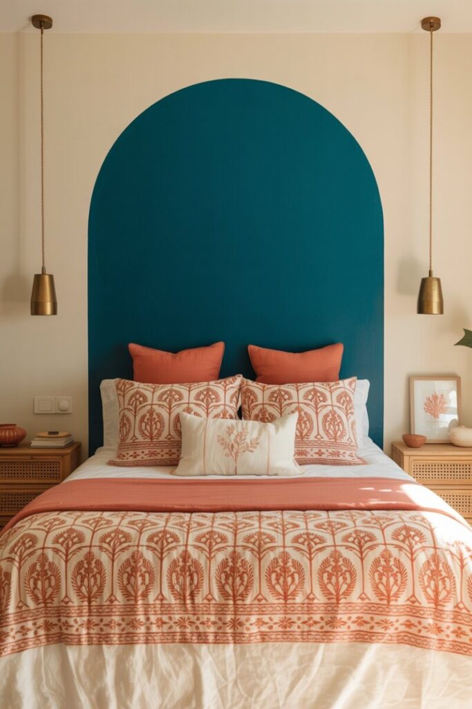
5. Deep Teal + Coral
Why it works: Teal is a jewel tone that delivers instant drama; coral softens and lifts the palette with a warm, sunlit punch. The combination is bold but grounded — perfect for mood-enhancing bedrooms that still feel livable.
Where it works best: Accent walls in primary suites, guest rooms, and any bedroom looking for a “vacation home” vibe.
How to use it: Paint a single accent wall (the wall behind the bed) in deep teal, with the remaining walls in a soft cream. Coral comes in through a patterned duvet (think block-printed coral and cream), throw pillows, or a small art print. Natural rattan or cane furniture keeps the palette from feeling too formal.
Ratio: 25% teal (accent), 55% cream, 15% coral, 5% rattan/gold.
Styling tip: For small bedrooms, keep teal to the accent wall only. A full room of deep teal can feel cave-like below 150 square feet.
Example palette: Deep jewel teal, sunlit coral, soft cream, natural rattan.
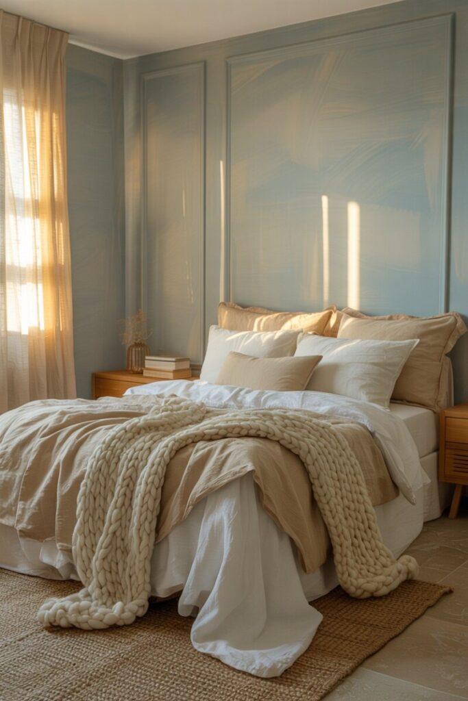
6. Pale Gray-Blue + Warm Coconut
Why it works: This is the most subtle pairing on the list — a cool, airy gray-blue balanced by warm, creamy coconut tones. It’s ideal for anyone who wants a calming bedroom color palette that still feels more interesting than straight white or gray.
Where it works best: Small bedrooms, rental-friendly spaces (easy to live with), and primary suites seeking a spa-like feel.
How to use it: Paint walls in pale gray-blue and use coconut tones through linen bedding, a chunky knit throw, and warm-toned wood furniture (think honey oak or bleached walnut). A small jute rug adds organic texture.
Ratio: 60% gray-blue, 35% coconut/cream, 5% natural texture (jute, rattan).
Styling tip: This palette can read as “cold” if every finish is cool. Make sure at least half your textiles and wood pieces lean warm.
Example palette: Pale gray-blue, warm coconut, soft honey oak, natural jute.
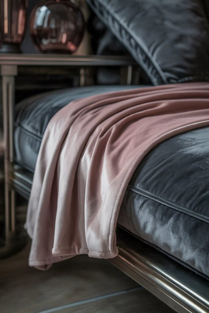
7. Blush Mauve + Gunmetal Gray
Why it works: Blush mauve is a grown-up pink with gray and purple undertones, which means it already shares DNA with gunmetal gray. The result is a romantic-industrial crossover that reads as sophisticated, not sweet.
Where it works best: Urban apartments, modern bedrooms, and guest rooms where you want a touch of personality without going full pastel.
How to use it: Use gunmetal as the dominant color — on a feature wall, dresser, or upholstered headboard — and introduce blush mauve through bedding, a soft throw, or curtains. Matte black metal fixtures and smoked glass lighting add edge.
Ratio: 55% gunmetal, 30% blush mauve, 15% matte black/smoked glass.
Styling tip: Blush mauve looks sophisticated in velvet and terrible in shiny polyester. Invest in a velvet pillow or blanket for maximum impact.
Example palette: Smoky mauve, deep gunmetal, matte black, smoked glass amber.
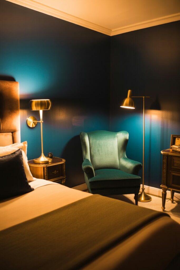
8. Navy + Forest Green
Why it works: Two jewel tones stacked together creates a rich, layered, almost club-like atmosphere. Navy and forest green share cool undertones and similar depth, so they feel curated rather than chaotic.
Where it works best: Primary suites, reading nook bedrooms, and any space where you want a “library after dark” feeling.
How to use it: Navy on the walls, forest green on furniture (a velvet armchair, a painted dresser) or textiles. Brass or unlacquered brass lighting fixtures lift the palette beautifully. Avoid cool whites in this room — they fight the richness. Reach for creamy ivories instead.
Ratio: 60% navy, 25% forest green, 15% brass/ivory.
Styling tip: This is a dark, saturated combo, so invest in layered lighting — sconces, a floor lamp, and at least one warm bulb overhead.
Example palette: Midnight navy, deep forest green, aged brass, soft ivory.
Universal Tips for Making Bold Combos Feel Cohesive
Whatever pairing you choose, these five principles keep your bedroom feeling designed rather than accidental.
- Repeat one color across at least three elements. If terracotta is on the wall, echo it in a pillow, a lamp base, and one piece of art. Repetition reads as intent.
- Anchor with neutrals. Off-white, warm beige, deep espresso, or soft gray give your bold colors room to breathe. Without neutrals, even harmonious pairings fatigue the eye.
- Pick a dominant temperature. Cool-leaning palettes feel crisp and modern; warm-leaning ones feel cozy and grounded. Don’t split 50/50 — choose one temperature to dominate by at least 70%.
- Keep metal finishes consistent. Mixing brass, chrome, and nickel in a single small room scatters the eye. Choose one metal finish and carry it through lamps, hardware, and frames.
- Scale color to the room. In small bedrooms, use the stronger color as an accent rather than on all four walls. A single navy accent wall does the work of a fully navy room without overwhelming the space.
Shopping and Sourcing Tips for US Homes
For paint, start with sample pots from big-box retailers (Benjamin Moore and Sherwin-Williams sample jars are widely available and reliable). Paint a 2×2 panel rather than the wall directly — you can move it around the room and return it if the color shifts too much.
For textiles and accent pieces, online marketplaces like Etsy (for block-printed bedding and handmade pillows) and CB2, West Elm, and Article (for affordable furniture) offer strong selections. Local vintage and antique stores — especially Habitat for Humanity ReStores and regional flea markets — are goldmines for unique wood furniture and brass lighting.
Affordable ways to experiment before committing: removable peel-and-stick wallpaper on a single wall, interchangeable pillow covers, thrifted frames spray-painted in a finish that matches your palette, and slipcovers for existing furniture.
Try One Pairing This Month
The best unexpected bedroom color combinations share one trait: they feel personal. Pick one pairing from this list that speaks to your space and mood, then test it with a single sample pot and one accent piece this month. You’ll know within a week whether it’s the direction you want to commit to.
Tried one of these combos in your own bedroom? Drop a photo in the comments or tag us on social — we love seeing how readers interpret these palettes. And if you’re deciding between finishes, check out our guide How to Choose the Right Paint Finish for Your Bedroom next.
